shall I publish again in MQTT ? as now I get unknown instead of the value

and yes this is a newbee here…
shall I publish again in MQTT ? as now I get unknown instead of the value
and yes this is a newbee here…

Currently i’ve this chart, but i want to add two horizontal lines one with a entity value (average price) and a static value 40.0 in this case.
Can someone give me a clue, with the default documentation i can’t my head around this.
type: custom:apexcharts-card
graph_span: 24h
hours_12: false
header:
  title: cent/kWh uurtarief vandaag
  show: true
span:
  start: day
now:
  show: true
  color: grey
  label: Nu
series:
  - entity: sensor.nordpool
    type: column
    data_generator: |
      return entity.attributes.raw_today.map((start, index) => {
        return [new Date(start["start"]).getTime(), entity.attributes.raw_today[index]["value"]];
      });
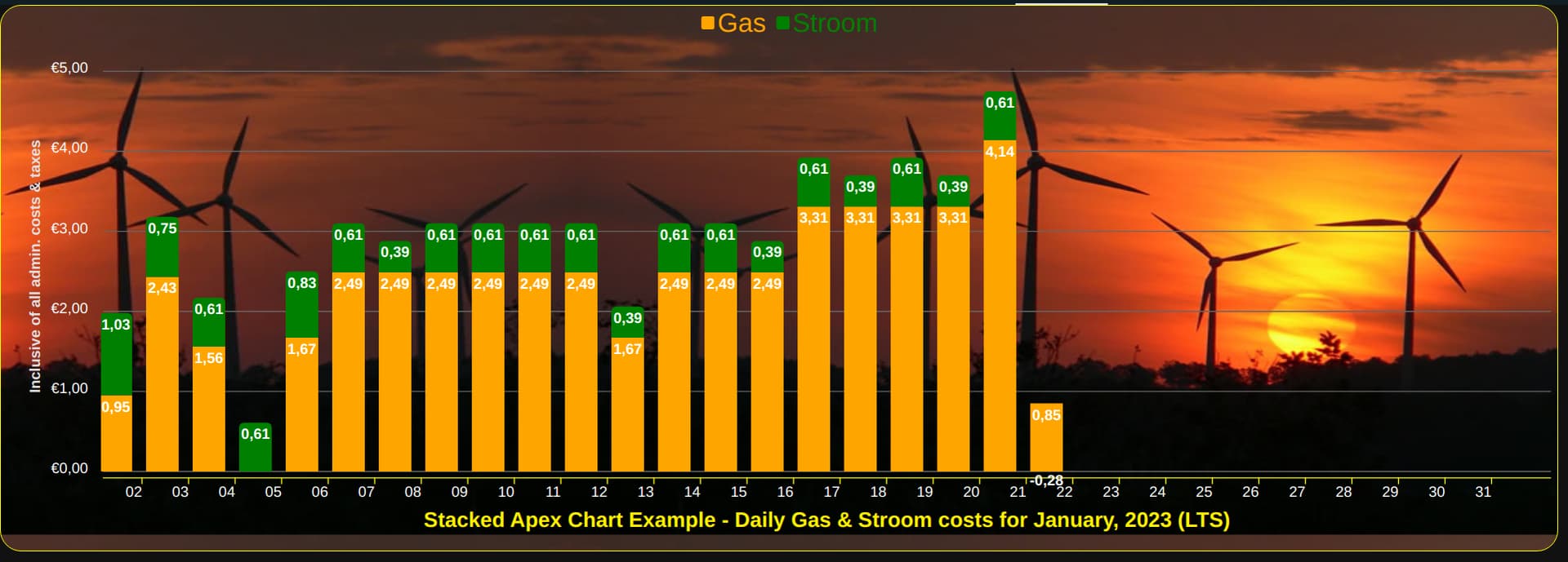
Hi all, I thought I’d share the code and image for a Monthly Stacked example that hopefully will answer some recently asked questions. There are some reported known issues when using this method, so checkout the HA Apex Chart github issues page if your question has not been answered by my posting. github link
type: vertical-stack
cards:
  - type: custom:config-template-card
    entities:
      - sensor.month
      - sensor.year
    card:
      type: custom:apexcharts-card
      graph_span: 1month
      cache: true
      span:
        start: month
        offset: +1day
      show:
        last_updated: false
        loading: false
      header:
        show: false
        standard_format: true
        floating: false
        show_states: false
      yaxis:
        - id: stroom&gas
          show: true
          min: 0
          max: 5
          decimals: 2
          apex_config:
            forceNiceScale: 'yes'
            labels:
              show: true
              formatter: |
                EVAL:function(value) {
                let text = parseFloat(value).toFixed(2);
                let result = "€" +text.replace(".", ",");
                return result;
                }
              style:
                colors: '#ffffff'
                fontSize: 14px
              offsetX: 0
              offsetY: 0
            axisBorder:
              show: false
              color: '#78909C'
            title:
              text: Inclusive of all admin. costs & taxes
              rotate: -90
              offsetX: 0
              offsetY: 0
              style:
                fontSize: 14px
      series:
        - entity: sensor.daily_gas_consumption_costs
          float_precision: 2
          type: column
          name: Gas
          yaxis_id: stroom&gas
          statistics:
            type: state
            period: day
            align: middle
          fill_raw: zero
          group_by:
            fill: zero
            duration: 1d
            start_with_last: false
            func: last
          color: orange
          unit: ' '
          show:
            legend_value: false
            in_header: true
            name_in_header: true
            header_color_threshold: true
            in_chart: true
            datalabels: true
            hidden_by_default: false
            extremas: false
        - entity: sensor.daily_electric_consumption_costs
          float_precision: 2
          type: column
          name: Stroom
          yaxis_id: stroom&gas
          statistics:
            type: state
            period: day
            align: middle
          fill_raw: zero
          group_by:
            fill: zero
            duration: 1d
            start_with_last: false
            func: last
          color: green
          unit: ' '
          show:
            legend_value: false
            in_header: true
            name_in_header: true
            header_color_threshold: true
            in_chart: true
            datalabels: true
            hidden_by_default: false
            extremas: false
      apex_config:
        chart:
          height: 500
          type: bar
          stacked: true
        plotOptions:
          bar:
            borderRadius: 5
            dataLabels:
              position: top
        dataLabels:
          enabled: true
          offsetX: 0
          offsetY: 0
          style:
            fontSize: 14px
            colors:
              - '#ffffff'
          zoom:
            enabled: false
          toolbar:
            show: true
            tools:
              download: true
              zoom: true
              zoomin: false
              zoomout: false
              pan: false
              reset: true
        tooltip:
          enabled: false
          shared: false
          theme: light
          style:
            fontSize: 14px
          onDatasetHover:
            highlightDataSeries: false
          x:
            show: true
            format: ddd dd MMM yyyy
          marker:
            show: false
          fixed:
            enabled: true
            position: topRight
            offsetX: -10
            offsetY: 0
        grid:
          show: true
          strokeDashArray: '0'
          borderColor: '#666666'
          xaxis:
            lines:
              show: false
          yaxis:
            lines:
              show: true
        xaxis:
          labels:
            show: true
            rotate: 0
            rotateAlways: true
            style:
              colors: '#ffffff'
              fontSize: 14px
            offsetX: 0
            offsetY: 0
            format: dd
          position: bottom
          showDuplicates: false
          axisBorder:
            show: true
            color: yellow
            height: 1
            width: 100%
            offsetX: 0
            offsetY: 5
          axisTicks:
            show: true
            color: yellow
            height: 6
            offsetX: 0
            offsetY: 0
          title:
            text: >-
              ${{'Stacked Apex Chart Example - Daily Gas & Stroom costs for ' +
              states['sensor.month'].state + ', ' + states['sensor.year'].state
              + ' (LTS)'}}
            offsetX: 0
            offsetY: 0
            floating: true
            style:
              fontSize: 20px
              color: '#fff000'
        legend:
          show: true
          showForSingleSeries: true
          position: top
          horizontalAlign: center
          fontSize: 25px
          offsetX: 0
          offsetY: 0
          labels:
            useSeriesColors: true
          onItemClick:
            toggleDataSeries: true
          onItemHover:
            highlightDataSeries: false
      card_mod:
        style: |

          ha-card {
            background-color: transparent;
            box-shadow: 0px 0px;

            border: 1px solid yellow;
            border-radius: 20px 20px 20px 20px;

            width: 99.4% !important;

            background-image: url("/local/images/windmill-sunset-3.jpg");

            background-size: 100% 500px;
          }
See my latest post that is using a monthly stacked method.
See my latest post that is using a monthly stacked method with datalabels.
Please help. How come the one graph plot is not even showing on the chart?
Do I need to set a min/max?
Thanks

Which one isn’t showing? Looks like your pool temp is only updating occasionally so there are gaps in the data.
Yea im not sure whats up with that, but its also almost below the minimum of the graph?
The default graph in HA displayed it just fine.
Confirm you are using chart_type line and not scatter?
And yes if you want to have more of a gap at the bottom you will have to use min but beware that is then fixed and may not be want you always want.
Yes, you should publish in MQTT
I’m trying to get this graph into a week format. Can someone help me with this?
type: custom:apexcharts-card
graph_span: 7d
update_interval: 5m
cache: true
span:
  end: day
  offset: '-1sec'
header:
  show: true
  title: Normaal en dal per dag
apex_config:
  xaxis:
    labels:
      format: dd-MM
      show: true
      showAlways: true
  yaxis:
    forceNiceScale: false
    decimalsInFloat: 0
    min: 0
  chart:
    type: area
    height: 300
  stroke:
    show: true
    width: 1
  legend:
    show: true
  dataLabels:
    enabled: false
    distributed: true
  fill:
    type: gradient
    gradient:
      shadeIntensity: 0.1
      opacityFrom: 0.25
      opacityTo: 1
      inverseColors: true
      stops:
        - 0
        - 90
        - 100
series:
  - entity: sensor.stroom_import_dal_dagelijks
    type: column
    name: Dal
    float_precision: 2
    group_by:
      func: max
      duration: 23h59m59s
  - entity: sensor.stroom_import_normaal_dagelijks (This is daily, i can change these to monthly or weekly)
    name: Normaal
    type: column
    float_precision: 2
    group_by:
      func: max
      duration: 23h59m59s
If you mean me? Thats not working for me since “statistics: type state” is not available for my sensor only max, min, mean.
Also, the core issue is described here…and I left a message:
There is a bug report in Apex-Chart Git which also mentioned some similar problem with diff … not sure if Apex-Chart problem or core statistics.
Anyhow, I still need help how to remove the wrong statistics value at 0:00 containing not 0 but the last value of the last day. How can I remove this wrong value from sensor statistics?
Thanks!
Yes, definitely line.
type: custom:apexcharts-card
chart_type: line
header:
  show: true
  show_states: true
  colorize_states: true
series:
  - entity: sensor.pooltemperature
  - entity: sensor.serverroomtemp
Thanks
Is there any way to group points by timestamp into days without reducing the number of points? Essentially I have multiple events occurring on the same day, but on my chart I’d like to show them all in line over the x-axis label for that day. Currently, they are offset from the label depending on the time these events occurred. In the graph below, both of the dots represent events that occurred on Jan. 21, but as you can see they are shifted left from the Jan 21 label depending on the time of day they were recorded:

If possible, I’d like to stack them vertically directly above each other and above the Jan 21 label.
Current config:
type: custom:apexcharts-card
chart_type: scatter
graph_span: 1 week
apex_config:
  dataLabels:
    enabled: true
  yaxis:
    min: 0
    max: 1440
    tickAmount: 6
    labels:
      formatter: |
        EVAL:function(value) {
          var suffix = '';
          var hour = Math.floor(value / 60);
          if (hour == 0) {
            return '';
          }
          if (hour > 12) {
            suffix = 'PM';
            hour -= 12;
          } else {
            suffix = 'AM';
          }
          return hour + suffix;
        }
header:
  show: true
  title: Poop Chart
  colorize_states: true
series:
  - entity: button.poop_button
    color: '#704000'
    group_by:
      func: raw
      duration: 1d
    transform: |
      var time = new Date(x);
      return time.getHours() * 60 + time.getMinutes();
I’ve one question how can i add a value of a sensor to the yaxis?
Hi, did not know this (admitting to not have read all options)
Question with that… I would like to color the label depending on another value
e.g. I have ‘pairs’ with value and boolean in my sensor
value:
 - 1
 - 2
..
value_b
 - true
 - false
...
Can one use an EVAL to change the style (color) of the label based on the boolean?
Unfortunately there is no formatter option available for label colors. You can change the colors to some extent. I have used 3 in this example.
yaxis:
  - id: °c
    decimals: 3
    apex_config:
      title:
        text: Temperatures °c
        style:
          fontSize: 16px
      forceNiceScale: true
      labels:
        show: true
        formatter: |
          EVAL:function(value) {
            let text = parseFloat(value).toFixed(0);
            let result = text.replace(".", ",");
            return result;
          }
        style:
          colors:
            - '#FFFF00'
            - '#ffffff'
            - '#0000FF'
          fontSize: 14px
series:

To use external and variable values in the Apexcharts card you must first install the HACS - Frontend “Config Template Card” card.
Use the example below my screenshot to make it the way you wish.

type: vertical-stack
cards:
  - type: custom:config-template-card
    entities: sensor.nordpool
    variables:
      average: states['sensor.nordpool'].attributes.average
    card:
      type: custom:apexcharts-card
      graph_span: 24h
      hours_12: false
      header:
        title: cent/kWh uurtarief vandaag
        show: true
      span:
        start: day
      now:
        show: true
        color: grey
        label: Nu
      apex_config:
        annotations:
          yaxis:
            - y: ${average}
              y2: 40
              strokeDashArray: 5
              borderColor: var(--primary-color)
              opacity: 0.5
              label:
                text: ${average}
      series:
        - entity: sensor.nordpool
          type: column
          data_generator: |
            return entity.attributes.raw_today.map((start, index) => {
              return [new Date(start["start"]).getTime(), entity.attributes.raw_today[index]["value"]];
            });
I ended up to program my own data_generator to correctly sum-up long term statistics. Would be great if HA core team or apex-chart team fixes the problem.
thanks here for inspiration
For anyone who may need this…here my code:
chart_type: donut
graph_span: 30d
update_interval: 1h
series:
  - entity: sensor.daily_energy_consumption
    name: House
    show:
      datalabels: percent
    data_generator: |
      var statistics = await hass.callWS({
          type: 'recorder/statistics_during_period',
          start_time: new Date(start).toISOString(),
          end_time: new Date(end).toISOString(),
          statistic_ids: [entity.entity_id],
          period: "hour",
      });

      var stats = statistics[entity.entity_id];

      var result = [];
      var len = stats.length;
      var hour, day;
      var tzoffset = new Date().getTimezoneOffset()*1000*60;
      var timeoffset = tzoffset - 1000*60; //timezone -1min
      var sum = 0;

      for (let i = 0; i < len; i++) {
        hour = new Date(stats[i].start).getHours();
        day = new Date(stats[i].start).getDate();
        if(parseFloat(hour) == 0){ //add last value to result
          sum += stats[i].max;
        }
      }

      if(hour !=0){ //add last reading of current day but avoid double
        sum += stats[len-1].max;
      }
      result.push([(new Date(stats[len-1].end).getTime()),sum]);

      return result;