Hi Pieter, the code in the formatter is python function?
Can I do the same inside the data generator?
It’s JS.
What do you want to achieve with your data generator?
The Apex Charts docs will tell you where scripting is allowed.
About data_generator:
I have an entity that has an attribute called profile
profile:
- 2023-07-06T00:00:00+0200: 60
- 2023-07-06T01:00:00+0200: 65
- 2023-07-06T02:00:00+0200: 60
- 2023-07-06T03:00:00+0200: 50
- 2023-07-06T04:00:00+0200: 70
etc
I cannot get any examples I can find to get this right.
I guess the reason is that the time has the extra +200 for CET.
Is it possible to make this work?
What should the data_generator look like?
I am looking for a way to show the AVERAGE of the MAX temps from my pool sensor.
If you see below, I have a nice graph of the MAX temps and MIN temps over the past 14 days.
Works awesome.
What I want is to take all those MAX temps, and get an average of those.
I got close, but the number is off. when I throw the past numbers into Excel and do an average, i am coming out with 94.
Here i am getting 92.
Anyone know how I can do this? I dont want to show it in the chart, just at the top like you see.

type: custom:apexcharts-card
graph_span: 14d
yaxis:
  - id: Max
    min: 0
    max: 105
  - id: Min
    opposite: true
    min: 0
    max: 105
  - id: Avg
    opposite: true
    min: 0
    max: 105
    show: false
span:
  end: day
header:
  show: true
  title: Pool Temperature 30 Days Max/Min
  show_states: true
  colorize_states: true
series:
  - entity: sensor.pool_temp
    name: Today Max
    yaxis_id: Max
    type: column
    group_by:
      func: max
      duration: 1d
    color: rgb(255, 0, 0)
    data_generator: ''
  - entity: sensor.pool_temp
    name: Today Min
    yaxis_id: Min
    type: column
    group_by:
      func: min
      duration: 1d
    data_generator: ''
  - entity: sensor.pool_temp
    name: Average Max
    yaxis_id: Avg
    type: column
    color: rgb(255,165,0)
    group_by:
      func: median
      duration: 14d
    data_generator: ''
    show:
      in_chart: false
1 Like
Greetings,
so i have 3 sensors.
1.Electricity usage from grid
2.Electricity usage of the home
3.Solar production
How can i make this graph like this one, colors below the solar production is a different color for the electricity usage and above solar production is electricity usage from grid.

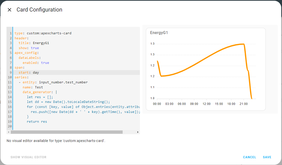
I made a post 3 posts before yours. I have a sensor with attributes that contains a time key and value. I want to plot them in using apex charts but I need to extract these values in a way that apex chart understand it. I could not, probably due to my limited JS knowledge.
I did some javascript coding and I reached so far to return the data correctly to ApexCharts, but still it is not plotted correctly, any one can give a clue?
As show in the attached picture, I’m printing the time and value to the console and it is correct, but the chart is plotted only at the end of the time axis, not from the start.

I donot believe this is correct as you are using the time ‘now’.
I tried this, i.e. construct a date time with today in front of the key…this works (!)
      let res = [];
      let day = new Date().toLocaleDateString()
      for (const [key, value] of Object.entries(entity.attributes.test1)) {
        res.push([new Date(day + ' ' + key).getTime(), value]);
      }
      return res
based on this:
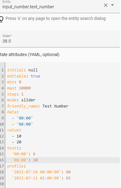
if the key/values are preceded by a hyphen it no longer works (see the ‘profile’ attribite) as it is seen differently then and I guess this requires indexing …for which my js skill are not good enough.
1 Like
I tried your suggestion, it gave me the exact same result as mine.
It seems that the ApexChart is ploting only the time for the current hour and onwards. i.e. when I checked the graph today at 19, I saw all the data till today 19:00. I do not see the data I have for the following hours.
Hi All,
Probably this is a stupid question, but I can’t figure it out.
How can I increase the data frequency from 1 hour to say 1 minute in the graph?
Example:
Every minute I want to see the amps of L1, L2 and L3.

That fixed it for me, thanks.
I was missing the following:
span:
  start: day
Hi,
What I’m trying to do is to compare solar power of today vs. yesterday. Not as total but at given time of day.
Do you have any idea how to display 2 series in same graphs of same entity but second one shifted 24h right?
Final usage would be to compare any given days as I need to compare days with similar weather but it’s just a detail.
Sorry if it was already discussed, but I was not able to find it.
I did something like this for my elec consumption and added a selector option…so I can pick ‘any’ date to compare with ‘any’ other date.
What you want is a bit simpler, just use the same series twice but shift the sencond one with offset -1d
1 Like
Any idea how to hide the horizontal dotted line on the y-axis?
I’m loving the ApexCharts cards, I have a card that is tracking the Octopus Agile electricity unit rate (that changes every half-hour, published at around 4pm daily. I’ve overlaid my usage but have two questions;
1/ Is it possible to left align the vertical usage bars?
2/ Is it possible and how would I highlight the current half-hour time period?
Cheers!

I have several ApexCharts cards on my dashboard. However I would like to have one card that only consists of a header (so no graph at all). Is that possible? Even if I put
    show:
      in_chart: false
with all the entities, I see an empty graph. I’d be grateful if anybody could help!
Hi All,
my goal is to create a chart that displays two sensors: one for the actual temperature and another for the set temperature. I want both sensors to have the same scaling on the y-axis, but I would like the graph to focus only on the actual temperature. This way, when the setpoint is much lower, it won’t be displayed on the graph.
Can someone help me?
Thanks in advance
type: custom:apexcharts-card
graph_span: 1.5d
yaxis:
  - id: Temperatura
    max: '|+1|'
    min: 15
    apex_config:
      tickAmount: 2
header:
  show: true
  title: Casa
  show_states: true
  colorize_states: true
series:
  - entity: sensor.riscaldamento_temperature
    name: Temperatura Nest
    color: rgb(255, 82, 0)
    opacity: 0.7
    yaxis_id: Temperatura
    show:
      legend_value: false
    group_by:
      func: avg
      duration: 25min
  - entity: sensor.riscaldamento_setpoint
    color: Red
    name: Riscaldamento
    yaxis_id: Temperatura
    type: area
    opacity: 0.15
    stroke_width: 0.15
    show:
      legend_value: false
      datalabels: false
      extremas: false
    group_by:
      func: max
      fill: last
      duration: 5min

I’m guessing this isn’t possible, but here it goes:
Is it possible to have only specific series stacked?
For example: I have three inverters and would ideally like to display their PV input’s separate but just stacked. None of the other series in the graph should be stacked
@watermarkhu I know this was over a year ago, but do you still have the code for the Buienradar data_generator fixing this? I’m having the same same issue as you.