ApexCharts card - A highly customizable graph card

Hi all, I just created a few graphs to compare local measured temp with forecasted figures

When I put them both in one graph it shows inconsistent state values.
This because the state value of a datagenerator is linked to the last value of the series

With the graph below I would like to see

  • the last value of the local sensor …i.e. this is as-is
  • the first value of the forecast sensors… you can clearly see they are incorrect, as the forecasted last values are in 5 days from now.
    Is there any way to improve on this without needing two new template sensors?

image

Sure, here is the full card that I’m using now, which combines the data from buienradar and buienalarm, bundled together with the 3 hour forecast using openweathermap.
image

Additional cards are vertical-stack-in-card and card-mod to tie it all together.

type: custom:vertical-stack-in-card
cards:
  - show_current: true
    show_forecast: true
    name: ''
    type: weather-forecast
    entity: weather.openweathermap
    secondary_info_attribute: wind_speed
    card_mod:
      style: |
        .type-weather-forecast {
          padding-bottom: 0px;
        }
  - type: custom:apexcharts-card
    apex_config:
      chart:
        height: 200px
      annotations:
        yaxis:
          - 'y': 0.25
            label:
              style:
                color: var(--secondary-text-color)
                background: var(--secondary-background-color)
              text: light
          - 'y': 1
            label:
              style:
                color: var(--secondary-text-color)
                background: var(--secondary-background-color)
              text: moderate
          - 'y': 2.5
            label:
              style:
                color: var(--secondary-text-color)
                background: var(--secondary-background-color)
              text: heavy
    yaxis:
      - decimals: 2
        min: 0
        max: ~0.5
        apex_config:
          tickAmount: 5
    update_interval: 5m
    graph_span: 2h
    span:
      start: minute
    now:
      show: true
      color: var(--primary-text-color)
    series:
      - entity: sensor.neerslag_buienradar_regen_data
        data_generator: |
          return entity.attributes.data.split(' ').slice(0, -1).map(item => {
            return [moment(item.split('|')[1], 'HH:mm').valueOf(), Math.pow(10, ((parseInt(item.split('|')[0] - 109) / 32)))]
          })
        color: '#6e9bd4'
        type: area
        name: Buienradar
        stroke_width: 2
        group_by:
          func: avg
          duration: 10min
        show:
          legend_value: false
      - entity: sensor.neerslag_buienalarm_regen_data
        data_generator: |
          return entity.attributes.data.precip.map((item, index) => {
            return [moment.unix(entity.attributes.data.start).add(index*entity.attributes.data.delta, 's').valueOf(), item]
          })
        color: '#224179'
        type: area
        curve: smooth
        stroke_width: 2
        group_by:
          func: avg
          duration: 10min
        name: Buienalarm
        show:
          legend_value: false

5 Likes

I have two sensors:
sensor.hvac_cooling_daily = total time HVAC is cooling per day
sensor.hvac_fan_on_daily = total time HVAC Fan is on per day

I want to plot a graph that show both measurements in a stacked bar graph.
Problem is that sensor.hvac_fan_on_daily stores the total time the fan is on (cooling + fan only).
So, I need: sensor.hvac_fan_on_daily - sensor.hvac_cooling_daily but I don’t want to create another sensor.

For the Fan on series I tried:

transform: return parseFloat(x) - parseFloat(hass.states['sensor.hvac_cooling_daily'].state);
group_by:
   func: last
   duration: 1d

But it is seems to be working correctly just for the current day. What am I doing wrong here?

image

image

Really enjoying this card. So thanks for all hard work!
It gives me perfectly the situation (solar, grid import & export) of the current day.

As I am using longterm statistics, it would be very interesting for me to dynamically define an offset. So I am able to show this graph for a specific date in history.

  • Date selector: maybe using a date picker helper to define the specific date and then calculate the offset.

  • < & > button to higher or lower the offset.

  • Toolbar configuration: is there something available in the toolbar?

Anyone has done something like this before?

Many thanks!

2 Likes

See one of my earlier posts…I used input helpers for offset

Well it seems I totally missed that one :slight_smile: . This is exactly what I had in mind :clap:. I see you also use the Tabbed Card for Daily / Weekly / Monthly / Actual. This was also something I was thinking of. This gives you endless possibilities to see your Energy statistics :+1:

Mind sharing your total config (inl the tabbed card)?
Thx!

@RomRider, loving the card! Just got started with some charts but the features are almost endless.

I have run into a weird problem though and will try to explain it as clear as possible.

First off I used the raw data, but this didn’t let me few all datapoint into the same tooltip which made the tooltip jump around while scrolling through the chart:


So I used the group_by function to make sure all the datapoints are aligned:

group_by:
        duration: 10sec
        func: max


Then it works how I wanted BUT for just a bit. When I refresh the page once it’s all bugged and doesn’t fix itself anymore. You can also see the lines being cut off on the left side.


And even weirder, when I enter ‘edit mode’ again it’s all working but just in edit mode. Refreshing the page doesn’t break the chart within edit mode. When I leave edit mode again it’s all bugged like before:


Here’s a video (gif) of all the steps above:

Screen Recording 2023-07-24 at 13.57.39

And of course my code

type: custom:config-template-card
entities:
  - input_number.apex_chart_purifier_zoom_level
  - input_number.apex_chart_purifier_pan_level
card:
  type: custom:apexcharts-card
  graph_span: ${states['input_number.apex_chart_purifier_zoom_level'].state+'min'}
  span:
    offset: >-
      ${('-' + states['input_number.apex_chart_purifier_pan_level'].state +
      'min')}
  show:
    loading: false
    last_updated: false
  header:
    show: true
    title: ''
    show_states: true
    colorize_states: true
  apex_config:
    grid:
      show: true
      borderColor: var(--contrast3)
      strokeDashArray: 0
      position: back
      padding:
        top: 0
        right: 20
        bottom: 20
        left: 10
    xaxis:
      labels:
        datetimeFormatter:
          year: yyyy
          day: dd MMM
          hour: HH:mm
          minute: HH:mm
      tooltip:
        enabled: false
      axisBorder:
        color: none
  yaxis:
    - id: pm
      min: 0
      max: ~8
      decimals: 0
      apex_config:
        tickAmount: 8
        labels:
          offsetX: -10
    - id: voc
      show: false
      min: 0
      max: 500
    - id: motorspeed
      show: false
      min: 300
      max: 2150
  series:
    - entity: sensor.luchtkwaliteitsensor_voc_index
      yaxis_id: voc
      name: VOC
      stroke_width: 2
      color: var(--contrast6)
      group_by:
        duration: 10sec
        func: max
    - entity: sensor.xiaomi_air_purifier_motor_speed
      yaxis_id: motorspeed
      stroke_width: 2
      curve: smooth
      type: line
      name: RPM
      group_by:
        duration: 10sec
        func: max
    - entity: sensor.luchtkwaliteitsensor_pm25
      yaxis_id: pm
      name: PM2.5
      stroke_width: 2
      type: line
      float_precision: 1
      curve: stepline
      color: var(--purple)
      group_by:
        duration: 10sec
        func: max

Would appreciate any help :slight_smile:

1 Like

Edit mode disables the internal data caching of apexcharts-card. So maybe there’s a bug with that. I’d need to check the code (that part is quite a mess :smiley:).

Try forcing disabling cache on this card with cache: false. It might be a bit slower, though…

1 Like

Works like a charm! Thanks for the fix (and the annotations) :wink:

Here it is…just a ‘few’ lines :slight_smile:

type: custom:tabbed-card
styles:
  '--mdc-theme-primary': yellow
  '--mdc-tab-text-label-color-default': orange
tabs:
  - card:
      type: custom:stack-in-card
      mode: vertical
      cards:
        - type: horizontal-stack
          cards:
            - type: custom:numberbox-card
              name: Offset 1
              border: true
              entity: input_number.offset_days
              card_mod:
                style: |
                  .grid-content.grid-left {
                    color: red;
                  }
                  .grid-content.grid-right {
                    color: red;
                  }
                  .grid-content.grid-left .secondary {
                    color: red;
                  }
            - type: custom:numberbox-card
              name: Offset 2
              border: true
              entity: input_number.offset_days_2
              card_mod:
                style: |
                  .grid-content.grid-left {
                    color: green;
                  }
                  .grid-content.grid-right {
                    color: green;
                  }
                  .grid-content.grid-left .secondary {
                    color: green;
                  }                  
        - type: vertical-stack
          cards:
            - type: custom:card-templater
              card:
                type: custom:apexcharts-card
                graph_span: 30h
                header:
                  show: true
                  title: Conso ELEC temps réel
                  show_states: true
                  colorize_states: true
                series:
                  - entity: sensor.linky_daily
                    curve: smooth
                    color: '#df6366'
                    offset_template: '-{{ states(''input_number.offset_days'') }}d'
                    type: column
                    opacity: 0.6
                    stroke_width: 1
                    statistics:
                      type: state
                  - entity: sensor.linky_daily
                    curve: smooth
                    offset_template: '-{{ states(''input_number.offset_days_2'') }}d'
                    color: green
                    type: column
                    opacity: 0.1
                    stroke_width: 0.2
                    statistics:
                      type: state
              entities:
                - entity: input_number.offset_days_2
                - entity: input_number.offset_days
    attributes:
      label: Linky Daily
  - card:
      chart_type: line
      period: day
      days_to_show: 35
      type: statistics-graph
      entities:
        - sensor.linky_weekly
      stat_types:
        - state
    attributes:
      label: Weekly
  - card:
      chart_type: line
      period: day
      days_to_show: 70
      type: statistics-graph
      entities:
        - sensor.linky_monthly
      stat_types:
        - state
    attributes:
      label: Monthly
  - card:
      type: custom:plotly-graph
      entities:
        - entity: sensor.linky_gross
          name: Linky Gross
          yaxis: y1
          x: $fn ({xs}) => xs
          'y': $fn ({ys}) => ys
        - entity: sensor.growatt_output_watt_actual
          name: Solar Panel
          yaxis: y1
          x: $fn ({xs}) => xs
          'y': $fn ({ys}) => ys
        - entity: sensor.linky_papp
          name: Linky Net
          yaxis: y2
          x: $fn ({xs}) => xs
          'y': $fn ({ys}) => ys
      hours_to_show: 0.5
      refresh_interval: 300
      raw_plotly_config: true
      title: Linky (net) / Panels
      defaults:
        entity:
          line:
            width: 2
      layout:
        dragmode: pan
        height: 400
        xaxis:
          rangeselector:
            'y': 1.2
            buttons:
              - count: 30
                step: minute
              - count: 1
                step: hour
              - count: 2
                step: hour
              - count: 8
                step: day
        yaxis:
          fixedrange: true
        yaxis2:
          fixedrange: false
          range:
            - 0
            - 3000
        grid:
          rows: 2
          columns: 1
          pattern: coupled
          roworder: top to bottom
    attributes:
      label: Linky Now

I’m trying to add an attribute from a portable midea duo heatpump ac unit - it can read the outdoor temp, so im trying to add it to a card with a bunch of temps, but I’m not sure how to add an entities attribute, and conver that to farenheit. has anybody tried that yet?

The solution was simple:

apex_config:
   chart: 
     height: 0

Can someone help me with with data_generator?

I am trying to get past and present data from Octopus Agile electricity pricing entity integration

At the moment I can either get historic data up to ‘now’ or future data (which strangely includes from midnight i.e. a little but of history) using data_generator

What I want is the previous days, current days and next days data (when available) to be shown.

The current data_generator I have only does data from midnight today and future:

    data_generator: |
      return entity.attributes.rates.map((entry) => {
          return [new Date(entry.from), entry.rate];
        });

Full code
type: custom:apexcharts-card
experimental:
  color_threshold: true
header:
  show: true
  floating: true
  title: Cost vs Power
span:
  offset: '-1d'
  start: day
graph_span: 3d
show:
  last_updated: true
  loading: true
apex_config:
  legend:
    show: false
  chart:
    zoom:
      type: x
      enabled: true
      autoScaleYaxis: true
    toolbar:
      show: true
      autoSelected: zoom
    xaxis.type: datetime
  xaxis:
    labels:
      show: true
      rotate: -45
      rotateAlways: true
      hideOverlappingLabels: true
      datetimeFormatter:
        hour: HH
series:
  - entity: sensor.smart_meter_electricity_power
    type: line
    name: Power
    yaxis_id: kwh
    group_by:
      func: avg
      duration: 5m
    color: black
    stroke_width: 2
    extend_to: now
  - entity: sensor.octopus_energy_electricity_private_private_previous_rate
    data_generator: |
      return entity.attributes.rates.map((entry) => {
          return [new Date(entry.from), entry.rate];
        });
    type: area
    name: p/kWh
    yaxis_id: pence
    color_threshold:
      - value: 0
        color: green
        opacity: 1
      - value: 10
        color: yellow
        opacity: 1
      - value: 25
        color: red
        opacity: 1
    group_by:
      func: avg
      duration: 10m
    stroke_width: 1
    color: lightblue
yaxis:
  - id: kwh
    min: 0
    decimals: 0
    opposite: false
  - id: pence
    decimals: 0
    opposite: true

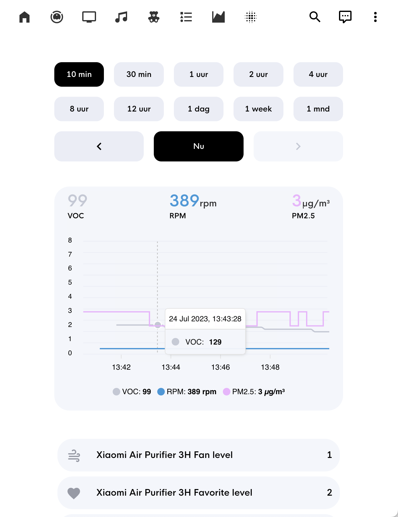
Hoping someone can help me out here. I’m fairly new to HA and the apexcharts-card.
Doing a line chart and for some reason I am getting an extra line connecting from the start of the data to “today” see screenshot: image

Here is my YAML:

type: custom:apexcharts-card
header:
  title: King County COVID Wastewater
  show: true
  colorize_states: true
chart_type: line
graph_span: 1.2y
span:
  end: day
  offset: '-2d'
series:
  - entity: sensor.covid_wastewater_1142
    name: shed 1142
    data_generator: |
      var filtered_data = entity.attributes.data.filter(function(record) {
        return 'pcr_conc_smoothed' in record;
      });

      var filtered_map = filtered_data.map(record => {
        return [new Date(record.date).getTime(), record.pcr_conc_smoothed/1000000];
      });

      return filtered_map;
    unit: vvp
    color: red
    group_by:
      fill: last
      duration: 5d
  - entity: sensor.covid_wastewater_1139
    name: shed 1139
    data_generator: |
      var filtered_data = entity.attributes.data.filter(function(record) {
        return 'pcr_conc_smoothed' in record;
      });

      var filtered_map = filtered_data.map(record => {
        return [new Date(record.date).getTime(), record.pcr_conc_smoothed/1000000];
      });

      return filtered_map;
    unit: vpp
    color: yellow
    group_by:
      fill: last
      duration: 5d
  - entity: sensor.covid_wastewater_676
    name: shed 676
    data_generator: |
      var filtered_data = entity.attributes.data.filter(function(record) {
        return 'pcr_conc_smoothed' in record;
      });

      var filtered_map = filtered_data.map(record => {
        return [new Date(record.date).getTime(), record.pcr_conc_smoothed/1000000];
      });

      return filtered_map;
    unit: vvp
    color: blue
    group_by:
      fill: last
      duration: 5d

With version 2023.7 they introduced the ability to use the servers timezone in the UI.

Normal HASS graphs (incl energy dash) seem to respect that new setting and correctly show the time based on server timezone.

However my apexcharts graphs do not, and still use my browsers timezone.

Is there a config setting in Apexcharts that I can use to have it also follow server timezone?

On a line chart, is there a way to label a specific line with its series name directly on the chart?

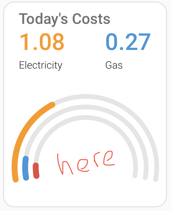
I took a little code from @Mattias_Persson and created this. It shows the current solar input correctly. But seems that a full radial would be 100W. What do I need to change to have the value of a full circle be e.g. 250W?

IMG_0016

Here is the code


type: custom:apexcharts-card
chart_type: radialBar
show:
  loading: false
apex_config:
  legend:
    onItemHover:
      highlightDataSeries: false
    show: false
  chart:
    height: 180px
    fontFamily: Segoe UI Light
  plotOptions:
    radialBar:
      startAngle: -180
      endAngle: 180
      dataLabels:
        name:
          show: true
          offsetY: 20
        value:
          show: true
          offsetY: -15
          fontSize: 20px
          fontWeight: 200
          color: orange
        total:
          show: true
          fontSize: 18px
          fontWeight: 300
          label: Solar
          color: '#a8a8a8'
          formatter: |
            EVAL:(w) => {
              return w.globals.seriesTotals + 'W';
            }
      hollow:
        size: 65%
      track:
        show: true
        background: '#222222'
        strokeWidth: 155%
  stroke:
    dashArray: 3.2
    lineCap: butt
series:
  - entity: sensor.solar_power
    color: orange

1 Like

I see the docs say the hass object is available in the transform and data generator sections, but I’m looking to use it in the formatter for my data labels.

I’m referring to this where I’d like to do a different calculation using also the value of another entity:

                  plotOptions: 
                    radialBar:
                      dataLabels:
                        value:
                          formatter: |
                            EVAL:function (percentage) {
                              const value =  percentage * 24 / 100;
                              const hour = Math.floor(value);
                              const minute = Math.round((value - hour) * 60);
                              return [`${hour}h${minute.toString().padStart(2, '0')}m`, `(${percentage.toFixed(0)}%)`];

Is this possible or should I log a feature request on GitHub?

Want to share your complete code?

I’m having some difficulty with radialbar, could anyone help me place the value of the red bar INSIDE the bars? This is the entity ‘sensor.electricity_cost_2’ and represents instantaneous cosy as GBP/Hour.

type: custom:apexcharts-card
update_interval: 5s
chart_type: radialBar
cache: true
series:
  - entity: sensor.electricity_daily_rolling_cost
    name: Electricity
    unit: ' '
    max: 3
    float_precision: 2
    show:
      legend_value: false
  - entity: sensor.gas_daily_rolling_cost
    name: Gas
    unit: ' '
    max: 3
    float_precision: 2
    show:
      legend_value: false
  - entity: sensor.electricity_cost_2
    name: Live Cost
    unit: ' '
    max: 1
    float_precision: 2
    show:
      legend_value: false
      in_header: false
header:
  show: true
  show_states: true
  colorize_states: true
  title: Today's Costs
apex_config:
  plotOptions:
    radialBar:
      offsetY: 0
      startAngle: -100
      endAngle: 100
      hollow:
        size: 50%
      dataLabels:
        name:
          show: false
        value:
          show: false
      track:
        strokeWidth: 80%
        margin: 5
  legend:
    show: false
  chart:
    height: 210
  grid:
    padding:
      left: 5
      right: 5
      bottom: 5