How do I get rid of the (-1d) ?
it comes from the "offset: ‘-1d’
How do I get rid of the (-1d) ?
it comes from the "offset: ‘-1d’
It drives me crazy! I can’t get it to work, to change the font size and weight of the states. Can anybody help?
I tried this code, but I am not sure where to put:
card_mod:
style: |
  div#state__value > #state {
    font-weight: 100;
    font-size: 12px;
  }
edit: got it. I updated the code.
edit2: Is it possible to divide the heat throu the current and to put the result on the top of the bars?

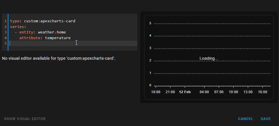
Hello
I want to use apex charts by using the config_templates, since I have a lot of similar charts.In the GitHub description it is stated that in managed lovelace UI the template configuration hast to be stored in the RAW yaml file of the dashboard.
Since I have several template definitions this is not a nice solution. I would like to store them all in another yaml file (e.g. apex_chart_templates.yaml). But unfortunately it is not posssible to use includes in RAW yaml file of managed lovelace UI.
Is there any other solution to store the templates in a separate file?
Thanks
I was hoping that someone knew a way to dispay the total number of hours over the 7 day period the total per day is perfect on the graph. Im good with either top or bottom locations for the 7 day total.
I looked through this thread but there are a lot of comments
You could create a template sensor that sums up the other entities, then display the sensor just in the head.
It is in the documentation
RomRider/apexcharts-card: ![]() A Lovelace card to display advanced graphs and charts based on ApexChartsJS for Home Assistant (github.com)
A Lovelace card to display advanced graphs and charts based on ApexChartsJS for Home Assistant (github.com)
The value of the right chart is only 1 or 0. But it gives me 0,5 values. The sensor also gives me only 1 or 0. How do I get rid of those 0,5 value
Hi, awesome project !
how to customize the grid by filling row and columns with a color ?
Thats kind of the issue I’m running into is just displaying different information in the in either the top or bottom locations it always just displays the span total (which is 24 hrs), but i want the 7 day total and i dont know to make it show something different.
Likely your entity does not exist…
Ive read over them many times but I’m asking how would i edit this so it works. The things I’ve tried just break the card.
I see you highlight the option “show” and add “as_duration” but i can’t seem to get it to accept that as a option. Could you elaborate how this would be entered in the yaml confing?
The link refers to ‘series’ show options and a bit further you can find an example on how show is used wihtin a series…donot expect docs to be perfect ![]()
It should be something like this:
type: custom:apexcharts-card
header:
 show: true
 title: 7 Day Call of Duty
 show_states: true
 colorize_states: false
graph_span: 7d
span:
 start: day
 offset: '-7d'
series:
 - entity: sensor.getchoo
   type: column
   name: Getchoo
   show:
    as_duration: minute
   group_by:
    func: max
    duration: 24hr
edit: no. That is not the function that I thought^^. Sorry.
Odd, with me this works flawlessly. I have no explanation, sorry
I just compared the graph of the apexchart and the graph of the onboard HA energy dashboard. They do not show the same. How can this be?
i tired with plotly curve, mini graph card. same results.
edit: found the issue maybe. i excluded weather.home from recorder.
Probably because the energiedash uses ‘statistics’ and your apex does not…you can setup Apex using the statistics instead
But shouldn’t the results be the same? What does “statistics” do differently compared to the Apex charts?