ApexCharts card - A highly customizable graph card

I just now looked at the values and they are way off from one another.
I would expect ‘history’ data as you are using in the Apex to at least come close to that in the energy dashboard… As you are not showing a (time)scale with apex nor the sensors you are using in the energy dash, I suspect they are not the same?

EDIT: correction, without the scale I can at least see that they have the same sizing.
Better guess: your apex shows the running total and the energy dash the one per hour, what happens when you add a Y-axis?

EDIT2: just came to thought that my response makes no sense… if they would be different on timescale then the graphs would not look identical

This worked for me.

show:
  datalabels: false

I have the same issue on Chrome. I suspect the HA upgrade to 2024.2 as the issue (not the browser). See High memory usage in Firefox and Tab crash(Previous such issues were closed without resolution) · Issue #662 · RomRider/apexcharts-card · GitHub

I wonder if anyone can help with an issue I’m having with column position or tick placement position.

I’m plotting half hourly unit prices for my electricity. The data has a start and end time aligned with half hourly blocks, and a price.

When plotted, the x axis ticks, labels, and ‘now’ annotation are plotted pointing at the middle of the column, rather than the start - which is incorrect. Ideally they’d be plotted 15m earlier (or the columns 15m later).

Here is today’s chart at 12:36:

The ‘now’ marker is in the middle of a period, when in fact we’re at the start of a period - it’s 15min ahead. The peak time starts at 4pm, but the markers indicate it starts at 3:45pm.

I think I want something akin to the tickPlacement option - though it doesn’t appear to work in this case.

Options I’ve tried:

  • adding an offset to the data - this works to move the columns, though the labels are now incorrect and mention (-15min)
  • adding an offset in addition to a custom formatter for the xaxis tooltip and general tooltip - this works but is a lot of extra code.

Here’s my basic yaml:

type: custom:apexcharts-card
experimental:
  color_threshold: true
header:
  show: true
  show_states: true
  colorize_states: true
  title: Today’s rates
stacked: false
graph_span: 17.5h
span:
  start: day
  offset: +6h
now:
  show: true
  label: Now
  color: black
yaxis:
  - min: 0
    max: 30
    decimals: 1
series:
  - entity: >-
      event.[my series]
    type: column
    name: Price
    color: gray
    opacity: 1
    stroke_width: 0
    unit: p/Kw
    show:
      in_header: false
      legend_value: false
      header_color_threshold: true
    color_threshold:
      - value: -100
        color: cyan
      - value: 0
        color: green
      - value: 20
        color: orange
      - value: 30
        color: red
    data_generator: |
      return entity.attributes.rates.map((entry) => {
         return [new Date(entry.start), entry.value_inc_vat * 100];
       });

Here’s what the chart should look like - where the columns correctly align with the time periods:

Seen this before, the only know solution I have seen… just add an offset of 15mins to the series

How can I return a 0 instead of a 0.5 ?

return x == ???

Hi did you managed to figure it out ? I came across your chart and I love it and want to adopt it but I also noticed this issue. Have you fixed it?

Cheers!

Hi, excellent work - very good!
I would like to add markdown elements (here: URL’s to external pages) to a well designed custom:apexcharts-card.
Is it possible to add them directly in the YAML code? The attempt of a combination via a vertical stack card was unsuccessful?
Thanks for any support.

I thought I’d share my hacky solution to the half hourly bars being placed 15m too early.

To fix it I:

  • Shift the series forward by 15 minutes (midpoint of width of the data) so it plots correctly
  • The tooltips will now have the wrong time, so I apply a custom formatter to the tooltip to remove 15m.

Other tweaks:

  • Made all the bars wider
  • Appended units to the yaxis scale (would be nice if this were built in!)
  • Stripped values prior to 6am as Apex seems to plot these incorrectly
type: custom:apexcharts-card
experimental:
  color_threshold: true
header:
  show: true
  show_states: true
  colorize_states: true
  title: Today’s rates
stacked: false
graph_span: 18h
span:
  start: day
  offset: +6h
now:
  show: true
  label: Now
  color: black
yaxis:
  - min: 0
    max: 30
    decimals: 1
    apex_config:
      tickAmount: 4
      labels:
        formatter: |
          EVAL: (value) => {
            return `${Math.round(value)}p`
          }
apex_config:
  plotOptions:
    bar:
      columnWidth: 95%
  tooltip:
    enabled: true
    x:
      show: true
      formatter: |
        EVAL:function(val, opts) {
          function formatTimeRange(start, end) {
            const formatDate = date => {
              const day = date.getDate()
              const month = date.toLocaleString('en-GB', { month: 'short' })
              return `${day} ${month}`
            }
          
            const formatTime = date => {
              let hours = date.getHours()
              let minutes = date.getMinutes()
              hours = hours < 10 ? '0' + hours : hours
              minutes = minutes < 10 ? '0' + minutes : minutes
              return `${hours}:${minutes}`
            }
          
            return `${formatDate(start)}: ${formatTime(start)} to ${formatTime(end)}`
          }
          let offset = 15 * 60 * 1000 // 15 minutes
          let periodWidth = 30 * 60 * 1000 // 30 minutes
          let startDate = new Date(val - offset)
          let endDate = new Date(val - offset + periodWidth)
          return formatTimeRange(startDate, endDate)
        }
  xaxis:
    tickPlacement: 'on'
    tooltip:
      enabled: false
series:
  - entity: >-
      [entity here]
    type: column
    name: Price
    color: gray
    opacity: 1
    offset: '-15min'
    stroke_width: 0
    unit: p/kWh
    show:
      in_header: false
      legend_value: false
      header_color_threshold: true
      offset_in_name: false
    color_threshold:
      - value: -100
        color: cyan
      - value: 0
        color: green
      - value: 20
        color: orange
      - value: 30
        color: red
    data_generator: >
      // Filter out rates before 6am. Without this, Apex displays rates but with
      the wrong time

      let daytimeRates = entity.attributes.rates.filter(entry => {
        let start = new Date(entry.start)
        return start.getHours() > 5
      })

      return daytimeRates.map((entry) => {
         return [new Date(entry.start), entry.value_inc_vat * 100];
      })
1 Like

anyone? @RomRider?

Hi there,

I am looking for a simple way to have a graph with temp and hum in one window.
Can anybody show me the correct code for x&y axis?
I didnt get it…
Is it also possible to remove the below text (red marked; it is double available with the top…)

type: custom:apexcharts-card
header:
  show: true
  show_states: true
  colorize_states: true
series:
  - entity: sensor.temp_bad_temperatur
    data_generator: ''
  - entity: sensor.temp_bad_luftfeuchtigkeit
    type: column
    data_generator: ''

Hi,

Here one

type: custom:apexcharts-card
graph_span: 2d
header:
  title: Température et humiditée
  show: true
  show_states: true
  colorize_states: true
yaxis:
  - id: first
    decimals: 0
    apex_config:
      tickAmount: 4
    min: -40
    max: 40
  - id: second
    opposite: true
    decimals: 0
    apex_config:
      tickAmount: 4
    min: 0
    max: 100
all_series_config:
  stroke_width: 2
series:
  - entity: sensor.tempest_st_00032986_temperature
    yaxis_id: first
    name: Température
    type: line
    curve: smooth
    stroke_width: 5
    group_by:
      func: last
  - entity: sensor.tempest_st_00032986_humidity
    yaxis_id: second
    name: Humidité
    type: column
    group_by:
      func: last

2 Likes

Anyone know if there is a way to remove the white stroke when having chart type set to scatter?

Screenshot 2024-03-01 140917

Is it possible to show a combo graph with a binary_sensor with apex? Like this:
Actually my entity is not a binary_sensor, but a sensor with On/Off values anyway.

You can make a binary sensor out of it ?

I guess I could, but how would that help? Does apex allow binary_sensors instead somehow?

Hi,

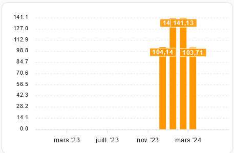
There is a bug with max long term statistics display on graph or I have not understand something ? It display the max value between the month and the previsous month :

type: custom:apexcharts-card
graph_span: 13month
span:
  start: month
  offset: '-12month'
yaxis:
  - id: euro
    min: 0
    max: auto
series:
  - entity: sensor.cost_month
    type: column
    yaxis_id: euro
    float_precision: 2
    show:
      datalabels: true
    statistics:
      type: max
      period: month

The graph :
image

The histo stats with good values :

We see 2 times “141”. So the apex graph display : “104”, “141”, “141”, “103”.
In reality, it should be : “104”, “141”, “103”, “10”

Thank you for help.

While I read the docs, I struggle identifying how to make a chart start at sunrise and end at sundown. I have both datetimes available here:

sensor.sun_solar_rising
sensor.sun_next_setting

Hi!
I have this card on my home assistant dashboard. It’s very simple and serves to measure the time my children spend watching television. I created it with this tutorial by Smart Home Junkie.

It seems to work fine as far as I can tell, but I have the problem that in the header it shows the information in this format that includes hours, minutes, seconds, and milliseconds.
I would like to format it to show the information in hours or hours and minutes, but I’m not interested in seeing seconds and milliseconds. Unfortunately, I don’t know how to do it, and that’s why I’m here, in case someone could help me. Thanks in advance.

This is how the card is configured:

type: custom:apexcharts-card
experimental:
  color_threshold: true
graph_span: 7d
span:
  end: day
show:
  last_updated: true
header:
  show: true
  title: Tiempo de tele
  show_states: true
  colorize_states: true
yaxis:
  - min: 0
    max: ~10
    decimals: 1
    apex_config:
      tickAmount: 5
series:
  - entity: sensor.tiempo_tv_day
    show:
      header_color_threshold: true
      extremas: true
      as_duration: hour
    type: column
    name: Duración
    group_by:
      func: last
      duration: 1d
    color_threshold:
      - value: 1
        color: dodgerblue
      - value: 3
        color: darkcyan
      - value: 5
        color: goldenrod
      - value: 7
        color: orangered
      - value: 10
        color: darkred

This is the sensor i use, created with MeasureIT

state_class: total
unit_of_measurement: s
device_class: duration
icon: mdi:measure
friendly_name: Tiempo TV_day
status: waiting for time window
prev_period: "00:00"
next_reset: "2024-03-04T03:00:00+00:00"