ApexCharts card - A highly customizable graph card

Hello Every Body
First thanks for this !!! I would like to show in a donut the energy use yesterday or for the last month i try this code but in the value in receive le last value of yesterday (exemple 411 kwh) not the value for only yesterday (exemple 12 kWh)

type: custom:apexcharts-card
graph_span: 24h
cache: true
span:
  start: day
apex_config:
  chart:
    height: 400px
  plotOptions:
    pie:
      donut:
        total:
          show: true
          showAlways: true
header:
  show: true
  title: Utilisatation Du Réseau
chart_type: donut
series:
  - entity: sensor.bureau_conso
    offset: '-1d'
  - entity: sensor.chaud_conso
    offset: '-1d'
  - entity: sensor.lavev_conso
    offset: '-1d'
  - entity: sensor.mal_conso
    offset: '-1d'
  - entity: sensor.nas_conso
    offset: '-1d'
  - entity: sensor.sdj_conso
    offset: '-1d'
  - entity: sensor.tv_conso
    offset: '-1d'
1 Like

What a great solution for HA!

I’m measuring the amount of rail, and my intention was to ensure that it was from “0.0 to 23.59”, but it seems to be a bit different

Can anyone help me find a way for ensuring that my graph’s is one full day?

Is there a way with ApexCharts to shade under a curve for portions only when my air conditioning is on? The stock history graph card can do this (as seen in picture). Thanks.Capture

1 Like

Would love if you can share your code for this? Have just started monitoring daily solar costs and savings but would love to be able to graph historical costs and consumption like you have :slight_smile:

Hi! I’ve discovered an issue where the tooltip is cut off. I’m wondering if this is some sort of a freak occasion, as it seems quite a big flaw in the card. Or are my charts and cards just too small and the tooltip fits into the card for everybody else?

I tried debugging it and trying to understand the box model and overflows involved, and found out that the <ha-card> element has overflow: hidden defined on it.

I’ve made a pull request and hopefully, it’ll get fixed soon, unless I misunderstood something and am just using it wrong.

1 Like

On an unrelated topic: is it possible to have dynamic values in the configuration? E,g, I would like to hide numbers in the header if the value is 0, but this doesn’t get parsed:

  - entity: sensor.rtorrent_down_speed
    show:
      in_header: '{{ float(states.sensor.rtorrent_down_speed.state) > 0 }}'

Hi,
Don’t know if you managed it, I’ve been struggling with the same question. Here is the part of the code that gets rid of the borders on the side and the bottom:

apex_config:
  grid:
    margin:
      left: 0
      right: 0
  chart:
    offsetY: 15
    parentHeightOffset: 0

Ok, so I’ve set myself a lofty goal here, but I’m reaching some limitations that I’ve been unable to get around these past few days. Any insight would be greatly appreciated.

What I want to achieve: a weather chart mapping past temperatures, temperature forecast, past precipitation (rain + snow) and precipitation forecast. I would like to show the past 7 days, temperatures are areas (same color for past and future) and precipitation are columns (stacked for rain + snow) placed on the relevant day’s tick. The card itself is placed on a picture-elements card, should take up about the whole width and about 40% of the height of said picture-elements card.

The following are my current hurdles:

  1. There’s an overlap in data. My forecast data provided via data-generator includes the present day. Currently using OWM with onecall daily API. That leads me to have two columns on the same day as well as an area overlap for temperatures. Overlap in temperatures:
    overlap
    I’m no JS wiz, but I’m guessing I’d need to fiddle with the data-generator code to avoid these overlaps?

  2. If I don’t set the columns to a ridiculous width (e.g. 600%) via apex-config, they are way to thin to my taste. However, setting the columns this wide messes with their placement with regard to the x-axis ticks and displaces the background behind the “now” flag. Even is the case when column width is set to 100%.
    now
    How do I get the columns wider without messing up the entire layout? And I’d like the column to be set either in centered between ticks - noon - or on the ticks - midnight. Currently, they’re in between but not centered.

  3. Somehow, the tooltips for the forecast precipitation show up in the past. See:


    Any Idea why that is? My data-generator code perhaps?

It’s still a work in progress, here’s the code for the card:

  - type: 'custom:apexcharts-card'
    graph_span: 14d
    span:
      start: day
      offset: -7d
    now:
      show: true
      label: 'Présent'
    yaxis:
      - id: temp
        show: true
        apex_config:
          forceNiceScale: true
          tickAmount: 5
          decimalsInFloat: 0
      - id: rain
        show: true
        opposite: true
        apex_config:
          forceNiceScale: true
          tickAmount: 5
          decimalsInFloat: 0
    apex_config:
      dataLabels:
        enabled: false
      chart:
        width: '100%'
        height: 100%
      legend:
        position: top
      grid:
        show: false
        padding:
          left: 0
          right: 0
      stroke:
        colors: ['#ffa31a', '#03a8f4', 'none']
      fill:
        type: ['gradient', 'gradient', 'solid', 'solid', 'solid']
        gradient:
          type: 'vertical'
          shadeIntensity: 0.5
          inverseColors: false
          opacityFrom: 1
          opacityTo: 0.3
          stops:
            - 0
        opacity: 0.65
      plotOptions:
        area:
          fillTo: origin
        bar:
          columnWidth: 100%
          stacked: true
      xaxis:
        axisBorder:
          show: false
        axisTicks:
          show: false
        tooltip:
          enabled: false
        tickPlacement: 'on'
    series:
      - entity: weather.openweathermap
        type: area
        name: 'Température'
        unit: °C
        attribute: temperature
        stroke_width: 0
        yaxis_id: temp
        color: '#ffa31a'
        fill_raw: last
        show:
          legend_value: false     
        group_by:
          func: avg
          duration: 2h 
        extend_to_end: false  
      - entity: weather.openweathermap
        type: area
        stroke_width: 0
        yaxis_id: temp
        color: '#ffa31a'
        name: 'Température'
        unit: °C
        extend_to_end: false
        fill_raw: last
        show:
          legend_value: false
        data_generator: |
          return entity.attributes.forecast.map((entry) => {
            return [new Date(entry.datetime).getTime(), entry.temperature];
          });
      - entity: sensor.openweathermap_rain
        type: column
        yaxis_id: rain
        name: 'Précipitations'
        unit: mm
        color: '#0b0385'
        fill_raw: last
        show:
          legend_value: false     
        group_by:
          func: sum
          duration: 1d
      - entity: sensor.openweathermap_snow
        type: column
        yaxis_id: rain
        name: 'Neige'
        unit: mm
        color: '#0b0385'
        fill_raw: last
        show:
          legend_value: false     
        group_by:
          func: sum
          duration: 1d
      - entity: weather.openweathermap
        type: column
        yaxis_id: rain
        color: '#0b0385'
        name: 'Précipitations'
        unit: mm
        extend_to_end: false
        fill_raw: last
        show:
          legend_value: false
        data_generator: |
          return entity.attributes.forecast.map((entry) => {
            return [new Date(entry.datetime).setHours(0, 0, 0, 0), entry.precipitation];
          });
    card_mod:
      style: |
        :host {
          left: 50%;
          top: 75%;
          width: 90%;
          height: 40%;
        }
        ha-card {
          background: none !important;
          height: 100%;
        }
        .wrapper.with-header {
          height: 100%;
        }

I am trying to track the number of times the garage door has been opened in a day.

This is the screenshot of the history of the entity.
image

The last value for Aug 3 and 4 is 7 and 3 respectively.

I am trying to plot the last value of the entity for a day in a chart.

type: custom:apexcharts-card
header:
  show: true
  show_states: true
yaxis:
  - min: ~2
    apex_config:
      decimalsInFloat: 0
      forceNiceScale: true
apex_config:
  chart:
    height: 200px
graph_span: 7d
color_list:
  - tomato
series:
  - entity: sensor.garage_door_daily_count
    type: column
    group_by:
      func: last
      duration: 1d

The chart appears as below, where the value is 3 for both the days.

image

If I change the group_by function to max, the chart appears as below. The values seem to be flipped around for the 2 dates.

image

Any help with getting the chart to show the right values on the right days?

1 Like

Hi,

I wonder if anyone can help. I have an entity with a bunch of attributes that’s retrieved from my electricity providor. Its an array which contains my consumption every half hour. Example output is below from the attribute.

Is there any way I can graph this using ApexCharts? I have tried and can’t work out what I would need to do, can I use both the consumption as the y axis and the interval start/end as the x axis?

Thank you in advance!

Craig

Results

  • consumption: 0.097 interval_start: ‘2021-08-04T00:00:00+01:00’ interval_end: ‘2021-08-04T00:30:00+01:00’ - consumption: 0.08 interval_start: ‘2021-08-03T23:30:00+01:00’ interval_end: ‘2021-08-04T00:00:00+01:00’ - consumption: 0.139 interval_start: ‘2021-08-03T23:00:00+01:00’ interval_end: ‘2021-08-03T23:30:00+01:00’ - consumption: 0.176 interval_start: ‘2021-08-03T22:30:00+01:00’ interval_end: ‘2021-08-03T23:00:00+01:00’ - consumption: 0.167

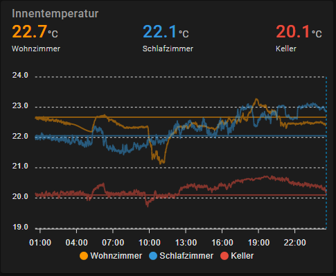
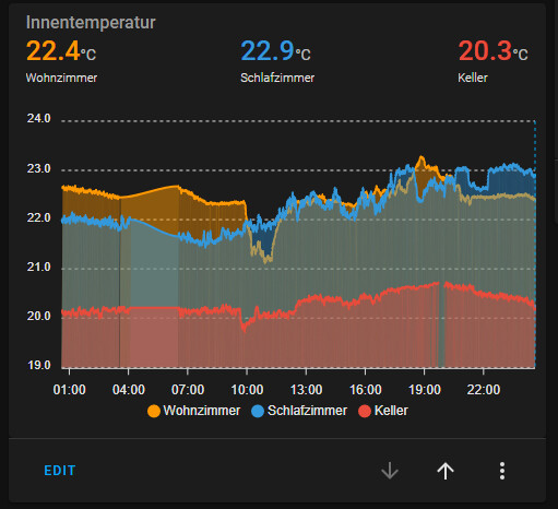
I have a goal of displaying external data so that I don’t need to include my weather data into homeassistant (and can have a long term graph) and today we succeeded in doing so with a custom web server. But I do get interesting results displayed.

image
image

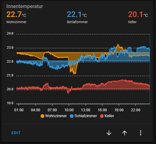
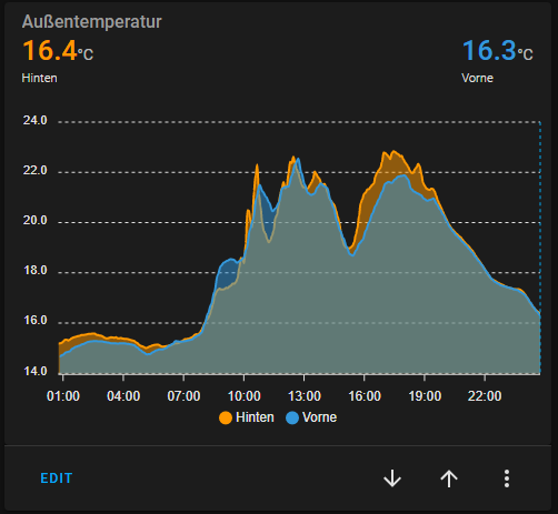
Using (almost) the same data via mqtt sensor works like it should
image

This is the complete code of the data generator card:

type: custom:apexcharts-card
graph_span: 1d
hours_12: false
header:
  show: true
  title: Innentemperatur
  show_states: true
  colorize_states: true
  standard_format: false
now:
  show: true
all_series_config:
  type: area
  stroke_width: 2
  opacity: 0.5
  unit: °C
  show:
    legend_value: false
series:
  - entity: sensor.time
    name: Wohnzimmer
    data_generator: |
      function makeRequest(method, url) {
          return new Promise(function (resolve, reject) {
              let xhr = new XMLHttpRequest();
              xhr.open(method, url);
              xhr.onload = function () {
                  if (this.status >= 200 && this.status < 300) {
                      resolve(xhr.response);
                  } else {
                      reject({
                          status: this.status,
                          statusText: xhr.statusText
                      });
                  }
              };
              xhr.onerror = function () {
                  reject({
                      status: this.status,
                      statusText: xhr.statusText
                  });
              };
              xhr.send();
          });
      }
      const request = async () => {
        var http = new XMLHttpRequest();
        var response = await makeRequest('GET', 'https://kuroi1992.dyndns.pro/test?type=temperature&location=inside&name=wohnzimmer&time=24h');
        console.debug(response);
        var json = JSON.parse(response);
        console.debug(json);
        return json.map(x => {
              return [x['time'], x['value']];
          });
      } 
      return request();
  - entity: sensor.time
    name: Schlafzimmer
    data_generator: |
      function makeRequest(method, url) {
          return new Promise(function (resolve, reject) {
              let xhr = new XMLHttpRequest();
              xhr.open(method, url);
              xhr.onload = function () {
                  if (this.status >= 200 && this.status < 300) {
                      resolve(xhr.response);
                  } else {
                      reject({
                          status: this.status,
                          statusText: xhr.statusText
                      });
                  }
              };
              xhr.onerror = function () {
                  reject({
                      status: this.status,
                      statusText: xhr.statusText
                  });
              };
              xhr.send();
          });
      }
      const request = async () => {
        var http = new XMLHttpRequest();
        var response = await makeRequest('GET', 'https://kuroi1992.dyndns.pro/test?type=temperature&location=inside&name=schlafzimmer&time=24h');
        console.debug(response);
        var json = JSON.parse(response);
        console.debug(json);
        return json.map(x => {
              return [x['time'], x['value']];
          });
      } 
      return request();
  - entity: sensor.time
    name: Keller
    data_generator: |
      function makeRequest(method, url) {
          return new Promise(function (resolve, reject) {
              let xhr = new XMLHttpRequest();
              xhr.open(method, url);
              xhr.onload = function () {
                  if (this.status >= 200 && this.status < 300) {
                      resolve(xhr.response);
                  } else {
                      reject({
                          status: this.status,
                          statusText: xhr.statusText
                      });
                  }
              };
              xhr.onerror = function () {
                  reject({
                      status: this.status,
                      statusText: xhr.statusText
                  });
              };
              xhr.send();
          });
      }
      const request = async () => {
        var http = new XMLHttpRequest();
        var response = await makeRequest('GET', 'https://kuroi1992.dyndns.pro/test?type=temperature&location=inside&name=keller&time=24h');
        console.debug(response);
        var json = JSON.parse(response);
        console.debug(json);
        return json.map(x => {
              return [x['time'], x['value']];
          });
      } 
      return request();
apex_config:
  markers:
    hover:
      size: 5

Before anyone suggests it, yes, the same problem happens even if I use the sensors corresponding to the temperature sensor, I just replaced them with sensor.time because in the long run I want to run completely via data generator and I needed to test if it works with any random sensor.

I have another graph using the same code and web backend with similar temperatures and on thet one it displays correctly so far.

image

The webserver used for testing is not online most of the time, so if anyone tries to test the example ot, it most likely won’t work.

Anyone got any idea how to force the curves to display correctly? I did try to manually set a minimum for the yaxis, but that only moved the yaxis, but still didn’t render the curves down to the axis.

1 Like

I just want to say that I absolutely love this card. I struggled a lot trying to get the mini-graph-card to do what I wanted and ended up only partially succeeding, while it only took about 30mins to get this working 100%. Between this and the custom button card, my dashboard is about 90% RomRider-powered :slight_smile: .

Is there any way to extend a radialBar margins out? I am getting a small radial which isn’t taking up a lot of space, would love if I could make it bigger? I am using a layout-card and giving it almost 70% of the width but the graph itself hardly uses any of it. If I add headers they extend to the full width but the graph does not.

I’m not sure of the ‘proper’ way to do this but I found an inelegant workaround for the climate entity using this config:

type: custom:apexcharts-card
graph_span: 10h
config_templates: standard_chart
header:
  title: ApexCharts-Card
series:
  - entity: climate.bedroom_2
    attribute: current_temperature
    group_by:
      func: max
      duration: 5min
  - entity: climate.bedroom_2
    attribute: temperature
    curve: stepline
  - entity: climate.bedroom_2
    attribute: hvac_action
    transform: 'return x === ''heating'' ? entity.attributes.current_temperature : null;'
    curve: stepline
    type: area
    opacity: 0.5

You would have to replace ‘heating’ with whatever hvac mode you are tracking.

3 Likes

Thank you for this wonderful card!

I have five two challenges with this card showing our TV consumption over the past week:

  • The x-axis doesn’t show a label for the first column. This is independent of the data range, so if I only pick 6 days instead of 7, the first column is still without label. Am I doing something wrong or should I report this as a bug?

  • I would like to change the color of the data labels to the normal text color used in the rest of the chart, e.g. for the annotation of the x-axis

  • I would like the data labels to not show hours in decimals, but show hours and minutes like the tooltip data does

  • I would like to change the tooltip data formatting to only show hours and minutes, not seconds.

  • The tooltip somehow seems to be offset. In the example, when I hover over the 3.9h column, it highlights that column but puts a vertical line on the 0.4h column and shows the 21m data from Aug 8 in the tooltip. Something is wrong here.

Any help is appreciated! Here is my configuration (updated):

type: custom:apexcharts-card
graph_span: 1w
span:
  end: day
yaxis:
  - id: tv
    show: false
series:
  - entity: sensor.watched_tv_today
    type: column
    group_by:
      func: max
      duration: 1d
    show:
      as_duration: hour
      datalabels: true
    yaxis_id: tv
apex_config:
  grid:
    show: false
  dataLabels:
    formatter: |
      EVAL:function(value, opts) {
        h = Math.floor(value);
        m = Math.floor((value - h) * 60);
        result = "";
        if (h > 0)
          result = h + "h ";
        if (m > 0)
          result += m + "m";
        return result;
      }
    offsetY: -10
    background:
      enabled: false
    style:
      colors: ['var(--primary-text-color)']
  tooltip:
    enabled: false

New chart with updated config. I’ve disabled the tooltip but this isn’t fixed.

3 Likes

I just learnt that this is a bug of the Apex library itself: First date is missing from graph · Issue #198 · RomRider/apexcharts-card · GitHub

I also just learnt that this is another bug in the underlying library. Too bad: Hovering offset in minimal layout · Issue #147 · RomRider/apexcharts-card · GitHub

Is it possible to dynamically set the tickAmount for the yaxis depending on the data?

Same problem. You solve it?
Thanks

Yup, I used a group_by option to make the datapoints exist at same instances of time:

group_by:
    func: avg
    duration: 1min
    fill: last