Hey
if you only want the box border gone, change the
borderWidth: 0
or if you want to hide the whole “background box” gone then set
background:
  enabled: false
Hey
if you only want the box border gone, change the
borderWidth: 0
or if you want to hide the whole “background box” gone then set
background:
enabled: false
Hi @backcountrymountains did you figure out how to use hass.states['sensor.other'] in a transform for this use case? I get the same - it just returns the current value
Loving this graph card. Hoping someone can help fix an odd issue I’m running into.
I’m trying to make a bar chart that display’s 7x days of energy usage (total usage per day). I have a sensor that actually reports this so I just need to grab the latest or max value from this. I’ve got the card basically showing what I need but the label on the X-Axis for “today” is always missing. The preceding 6x days are completely fine and show without issue. This is when using the group_by function. If I switch this to the statistics function, the label for today displays but I then get an entire columns width of extra space at the end of the graph.
Does anyone have any idea what’s happening here and how to fix it?
Left is group_by, Right is statistics
Hello All
May i know how do i remove legend value and name below from chart

Hi guys. I’ve searched the forum but can’t seem to find an example for the Transform option I’m looking for. Can anyone show me an example of transform to subtract the value of the sensor but the value of another sensor?
I tried:
- entity: sensor.cepsa_lisboa_estadio_universitario_gasoleo_simples
    transform: return x - hass.states['input_number.desconto_cepsa'];
The result is N/A. (both entities use the same unit of measurement)
got it:
transform: return x - hass.states['input_number.desconto_cepsa'].state;
perhaps with :
span:
 start:
 end:
Is it possible to reduce value stroke width on radialBar type ?

Sorry if this has been asked already. I do have two questions:

Thanks for the suggestion. I am already using end: day
I’m not sure if this is a bug with the card but I changed it to start: day then messed about with and offset before setting it back to end: day and now it’s displaying properly?
Can anyone tell me how I can get more than 1 decimal inside the graph when you hover over the columns? It rounds off every value to 1 decimal, and it is not very helpful.
 .
.
Config:
 - type: 'custom:apexcharts-card'
      apex_config:
        yaxis:
          labels:
            formatter: |
              EVAL:function (val) {
                return val.toFixed(2) + "€" ;
              }
          show: true
          min: 0
      graph_span: 2d
      span:
        end: day
        offset: +24h
      header:
        show: true
        title: Stroomkosten
      series:
      - entity: sensor.powercost
        type: column
        name: kWh
        color: '#e3a8ab'
        opacity: 0.3
        extend_to_end: false
        stroke_width: 2
        unit: €
        show:
          in_header: false
          legend_value: false
        data_generator: |
          return entity.attributes.Prices.map((entry) => {
             return [new Date(entry.readingDate), entry.price];
           });
copying an example config I am trying to understand, I come across:
    apex_config:
      tickAmount: 4
and I cant see the effect of that. in the docs, the is mentioned (used in an example) 3 times, but not explained.
Can anybody tell me what this is for please?
Options (Reference) > yaxis – ApexCharts.js says it configures:
Number of Tick Intervals to show
but the still doesnt mean much to me…
If you add it to the yaxis section, it is the amount of yaxis markers/lines
yes, I now see that, thanks!
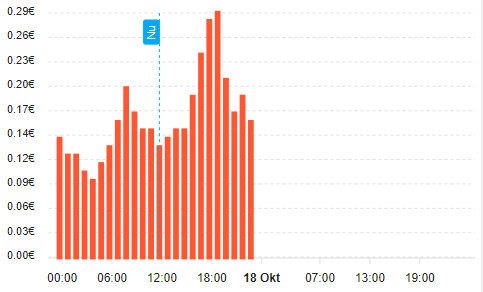
One more question on the same config. The columns seem to be running behind 1 hour. When I hover over them they show the correct time, but you can see the first column starts at 23:00 yesterday, while the timestamp of this value is 0:00. Also the last column stops at 23:00 today. This also causes the “now” line to be on the “wrong” column.
In the image below, the current time is 11:45 and the column on which the now line is, is actually the column for 12:00-13:00.
Is there a way to shift the columns one hour to the right without having to change the timestamp?
Config is in my previous post.
Anyone answer my question
I have removed state value .I need to remove nane also below graph
Hi folks. Hope everyone is well.
I would like to change the decimals shown (0,0…X) in the tooltip and legend so I can read the BTC values properly.
Who can help?

TIA
Hello, excuse me, can you copy the code from the card?
how did you delete the legend below?
apex_config:
  legend:
    show: false
reduce value stroke width on radialBar type
:
apex_config:
  plotOptions:
     radialBar:
      hollow:
        size: 50%

