ApexCharts card - A highly customizable graph card

hi, did you ever figure something out? I’m looking for something similar…

xaxis:
  type: numeric

gives me /// apexcharts-card version 2.0.1 /// value.xaxis is extraneous

does that mean you can only have datetime as xaxis? There is no mention of xaxis options in the ha doc, but I see that in xaxis – ApexCharts.js
Is there an alternative?
My goal is to display a daily heatpump COP against temperature.

Maybe I am blind, but how do I create line with scatter charts?
I can do line or I can do scatter using e.g. chart_type: scatter . But how do I see both in one chart?

I don’t think a combination of scatter and line in one chart is possible with the apexcharts library. The doc doesn’t mention amy combination of that sort.

Thank you @CDRX2 , but I was thinking that maybe one of these two would work:

But I can get neither to work.
The latter seems unsupported because only line, scatter and column have been implemented by @RomRider , if I understand correctly.

According to this, you are right, those chart types have not been implemented in the card. Time to create a feature request :wink:

Done :slight_smile:

1 Like

Hi all, relatively new here, having just stumbled on this amazing piece of work.
I am really stuck. I have two sensor values from my energy supplier (Electricity, Gas) reported daily as a price
All I need to do is simply add the two and get an overall daily cost.
Is that at all possible? I really can’t get my head around the javascript integrations.

series:
  - entity: sensor.octopus_energy_electricity_cost
    name: Electricity
    type: column
    color: slateblue
    group_by:
      func: max
  - entity: sensor.octopus_energy_gas_cost
    name: Gas
    type: column
    color: orangered
    group_by:
      func: max

Has anyone found a way to present manual data in Apex Charts? If I have enery consumption for the last years per month, can I then put them in an array or similar and just plot that data?

Basically replacing this Excel view with the same in Apex Charts?

1 Like

Hi!
Just starting with this card and cannot solve to issue with my graphs which are important for me.
First - I cannot make Y axes to start with the values I would like (for dewpoint deficite - blue line minimum desirable limit is 1, for humidity it is 20). I installed min value in yaxis, but it doesnt do anything.
The second problem is I have a strange scaling in brush, which is from 0 to 160 (the main graph use 2 axes but on the brush it is only one) - no matter that the biggest value of the humidity sensor is 100, dewpoint deficite sensor is no more than 10-15. Moreover it disregards the yaxes on the main graph and doing its own.
The code is below:

               - type: custom:apexcharts-card
                 experimental:
                   brush: true
                 graph_span: 6h
                 brush:
                   selection_span: 2h
                   apex_config: 
                     yaxis:
                       - max: 100
                 yaxis:
                   - id: first 
                     decimals: 1
                     show: true
                     min: 1
                     align_to: 1
                     apex_config:
                       tickAmount: 5
                   - id: second
                     opposite: true 
                     decimals: 0
                     align_to: 1
                     min: 20
                     apex_config:
                       tickAmount: 5
                 header:
                   show: true
                   title: "Дефіцит точки роси"
                   show_states: false
                   colorize_states: true
                 all_series_config:
                   stroke_width: 1
                   opacity: 1
                 series: 
                   - entity: switch.aqara_br_light_fan_switch_left
                     type: area
                     color: red
                     transform: "return x === 'on' ? 10 : 0;"
                     opacity: 0.1
                     stroke_width: 0.5
                     name: "Вимикач"
                     curve: stepline
                     yaxis_id: first
                     show:
                       legend_value: false
                       in_brush: true
                       in_chart: true
                   - entity: sensor.dewpoint_deficit_br
                     type: line
                     name: "ДТР стіна, °C"
                     color: blue
                     stroke_width: 2
                     yaxis_id: first
                     group_by:
                       func: avg
                       duration: 1min
                     show:
                       extremas: true
                       in_brush: true
                   - entity: sensor.temphum2_br_humidity
                     type: line
                     name: "H душ, %"
                     color: 	yellow
                     stroke_width: 3
                     yaxis_id: second
                     group_by:
                       func: avg
                       duration: 1min
                     show:
                       extremas: true
                       in_brush: 

truegraph

Thanks for bringing ApexCharts to HA! :slight_smile: I noticed that Home Assistant on Android runs a little sluggish after creating a few energy graphs, is this a known issue or is it just on my end?

Hello!
Is there any way to show the live data of the entity on the header not the average?

Hi all,

I’ve been tampering with this card for a few weeks now, and it’s great, really like it. I’ve encountered several issues, but with all the info in this thread, I’ve managed to figure out most of them myself. However, there is one issue I can’t get my head around. Hopefully, one of you sees what I’m doing wrong.

Like many, I want to track my energy usage and costs. So I made 2 cards, 1 for gas and 1 for electricity, to track the costs of the fixed, variable and total costs (total being the sum of fixed and variable) throughout the day.

For gas, this works fine, see the plot below. Fixed (Vast) stays at 0,64, Variable increases every 5 minuted (per the statistics setting) and consequently, Total increases parallel to Variable (with a difference of 0,64).

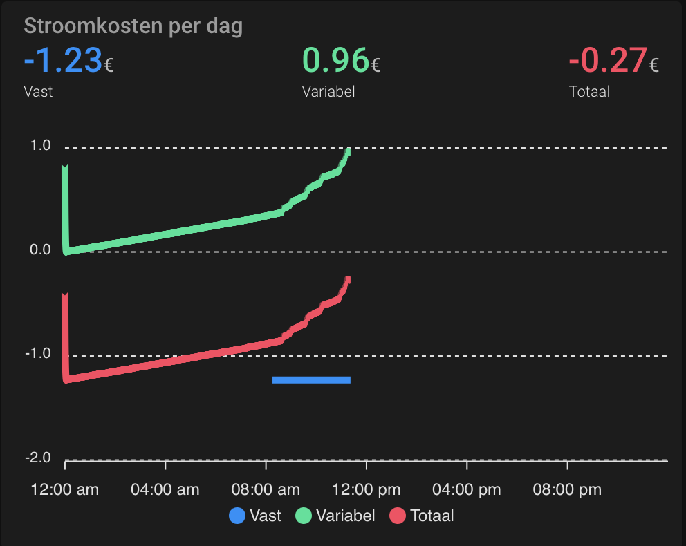
For electricity, however, for some reason, total does not increase, it stays at -0,53, whereas, as you can see, Variable is increasing. The yaml code for both cards is exactly the same (I copied the yaml code and only changed the entity IDs), see the code below. I also checked the ninja code of the template and the number is in fact increasing.

And finally, I checked the entity’s history and there it also shows an increasing number.

I created the template sensor yesterday and at that moment the value was -0,53, so it hasn’t changed since, so also no changes at the start of today. The only difference I see with the gas card is that the fixed electricity costs are negative, but that shouldn’t cause this issue right? Anyone seeing what’s wrong with the card or its yaml code?

type: custom:apexcharts-card
header:
  show: true
  title: Stroomkosten per dag
  show_states: true
  colorize_states: true
update_interval: 1m
graph_span: 1d
span:
  end: day
color_list:
  - '#008FFB'
  - '#00E396'
  - '#FF4560'
  - '#FEB019'
  - '#775DD0'
  - '#775DD0'
all_series_config:
  type: line
  show:
    legend_value: false
  statistics:
    type: state
    period: 5minute
    align: start
  extend_to: now
  float_precision: 2
stacked: false
series:
  - entity: sensor.stroomkosten_per_dag_vast
    name: Vast
  - entity: sensor.stroomkosten_per_dag_variabel
    name: Variabel
  - entity: sensor.stroomkosten_per_dag
    name: Totaal

Edit: I checked to see what happens if I delete the statistics part of the code. It seems that’s causing the issue, see plot below. However, I do want to use statistics to be able to make the same card for a longer period. Also, I get this vertical line at the beginning of the day, which I understand, but is not pretty… Finally, I still don’t understand why the gas card is working fine.

type: custom:apexcharts-card
header:
  show: true
  title: Stroomkosten per dag
  show_states: true
  colorize_states: true
update_interval: 1m
graph_span: 1d
span:
  end: day
color_list:
  - '#008FFB'
  - '#00E396'
  - '#FF4560'
  - '#FEB019'
  - '#775DD0'
  - '#775DD0'
all_series_config:
  type: line
  show:
    legend_value: false
  extend_to: now
  float_precision: 2
stacked: false
series:
  - entity: sensor.stroomkosten_per_dag_vast
    name: Vast
  - entity: sensor.stroomkosten_per_dag_variabel
    name: Variabel
  - entity: sensor.stroomkosten_per_dag
    name: Totaal

i succeeded, you have to use orientation: orizontal

                    offsetY: 120
                    offsetX: 0
                    orientation: orizontal

How to stop animations on cards? I’ve tried:

    animations:
      enabled: false
    animateGradually:
      enabled: false
    dynamicAnimation:
      enabled: false

Full Card:

type: custom:apexcharts-card
header:
  show: true
  title: Temperature Levels
  show_states: true
  colorize_states: true
  floating: true
chart_type: radialBar
apex_config:
  chart:
    height: 650
    foreColor: rgb(148,0,175)
    offsetY: 0
    offsetX: 20
    animations:
      enabled: false
    animateGradually:
      enabled: false
    dynamicAnimation:
      enabled: false
  plotOptions:
    radialBar:
      inverseOrder: true
      offsetY: -10
      startAngle: -105
      endAngle: 105
      hollow:
        size: 45%
        background: transparent
  stroke:
    show: true
    curve: smooth
    lineCap: round
    width: 1
  fill:
    type: gradient
    gradient:
      shade: dark
      type: horizontal
      shadeIntensity: 0.5
      inverseColors: true
      opacityFrom: 1
      opacityTo: 1
      stops:
        - 0
        - 100
  legend:
    show: false
card_mod:
  style: |
    div#header {
      padding-top: 50%;
      text-align: center
    }
series:
  - entity: sensor.rm4_mini_temperature
    name: Living Room
  - entity: sensor.motion_hue_m_bath_temperature
    name: Master Bath
  - entity: sensor.dehumidifier1b4c_temperature
    name: Basement
  - entity: sensor.weather_porch_temperature
    name: Porch
  - entity: sensor.plant_sensor_7e1a_temperature
    name: Nursery
  - entity: sensor.weather_server_temperature
    name: Server
  - entity: sensor.absalompc_gputemperature
    name: GPU

Could you share your code for this? Trying to figure out how to sort my usage by day

Hi!
Really nice-looking card! Can anyone explain to me how to make a pie chart from a single entity with text values? I have read through almost the complete thread, but I cannot find any examples of that.
I have an entity, where the state changes during the day between different text values, like “Orange”, “Apple”, “Banana”, and I would like a pie chart display how many percent of each “fruit” there is during the day.

How did you realize the span hours select option?
Might you please share your card configuration code?

With config-template-card

Just like my other selector on the solar overview I posted some time ago in this thread.
Please search for that, I am on the road currently, so you’ll find it sooner than I can gat to my code :wink:

1 Like

Ok, I have more data to experiment with, so I think I can narrow down the issue and specify my question.

As I said, I’m simply trying to track energy costs, using statistics within this card. In the plot you see:

  • Fixed cost (Vast), which is a fixed amount per day and is negative due to a discount
  • Variable costs, which is climbing throughout the day
  • Total cost, which is the sum of fixed and variable and should also be climbing throughout the day, starting at the level of fixed cost

When I look at the history of the entities, all is fine and total cost is indeed climbing as it should. When I plot this in the card, however, I get a flat line (at the level of yesterday’s cost), until it shoots through zero. From then onwards, it behaves as expected.

So my question is: does anyone use statistics in this card en face the same issue. It doesn’t seem to be a bug of the card, because it can obviously plot negative statistics, as shown in this plot. There doesn’t seem to be an issue with the template sensor or the statistics integration either, because the same entity shows perfectly in the statistics card. Is it the combination of statistics and this card? Anyone?

Would anyone have an example of how to show a time in the header of a chart?

I have a sensor, which has a state of ie. 02:05 which is the last time there was a sucessful scrape of data from a webpage.

I’m having difficulty showing that in the header of my chart.

With the options I have currently set it is being displayed as 1. If the time was 05:54 the header is being displayed 5.

type: custom:apexcharts-card
graph_span: 30d
header:
  standard_format: false
  show: true
  title: OilPal
  show_states: true
  colorize_states: true

- entity: sensor.oilpalmodemlastreading
    name: Last Reading
    show:
      in_header: true
      name_in_header: true
      in_chart: false