Auto-populating Dashboards with Strategy Pack - Area Dashboard Strategy
Hey, after months of lurking around the forum, I wanted to try to give something back and share something myself. ![]()
The Strategy Pack!
It’s a collection of Home Assistant Strategies and is supposed to keep growing.
If you want to know more (about all available Strategies and their Documentation) take a look at the new GitHub Pages Homepage!
First, what are Strategies?
A strategy is JavaScript code that gets executed to create Dashboards and Views automatically. They make it easy to have auto-populated Dashboards with next to no configuration!
You no longer need to painstakingly specify and order every entity and card on your Dashboard with thousands of lines of YAML!
More on them in the Home Assistant Documentation.
What does Strategy Pack do?
It provides a multitude of these Strategies! There’s even some that create whole Dashboards with all your entities neatly displayed!
But there are also some more specific Strategies if have found a need for in my personal Home Assistant Journey.
And I look forward to adding more. So feel free suggest new ones, or even make your own and submit a Pull Request!
Nice-looking Dashboard and all, but what’s special about this?
The clue is that a Strategy auto-generates everything. Meaning you do not need to list all entities and cards you want in some cumbersome way.
You can just let the Strategy work its magic with some few lines of YAML configuration or in some Strategies even no configuration at all!
And if you don’t like what you get in your Dashboard just read the detailed configuration documenation for every Strategy giving you the ability to customize next to everything!
| The minimal configuration and... | ...the impressive result of just one Strategy for example! |
|---|---|
views:
  - strategy:
      type: custom:battery-view-strategy
    path: battery
    icon: mdi:battery-50
    title: Battery
|
It looks like it needs a whole lot of space on the screen. Do I need a second Dashboard for my phone?
The Strategies are all fully responsive, meaning you can use all of them on Tablets and Phones as well! That`s just what i do!
Example of Responsiveness with Area Dashboard Strategy:

Can you give me an example for one such Strategy?
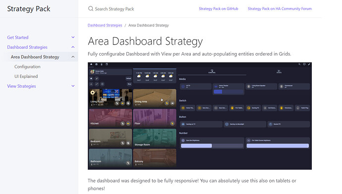
Yeah sure, the Area Dashboard Strategy is a Dashboard Strategy, meaning it creates a whole Dashboard for you that looks like this:

with only 2 lines of YAML!
strategy:
  type: custom:area-dashboard-strategy
The Dashboard generated will have a view for every Area in your Home Assistant instance.
This Dashboard additionally has a Tab menu on the right side to group entities and also Grids (=the rows you see with the headers), helping with the distinction between different types of entities.
I always found myself drawn to this solution in Dashboards as my number of entities grew. One single page was always way too cluttered.
Additionally if you don’t like something it is fully configurable!
You can start out without configuring! There’s a sensible default I use myself which creates this whole dashboard with really just 2 lines!
I hope this helps some people, and if there are issues, just let me know! ![]()
Thanks to this awesome community! Some more influential people to this are also mentioned in a credit section! Special thanks to all of them!


