Hi sorry? Yes this is fixed! But I was referring to a other question. Tagged it wrong I guess…
You can change its color based on an entity state by adding this custom style. Just change the sub-button number to the one you want to target, change also the entity and/or the state and the colors (can be a hex, rgb, variable…).
.bubble-sub-button-1 {
  background-color: ${hass.states['light.your_light'].state === 'on' ? 'blue' : 'red'} !important;
}
Thanks! This is perfect! Only thing missing for my configuration is conditionals on sub buttons 
You can do that too with the custom styles, here is how I show a sub-button when my mower is blocked, if not it is hidden by default:
.bubble-sub-button-1 {
    display: ${hass.states['mower.landroid'].state === 'error' ? '' : 'none'} !important;
}
Here is also another great example of conditional sub-button:
1 Like
Thanks and if i want to get the color of a light ?
This project is amazing. The amount of updates and support is unreal. Thank you. I have a few questions
1.) Can the size of the bubble card be manually adjusted?
2.) Can I add conditional icons? For example, I have a person bubble card with 6 sub buttons showing states of input selects for home/away, room tracking, activity (Sleeping, working), and battery levels of phone/watch
I am coming from a custom button card in which I specified icons for each state. For example, Home has a green home icon when home, activity has a car icon when driving, battery has green/yellow/red icons for battery levels. Is there anyway I can achieve the same goal here?
Right now, I can only choose the icon for the entity, not for each state.
Thanks again for all of your hard work
EDIT: Just in case this isn’t possible - do you know what font bubble card is using? I would then look to replicate it with a custom card with the same font. Thanks
Hi and thank you for the kind words!
You can do all that with the custom styles, for the size of a button you can add this:
.bubble-button-card-container {
    height: 120px !important;
}
And for the conditional icons this is possible since beta 7, here is what I’ve said about it in its changelog:
- Sub-button custom icon template: You can now change the sub-buttons icons with a template. Here is an example of a template that changes the icon of the third sub-button (0 is 1) based on an entity state:
${subButtonIcon[2].setAttribute("icon", hass.states['mower.garden'].state === 'error' ? 'mdi:alert' : 'mdi:robot-mower')}, try that in the custom styles editor.
If you need more help don’t hesitate to ask 
Absolutely beautiful. I think my dashboard will be 90-100% bubble card lol
Thanks for explaining. Since I know 0 code including css, I am often not aware of the possibilities. Using examples from the community and chatGPT has been a godsend.
I have another question actually
Is there a way to customize the icon for the main button? (Size, placement, background etc). For my person card, I wanted to use sensor.person but since sensors can’t have a picture attached, I used person.person and hid the entity state. This works fine and it shows the picture
However, the picture has a black background added by bubble card, I just wanted no background as the picture itself has transparent background.
Any ideas?
Thanks again!
You can do that too, I’ve added a slight opacity on it (0.5) to make the color looks like the other one. Here is how you can do that:
.bubble-sub-button-1 {
  background: ${'rgba(' + (hass.states['light.your_light']?.attributes?.rgb_color || []).join(', ') + ', 0.5)'} !important;
}
I have a menu bar at the bottom of my page, with buttons for each Bubble card.
Is it possible to use the new EventListener to change the color of the icon when a card is open, and back again when closed?
This is my code:
type: custom:mod-card
card_mod:
  style: |
    @media (min-width:180px) {
      ha-card {
        z-index: 5!important;
        position: fixed;
        background: #121a2d;
        bottom: 30px;
        left: 20px;
        padding: 8px;
        border-radius: 100px;
        border-style: none;
        width: calc(100% - 40px);
        margin-top: 30px;
      }
    }
    @media (min-width:800px) {
      ha-card {
        width: calc(60% - 30px);
        left: calc(20% + 43px);
      }
    }
card:
  type: grid
  square: false
  columns: 5
  cards:
    - type: custom:button-card
      icon: mdi:lightbulb
      tap_action:
        haptic: heavy
        action: navigate
        navigation_path: >
          [[[var hash = window.location.hash; if (hash == '#belysning') return
          'hem'; else return '#belysning';]]]
      styles:
        icon:
          - width: 22px
          - color: white
        img_cell:
          - width: 50px
          - height: 40px
        card:
          - background: none
          - padding: 0
          - border-radius: 100px
          - border-style: none;
          - box-shadow: none;
    - type: custom:button-card
      icon: mdi:garage-variant
      tap_action:
        action: navigate
        navigation_path: >
          [[[var hash = window.location.hash; if (hash == '#garage') return
          'hem'; else return '#garage';]]]
      styles:
        icon:
          - width: 22px
          - color: white
        img_cell:
          - width: 50px
          - height: 40px
        card:
          - background: none
          - padding: 0
          - border-radius: 100px
          - border-style: none;
          - box-shadow: none;
    - type: custom:button-card
      icon: mdi:mower
      tap_action:
        action: navigate
        navigation_path: >
          [[[var hash = window.location.hash; if (hash == '#grasklippare')
          return 'hem'; else return '#grasklippare';]]]
      styles:
        icon:
          - width: 22px
          - color: white
        img_cell:
          - width: 50px
          - height: 40px
        card:
          - background: none
          - padding: 0
          - border-radius: 100px
          - border-style: none;
          - box-shadow: none;
    - type: custom:button-card
      icon: mdi:robot-vacuum-variant
      tap_action:
        action: navigate
        navigation_path: >
          [[[var hash = window.location.hash; if (hash == '#dammsugare') return
          'hem'; else return '#dammsugare';]]]
      styles:
        icon:
          - width: 22px
          - color: white
        img_cell:
          - width: 50px
          - height: 40px
        card:
          - background: none
          - padding: 0
          - border-radius: 100px
          - border-style: none;
          - box-shadow: none;
    - type: custom:button-card
      icon: mdi:television
      tap_action:
        haptic: heavy
        action: navigate
        navigation_path: >
          [[[var hash = window.location.hash; if (hash == '#tv') return 'hem';
          else return '#tv';]]]
      styles:
        icon:
          - width: 22px
          - color: white
        img_cell:
          - width: 50px
          - height: 40px
        card:
          - background: none
          - padding: 0
          - border-radius: 100px
          - border-style: none;
          - box-shadow: none;
Hi Cloos,
I tried to implement subbutton custom icon template code to the header of a popup card. Using custom styles. Somehow doesn’t work… instead when using the code the whole header disappears, ie no text, no icons are shown…
What am I doing wrong?
Thanks for any help!
Looked back through the threads but can’t seem to find where you change the color of the pop up card. Can anyone point me in the right direction?
**** Updated found it and realised I was an idiot!!!
Merci beaucoup !
It works but I have strange behaviour if i don’t put the code in specific order.
On one card don’t work yet on all sub_button i will continue testing
Thank you for the feedback, keep me informed on that!
Thanks, was trying to figure out how that works so I can deploy different versions.
How would I have custom columns instead of rows? Couldnt figure it out
Example I was 3 columns with 2 rows
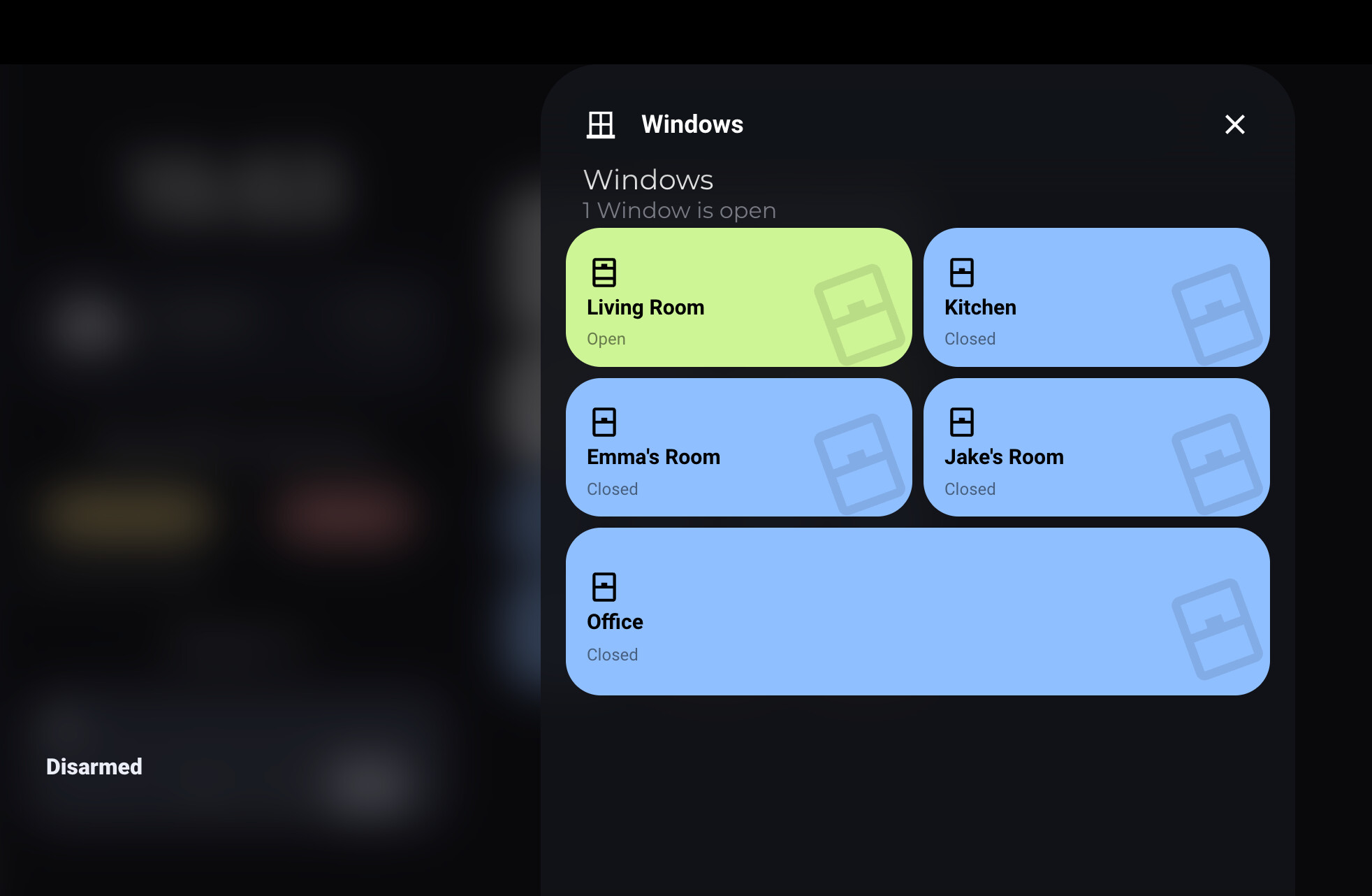
Hi,
I’m using bubble card on my tablet dashboard to show when lights, windows or doors are open and you click on a custom card, it displays a pop up showing what’s open etc.
On my dashboard, the background is blurred apart from the status of my alarm card. The alarm code status is in a custom field of “cs” but I can’t work out how to get it so that when the pop-up appears, it also blurs or hides the status.
Below is a screenshot;
And below is the alarm panel code I’m using;
type: custom:button-card
entity: alarm_control_panel.jem_alarm
name: House Alarm
icon: mdi:shield-lock
variables:
  active_color: red
state:
  - value: disarmed
    icon: mdi:shield-lock-open
    custom_fields:
      cs: Disarmed
    styles:
      card:
        - background: >-
            [[[ return states[entity.entity_id].state == 'on' ||
            states[entity.entity_id].state == variables.on_state ? 'var(--' +
            variables.active_color + ')' : 'var(--contrast6)'; ]]]
        - padding: 16px
        - '--mdc-ripple-press-opacity': 0
        - height: '[[[ return variables.max_height ? ''100%'' : ''100px''; ]]]'
      icon:
        - width: 24px
        - height: 24px
        - line-height: 24px
        - color: >-
            [[[ return states[entity.entity_id].state == 'on' ||
            states[entity.entity_id].state == variables.on_state ?
            'var(--black)' : 'var(--contrast18)'; ]]]
      img_cell:
        - justify-self: start
        - width: 24px
        - height: 24px
        - line-height: 24px
        - border-radius: 8px
      name:
        - text-align: start
        - white-space: no-wrap
        - font-weight: 500
        - justify-self: start
        - font-size: 12px
        - margin: 6px 0 2px 0
        - color: >-
            [[[ return states[entity.entity_id].state === 'disarmed' ? '#676867'
            : '']]]
        - text-overflow: ellipsis
      custom_fields:
        cs:
          - text-align: left
          - white-space: '[[[ return variables.max_height ? ''normal'' : ''no_wrap''; ]]]'
          - z-index: 4
          - justify-self: start
          - font-size: 16px
          - font-weight: 900
          - line-height: 18px
          - width: 100%
          - color: >-
              [[[ return states[entity.entity_id].state == 'on' ||
              states[entity.entity_id].state == variables.on_state ?
              'var(--black)' : 'var(--contrast18)'; ]]]
  - value: armed_night
    icon: mdi:shield-moon
    custom_fields:
      cs: Night
    styles:
      card:
        - background: >-
            [[[ return states[entity.entity_id].state === 'armed_night' ?
            '#2b2243' : '']]]
        - padding: 16px
        - '--mdc-ripple-press-opacity': 0
        - height: '[[[ return variables.max_height ? ''100%'' : ''100px''; ]]]'
      icon:
        - width: 24px
        - height: 24px
        - line-height: 24px
        - color: >-
            [[[ return states[entity.entity_id].state === 'armed_night' ?
            '#959497' : '']]]
      img_cell:
        - justify-self: start
        - width: 24px
        - height: 24px
        - line-height: 24px
        - border-radius: 8px
      name:
        - text-align: start
        - white-space: no-wrap
        - font-weight: 500
        - justify-self: start
        - font-size: 12px
        - margin: 6px 0 2px 0
        - color: >-
            [[[ return states[entity.entity_id].state === 'armed_night' ?
            '#676867' : '']]]
        - text-overflow: ellipsis
      custom_fields:
        cs:
          - text-align: left
          - white-space: '[[[ return variables.max_height ? ''normal'' : ''no_wrap''; ]]]'
          - z-index: 4
          - justify-self: start
          - font-size: 16px
          - font-weight: 500
          - line-height: 18px
          - width: 100%
          - color: >-
              [[[ return states[entity.entity_id].state === 'armed_night' ?
              '#959497' : '']]]
  - value: arming
    icon: mdi:shield-alert
    custom_fields:
      cs: Arming
    styles:
      card:
        - background: >-
            [[[ return states[entity.entity_id].state == 'arming' ||
            states[entity.entity_id].state == variables.on_state ? 'var(--' +
            variables.active_color + ')' : 'var(--contrast6)'; ]]]
        - padding: 16px
        - '--mdc-ripple-press-opacity': 0
        - height: '[[[ return variables.max_height ? ''100%'' : ''100px''; ]]]'
      icon:
        - animation: blink 2s ease infinite
        - width: 24px
        - height: 24px
        - line-height: 24px
        - color: >-
            [[[ return states[entity.entity_id].state == 'arming' ||
            states[entity.entity_id].state == variables.on_state ?
            'var(--black)' : 'var(--contrast18)'; ]]]
      img_cell:
        - justify-self: start
        - width: 24px
        - height: 24px
        - line-height: 24px
        - border-radius: 8px
      name:
        - text-align: start
        - white-space: no-wrap
        - font-weight: 500
        - justify-self: start
        - font-size: 12px
        - margin: 6px 0 2px 0
        - color: >-
            [[[ return states[entity.entity_id].state === 'arming' ? '#676867' :
            '']]]
        - text-overflow: ellipsis
      custom_fields:
        cs:
          - text-align: left
          - white-space: '[[[ return variables.max_height ? ''normal'' : ''no_wrap''; ]]]'
          - z-index: 4
          - justify-self: start
          - font-size: 16px
          - font-weight: 500
          - line-height: 18px
          - width: 100%
          - color: >-
              [[[ return states[entity.entity_id].state == 'arming' ||
              states[entity.entity_id].state == variables.on_state ?
              'var(--black)' : 'var(--contrast18)'; ]]]
  - value: armed_away
    icon: mdi:shield-car
    custom_fields:
      cs: Armed Away
    styles:
      card:
        - background: >-
            [[[ return states[entity.entity_id].state === 'armed_away' ?
            '#3b8048' : '']]]
        - padding: 16px
        - '--mdc-ripple-press-opacity': 0
        - height: '[[[ return variables.max_height ? ''100%'' : ''100px''; ]]]'
      icon:
        - width: 24px
        - height: 24px
        - line-height: 24px
        - color: >-
            [[[ return states[entity.entity_id].state === 'armed_away' ?
            '#000000' : '']]]
      img_cell:
        - justify-self: start
        - width: 24px
        - height: 24px
        - line-height: 24px
        - border-radius: 8px
      name:
        - text-align: start
        - white-space: no-wrap
        - font-weight: 500
        - justify-self: start
        - font-size: 12px
        - margin: 6px 0 2px 0
        - color: >-
            [[[ return states[entity.entity_id].state === 'armed_away' ?
            '#959497' : '']]]
        - text-overflow: ellipsis
      custom_fields:
        cs:
          - text-align: left
          - white-space: '[[[ return variables.max_height ? ''normal'' : ''no_wrap''; ]]]'
          - z-index: 4
          - justify-self: start
          - font-size: 18px
          - font-weight: 500
          - line-height: 16px
          - width: 100%
          - color: >-
              [[[ return states[entity.entity_id].state === 'armed_away' ?
              '#000000' : '']]]
  - value: pending
    icon: mdi:shield-alert-outline
    custom_fields:
      cs: Alarm Pending
    styles:
      card:
        - background: >-
            [[[ return states[entity.entity_id].state === 'pending' ? '#FFBF00'
            : '']]]
        - padding: 16px
        - '--mdc-ripple-press-opacity': 0
        - height: '[[[ return variables.max_height ? ''100%'' : ''100px''; ]]]'
      icon:
        - width: 24px
        - height: 24px
        - line-height: 24px
        - color: >-
            [[[ return states[entity.entity_id].state === 'pending' ? '#000000'
            : '']]]
      img_cell:
        - justify-self: start
        - width: 24px
        - height: 24px
        - line-height: 24px
        - border-radius: 8px
      name:
        - text-align: start
        - white-space: no-wrap
        - font-weight: 500
        - justify-self: start
        - font-size: 12px
        - margin: 6px 0 2px 0
        - color: >-
            [[[ return states[entity.entity_id].state === 'pending' ? '#959497'
            : '']]]
        - text-overflow: ellipsis
      custom_fields:
        cs:
          - text-align: left
          - white-space: '[[[ return variables.max_height ? ''normal'' : ''no_wrap''; ]]]'
          - z-index: 4
          - justify-self: start
          - font-size: 18px
          - font-weight: 500
          - line-height: 16px
          - width: 100%
          - color: >-
              [[[ return states[entity.entity_id].state === 'pending' ?
              '#000000' : '']]]
  - value: triggered
    icon: mdi:shield-alert
    custom_fields:
      cs: Alarm Triggered
    styles:
      card:
        - background: >-
            [[[ return states[entity.entity_id].state === 'triggered' ?
            '#FF0000' : '']]]
        - padding: 16px
        - '--mdc-ripple-press-opacity': 0
        - height: '[[[ return variables.max_height ? ''100%'' : ''100px''; ]]]'
      icon:
        - width: 24px
        - height: 24px
        - line-height: 24px
        - color: >-
            [[[ return states[entity.entity_id].state === 'triggered' ?
            '#000000' : '']]]
      img_cell:
        - justify-self: start
        - width: 24px
        - height: 24px
        - line-height: 24px
        - border-radius: 8px
      name:
        - text-align: start
        - white-space: no-wrap
        - font-weight: 500
        - justify-self: start
        - font-size: 12px
        - margin: 6px 0 2px 0
        - color: >-
            [[[ return states[entity.entity_id].state === 'triggered' ?
            '#959497' : '']]]
        - text-overflow: ellipsis
      custom_fields:
        cs:
          - text-align: left
          - white-space: '[[[ return variables.max_height ? ''normal'' : ''no_wrap''; ]]]'
          - z-index: 4
          - justify-self: start
          - font-size: 18px
          - font-weight: 500
          - line-height: 16px
          - width: 100%
          - color: >-
              [[[ return states[entity.entity_id].state === 'triggered' ?
              '#000000' : '']]]
styles:
  grid:
    - grid-template-areas: '"i i" "cs cs" "n ec" "n ec"'
    - grid-template-columns: 1fr min-content
    - grid-template-rows: 1fr min-content min-content 1fr min-content
  custom_fields:
    cs:
      - text-align: start
      - font-weight: 50
      - justify-self: start
      - font-size: 12px
      - margin: 6px 0 2px 0
      - color: black
      - text-overflow: ellipsis
    es:
      - color: var(--black)
    ec:
      - justify-self: start
      - justify-content: center
  card:
    - background: '[[[ return ''var(--'' + variables.active_color + '')'';]]]'
  icon:
    - color: var(--black)
  name:
    - color: var(--black)
custom_fields:
  ec:
    card:
      type: tile
      entity: '[[[ return entity.entity_id; ]]]'
      color: red
      features:
        - type: alarm-modes
          modes:
            - armed_away
            - armed_night
            - disarmed
      card_mod:
        style:
          .: |
            ha-card .content {
              display: none;
            } ha-card {
              width: 200px;
              background: transparent;
              border-radius: 0px;
            } ha-card.active {
              height: 40px;
            }
          .features hui-alarm-modes-tile-feature $: |
            .container {
              padding: 0px !important;
            }
          .features hui-alarm-modes-tile-feature $ .container ha-control-select $ .container: |
            .option {
              background-color: transparent !important;
              border-radius: 13px !important;
            }
            card_mod:
          hui-card-features $:
            hui-alarm-modes-card-feature $:
              ha-control-select$: |
                .container {
                  color: grey !important;
                  --control-select-color: var(--contrast14) !important;
                       }
Any ideas on what I need to do to update this so it blurs/hides properly? Thanks in advance
Hi, have you tried the latest beta? I’ve fixed something that could be related to this issue.
I haven’t no, I’m only using the latest stable version from HACS. If it’s not me, then that’s fine. Can wait until the beta has been released
Bubble Card 2 - The… One?
If you missed it, you can take a look at the 2.0.0-beta.1 (huge) full changelog here.
Version 2.0.0-beta.12
Hi everyone!
The previous beta was a good one but it was still not perfect. I also found and fixed some new issues, but also a memory leak in the pop-ups, everything is more stable and even smoother now!
This release should be a really good candidate!
 Bug fixes and optimizations
- Fixed a memory leak in the pop-ups
- Custom styles are now correctly applied to a pop-up without a header
- The sliders now update the input only when they are released
- Fixed numerous styling issues with the pop-up header
- Fixed an issue when a dropdown was opened inside a pop-up #539
- Changed the label in the editor for the entities supported by the slider buttons
- I might have also fixed some issues with pop-up centering
I can’t wait for your priceless feedback!
Enjoy! 
2 Likes
Has anyone figured out a way to change the Bubble Card Button text (name) dynamically? I’ve been digging and can’t seem to find a way to do this. Essentially, I have a button that turns on a switch and when that switch turns on, I want to change the text to something like “Loading…” while I wait for a device to power on and then change the text to “Turn Off” when the device has fully loaded.
Thoughts?