I have slider buttons for my lights, and when i’m using my thumb to scroll down in the HA companion app the phone vibrates when i touch one of the slider buttons, without activating it. Is there a way to get rid of it? Kinda anoying
1 Like
Thank you. What I have is fully functional. Now I just want to get the styling to match the default theme. Here’s what I’ve managed…

I think it would be better if it was formed from one button card rather than three, so the background was continuous.
It would also be better if the target temp showed °C after itself.
I don’t know CSS and am struggling to achieve this using custom button card. If any custom button card / CSS wizards can help my code at present is below.
Thank you!
type: horizontal-stack
cards:
  - type: custom:button-card
    aspect_ratio: 3/1
    icon: mdi:minus
    size: 25px
    tap_action:
      action: call-service
      service: climate.set_temperature
      service_data:
        entity_id: climate.utility_room
        temperature: >
          [[[ var temp =
          ((states['climate.utility_room'].attributes.temperature) - 0.5);
             return temp; ]]]
    styles:
      card:
        - background-color: '#282828'
          border-style: none
          border-radius: 25px
          height: 50px
  - type: custom:button-card
    aspect_ratio: 3/1
    entity: climate.utility_room
    state_display: |
      [[[ return entity.attributes.temperature ]]]
    tap_action: none
    show_name: false
    show_icon: false
    show_state: true
    styles:
      card:
        - background-color: '#282828'
          border-style: none
          border-radius: 25px
          height: 50px
  - type: custom:button-card
    aspect_ratio: 3/1
    icon: mdi:plus
    size: 25px
    tap_action:
      action: call-service
      service: climate.set_temperature
      service_data:
        entity_id: climate.utility_room
        temperature: >
          [[[ var temp =
          ((states['climate.utility_room'].attributes.temperature) + 0.5);
             return temp; ]]]
    styles:
      card:
        - background-color: '#282828'
          border-style: none
          border-radius: 25px
          height: 50px
1 Like
Hello, you could add this in your custom style part :
.bubble-button-card-container {
  border-radius: 10px !important;
}
Hi,
to begin with I’m not an CSS expert at all… but I played around a bit with the “horizontal row of sub buttons” from Cloos (see the advance sample on his github page).
it gives you at least three buttons within one button card and maybe it helps to develop your own card further. So be aware you have to play around a bit with the margins and heights, widths etc… I’m sure there is a more elegant code… but we all learn by doing and trying 
EDIT: depending on resolution of tablet or whatever screen you are using you have to change the margins, heights etc… there must be a more elegant code…
type: custom:bubble-card
card_type: button
card_layout: large
button_type: name
show_icon: false
show_name: false
sub_button:
  - name: Up
    icon: mdi:arrow-up-bold
    show_background: true
    tap_action:
      action: toggle
  - name: Stop
    icon: mdi:stop
    show_background: true
    tap_action:
      action: toggle
  - name: Down
    icon: mdi:arrow-down-bold
    show_background: true
    tap_action:
      action: toggle
styles: |
  .card-content {
    width: 100%;
    margin: 0 !important;
  }
  .bubble-button-card-container {
    background: rgba(25, 25, 25, 0.4);
    width: 100%;
  }

  .large .bubble-button-card-container {
    height: 100px;
  }


  .bubble-sub-button {
    height: 50px !important;
    width: 115px !important;
  }
  .bubble-sub-button-1 {
    background: rgba(25, 25, 25, 0.4);
    }
  .bubble-sub-button-2 {
    background: rgba(25, 25, 25, 0.4);
  }

  .bubble-sub-button-3 {
    background: rgba(25, 25, 25, 0.4);
  }

  .bubble-sub-button-container {
    margin-right: 3%;
  }
  .bubble-sub-button-icon {
    --mdc-icon-size: 32px !important;
  }
  .bubble-name-container {
    margin-right: 0px !important;
rows: auto
Thank you for your inspiration. I have had a go at adapting my code to sub buttons as per below.
While it looks perfect, it breaks the functionality and I get an error saying "Failed to call service climate/set_temperature. expected float for dictionary value @ data[‘temperature’]
    type: custom:bubble-card
    card_type: button
    name: Temperature
    show_icon: false
    show_attribute: false
    show_state: false
    show_name: true
    scrolling_effect: false
    button_type: name
    sub_button:
      - icon: mdi:minus
        show_background: false
        tap_action:
          action: call-service
          service: climate.set_temperature
          service_data:
            entity_id: climate.utility_room
            temperature: >
              [[[ var temp =
              ((states['climate.utility_room'].attributes.temperature) - 0.5);
                return temp; ]]]
      - entity: climate.utility_room
        show_background: false
        show_icon: false
        show_name: false
        show_attribute: true
        attribute: current_temperature
        tap_action:
          action: none
      - icon: mdi:plus
        show_background: false
        tap_action:
          action: call-service
          service: climate.set_temperature
          service_data:
            entity_id: climate.utility_room
            temperature: >
              [[[ var temp =
              ((states['climate.utility_room'].attributes.temperature) + 0.5);
                return temp; ]]]
You can create scripts then calling these scripts with call-services. This should works.
Hey Cloos, I found a quirk (which may be operating as intended/as required), but not entirely sure:
I have a bubble button that contains 4 sub-buttons. The first sub-button has show_icon set to false.
I want to dynamically change the icon for the second sub-button based on a sensor value. I would expect that I need to use subButtonIcon[1] to change its icon, but I find that I need to use subButtonIcon[0] instead.
I assume that this is because the first sub-button has its icon disabled, there isn’t an instance for it in the array?
The drawback of this is that if I want to change some other property of the sub-button, I need to use index 1 rather than 0. Or if I eventually enable the icon for the first sub-button, I need to remember to change the index from 0 to 1.
Is this expected, and is there a way to change the underlying implementation so that styles can reference the sub-button index consistently?
My full card, just for completeness:

type: custom:bubble-card
card_type: button
button_type: slider
name: 48V SoC
show_state: true
icon: mdi:battery
double_tap_action:
  action: none
hold_action:
  action: none
columns: 4
sub_button:
  - entity: sensor.48v_battery_voltage
    show_icon: false
    show_state: true
  - entity: sensor.battery_power_48v
    show_name: false
    show_state: true
    show_icon: true
  - entity: sensor.total_solar_power
    show_last_changed: false
    show_state: true
    show_attribute: false
    icon: mdi:solar-power-variant
  - show_state: true
    entity: sensor.integrel_oegs_combined_power
    icon: mdi:engine
entity: input_number.48v_battery_soc_input_number
styles: |
  .bubble-state {
    font-size: 26px !important;
    font-weight: 600 !important;
    opacity: 1 !important;
    /* justify-content: center !important; */
  }
  .bubble-icon {
    opacity: 1;
    /* color: ${state < 25 ? 'red' : state < 50 ? 'orange' : 'green'} !important; */
    color: white !important;
  }

  .bubble-range-fill {
    /* background: linear-gradient(to right, red 25%, orange 25% 50%, green 50%) !important; */
    background: ${state < 25 ? 'red' : state < 50 ? 'orange' : 'green'} !important;
  }

  /* .is-on .bubble-sub-button-1 {
    background-color: gray !important;
  } */

  /*
  .bubble-range-slider {
    background: linear-gradient(to right, red 25%, orange 25% 50%, green 50%) !important;
  }
  */

  .bubble-sub-button-1 {
    background-color: black !important;
  }
  .bubble-sub-button-2 {
    background-color: ${hass.states['sensor.battery_power_48v'].state < 0 ? 'red' : 'limegreen' } !important;
  }
  .bubble-sub-button-3 {
    background-color: ${hass.states['sensor.total_solar_power'].state == 0 ? 'black' : 'limegreen' } !important;
  }
  .bubble-sub-button-4 {
    background-color: ${hass.states['sensor.integrel_oegs_combined_power'].state == 0 ? 'black' : 'limegreen' } !important;
  }

  ${icon.setAttribute("icon",
      state < 10 ? 'mdi:battery-10' :
      state < 20 ? 'mdi:battery-20' :
      state < 30 ? 'mdi:battery-30' :
      state < 40 ? 'mdi:battery-40' :
      state < 50 ? 'mdi:battery-50' :
      state < 60 ? 'mdi:battery-60' :
      state < 70 ? 'mdi:battery-70' :
      state < 80 ? 'mdi:battery-80' :
      state < 90 ? 'mdi:battery-90' :
      'mdi:battery')}

  ${subButtonIcon[0].setAttribute("icon",
      hass.states['sensor.battery_power_48v'].state < 0 ? 'mdi:battery-arrow-down' :
      'mdi:battery-arrow-up')}
card_layout: large-2-rows
Interesting, it’s probably possible to change that, I have less time to work on the project at the moment so this is not my priority but I’m adding this at my to-do list.
1 Like
Just started testing bubble card, getting stumped straight away with the horizontal button stack. The first two buttons overlap on the companion app on iOS.

type: custom:bubble-card
card_type: horizontal-buttons-stack
1_name: Ljós
1_icon: mdi:lamp
1_link: '#lights'
2_name: Ljós
2_icon: mdi:lamp
2_link: '#lights2'
3_name: Ljós
3_icon: mdi:lamp
3_link: '#lights3'
The horizontal stack is the last card and is not inside another card.
Hi, have you tried with different names and also have you cleared your cache?
Hah that worked, thank you!
While I “have” you, or someone else, is it possible to have a pop-up open by default? I’m trrying to create a very simple dashboard that only consists of 4 pop-ups, with one default one that is open on start, and opens if another one is closed.
Hi,
How can we change the border-radius of bubble-button-card-container directly in the theme file? So that it changes all my cards.
You can open a pop-up by default, here is how:
You can’t at the moment, but this is in my to-do list.
1 Like
At the moment it is really hard to style the bubblecard integration. Could you - in a future release - make more use of CSS variables, so these are easy overridable in a custom theme? This together with the radius of the bubble cards…
Or - and I’m not completely sure if this is possible - use HTML-templates for rendering the cards, with additional, smaller and overridable stylesheets.
The addition of a custom night/day-theme, to show how these could be used would be really nice either… Or a rounded corner theme, and a square theme… Or perhaps, a theme that would integrate perfectly into the default HA theme itself.
If you need help with the styling/theming, please reach out…
1 Like
Solved on theme file :
card-mod-card: |
.bubble-button-card-container{
border-radius: 10px !important;
}
1 Like
Good to know! But indeed I’m planning to add variables for all these styles to makes things easier to customize.
4 Likes
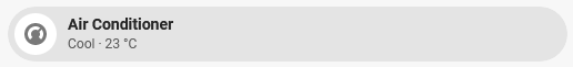
I have an Air Conditioner (Tuya Integration) that doesn’t seem to change the BubbleCard Button Background depending on it’s state (Off, Cool, etc.). Any ideas what I’m doing wrong here? It’s purely just a Button with the climate entity.
Is there any way to display the state from a sub button in the next line? Right now if it’s standard it will be cut off, would be better to have it the line below for that use case

  - type: custom:bubble-card
    card_type: button
    card_layout: large
    button_type: name
    show_icon: false
    show_name: false
    sub_button:
      - name: Nozzle Temp
        icon: mdi:printer-3d-nozzle-heat
        tap_action:
          action: more-info
        show_background: false
        show_name: false
        show_state: true
        entity: sensor.p1s_01p00a450500132_nozzle_temperature
      - name: Bed Temp
        icon: mdi:train-car-flatbed
        entity: sensor.p1s_01p00a450500132_bed_temperature
        show_background: false
        tap_action:
          action: more-info
        show_name: false
        show_state: true
      - name: Speed Profile
        icon: mdi:speedometer
        show_background: false
        show_state: true
        tap_action:
          action: more-info
        entity: sensor.p1s_01p00a450500132_speed_profile
    styles: |
      .card-content {
        width: 100%;
        margin: 0 !important;
      }
      .bubble-button-card-container {
        background: none;
      }
      .bubble-sub-button {
        height: 46px !important;
        width: 46px !important;
      }
      .bubble-sub-button-container {
        width: 100%;
        justify-content: space-between !important;
      }
      .bubble-sub-button-icon {
        --mdc-icon-size: inherit !important;
      }
      .bubble-name-container {
        margin-right: 0px !important;
      }
If you want help you really need to post the YAML-code of your card… otherwise no one can see what possibly went wrong…