A bit more compact view for custom:sun-card:
type: custom:sun-card
showAzimuth: false
showElevation: false
timeFormat: 24h
card_mod:
  style: |
    .sun-card-header span {
      font-size: var(--mdc-typography-body1-font-size) !important;
      padding-bottom: 0px !important;
    }
    .sun-card-footer span {
      font-size: var(--mdc-typography-body1-font-size) !important;
      padding-bottom: 0px !important;
    }
    .sun-card-footer-row {
      padding-top: 0px !important;
    }
Left - with card-mod, right - w/o card-mod:

A similar for a horizon-card (fork of the archived sun-card):
type: custom:horizon-card
card_mod:
  style: |
    .horizon-card-header {
      margin-top: 0px !important;
    }
    .horizon-card-graph {
      margin-top: 0px !important;
      margin-bottom: 0px !important;
    }
    .horizon-card-footer {
      margin-bottom: 0px !important;
    }
    .horizon-card-footer > * {
      margin-top: 0px !important;
    }
    .horizon-card-field-name {
      font-size: 0.8rem !important;
      color: red !important;
    }
    .horizon-card-field-value {
      font-size: 1.8rem !important;
      color: cyan !important;
    }

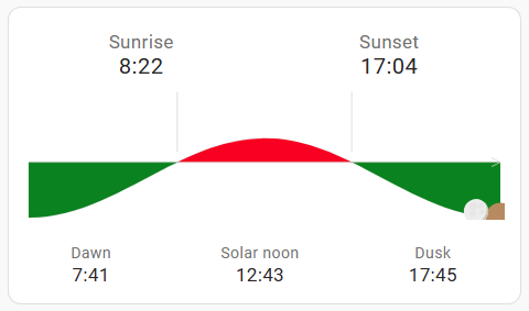
Change colors for “day/night”:
type: custom:horizon-card
card_mod:
  style: |
    ha-card {
      --hc-day-color: red;
      --hc-night-color: green;
    }