ok, thx , i did looked at browser-mod and mini-player , as i only need a “simple” player for “streaming-channels” , but your top-menu gave me more ideas  for automation’s, i.e wakeup, cast
Thanks for clarification.
So card-mod-{thing} is only for theming?
And this class-thing mentioned here, too?
I’ll try with anchors.
I had these .card-header {} mods in all of my cards, in 2 versions (with and without bottom margin) so the caused some serious repetition. Top card got the &header anchor, and all cards below that re-used it via *header. Very easy.
  - type: entities
    title: First card
    card_mod: &header_no_margin
      style: |
        .card-header {
          background-color: var(--background-color-off);
          color: var(--text-color-off);
          padding-top: 0px;
          padding-bottom: 0px;
          /* margin: 0px 0px 16px 0px; */
        }

  - type: entities
    title: Next card
    card_mod: *header_no_margin
However, I recently switched to creating a class in my card-mod-themes and now only set a class on the cards (and repeat those with anchors, which saves yet another line 
have a look here for the class creation : https://gist.github.com/Mariusthvdb/9069c8c4dcad6324035a679244bbfdf1#file-themes_card_mod-yaml-L64
use them in the views:
type: entities
title: Audio settings
card_mod:
  class: class-header-margin
Hey everyone! Reaching out for some help here styling a card.
I’ve worked with card-mod before but struggling with styling the Mushroom Person card - if anyone is familiar with the Mushroom project.
My goal is to change the width/height of the div.container holding the entity picture.
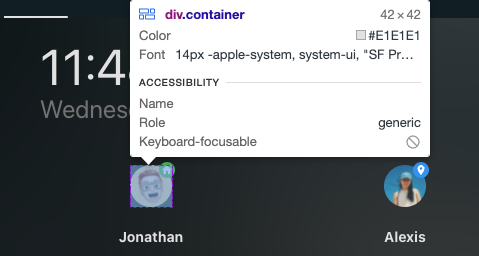
Ive tried using Card-mod-helper. Below is the JS path to the div.container.
document.querySelector("body > home-assistant").shadowRoot.querySelector("home-assistant-main").shadowRoot.querySelector("app-drawer-layout > partial-panel-resolver > ha-panel-lovelace").shadowRoot.querySelector("hui-root").shadowRoot.querySelector("#view > hui-view > vertical-layout").shadowRoot.querySelector("#columns > div > hui-horizontal-stack-card:nth-child(3)").shadowRoot.querySelector("#root > mushroom-person-card:nth-child(1)").shadowRoot.querySelector("mushroom-card > div > mushroom-state-item > mushroom-shape-avatar").shadowRoot.querySelector("div")
Any ideas? My goal is to change the container width/height to 75px - instead of 42px.
Thanks!
Are you referring to this?
If so, I haven’t used that feature, so I won’t be able to help with that, sorry. Just looking at the docs, there is a strong emphasis on where those themed definitions should be added, and that is not under a dashboard view.
Check this decluttering template as an example:
  decl_horizontal_stack:
    default:
      - VALUE_WIDTH_1: 50%
      - VALUE_OVERFLOW_VISIBLE: true
      - OBJ_KEEP:
          background: false
          box_shadow: false
          margin: false
          outer_padding: false
          border_radius: false
    card:
      type: custom:stack-in-card
      keep: '[[OBJ_KEEP]]'
      mode: horizontal
      cards: '[[CARDS]]'
      card_mod:
        style:
          hui-horizontal-stack-card $: |
            div#root > :first-child {
              width: [[VALUE_WIDTH_1]];
              flex: auto;
            }
            div#root > :last-child {
              width: calc(100% - [[VALUE_WIDTH_1]]);
              flex: auto;
            }
          .: |
            ha-card {
              box-shadow: none;
              {% if [[VALUE_OVERFLOW_VISIBLE]] == true %}
              overflow: visible !important;
              {% endif %}
            }
Using the template:
type: vertical-stack
cards:
  - type: custom:decluttering-card
    template: decl_horizontal_stack
    variables:
      - CARDS: &ref_cards
          - type: entities
            entities:
              - entity: sensor.cleargrass_1_temperature
                name: Indoor
          - type: custom:bar-card
            entities:
              - entity: input_number.test_level_1
            positions:
              icon: 'off'
              name: 'off'
  - type: custom:decluttering-card
    template: decl_horizontal_stack
    variables:
      - CARDS: *ref_cards
      - VALUE_WIDTH_1: 60%
  - type: custom:decluttering-card
    template: decl_horizontal_stack
    variables:
      - CARDS: *ref_cards
      - VALUE_WIDTH_1: 70%
  - type: custom:decluttering-card
    template: decl_horizontal_stack
    variables:
      - CARDS:
          - type: entities
            entities:
              - entity: sun.sun
              - entity: sun.sun
              - entity: sun.sun
          - type: custom:mini-graph-card
            entities:
              - entity: sensor.cleargrass_1_co2
                name: CO2
            height: 250
            show:
              state: true
              name: true
              icon: false
              labels: false
              points: false
      - VALUE_WIDTH_1: 65%
      - OBJ_KEEP:
          background: false
          box_shadow: true
          margin: false
          outer_padding: false
          border_radius: false
  - type: entities
    entities:
      - sun.sun
      - type: custom:decluttering-card
        template: decl_horizontal_stack
        variables:
          - CARDS:
              - type: custom:hui-element
                row_type: sensor-entity
                entity: sensor.cleargrass_1_temperature
                name: Indoor
              - type: custom:slider-entity-row
                entity: input_number.test_number
                full_row: true
          - VALUE_WIDTH_1: 40%
      - entity: sensor.cleargrass_1_co2

Surely the template does not cover all possible needs. At least it gives you an example of customizing a width.
1 Like
In another card i used, i didn’t wanted a name, and with name: false i got the entity-name instead(how funny is that) … i went to Configuration/entities, gave the entity a (.) dot  … as name, i know i doesn’t move/remove it , but now it’s only a tiny dot, i hardly see with my old eyes and dirty glasses
… ahhh i just got another idea … write whatever i want, style the text same color as background 
yes, thats a known trick
however, I dont want to Remove the id, I want to move it… but its fairly ok now. Its more that Id like to be in control, and this still leaves me wanting…
I wonder how many Themes(and card design) the new 2022.3 f… up, question is will card-mod, card-mod-themes eventually (soon) become “obsolete” as-well … luckily i only have 2 Themes, 1 for View and 1 for Cards both with “inspiration” from when i started with Card-mod … i know i could have started “converting” paper-elements, but … now “updates” to various cards start to “drop-in” … is it best to wait, to see how these “falls out” ? … Thomasloven is first out with layout and auto-entities
Don’t hope so. But the rebuilding of card-mod has been there in most of the releases in the past already. So we are used to do it. 
1 Like
ok, yes im “new” here, so still alot of my designing is in “experimental” state, but i started to get a grip of it, so the “paper-elements” ( in Theme controlling various colors, with reference to few “standard” colors, now inside card clicking “showing code editor” i got white background/white txt … in regards to “rebuilding” of cards, they seems to “usually” include nice enhancements and new features.

PS: was first thinking wtf happend here, did they moved the “inputs” ?
Hey Guys,
Would anyone be able to assist me in styling the divider lines highlighted in my screenshot below. Im really struggling to give this bit to work. The research I have done so far would suggest divider line colour is set by --secondary-text-color: however it doesn’t seem to change the colour, I have set this at both the card style level and in my theme but neither seem to be taking effect.
        - type: 'custom:home-feed-card'
          style: |
            ha-card {
            margin-top: 0px;
            margin-bottom: 20px;
            margin-left: 35px;
            margin-right: 35px;
            background-color: none;
            border: 0px;
            background: none;
            box-shadow: none;
            line-height: 18px;
            color: #8e9393;
            font-size: 12px;
            --secondary-text-color: #8e9393;
            }
          card_id: main_feed
          show_empty: false
          id_filter: ^event*
          more_info_on_tap: false
          state_color: false
          show_icons: false
          more_info_on_tap: false
          entities:

is that code-snippet from ur card ? ( no specified color for divider as far as i can see), how does i look like in ur Theme ?
have you tried
- type: divider( or section) ? in ur card ?
Previous posts above suggest that the following should be used to set the colour, but this code doesn’t seem to make any difference in either the card or theme. Colour is defaulting to white in this card.
Interesting though I’ve just checked other dividers used in the entity card and they appear to be picking up the correct colour (see image below), I am assuming the theme is therefore working and perhaps the dividing lines in the feed card are referencing something else?
--secondary-text-color: #8e9393;

could be so, entities card have a HA-element, have no idea of feed-card, then try to use - type:divider ( thou i think this is special also, but -type:section , hmmm might also only work i card like entities.
what the “purpose” of feed-card ?
PS: I dont think you can use Card-Mod on this card, it seems “Deprecated” … try template
edit2: and remember all the “trivial” stuff, like clear ur browser, check in other browsers , when ur working with this card
Where are you seeing reference that it is Deprecated?
not this card in particular, but in below link, you find another ink to “custom-updater” , … and in regards to the problems people had/have i see in " Lovelace: Home Feed Card" … i made my own “assumption” , i would never start to use it , sorry but that’s my opinion … when was the Last Update from developer of this Card ? , that’s a part of my Assumption
PS: Sorry i mixed up the 2 cards in regards to “updates” , but still don’t find any “options” for divider.
But i do see that it uses “entities” , and it should in this case be there, if possible
entities:
  - entity: your.entity
    name:
    something:else
  - type: section
    * i dont know which options CSS there are for defining the "section"
but there is - type: devider
which have more options, maybe your Theme vil apply what you already have, as it's within "entities"Divider in entities-card
I tried that thing with those anchors and it worked wonderful. Thanks for that.
But saving some changes with editor in UI seems to evaluate those anchors and paste the code instead of my anchors.
Next time I would like to change something I have to do that again many times! 
@Ildar_Gabdullin thank you so much for all the examples you have provided in this post. I have spent many hours learning from your examples.
With the changes made in 2022.3 I have found that all my input (select, date, numbers) references have boxes around them now. For input_select I have eliminated the boxes using the code I’ve listed below, but after i select a new item in the dropdown box the gray box reappears until I click anywhere else on the screen.
I noticed this problem before but it nevered bothered me because it didn’t involve the input_ fields. Now it just looks ugly. Looking for help in eliminating this box, thanks
type: vertical-stack
in_card: true
cards:
  - type: markdown
    style: |
      ha-card { margin-top: -.8em;
                margin-bottom: .5em; }
    content: >
      ## {{ states('sensor.todays_date') }}

  - type: entities
    style: |
      ha-card { margin-top: -2em;
                margin-bottom: .8em;
                --mdc-select-fill-color: white;
              }
    show_header_toggle: false
    entities:
      - input_select.calendar_selection
1 Like