Search in card-mod themes thread.
1 Like
Most probably, there is a filter or a transparent or alpha set as well, which you should adjust according to your needs.
See above


Why the “mod-card” is here?
190 lines for MWE - and zero appearances of “card-mod” keyword.
1 Like
I cant get card-mod to work, anywhere.
Its installed correctly, but all I get when adding
style: |
  ha-card .entities {
    color: red;
  }
to a card yaml is
Visual editor is not supported for this configuration
Key ‘style’ is not expected or not supported by the visual editor.
You can still edit your config in YAML.
…and text color is not red. Ive tried many other kinds of stylings too, with the same result. What basic thing can I have gotten so laughably wrong?
Its the same if I add “card_mod:”, as in
card_mod:
  style: |
    ha-card {
      color: red;
    }
SOLVED IT!
- I went through everything twice and found nothing wrong with card-mod, it loaded correctly and everything. Then for some reason I thought of HomeKit Infused which I had downloaded but not configured completely because it is all YAML-based. I deleted everything HKI related and restarted HA and voila! Text is red!

1 Like
You are right, this should be in Layout-card - Take control of where your cards end up
Deleting post …
hey, just looking for s beginner help
below is a sample my code and image for reference, but all i want to do is round the corners and be able to apply a line colour. Im just unsure where to even add the styling? if someone is able to help me out here, im hoping it will go along way to learning it? cheers
type: custom:stack-in-card
title: Indoor Climate
mode: vertical
cards:
  - type: custom:stack-in-card
    cards:
      - type: custom:mushroom-chips-card
        chips:
          - type: entity
            entity: sensor.whole_house_average_humidity
            icon_color: green
          - type: entity
            entity: sensor.whole_house_average_temperature
            icon_color: blue
          - type: template
            entity: climate.ac_controls_interface

How to change card-mod styles for dark & light modes
There are 2 methods of changing a card-mod style dependingly on the current HA theme:
- Use a user-defined variable for some CSS property.
Specify some user-defined variable for the light theme & for the dark theme:
### styling
card_mod:
  style: |
    some_element {
      color: var(--my-favourite-color);
    }
...
## defining themes
my_theme:
  modes:
    light:
      ...
      my-favourite-color:  black
      ...
    dark:
      ...
      my-favourite-color:  white
      ...
This method implies that a custom theme (“my_theme”) is defined.
If a default theme is used then the 2nd method may be used.
- Use different card-mod styles dependingly on the current mode - light or dark.
A client device has at least the light mode; the dark mode MAY BE provided too.
Switching between modes may be at automatic (dependingly on a current time) or manual.
HA has 3 options for a default theme:
- automatic selection (if the client device is in light mode then the light theme is selected; same for the dark mode);
- light & dark themes (set a theme independingly on the client device’s mode).
Here are these options for the default theme:

Regarding a custom theme: if both light & dark modes are specified for the theme then these options are same:

But if no light or dark modes are specified then there are no options:

So, this method implies that:
- either the default theme is used;
- or a custom theme with specified light & dark modes is used.
There is one more condition - the “Auto” mode must be selected (if device is in dark mode → use a dark theme, and vise versa).
Now finally about the method itself.
A special CSS media feature is used to determine a current mode:
type: entities
entities:
  - entity: sun.sun
    name: cyan if DARK
    card_mod:
      style:
        hui-generic-entity-row $: |
          @media (prefers-color-scheme: dark) {
            state-badge {color: cyan;}
          }
          @media (prefers-color-scheme: light) {
            state-badge {color: red;}
          }
In the light mode the icon is of red color:

If the current option is “dark”:
then the icon’s color is still red:

because the mode is still light - only the dark theme is selected!
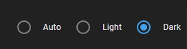
Now set the “auto” option:

switch on the dark mode (for Windows 10: Settings → Colors):

and the icon’s color is cyan - as it should be:

BTW, for testing purpose Chrome has a “dark mode emulation” feature.
7 Likes
Thank you for this! I was banging my head against this for a while, and while I absolutely could not get the @media (prefers-color-scheme.. option working, custom variables in themes did work! I’ll keep playing with the @media option later, as that would be the most theme-agnostic (my gf uses an ios theme whereas I use Mushroom theme, so I’ve had to throw custom vars into both for now, bleh).
This…this is gold for anyone that wants to change up all the default settings and make their own style.
I do have a question though. Can you get to any part of a card by just appending “.header .name” for example to “ha-card” like shown below? I notice you dont do it on all your examples and wanted to confirm if this only works for some cards or all.
style: |
  ha-card .header .name {
    color: green;
  }
Post liked and bookmarked. Thank you.
Not sure if I am getting your point.
Yes, we can get to any part by using a correct path.
In this particular example there is no need to use “ha-card .header .name”, the “.header .name” is enough.
In some my examples I did use the “ha-card” in these cases (I was at the very beginning), but usually it is not obligatory.
Currently I am using “ha-card” only in “style the whole card” cases (i.e. not for some specified element).
Wondering if I can get some help with a template in card mod to turn the card background a certain color based on an entity’s attribute. I’m terrible with templates and just started with Card-mod so I hope this isn’t too stupid of a question…
I have this but it isn’t working.
card_mod:
  style: |
    ha-card {
     background: [[ if (states.climate.z_wave_thermostat_2.attributes.hvac_action == "cooling", "blue",) else if (states.climate.z_wave_thermostat_2.attributes.hvac_action == "heating", "red",) else if (states.climate.z_wave_thermostat_2.atrributes.hvac_action == 'idle', "grey")]];
     }
Thanks!
Use jinjia2 for templates.
Like this:
card_mod:
  style: |
    ha-card {
      {% if ....... %}
      background: cyan;
      {% else %}
      background: red;
      {% endif %}
     }
Awesome, thank you so much. Was able to get it working.
How should the correct entry for “condtional row” look for secondary info to appear?

  - entity: input_number.pc_grzejniki_obnizenie_stalej_temp_wody
    secondary_info: true
    card_mod:
      style:
        hui-generic-entity-row$: |
          .secondary::after {
            content: "{{states('sensor.pc_grzejniki_obnizenie_stalej_temp_wody')}}"
            }
  - type: conditional
    conditions:
      - entity: switch.pc_grzejniki_metoda_pogodowa
        state: 'on'
    row:
      entity: input_number.pc_grzejniki_krzywa
      secondary_info: true
      card_mod:
        style:
          hui-generic-entity-row$: |
            .secondary::after {
              content: "{{states('sensor.pc_grzejniki_obnizenie_stalej_temp_wody')}}"
              }

I have tried variants with “hui-conditional-row” but without success. Could you
please help me?
1st post → link at the bottom → post with links → link for conditional
Thank you. I got the expected result after applying.
    style:
        hui-input-number-entity-row$:
            hui-generic-entity-row$: |
                .secondary::after {
                   content: "{{states('sensor.pc_grzejniki_obnizenie_stalej_temp_wody')}}"
                   }
Hello there,
I have some conditional-cards in a horizontal stack and the display is a bit weird because some “flex”.

What I would like to do is :

But I did not managed to achieve this…
As you can see

Anyone for help on this one ? Thx !
Selector gives me :
document.querySelector("body > home-assistant").shadowRoot.querySelector("home-assistant-main").shadowRoot.querySelector("app-drawer-layout > partial-panel-resolver > ha-panel-lovelace").shadowRoot.querySelector("hui-root").shadowRoot.querySelector("#view > hui-view > hui-masonry-view").shadowRoot.querySelector("#columns > div > hui-vertical-stack-card").shadowRoot.querySelector("#root > hui-horizontal-stack-card:nth-child(3)").shadowRoot.querySelector("#root > hui-conditional-card:nth-child(2)")
If I go to chrome dev tools, select my conditional card and put in element style : flex: none; I have the correct resulting display…but until now I did not managed to make it with card-mod. Is that even possible ?
Sure here is a code snippet
  - cards:
    - cards:
      - card:
          entity: sensor.open_doors
          template: pilule_open_count
          icon: mdi:door-open
          type: 'custom:button-card'
        conditions:
          - entity: sensor.ppl_at_home
            state: '0'
          - entity: sensor.open_doors
            state_not: '0'
        type: conditional
      - card:
          entity: sensor.open_windows
          template: pilule_open_count
          icon: mdi:window-open-variant
          type: 'custom:button-card'
        conditions:
          - entity: sensor.ppl_at_home
            state: '0'
          - entity: sensor.open_windows
            state_not: '0'
        type: conditional
      type: horizontal-stack
    type: vertical-stack
Button card templates :
  pilule_open_count:
    template: pilule_icon
    tap_action:
      action: more-info
    label: |
      [[[
        var open = entity.state;
        return open;
      ]]]
  pilule_icon:
    template: pilule
    show_icon: true
    size: 80%
    show_state: false
    variables:
      icon: "mdi:arrow-left"
    icon: '[[[ return variables.icon ]]]'
    styles:
      grid:
        - grid-template-areas: '"i l"'
      label:
        - justify-self: center
        - padding: 0px 6px
        - font-weight: bold
        - font-size: 14px
  pilule:
    tap_action:
      action: more-info
    show_icon: false
    show_name: false
    show_state: false
    show_label: true
    size: 80%
    styles:
      img_cell:
        - width: 24px
      card:
        - border-radius: 30px
        - box-shadow: var(--box-shadow)
        - height: 36px
        - width: auto
        - padding-left: 6px
        - padding-right: 6px
      grid:
        - grid-template-areas: '"l"'
      label:
        - justify-self: center
        - padding: 0px 6px
        - font-weight: bold
        - font-size: 14px
Thx for you help !
Edit : added templates for button cards…