How to change card-mod styles for dark & light modes
There are 2 methods of changing a card-mod style dependingly on the current HA theme:
- Use a user-defined variable for some CSS property.
Specify some user-defined variable for the light theme & for the dark theme:
### styling
card_mod:
  style: |
    some_element {
      color: var(--my-favourite-color);
    }
...
## defining themes
my_theme:
  modes:
    light:
      ...
      my-favourite-color:  black
      ...
    dark:
      ...
      my-favourite-color:  white
      ...
This method implies that a custom theme (“my_theme”) is defined.
If a default theme is used then the 2nd method may be used.
- Use different card-mod styles dependingly on the current mode - light or dark.
A client device has at least the light mode; the dark mode MAY BE provided too.
Switching between modes may be at automatic (dependingly on a current time) or manual.
HA has 3 options for a default theme:
- automatic selection (if the client device is in light mode then the light theme is selected; same for the dark mode);
- light & dark themes (set a theme independingly on the client device’s mode).
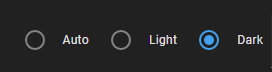
Here are these options for the default theme:

Regarding a custom theme: if both light & dark modes are specified for the theme then these options are same:

But if no light or dark modes are specified then there are no options:

So, this method implies that:
- either the default theme is used;
- or a custom theme with specified light & dark modes is used.
There is one more condition - the “Auto” mode must be selected (if device is in dark mode → use a dark theme, and vise versa).
Now finally about the method itself.
A special CSS media feature is used to determine a current mode:
type: entities
entities:
  - entity: sun.sun
    name: cyan if DARK
    card_mod:
      style:
        hui-generic-entity-row $: |
          @media (prefers-color-scheme: dark) {
            state-badge {color: cyan;}
          }
          @media (prefers-color-scheme: light) {
            state-badge {color: red;}
          }
In the light mode the icon is of red color:

If the current option is “dark”:
then the icon’s color is still red:

because the mode is still light - only the dark theme is selected!
Now set the “auto” option:

switch on the dark mode (for Windows 10: Settings → Colors):

and the icon’s color is cyan - as it should be:

BTW, for testing purpose Chrome has a “dark mode emulation” feature.