🔹 Card-mod - Add css styles to any lovelace card

The doc for card-mod can be found here and this is a useful tool for navigating the dom structure.

As for removing the rounded borders, you should look into the CSS border-radius property. For the space, you’ll have to use your browser’s dev tools to find where that comes from in order to reduce it.

I’m having an issue with the card_mod all of a sudden. I have a markdown card which I’m styling and this has worked well up until now.

Here’s my code:

card_mod:
  style:
    .: |
      ha-card {
        font-family: Orbitron;
        background:#000;
        display: flex;
        place-content:center;
        text-align:center;
        opacity: .3              
      }
    ha-markdown:
      $: |
        h3 {
          margin-top:100px !important;
          font-size: 5rem;
        }
        h1 {
          font-size: 10em;
          font-weight: thin;
          letter-spacing: '-0.01em';
          margin-bottom:150px !important;
        }

The issue is that the styles which target the h3 and h1 inside the ha-markdown element are not being applied, until I go to “Edit dashboard” and the view enters edit mode. Then the styles are applied. Then when I leave edit mode, they are still applied. If I refresh the browser, the styles are not applied anymore, until I enter edit mode. Rinse and repeat. Any ideas?

There are similar observations on Github.
How to solve it: change your style to this:

card_mod:
  style:
    ha-markdown $: |
      h3 {
        ...
      }
      h1 {
        ...
      }
    .: |
      ha-card {
        ...
      }

1 Like

Thanks @Ildar_Gabdullin - works now !

Hey :slight_smile:

Do you guys know how to set the width of a card? I have a weatherforecast which is a bit wide I want to reduce it’s size a bit… Adding --ha-card-width: 50px; or width: 50px; does not do anything. Is there some kind of doc where all CSS variables for the card-mod are listed?

          - type: custom:simple-weather-card
            entity: weather.buienradar
            name: " "
            primary_info:
              - wind_bearing
              - humidity
            secondary_info:
              - precipitation
              - precipitation_probability
            card_mod:
              style: |
                :host{
                  --ha-card-border-width: 0px;
                }
            template: footer

OK here’s a real special one. One of the hardest for me personal, even it should be very easy… basically.

How to apply

                        ha-svg-icon {
                          color: green;

to a custom:bar-card generated by custom:auto-entities?

Here's the code snippet (look for "sensor.abfall_home_bio" / see "full tree" below!)
      - type: custom:auto-entities
        card:
          type: custom:bar-card
          title: ''
          limit_value: false
          min: 0
          max: 30
          positions:
            icon: outside
            indicator: inside
            name: inside
            minmax: 'off'
            value: inside
          entity_row: true
          stack: vertical
          direction: right
          columns: 1
          decimal: 0
          color: var(--custom-bar-card-color, var(--primary-color))
          unit_of_measurement: ''
          width: 100%
          height: 50px
          style: |-
            bar-card-value {
              margin-right: 10px;
              font-size: 13px;
              font-weight: bold;
              text-shadow: 1px 1px #0005;
            }
            bar-card-card {
              #margin-left: 210px;
            }
            bar-card-currentbar, bar-card-backgroundbar {
              border-radius: 4px;
            }
        entities: []
        filter:
          include:
            - entity_id: sensor.abfall_home_bio
              options:
                color: brown
                card_mod:
                  style:
                    bar-card-iconbar:
                      $: |
                        ha-svg-icon {
                          color: green;
                        }  
            - entity_id: sensor.abfall_home_gelb
              options:
                color: orange
            - entity_id: sensor.abfall_home_papier
              options:
                color: black
            - entity_id: sensor.abfall_home_rest
              options:
                color: grey
            - entity_id: sensor.abfall_home_schadstoff
              options:
                color: green
          exclude:
            - state: unavailable
            - state: unknown
            - entity_id: sensor.abfall_home_naechsteabholung
        show_empty: false
        unique: true
        sort:
          method: state
          reverse: false
          numeric: true

In the end I want to colorize all those icons individually:

In 🔹 Card-mod - Add css styles to any lovelace card - #1188 by Ildar_Gabdullin I found the styling, but I don’t know

1) If I need to apply the styling in the options area of the auto-entities filter (or where else to put the card_mod section at?) and
2) How to access the icon.

Full tree is:
custom:vertical-stack-in-card
:arrow_right: entities
:arrow_right::arrow_right: custom:auto-entities
:arrow_right::arrow_right::arrow_right: custom:bar-card
:arrow_right::arrow_right::arrow_right::arrow_right: entity
:arrow_right::arrow_right::arrow_right::arrow_right::arrow_right: icon

Here’s the site inspector:

I want to learn on this heavy example how to access this part (navigate correctly and create the right syntax).

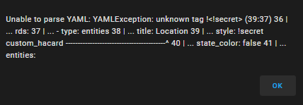
Hi I tried the method you’ve mention but keep getting a YAML error. Any ideas?
The style works fine when in my code but I have it in for every card and want to tidy things up.
Thanks

image

image

image

Secrets are not supported in a storage mode.

Is there a method to change out of storage mode? Could you elaborate please.
How do you know I’m in storage mode from the screen shots?

It is an off-topic here.
Use this as a starting point.

Happy New Year everyone. Looking at the post here, I am trying to do the exact same thing…

New-1

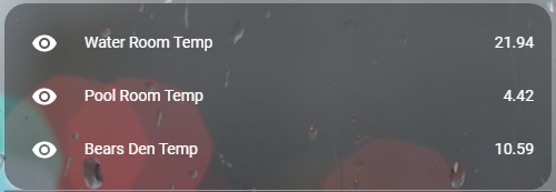
If any of these temperature sensors are offline, I would like the temperature to show in red. For each of the sensors above, I have 2 items: (sensor.water_room_temp & sensor.water_room_offline)…

      - name: "Water Room Temp"
        value_template: "{{ value_json.data['items'][0]['last_temp'] }}"
      - name: "Water Room Offline"
        value_template: "{{ value_json.data['items'][0]['offline'] }}"

sensor.water_room_offline gives me a 0 if it’s online or a 1 if it’s offline.

I read in that post that there are different ways to accomplish this however I would like to use card_mod and templates. I have played around with the syntax based on that thread but I just can’t seem to get it working.

Thanks so much in advance everyone and all the very best for a healthy, happy 2023!

1st post → link at the bottom → styles for Entities card → colored icons.

For conditional styling you may use a jinjia template similar to one you posted in a card-mod-theme thread.

Thank you for the reply. First post, got it. Link at the bottom, got it. That took me here. I wasn’t able to find the rest - I’m sorry.

The temperature (sensor.water_room_temp) color change is based on a completely different variable (sensor.water_room_offline). Do I need to define that variable like in this post or can I just reference it in an ‘if’ statement?

Go here

Thank you very much for your time and patience with me @ Ildar_Gabdullin. You and RobC are such a huge help to this community and I am VERY appreciative. I was making things much more complicated then they needed to be. For anyone else that may be looking to do this, here is the final code that works great…

entities:
  - entity: sensor.water_room_temp
    card_mod:
      style:
        hui-generic-entity-row:
          $: |
            .text-content:not(.info) {
              color:
                {% if is_state('sensor.water_room_offline', '1') %}
                  red
                {% else %}
                  black
                {% endif %}
                ;
            }
  - entity: sensor.pool_room_temp
    card_mod:
      style:
        hui-generic-entity-row:
          $: |
            .text-content:not(.info) {
              color:
                {% if is_state('sensor.pool_room_offline', '1') %}
                  red
                {% else %}
                  black
                {% endif %}
                ;
            }
  - entity: sensor.bears_den_temp
    card_mod:
      style:
        hui-generic-entity-row:
          $: |
            .text-content:not(.info) {
              color:
                {% if is_state('sensor.bears_den_offline', '1') %}
                  red
                {% else %}
                  black
                {% endif %}
                ;
            }```

Please note this does not seem to work (anymore) this way:

Using this example, also the entity name (“Network throughput”) is changed instead of only the value area.

:arrow_right: I am applying this to an entities card inside a grid card.

:white_check_mark: Instead, one should use .text-content:not(.info):after and .text-content:not(.info) to exclude .info.

:exclamation: What I could not fix so far, is the entity value being aligned at the bottom (because of the invisible original value space above) which is looking quite ugly :frowning_face:
→ Update: for this, using line-height: 0px; inside .text-content:not(.info) did the trick.

Does work:

Indeed, you’re absolutely right. Tested it once again: working.

I have no idea why it didn’t for my use-case…

Probably because I already had some styling (colorizing) in there and the navigation is different.
Your example:

        style:
          hui-generic-entity-row: |

What I had used from one of your other examples:

        style:
          hui-generic-entity-row:
            $: |
Full example
type: grid
title: Abfall-Kalender
columns: 1
square: false
cards:
  - type: entities
    entities:
      - entity: sensor.fritzbox_gigabytes_received
        name: Network throughput
      - entity: sensor.fritzbox_gigabytes_sent
        name: Network throughput
        style:
          hui-generic-entity-row: |
            .text-content::after {
              content: "{{states(config.entity)|float*1024}} KBit/s";
              color: var(--primary-text-color);
            }
            .text-content {
              color: transparent;
            }
  - type: entities
    title: Abholung heute ❔
    state_color: true
    entities:
      - entity: calendar.abfall_home
        name: Home
        icon: mdi:home-map-marker
        style:
          hui-generic-entity-row:
            $: |
              #state-badge {
                {% if is_state(config.entity, 'on') %}
                  color: red;
                {% endif %}
              }
              .info.pointer {
                {% if is_state(config.entity, 'on') %}
                  color: red;
                  font-weight: 700;
                {% endif %}
              }
              .text-content:not(.info) {
                {% if is_state(config.entity, 'on') %}
                  color: red;
                {% endif %}
              }
              .text-content:not(.info):after {
                {% if is_state(config.entity, 'on') %}
                  content: "Ja, heute!";
                  color: red;
                  font-weight: 700;
                {% else %}
                  content: "Nein";
                  color: var(--primary-text-color);
                {% endif %}
              }
              .text-content:not(.info) {
                color: transparent;
                line-height: 0px;
              }

:white_check_mark: I mean it is still working, so nevermind - my fault, wrong alarm.

As mentioned in

I need to learn the navigation stuff, finally. | and $: | are just random characters to me and their positioning too :laughing:

I have following part of LovelaceUI on my wall panels.


I need to change height of the weather card to be aligned with cards on the left and right.
To be more precise, I am able to adjust card height but not to have content adopted to the new size - top padding is not changed and bottom padding is broken, solution seems to me to decrease space between the icon and day or temperatures and precipitation .
So far use"

      style: |
                ha-card {
                  height: 178px;
                  background: none;
                  font-variant: small-caps;
                  display: flex;
                  } 

Could anybody advice the proper solution?

Hi! I need help to move the text/stage/title “Garage” in my card a few pixels up.
Does anyone have a solution?

Current style:

  style: |
    style: |
      ha-card {
        border: none;
        --icon-size: 70px;
      }

Full card:

type: custom:stack-in-card
mode: vertical
card_mod:
  style: |
    ha-card {
      height: 110px;
      border: none;
      background: rgba(var(--rgb-green-color), 0.10);
    }
cards:
  - type: custom:mushroom-template-card
    primary: Garage
    secondary: ''
    icon: mdi:garage
    icon_color: green
    tap_action:
      action: none
    style: |
      ha-card {
        border: none;
        --icon-size: 70px;
      }
  - type: custom:mushroom-chips-card
    alignment: end
    style: |
      ha-card {
        --chip-border-width: 0;
        #--chip-spacing: 20px;
        #margin-top: -45px;
        margin: -30px 10px 0px 0px;
      }
    chips:
      - type: light
        entity: light.hue7
        content_info: none
        icon: mdi:ceiling-light
        use_light_color: true
        style: |
          ha-card {
            {% if is_state(config.entity, 'on') %}
              {% set r = state_attr(config.entity, 'rgb_color')[0] %}
              {% set g = state_attr(config.entity, 'rgb_color')[1] %}
              {% set b = state_attr(config.entity, 'rgb_color')[2] %}
              {% set br = state_attr(config.entity, 'brightness')%}
              background: rgba( {{r}}, {{g}}, {{b}}, {{(br*0.00045+0.05)}}) !important;
            {% else %}
              opacity: 50%;
              background: #00000000 !important;
            {% endif %}
          }
      - type: light
        entity: light.huemirror1
        content_info: none
        icon: mdi:wall-sconce-flat
        use_light_color: true
        style: |
          ha-card {
            {% if is_state(config.entity, 'on') %}
              {% set r = state_attr(config.entity, 'rgb_color')[0] %}
              {% set g = state_attr(config.entity, 'rgb_color')[1] %}
              {% set b = state_attr(config.entity, 'rgb_color')[2] %}
              {% set br = state_attr(config.entity, 'brightness')%}
              background: rgba( {{r}}, {{g}}, {{b}}, {{(br*0.00045+0.05)}}) !important;
            {% else %}
              opacity: 50%;
              background: #00000000 !important;
            {% endif %}
          }
      - type: entity
        entity: switch.handdukshangare
        icon_color: deep-orange
        icon: mdi:radiator
        content_info: none
        tap_action:
          action: toggle
        style: |
          ha-card {
            {% if is_state(config.entity, 'off') %}
              opacity: 50%;
              background: #00000000 !important;
            {% else %}
              background: rgba(var(--rgb-deep-orange-color), 0.15) !important;
            {% endif %}
          }
      - type: light
        entity: light.hue6
        content_info: none
        icon: mdi:ceiling-light
        use_light_color: true
        style: |
          ha-card {
            {% if is_state(config.entity, 'on') %}
              {% set r = state_attr(config.entity, 'rgb_color')[0] %}
              {% set g = state_attr(config.entity, 'rgb_color')[1] %}
              {% set b = state_attr(config.entity, 'rgb_color')[2] %}
              {% set br = state_attr(config.entity, 'brightness')%}
              background: rgba( {{r}}, {{g}}, {{b}}, {{(br*0.00045+0.05)}}) !important;
            {% else %}
              opacity: 50%;
              background: #00000000 !important;
            {% endif %}
          }


Edit: Solved it:

    style: |
      ha-card {
        border: none;
        --icon-size: 70px;
      }
      mushroom-state-info {
         margin-top: -20px;
      }