e-raser
January 4, 2023, 6:51pm
4134
Please note this does not seem to work (anymore) this way:
Using this example, also the entity name (“Network throughput”) is changed instead of only the value area.
.text-content:not(.info):after and .text-content:not(.info) to exclude .info.
line-height: 0px; inside .text-content:not(.info) did the trick.
e-raser
January 4, 2023, 9:44pm
4136
Indeed, you’re absolutely right. Tested it once again: working.
I have no idea why it didn’t for my use-case…
Probably because I already had some styling (colorizing) in there and the navigation is different.
        style:
          hui-generic-entity-row: |
What I had used from one of your other examples:
        style:
          hui-generic-entity-row:
            $: |
Full example
type: grid
title: Abfall-Kalender
columns: 1
square: false
cards:
  - type: entities
    entities:
      - entity: sensor.fritzbox_gigabytes_received
        name: Network throughput
      - entity: sensor.fritzbox_gigabytes_sent
        name: Network throughput
        style:
          hui-generic-entity-row: |
            .text-content::after {
              content: "{{states(config.entity)|float*1024}} KBit/s";
              color: var(--primary-text-color);
            }
            .text-content {
              color: transparent;
            }
  - type: entities
    title: Abholung heute ❔
    state_color: true
    entities:
      - entity: calendar.abfall_home
        name: Home
        icon: mdi:home-map-marker
        style:
          hui-generic-entity-row:
            $: |
              #state-badge {
                {% if is_state(config.entity, 'on') %}
                  color: red;
                {% endif %}
              }
              .info.pointer {
                {% if is_state(config.entity, 'on') %}
                  color: red;
                  font-weight: 700;
                {% endif %}
              }
              .text-content:not(.info) {
                {% if is_state(config.entity, 'on') %}
                  color: red;
                {% endif %}
              }
              .text-content:not(.info):after {
                {% if is_state(config.entity, 'on') %}
                  content: "Ja, heute!";
                  color: red;
                  font-weight: 700;
                {% else %}
                  content: "Nein";
                  color: var(--primary-text-color);
                {% endif %}
              }
              .text-content:not(.info) {
                color: transparent;
                line-height: 0px;
              }
As mentioned in
Here's the code snippet (look for "sensor.abfall_home_bio" / see "full tree" below!) - type: custom:auto-entities
card:
type: custom:bar-card
title: ''
limit_value: false
…
I need to learn the navigation stuff, finally. | and $: | are just random characters to me and their positioning too
kajmaj
January 5, 2023, 8:07am
4137
I have following part of LovelaceUI on my wall panels.
I need to change height of the weather card to be aligned with cards on the left and right.
To be more precise, I am able to adjust card height but not to have content adopted to the new size - top padding is not changed and bottom padding is broken, solution seems to me to decrease space between the icon and day or temperatures and precipitation .
So far use"
      style: |
                ha-card {
                  height: 178px;
                  background: none;
                  font-variant: small-caps;
                  display: flex;
                  }
Could anybody advice the proper solution?
rs443
January 7, 2023, 2:08pm
4138
Hi! I need help to move the text/stage/title “Garage” in my card a few pixels up.
Current style:
  style: |
    style: |
      ha-card {
        border: none;
        --icon-size: 70px;
      }
Full card:
type: custom:stack-in-card
mode: vertical
card_mod:
  style: |
    ha-card {
      height: 110px;
      border: none;
      background: rgba(var(--rgb-green-color), 0.10);
    }
cards:
  - type: custom:mushroom-template-card
    primary: Garage
    secondary: ''
    icon: mdi:garage
    icon_color: green
    tap_action:
      action: none
    style: |
      ha-card {
        border: none;
        --icon-size: 70px;
      }
  - type: custom:mushroom-chips-card
    alignment: end
    style: |
      ha-card {
        --chip-border-width: 0;
        #--chip-spacing: 20px;
        #margin-top: -45px;
        margin: -30px 10px 0px 0px;
      }
    chips:
      - type: light
        entity: light.hue7
        content_info: none
        icon: mdi:ceiling-light
        use_light_color: true
        style: |
          ha-card {
            {% if is_state(config.entity, 'on') %}
              {% set r = state_attr(config.entity, 'rgb_color')[0] %}
              {% set g = state_attr(config.entity, 'rgb_color')[1] %}
              {% set b = state_attr(config.entity, 'rgb_color')[2] %}
              {% set br = state_attr(config.entity, 'brightness')%}
              background: rgba( {{r}}, {{g}}, {{b}}, {{(br*0.00045+0.05)}}) !important;
            {% else %}
              opacity: 50%;
              background: #00000000 !important;
            {% endif %}
          }
      - type: light
        entity: light.huemirror1
        content_info: none
        icon: mdi:wall-sconce-flat
        use_light_color: true
        style: |
          ha-card {
            {% if is_state(config.entity, 'on') %}
              {% set r = state_attr(config.entity, 'rgb_color')[0] %}
              {% set g = state_attr(config.entity, 'rgb_color')[1] %}
              {% set b = state_attr(config.entity, 'rgb_color')[2] %}
              {% set br = state_attr(config.entity, 'brightness')%}
              background: rgba( {{r}}, {{g}}, {{b}}, {{(br*0.00045+0.05)}}) !important;
            {% else %}
              opacity: 50%;
              background: #00000000 !important;
            {% endif %}
          }
      - type: entity
        entity: switch.handdukshangare
        icon_color: deep-orange
        icon: mdi:radiator
        content_info: none
        tap_action:
          action: toggle
        style: |
          ha-card {
            {% if is_state(config.entity, 'off') %}
              opacity: 50%;
              background: #00000000 !important;
            {% else %}
              background: rgba(var(--rgb-deep-orange-color), 0.15) !important;
            {% endif %}
          }
      - type: light
        entity: light.hue6
        content_info: none
        icon: mdi:ceiling-light
        use_light_color: true
        style: |
          ha-card {
            {% if is_state(config.entity, 'on') %}
              {% set r = state_attr(config.entity, 'rgb_color')[0] %}
              {% set g = state_attr(config.entity, 'rgb_color')[1] %}
              {% set b = state_attr(config.entity, 'rgb_color')[2] %}
              {% set br = state_attr(config.entity, 'brightness')%}
              background: rgba( {{r}}, {{g}}, {{b}}, {{(br*0.00045+0.05)}}) !important;
            {% else %}
              opacity: 50%;
              background: #00000000 !important;
            {% endif %}
          }
Edit: Solved it:
    style: |
      ha-card {
        border: none;
        --icon-size: 70px;
      }
      mushroom-state-info {
         margin-top: -20px;
      }
e-raser
January 7, 2023, 8:01pm
4139
Stumbled over the same thing, as nearly all my modded cards look very broken now as I updated to HA Core 2022.11. Example:
Instead of using box-shadow: none; for the ha-card, using border-width: 0px; seems to do the trick now. Hopefully I can just search + replace this in all my dashboards, otherwise doing this manually would easily take me 3 to 5 hours.
…and nothing 2022.11: A heck of a release! - Home Assistant release notes to have a chance of discovering this before doing the update - or did I miss something? Is there maybe a dev corner or something?
e-raser
January 7, 2023, 8:03pm
4140
But what if “my theme” is the default HA theme?
dbrunt:
!important
oh my god… i’ve been chewing on this card.button-card-main for days now to change the size of the font… your post made my week. adding !important did the trick !!! thanks a million
dbrunt
January 8, 2023, 4:12pm
4142
Yes, !important is well, important! Overrides everything before. Glad to be of assistance!
1 Like
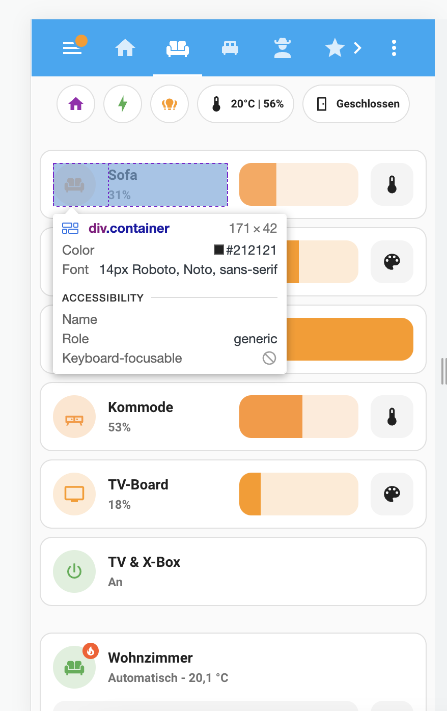
I am trying to figure out how to adjust the size of the light adjustment bars in the light card.
I think I’m wasting space, so I would like to have the bar to extend to the left, like I mocked in the screenshot.
(How) can I achieve that with card-mod? And, are there any good tutorials on how to get started with card-mod as a non-developer?
I figured it seems to be the div.container, but I don’t know how to write the card-mod code for that from scratch.
My card code:
square: false
columns: 1
type: grid
cards:
  - type: custom:mushroom-light-card
    entity: light.group_wz_stehlampe
    icon: mdi:sofa
    secondary_info: state
    show_brightness_control: true
    show_color_control: true
    name: Sofa
    icon_type: entity-picture
    tap_action:
      action: toggle
    collapsible_controls: false
    primary_info: name
    show_color_temp_control: true
    use_light_color: true
    layout: horizontal
  - type: custom:mushroom-light-card
    entity: light.sessel
    icon: mdi:sofa-single
    show_brightness_control: true
    use_light_color: false
    secondary_info: state
    show_color_control: true
    show_color_temp_control: false
    fill_container: true
    primary_info: name
    tap_action:
      action: toggle
    hold_action:
      action: more-info
    double_tap_action:
      action: none
    icon_type: entity-picture
    name: Sessel
    collapsible_controls: false
    layout: horizontal
  - type: custom:mushroom-light-card
    entity: light.esstisch
    icon: mdi:ceiling-light
    secondary_info: state
    show_brightness_control: true
    show_color_control: true
    name: Esstisch
    icon_type: entity-picture
    collapsible_controls: false
    tap_action:
      action: toggle
    primary_info: name
    use_light_color: true
    show_color_temp_control: true
    layout: horizontal
  - type: custom:mushroom-light-card
    entity: light.wohnzimmer_kommode
    icon: mdi:buffet
    name: Kommode
    show_brightness_control: true
    primary_info: name
    secondary_info: state
    show_color_temp_control: true
    use_light_color: true
    show_color_control: true
    layout: horizontal
  - type: custom:mushroom-light-card
    entity: light.group_tv_board
    icon: mdi:television
    name: TV-Board
    use_light_color: false
    show_brightness_control: true
    show_color_control: true
    show_color_temp_control: false
    layout: horizontal
  - type: custom:mushroom-entity-card
    entity: switch.steckdose_tv_x_box
    name: TV & X-Box
    icon: mdi:power
    icon_color: green
    secondary_info: state
    icon_type: entity-picture
    tap_action:
      action: toggle
    primary_info: name
    fill_container: true
    layout: horizontal
Thanks for any help!
e-raser
January 8, 2023, 9:57pm
4144
Please note this (styling the icon
Because of:
No one found a solution for this yet. If you do, would you mind sharing it here and there?
opened 03:10PM - 09 Dec 22 UTC
closed 09:12PM - 11 Feb 24 UTC
As title, the template-entity-row can not be set to inherit the new color scheme… s, see below for an example using the new binary-color which colors blue when on https://github.com/home-assistant/frontend/blob/3c8c1260b172cb2ef01328070e1c900b2cd3d4dc/src/resources/ha-style.ts#L145
in this case the top entity (unmodded, only needs `state_color: true`)
the bottom speaks for itself, the active is also set, but it takes
`paper-item-icon-active-color: gold` from the theme I set before the new color schemes were introduced.
```
- type: entities
state_color: true
entities:
- binary_sensor.ha_dev_update_available
- type: custom:template-entity-row
entity: binary_sensor.ha_dev_update_available
name: >
{% if states[config.entity] is not none %}
{{state_attr(config.entity,'friendly_name').split(': Update Available')[0]}}
{% else %} Initializing
{% endif %}
state: >
{% if states[config.entity] is not none %}
{{iif(states(config.entity) == 'on','Update available','Up to date')}}
{% else %} Waiting for state
{% endif %}
secondary: >
{% if states[config.entity] is not none %}
{% set id = states[config.entity].object_id.split('_update_available')[0] %}
{% if states['sensor.' + id + '_newest_version'] is not none %}
New: {{states('sensor.' + id + '_newest_version')}} -
{% endif %}Current:
{{states('sensor.' + id + '_version')}}
{% else %} Initializing
{% endif %}
active: >
{{is_state(config.entity,'on')}}
```
<img width="522" alt="Schermafbeelding 2022-12-09 om 16 09 51" src="https://user-images.githubusercontent.com/33354141/206732674-f086c20f-91f7-45aa-8e8d-c6efabf1f881.png">
taking out paper color from the theme, leaves us with:
<img width="508" alt="Schermafbeelding 2022-12-09 om 16 14 27" src="https://user-images.githubusercontent.com/33354141/206733695-18c45d21-1faf-43a8-a598-c884174d7e47.png">
even though the more info is correctly showing the blue:
<img width="560" alt="Schermafbeelding 2022-12-09 om 16 15 18" src="https://user-images.githubusercontent.com/33354141/206733789-7079ab6c-748f-415f-89eb-600acf704544.png">
to be 100% certain it isnt an issue with the config.entity var, I also tried
```
active: >
{{is_state('binary_sensor.ha_dev_update_available','on')}}
```
lastly, when taking out the full t-e-r config, and only leaving the auto-entities section
```
- type: custom:auto-entities
card:
type: entities
title: Binaries update available
card_mod:
class: class-header-margin
state_color: true
show_empty: false
filter:
include:
- entity_id: binary_sensor.*_update_available
state: 'on'
# options:
# type: custom:template-entity-row
# name: >
# {% if states[config.entity] is not none %}
# {{state_attr(config.entity,'friendly_name').split(': Update Available')[0]}}
# {% else %} Initializing
# {% endif %}
# state: >
# {% if states[config.entity] is not none %}
# {{iif(states(config.entity) == 'on','Update available','Up to date')}}
# {% else %} Waiting for state
# {% endif %}
# secondary: >
# {% if states[config.entity] is not none %}
# {% set id = states[config.entity].object_id.split('_update_available')[0] %}
# {% if states['sensor.' + id + '_newest_version'] is not none %}
# New: {{states('sensor.' + id + '_newest_version')}} -
# {% endif %}Current:
# {{states('sensor.' + id + '_version')}}
# {% else %} Initializing
# {% endif %}
# active: >
# {{is_state(config.entity,'on')}}
```
the blue is shown alright:
<img width="505" alt="Schermafbeelding 2022-12-09 om 16 23 31" src="https://user-images.githubusercontent.com/33354141/206735282-276ca73e-648b-46f4-bc99-e42e02781c42.png">
independent from the paper color. so it is the t-e-r preventing the inheritance of the new color scheme
btw, exchanging
```
# paper-item-icon-color: var(--primary-color)
state-icon-color: '#636B75'
```
doesnt make a difference, in this case the state-icon-color is used, and still not the supposed binary color
Yes, thank you, I know that this stopped working.
e-raser
January 8, 2023, 11:14pm
4146
I totally understand your frustration. There’ve been a lot of changes recently, especially to the UI. This basically renders many custom integrations useless (my use-case for custom:template-entity-row is now completely blocked by the HA 2022.12 changes), not even styling them is helpful. Really a bit frustrating
Maybe adding a “tested with HA Core 20YY.MM” for the examples would be an option in future.
I’m trying to use a Google font with this card-mod but I’m failing.
type: entity
entity: sensor.dev_display_text_sensor
name: ' '
card_mod:
  style: |
    ha-card {
      height: 100px;
      color: yellow;
      text-align: center
      font-size: 12px
      font-family: 'Zen Dots' ;
      background-color: blue;
      border: solid 1px var(--primary-color); }
          }
And I put this at the top of my Lovelace raw config file:
resources:
  - url: https://fonts.googleapis.com/css2?family=Zen+Dots
    type: css
I’m ultimately trying to get it to look like this without the "more info " icon. It also won’t center…
I’m sure it’s my css but any help appreciated!
EDIT: turns out Brave browser doesn’t support external fonts but Safari does:
Hi every CSS gurus,
Here’s my problem with mushroom-title-card. I’m unable to change the font-size and text color using card_mod. Please help, I tried different combinations of style on ‘div.header’, ‘h1’, … but cannot find a way to get ‘.title’ working.
Card-mod-helper is giving this code after the conversion of the js path: view>hui-view>grid-layout$#root>hui-grid-card:nth-child(1)$#root>mushroom-title-card$div>h1
Here’s the CSS from Chrome:
Thanks a lot!!!
Hey Guys,
I need help with my mushroom template card. I want to animate my icon AND change the size of the card. what am I doing wrong?
type: custom:mushroom-template-card
primary: ''
icon: |-
  {% if is_state('switch.kamin','on') -%}
    mdi:fireplace
  {%- else -%}
    mdi:fireplace-off
  {%- endif %}
icon_color: |-
  {% if is_state('switch.kamin','on') -%}
    orange
  {%- else -%}
    disabled
  {%- endif %}
layout: horizontal
entity: switch.kamin
card_mod:
  style: |
    :host {
     --mush-icon-size: 40px;
    }
    mushroom-shape-icon$: |
      ha-icon {
        {{'--icon-animation: fire 1500ms infinite;'if is_state('switch.kamin', 'on') }}
        transform-origin: 50% 85%;
      }
      @keyframes fire {
          0%, 19%, 23%, 39%, 43%, 49%, 53%, 69%, 73%, 89%, 93%, 100% { clip-path: polygon(0 0, 100% 0, 100% 100%, 0 100%); }
          20%, 40%, 50%, 70%, 90% { clip-path: polygon(0 0, 100% 0, 100% 100%, 65% 99%, 66% 49%, 52% 44%, 33% 48%, 33% 82%, 66% 82%, 69% 100%, 0 100%); }
      }
I found the problem.
type: custom:mushroom-template-card
primary: ''
icon: |-
  {% if is_state('switch.kamin','on') -%}
    mdi:fireplace
  {%- else -%}
    mdi:fireplace-off
  {%- endif %}
icon_color: |-
  {% if is_state('switch.kamin','on') -%}
    orange
  {%- else -%}
    disabled
  {%- endif %}
layout: horizontal
entity: switch.kamin
card_mod:
  style:
    .: |
     :host {
     --mush-icon-size: 70px;
     }
    mushroom-shape-icon$: |
      ha-icon {
        {{'--icon-animation: fire 1500ms infinite;'if is_state('switch.kamin', 'on') }}
        transform-origin: 50% 85%;
      }
      @keyframes fire {
          0%, 19%, 23%, 39%, 43%, 49%, 53%, 69%, 73%, 89%, 93%, 100% { clip-path: polygon(0 0, 100% 0, 100% 100%, 0 100%); }
          20%, 40%, 50%, 70%, 90% { clip-path: polygon(0 0, 100% 0, 100% 100%, 65% 99%, 66% 49%, 52% 44%, 33% 48%, 33% 82%, 66% 82%, 69% 100%, 0 100%); }
      }
gpolzer1
January 11, 2023, 2:28pm
4152
hello one question please can you also make a border with switch-checked-track-color
catchdave
January 12, 2023, 5:14pm
4153
@thomasloven : Question about the right way to enforce the height of the mini-graph-card. I get a warning from card-mod: “mod-card should NEVER be used with a card that already has a ha-card element, such as mini-graph-card”.
I tried doing it the normal style way, but to enforce the height of mini-graph card, it seems that the CSS height attribute has to be on the mini-graph-card element, which is above the ha-card element. Would love to know the right/best way to do have a smaller graph card (in height). This is what I currently have (it’s in a de-cluttering-template):
  small_mini_graph:
    card:
      type: custom:mod-card
      card_mod:
        style: |
          mini-graph-card { height: 128px; }
      card:
        type: custom:mini-graph-card
        upper_bound_template: '[[upper_template]]'
        entity: '[[sensor]]'
        entities:
          - entity: '[[sensor]]'
            color: '[[color]]'
        show:
          icon_adaptive_color: true
        height: 80
        font_size: 90
        style: |
          .states { padding-bottom: 0; }
          .header { padding-right: 8px; }

 I am applying this to an entities card inside a grid card.
 Instead, one should use
  What I could not fix so far, is the entity value being aligned at the bottom (because of the invisible original value space above) which is looking quite ugly

 I mean it is still working, so nevermind - my fault, wrong alarm.


