tommi32
July 3, 2023, 6:24am
4889
Hi there
type: custom:mod-card
card_mod:
  style:
    hui-horizontal-stack-card $: |
      hui-entity-card:nth-of-type(1) {
        flex-grow: 2 !important;
      }
      hui-entity-card:nth-of-type(2) {
        flex-grow: 1 !important;
      }
card:
  type: horizontal-stack
  cards:
    - type: entity
      entity: sun.sun
    - type: entity
      entity: sun.sun
It work well, but i want to use mini media player card with picture entity card
type: custom:mod-card
card_mod:
  style:
    hui-horizontal-stack-card $: |
      hui:picture-entity-card:nth-of-type(1) {
        flex-grow: 1 !important;
      }
      hui:mini-media-player-card:nth-of-type(2) {
        flex-grow: 2 !important;
      }
card:
  type: horizontal-stack
  cards:
    - type: picture-entity
      show_state: false
      show_name: false
      camera_view: auto
      entity: camera.stb_obyvacka_6
    - type: custom:mini-media-player
      name: STB Obývačka 2
      entity: media_player.stb_obyvacka_2
      artwork: material
      info: scroll
The cards are working, but with aspect 1/2 and 1/2. hui:picture-entity-card:nth-of-type(1) { hui:mini-media-player-card:nth-of-type(2) {
Can you give me some hints??
Without test. Is the element really here : instead of - (have a look in the dev tools of your browser). And secondly, why n-th of type 2 if you have only 1?
FuzzyB3ar
July 4, 2023, 8:56am
4891
Wizards of the HA, please assist me with my styles here. I cannot figure out what I am doing wrong.
Any advice?
type: picture-elements
image: local/pictures/GX Touch 50_HA12.png
card_mod:
style: |
@keyframes my-blink {
0% {opacity: 0;}
50% {opacity: 1;}
100% {opacity: 0;}
}
ha-card {
--paper-item-icon-grid-color-check: {% if states('sensor.victron_vebus_activein_l1_power_227') > "0" %} red {% else %} none {% endif %};
--paper-item-icon-gridIcon-color-check: {% if states('sensor.victron_vebus_activein_l1_power_227') > "0" %} white {% else %} red {% endif %};
--paper-item-icon-acloads-color-check: {% if states('sensor.victron_vebus_out_l1_power_227') > "0" %} blue {% else %} red {% endif %};
--paper-item-icon-acloadsIcon-color-check: {% if states('sensor.victron_vebus_out_l1_power_227') > 0 %} white {% else %} red {% endif %};
--paper-item-icon-battery-color-check: {% if states('sensor.victron_system_battery_power') > "0" %} blue {% else %} blue {% endif %};
--paper-item-icon-batteryIcon-color-check: {% if states('sensor.victron_system_battery_soc') > "60" %} white {% else %} white {% endif %};
--paper-item-icon-pv-color-check: {% if states('sensor.victron_system_dc_pv_power') > "0" %} orange {% else %} none {% endif %};
--paper-item-icon-pvIcon-color-check: {% if states('sensor.victron_system_dc_pv_power') > "0" %} white {% else %} red {% endif %};
--paper-item-icon-vebus--color-check: {% if states('sensor.victron_vebus_state_246') > "0" %} yellow {% else %} red {% endif %};
}
elements:
- type: state-label
name: Red Grid Block - Grid Name
entity: sensor.blank_blank
prefix: GRID
style:
top: 2%
left: 11%
color: rgb(255,255,255)
font-family: Arial
font-size: 130%
font-weight: bold
transform: rotate(0deg)
tap_action:
action: none
- type: state-label
name: Red Grid Block - Eskom Grid Watt
entity: sensor.victron_vebus_activein_l1_power_227
style:
top: 20%
left: 19%
font-size: 130%
font-weight: bold
tap_action:
action: none
- type: state-label
name: Red Grid Block - Loadshedding Name
entity: sensor.blank_blank
prefix: Stage
style:
top: 22%
left: 15%
color: rgb(255,255,255)
font-family: Arial
font-size: 90%
font-weight: bold
transform: rotate(0deg)
tap_action:
action: none
- type: state-label
name: Red Grid Block - Load Shedding
entity: sensor.load_shedding_stage_eskom
style:
top: 33.75%
left: 21%
font-size: 75%
font-weight: bold
tap_action:
action: none
- type: state-icon
name: Red Grid Block - Icon
icon: mdi:transmission-tower
entity: sensor.victron_vebus_activein_l1_power_227
style:
left: 7%
top: 30%
transform: translate(-50%, -50%) scale(2, 2)
opacity: 0.6
'--paper-item-icon-color': var(--paper-item-icon-gridIcon-color-check)
tap_action:
action: none
- type: state-icon
name: Red Grid Block - Line
icon: mdi:lightning-bolt1
entity: sensor.victron_vebus_activein_l1_power_227
style:
top: 22.98%
left: 35.1%
width: 6.6%
height: 4px
background-color: var(--paper-item-icon-grid-color-check)
transform: translate(-50%, -50%)
animation: my-blink 2s linear infinite
animation-fill-mode: both
- type: icon
name: Red Grid Block - Dot on Grid
icon: mdi:circle
style:
top: 19.4%
left: 28.5%
color: var(--paper-item-icon-grid-color-check)
transform: scale(0.5)
animation: my-blink 2s linear infinite
animation-fill-mode: both
- type: icon
name: Red Grid Block - Dot on Victron
icon: mdi:circle
style:
top: 19.4%
left: 36.9%
color: var(--paper-item-icon-grid-color-check)
transform: scale(0.5)
animation: my-blink 2s linear infinite
animation-fill-mode: both
- type: state-label
name: Victron Block - Vebus State
entity: sensor.blank_blank
prefix: Inverter
style:
top: 7%
left: 50%
font-size: 130%
font-weight: bold
tap_action:
action: none
- type: state-icon
name: Victron Block - Icon
icon: mdi:flash-triangle
entity: sensor.grid_power
style:
left: 42%
top: 37%
transform: translate(-50%, -50%) scale(1.5, 1.5)
'--paper-item-icon-color': var(--paper-item-icon-vebus--color-check)
tap_action:
action: none
- type: state-label
name: Green AC Block - Grid Name
entity: sensor.blank_blank
prefix: AC Loads
style:
top: 2%
left: 72%
color: rgb(255,255,255)
font-family: Arial
font-size: 130%
font-weight: bold
transform: rotate(0deg)
tap_action:
action: none
- type: state-label
name: Green AC Block - AC Loads
entity: sensor.victron_vebus_out_l1_power_227
style:
top: 20%
left: 82%
font-size: 130%
font-weight: bold
tap_action:
action: none
- type: state-icon
name: Green AC Block - Icon
icon: mdi:home-lightning-bolt
entity: sensor.victron_vebus_out_l1_power_227
style:
left: 92%
top: 31%
transform: translate(-50%, -50%) scale(2, 2)
opacity: 0.6
'--paper-item-icon-color': var(--paper-item-icon-acloadsIcon-color-check)
tap_action:
action: none
- type: state-icon
name: Green AC Block - Grid Line
icon: mdi:arrow-right1
entity: sensor.victron_vebus_out_l1_power_227
style:
top: 22.96%
left: 64.66%
width: 6.8%
height: 4px
background-color: var(--paper-item-icon-acloads-color-check)
transform: translate(-50%, -50%)
animation: my-blink 2s linear infinite
animation-fill-mode: both
- type: icon
name: Green AC Block - Dot on Victron
icon: mdi:circle
style:
top: 19.3%
left: 57.8%
color: var(--paper-item-icon-acloads-color-check)
transform: scale(0.5)
animation: my-blink 2s linear infinite
animation-fill-mode: both
- type: icon
name: Green AC Block - Dot on AC Loads
icon: mdi:circle
style:
top: 19.3%
left: 66.5%
color: var(--paper-item-icon-acloads-color-check)
transform: scale(0.5)
animation: my-blink 2s linear infinite
animation-fill-mode: both
- type: state-label
name: Blue Battery Block - Battery SOC
entity: sensor.blank_blank
prefix: Battery
style:
top: 50%
left: 18%
font-size: 130%
font-weight: bold
tap_action:
action: none
- type: state-label
name: Blue Battery Block - Battery SOC
entity: sensor.victron_system_battery_soc
style:
top: 60%
left: 18%
font-size: 130%
font-weight: bold
tap_action:
action: none
- type: state-label
name: Blue Battery Block - Battery Power
entity: sensor.victron_system_battery_power
style:
top: 68%
left: 18%
font-size: 90%
font-weight: bold
tap_action:
action: none
- type: state-label
name: Blue Battery Block - Battery Voltage
entity: sensor.victron_battery_voltage
style:
top: 73%
left: 25%
font-size: 80%
font-weight: bold
tap_action:
action: none
- type: state-label
name: Blue Battery Block - Battery Current
entity: sensor.victron_battery_current
style:
top: 78%
left: 25%
font-size: 80%
font-weight: bold
tap_action:
action: none
- type: state-icon
name: Blue Battery Block - Icon
icon: mdi:car-battery
entity: sensor.victron_vebus_out_l1_power_227
style:
left: 8%
top: 75%
transform: translate(-50%, -50%) scale(2, 2)
opacity: 0.6
'--paper-item-icon-color': var(--paper-item-icon-batteryIcon-color-check)
tap_action:
action: none
- type: state-icon
name: Blue Battery Block - Battery V-Line
icon: mdi:lightning-bol
entity: sensor.victron_system_battery_power
style:
top: 52.5%
left: 50.1%
width: 1.2%
height: 70px
background-color: var(--paper-item-icon-battery-color-check)
transform: translate(-50%, -50%)
animation: my-blink 2s infinite
animation-fill-mode: both
- type: icon
name: Blue Battery Block - Dot on Victron V-Line
icon: mdi:circle
style:
top: 37%
left: 47.63%
color: var(--paper-item-icon-battery-color-check)
transform: scale(0.5)
animation: my-blink 2s linear infinite
animation-fill-mode: both
- type: state-icon
name: Blue Battery Block - Battery H-Line
icon: mdi:lightning-bolt1
entity: sensor.victron_system_battery_power
style:
top: 66.9%
left: 38.6%
width: 15%
height: 4px
background-color: var(--paper-item-icon-battery-color-check)
transform: translate(-50%, -50%)
animation: my-blink 2s linear infinite
animation-fill-mode: both
- type: icon
name: Blue Battery Block - Dot on Battery
icon: mdi:circle
style:
top: 63.3%
left: 27.8%
color: var(--paper-item-icon-battery-color-check)
transform: scale(0.5)
animation: my-blink 2s linear infinite
animation-fill-mode: both
- type: state-label
name: Blue Battery Block - Battery Hours Left
entity: sensor.seconds_to_hours
style:
top: 78%
left: 50%
font-size: 180%
font-weight: bold
tap_action:
action: none
- type: state-label
name: Yellow PV Block - Grid Name
entity: sensor.blank_blank
prefix: PV
style:
top: 47%
left: 79%
color: rgb(255,255,255)
font-family: Arial
font-size: 130%
font-weight: bold
transform: rotate(0deg)
tap_action:
action: none
- type: state-label
name: Yellow PV Block - PV Main
entity: sensor.victron_system_dc_pv_power
style:
top: 61%
left: 84%
font-size: 110%
font-weight: bold
tap_action:
action: none
- type: state-label
name: Yellow PV Block - Mppt 2
entity: sensor.solar_yield_today
style:
top: 73%
left: 81%
font-size: 80%
font-weight: bold
tap_action:
action: none
- type: state-label
name: Yellow PV Block - Mppt 3
entity: sensor.solar_max_power_today
style:
top: 79%
left: 81%
font-size: 80%
font-weight: bold
tap_action:
action: none
- type: state-icon
name: Yellow PV Block - Icon
icon: mdi:solar-power-variant
entity: sensor.victron_system_dc_pv_power
style:
left: 92%
top: 74%
transform: translate(-50%, -50%) scale(2, 2)
opacity: 0.6
'--paper-item-icon-color': var(--paper-item-icon-pvIcon-color-check)
tap_action:
action: none
- type: state-icon
name: Yellow PV Block - PV Line
icon: mdi:lightning-bolt1
entity: sensor.victron_system_dc_pv_power
style:
top: 66.75%
left: 61.3%
width: 15.2%
height: 4px
background-color: var(--paper-item-icon-pv-color-check)
transform: translate(-50%, -50%)
animation: my-blink 2s infinite
animation-fill-mode: both
- type: icon
name: Yellow PV Block - Dot on PV
icon: mdi:circle
style:
top: 63.1%
left: 67.3%
color: var(--paper-item-icon-pv-color-check)
transform: scale(0.5)
animation: my-blink 2s linear infinite
animation-fill-mode: both
- type: state-label
name: Grey Block - Name Next Loadshedding
entity: sensor.blank_blank
prefix: Next Loadshedding
style:
top: 83%
left: 37%
color: white
font-family: Arial
font-size: 77%
font-weight: bold
transform: rotate(0deg)
tap_action:
action: none
- type: state-label
name: Grey Block - Next Loadshedding
entity: calendar.load_shedding_forecast
attribute: start_time
style:
top: 94%
left: 50%
transform: translate(-50%, -50%)
font-size: 15px
font-weight: bold
tap_action:
action: none
- type: service-button
name: Grey Block - Charge Batteries Button
title: Charge
style:
top: 92%
left: 16%
'--mdc-theme-primary': blue
service: switch.toggle
service_data:
entity_id: switch.keep_batteries_charged

Here 440 lines of my code, now sort it out.
P.S. If you want people to help you - simplify this. Provide a SHORT (< 20-30 line) code snippet which does not work, + correct your screenshot.
2 Likes
MrSir
July 10, 2023, 11:19am
4894
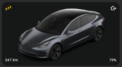
Hi all, I’ve been scrolling this thread for hours and after much trial and error can’t seem to accomplish what I’m out to do.state-icon within a picture-elements card. I’d like to customise the colour of the icon depending on its state. I want to use some custom colours, and not the ‘dashboard-wide’ colour scheme that HA is trying to force me into.
This is my base card (sorry about the non-reproducible image…)
  - type: picture-elements
    image: /local/model_3_grey_wide.png
    elements:
        - type: state-icon
          entity: binary_sensor.asleep
          icon: mdi:sleep
          style:
            top: 1%
            left: 1%
            transform: none
It looks like (using the inspector) that the var(--state-binary_sensor-active-color); is responsible for the colour, but I’d like to change it to an arbitrary value (e.g. a hex code).
My attempts at changing the colour have all ended in failure. Any helpful hints appreciated!
alexeiw123
July 13, 2023, 12:34am
4895
I’ve got a mushroom light card where I’m changing the icon using card-mod based on a template
card_mod:
  style: |
    :host {
      --card-mod-icon:
        {% if states('binary_sensor.range_motion_occupancy') == 'on' %} mdi:motion-sensor
        {% else %} mdi:motion-sensor-off
        {% endif %};
      --card-mod-icon-color:
        {% if states('binary_sensor.range_motion_occupancy') == 'on' %} orange
        {% else %} lightgrey
        {% endif %};
    }
Below shows how I’ve got this with individual cards and what I’m trying to achieve on one card.
motion detected, light on
motion cleared, light on, timer running
motion cleared, light off
My question is, how do I get card-mod to only change the icon on the left, and not the one on the right as well (which is either for colour temperature or brightness)
2 Likes
boardlord1
July 13, 2023, 9:53am
4896
A little help wanted
Code:
type: custom:mini-graph-card
name: Bedroom
entities:
  - entity: sensor.average_mi_bedroom_temperature
  - entity: sensor.mi_bedroom_fce8_humidity
    show_state: true
    show_graph: false
line_color: dodgerblue
card_mod:
  style: |
    ha-card {
    .states.flex .state .state__value.ellipsis {
      font-size: 21px;
      align-self: center;
    }
I’d like bring the two values closer together (centre-aligned) so that they’ll fit on a mobile dashboard as well. Thanks in advance for your help!
Do you have a screenshot where it is not fitting? I currently don’t get it, because the left is always left aligned and the right is right aligned and it is so close together as it is needed per size.
You have to assign the color to the item you want to change and not change the variable wich is only used in both places. As I’m not using mushroom, I cannot point you to the DOM elements, but my hint is right though. Not change --card-mod-icon-color in :host, but color: of the item you want to have another color.
boardlord1
July 13, 2023, 1:43pm
4899
Here’s an example. The alignment is needed when displayed in the mobile app. If I didn’t pull them closer to each other, I’d have to reduce the font size very much…
Can you show, what you have tried? As the direct assignment is already working?
- type: picture-elements
    image: /local/model_3_grey_wide.png
    elements:
        - type: state-icon
          entity: binary_sensor.asleep
          icon: mdi:sleep
          style:
            top: 1%
            left: 1%
            transform: none
          card_mod:
            style: |
              state-badge { color: red; }
You can remove the margin-left of the second value:
card_mod:
  style: |
    .states.flex .state .state__value.ellipsis {
        font-size: 21px;
        align-self: center;
    }
    .states--secondary {
      margin-left: 0px !important;
    }
And BTW, there was a {} problem in your css above, too.
1 Like
MrSir
July 13, 2023, 9:32pm
4902
Thanks for the reply!
Unfortunately that code isn’t working… hmm… has there been a super-recent change to card mod or HA that would influence this? I’m running HA 2023.6.3, and the card_mod release from 4th of April on github.
I don’t have the exact code I’ve tried, but I’ve tried modifying var(--state-binary_sensor-active-color);, various --paper-icon-XXXX options, various :host {} options, and also some ha-card {} options.
Any ideas? What versions are you running?
alexeiw123
July 13, 2023, 9:48pm
4903
Thankyou, without me knowing how to identify those elements, I’ll take the question over to the mushroom topic.
This is, because every sensor class can build the DOM and color it in another way. Try this, because it is one level deeper and most probably more secure.
  - type: state-icon
    entity: sun.sun
    icon: mdi:sleep
    style:
      top: 1%
      left: 1%
      transform: none
    card_mod:
      style:
        state-badge:
          $: |
            ha-state-icon { color: red !important; }
And as for alexeiw123, just try to avoid manipulating the variables, which are used and set the colors directly to the element.
MrSir
July 14, 2023, 11:19am
4905
Thank you!
For anyone else in my boat, this solution works for non-conditional state-icon within picture-elements.
Conditional ones, however, don’t seem to work. I’ve spent an hour reading the underlying CSS/html but I don’t seem to understand why they should be any different
Thanks again
arganto
July 14, 2023, 12:27pm
4906
MrSir:
For anyone else in my boat, this solution works for non-conditional state-icon within picture-elements.
Conditional ones, however, don’t seem to work.
Where did you wrote before, that the requirement is a conditional one?
Anyway. Try invest you hours in looking, where the difference is and adjust then the examples accordingly. Here you can directly see, that with a conditional element, the element is just one level deeper.
  - type: conditional
    conditions:
      - entity: sun.sun
        state: above_horizon
    elements:
      - type: state-icon
        entity: sun.sun
        icon: mdi:sleep
        style:
          top: 1%
          left: 1%
          transform: none
    card_mod:
      style:
        hui-state-icon-element:
          $:
            state-badge:
              $: |
                ha-state-icon { color: red !important; }
Above with condition, below without
1 Like
Any chance of some help here.
I’m trying to add a background colour to this column on the left. any idea how i would code card-mod for this?
Put a mod-card above/around the stack card and mod from there. the ha stack-card don’t have an ha-card element and can’t be modded without mod-card.
Can I not just access the hui-vertical-stack-card selector (highlighted area in the image)? The css in lovelace is baffling.
I’m reluctant to wrap the whole thing in a mod card as this breaks the GUI editing doesn’t it?


 I’ve a mini-graph card that displays both temperature (with graph) and humidity (without graph), with reduced font size:


