Many thanks!!
1 Like
Thermostat Card: Disable More-Info and Slider
  - type: thermostat
    entity: climate.my_thermostat
    card_mod:
      style:
        .: |
          .more-info {
            width: 0;
          }
        ha-state-control-climate-temperature$:
          ha-control-circular-slider$: |
            g#interaction {
              display: none;
            }
Before:
(“hand” style pointer indicating slider grab, and “more info” button available)

After:
(“arrow” style pointer indicating no slider grab, and “more info” button not present)

The plus and minus buttons still function with this configuration.
Enjoy
5 Likes
So at this update of card-mod I actually managed to read the memo!
And this time I did see the performance improvement recomondation to install as ‘frontend module’ 
so I added this:
frontend:
  extra_module_url:
    - /hacsfiles/lovelace-card-mod/card-mod.js
Running both Yaml- and gui-dashboard
lovelace:
  mode: storage
card-mod installed via HACS

have/had working configs before adding the frontend/extra-module, ,so how do I actually verify that my new setting works ??
- it seems to be quicker, but that might just be the placebo-effect that is tricking me (again?) ?
using Chrome on laptop, CompanionApp on Android and CATT to NestHub
#doveryay, no proveryay
Did you crop the images wrong? Both look the same to me. I am guessing you removed the info underneath the + and -, judging from your code.
Still have not figured out how to add information to the state in the slider-entity-row. Anybody have any idea what I can try?
Information is there. Maybe the state does not have enough room to show the info and I just thought I placed it incorrectly? No idea… weird and annoying not to get it to work -.-

or if overflow visible

but of course this then does not work properly in mobile view where width is limited
I hope that somebody can help me with this:
I would like to have the three dots in this picture, the icon, smaller.

Somehow I can’t find out how to make it smaller. This is the currect code of the todo list: (yes, it’s a mess, but it works)
                - type: todo-list
                  entity: todo.albert_heijn
                  card_mod:
                    style:
                      ha-textfield:
                        $: |
                          .mdc-text-field__input {
                            color: white !important;
                          }
                          .mdc-text-field {
                            --mdc-text-field-fill-color: transparent;
                            height: auto !important;
                            --text-field-padding: 0px 0px 5px 5px;
                          }
                          .mdc-line-ripple::before,
                          .mdc-line-ripple::after {
                            border-bottom-style: none !important;
                          }
                      .: |
                        ha-card {
                          --mdc-typography-subtitle1-font-size: 11px;
                          #background: #00A0E2;
                          background: url('/local/images/background_image/albert_heijn.png');
                          background-size: 100%;
                          box-shadow: none;
                          height: 242px !important;
                          width: 100%;
                          max-height: 242px; /* Set a maximum height for the card */
                          overflow-y: auto; /* Enable vertical scrolling if content exceeds max height */

                          @media (max-width: 767px) {
                          height: 180px; /* Adjusted height for mobile */
                          max-height: 180px; /* Set a maximum height for the card */
                          }

                          @media only screen and (min-device-width: 360px) and (max-device-width: 1440px) and (-webkit-min-device-pixel-ratio: 3) {
                          height: 205px;
                          max-height: 205px;
                          }
                        }
                        :host {
                          --mdc-checkbox-ripple-size: 20px;
                          #--mdc-checkbox-state-layer-size: 5px;
                          --mdc-text-field-idle-line-color: grey;
                          --mdc-text-field-hover-line-color: red;
                          --mdc-theme-primary: grey;
                        }
                        ha-checkbox {
                          padding-left: 12px;
                        }
                        ::-webkit-scrollbar {
                          display: none;
                        }
                        ha-icon-button.reorderButton,
                        ha-icon-button.addButton {
                          display: none !important;
                        }
                        .checked {
                          margin: 0px 0px !important;
                          font-size: 11px;
                        }
                        .checked span {
                          visibility: hidden;
                          position: relative;
                        }
                        .checked span:after {
                          visibility: visible;
                          position: absolute;
                          top: 0;
                          left: 0;
                          content: "Afgevinkt"
                        }
                        .divider {
                          display: none;
                        }
                        .header {
                          height: 10px;
                          font-size: 11px;
                          padding-left: 50px;
                          margin-top: 0px;
                        }
                        .header span {
                          visibility: hidden;
                        }
                        ha-check-list-item {
                          min-height: 15px !important;
                        }
                        div.header {
                          margin-top: 0px;
                        }

Hi Everyone,
I want to style the default thermostat, but I can’t figure out how. I tried tweaking the piece of code @Chriswak used for disabling the slider grab, but no luck.
If someone can point me in the right direction, for example, changing the slider color or removing the state (ex. idle) that would be great!
I’m trying to set the font size in a custom:bignumber-card but can’t seem to figure it out.
I’m able to change the font size in a standard Entity card using the following card_mod code but using the same on the bignumber card doesn’t work.
type: entity
entity: sensor.textpressuretrend
state_color: true
icon: none
card_mod:
  style: |
    .info .value {
      font-size: 24px;
    }
I’m guessing the “.info .value” is the problem as it’s probably not pointing to the correct element within the bignumber card but I don’t know how to find the correct element.
What I’m attempting to do is reduce the font size but keep the card size the same as some others that are grouped together. One of the cards displays some text that sometimes has two lines so the size of the card grows to fit the text.


I’ve also tried using a standard Entity card by hiding the Header but then the text isn’t center aligned within the card and I’ve not been able to figure how to do that either.

Hi All, After a recent HA update as well as card_mod update, my dashboard has some layout issues. Spaces where there was none and backgrounds on instead of off… any direction on where to start would be very much appreciated.
Before (ignore red line around tide times):

After:

1 Like
I have same issues with card mod after updated 
Without knowing the code, no one will be able to help. I expect missing card_mod lines according to the breaking changes.
@EdDickens Try messing with these card_mod: settings
  - type: custom:bignumber-card
    entity: sensor.basement_sensor
    state_color: true
    icon: none
    card_mod:
      style: |
        ha-card {
          --base-unit: 20px;
          padding: calc(var(--base-unit)*2) calc(var(--base-unit)*1.0);
           }
Can someone help me out with this question?
I initially started to ask this question on Discord but after a looooong time trying, I finally solved it myself.
Maybe someone else would like something like this, so here is the quesion:
Summary
I know I should know this, but I am still getting it wrong.
I have two style mods which work separately but my syntax for joining them is incorrect.
        card_mod:
          style:
            hui-generic-entity-row $: |
              .info.text-content {
                overflow: visible;
                margin-left: 0px;
                margin-right: 0px;
              }
and
        card_mod:
          style: |
            .state::after {
              content: "your string here";
              margin-right: 10px;
              color: red;
            }
- But not sure how to join, because just pasting underneath will result in a broken card.
Adding $: | did not fix it either
        card_mod:
          style:
            hui-generic-entity-row $: |
              .info.text-content {
                overflow: visible;
                margin-left: 0px;
                margin-right: 0px;
              }
            $: |
              .state::after {
                content: "your string here";
                margin-right: 10px;
                color: red;
              }
This works for the state but breaks the hui-generic-entitiy-row
        card_mod:
          style: >-
            hui-generic-entity-row $: |
              .info.text-content {
                overflow: visible;
                margin-left: 0px;
                margin-right: 0px;
              }
            .state::after {
              content: "your string here";
              margin-right: 10px;
              color: red;
            }
Does anybody know how to join the two correctly? Is it a problem with my usage of $: | or >- or something else?
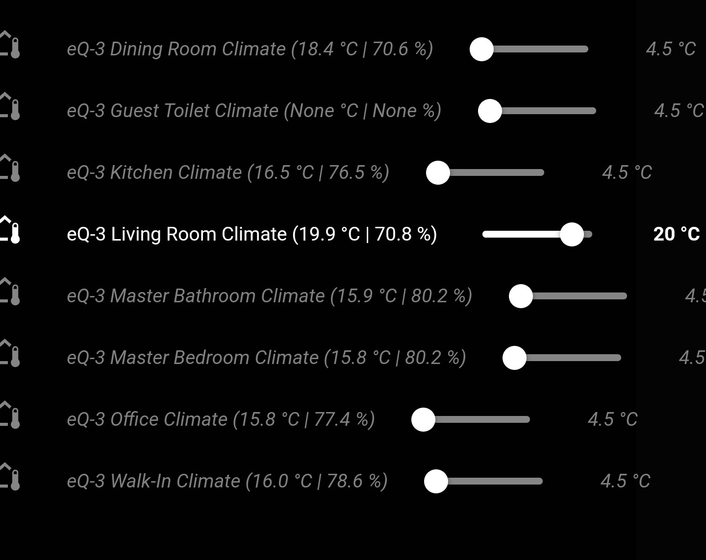
The solution is
        name: ' '
        type: custom:slider-entity-row
        card_mod:
          style:
            .: |
              .state {
                white-space: nowrap;
                display: inline-block;
                color: green;
              }
              .state::after {
                content: {% if state_attr(config.entity,'current_temperature') != none %} "({{state_attr(config.entity,'current_temperature')}} °C | {{state_attr(config.entity,'current_humidity')}} % | {{states(config.entity.replace('climate.', 'sensor.').replace('_climate', '_valve'))}} %)"{% endif %};
                margin-right: 10px;
                color: red;
              }
            hui-generic-entity-row $: |
              .info.text-content {
                overflow: visible;
                margin-left: 0px;
                margin-right: 0px;
              }
              .text-content::before {
                content: "{{state_attr(config.entity,'friendly_name').replace('eQ-3', '').replace(' Climate', '')}}";
                color: magenta
              }
              .text-content::after {
                content: {% if state_attr(config.entity,'current_temperature') != none %} "({{state_attr(config.entity,'current_temperature')}} °C | {{state_attr(config.entity,'current_humidity')}} % | {{states(config.entity.replace('climate.', 'sensor.').replace('_climate', '_valve'))}} %)"{% endif %};
                font-size: 0.8em;
                #vertical-align: sub;
                color: yellow;
              }
Which allows you to add all kinds of information.
I colored the different parts for you. Obviously it looks awfull with the colors. Plus of course use either the text-content or the state.
If you want to use the text-content I would recommend setting name: ' ' (notice the space, otherwise it will not do anything).

P.S.: Card is inside entities card and in my case inside auto-entities.
EDIT:
I ended up doing this (for now), which shows the current temperature behind the room name and the current valve position of the thermostat behind the target temperature.

Next todo would be to somehow make the name, the slider and the state a defined width. Mainly so the slider and state are all aligned, but I have not started on that yet.
If anybody knows how to achieve this, then I would appreciate the mod
1 Like
Thanks.
Looks like this is going to work. I just need to figure out the correct ratio between
–base-unit and height to get the correct font size and keep it centered.

Maybe use em as unit instead of px? I find it useful because pixels are a bit less practical for mobile phones, tablets etc.
In my example above I used em and small value difference make nice (and consistent) visual changes.
Hello.
I am trying to buld a card for my Nintendo Switch, and I wanted to show, in the background, the image of the last game played, dimmed and in black and white. I almost did this, but I can’t mod the image without modding the text and icons also…
What I got:
type: custom:vertical-stack-in-card
cards:
  - type: entities
    entities:
      - entity: binary_sensor.ping_nintendo_switch_1
      - entity: sensor.nintendo_switch_1_last_user
        name: Utilizador
      - entity: sensor.nintendo_switch_1_last_used_app
        name: Aplicação
      - entity: switch.alarms_enabled_today
      - entity: switch.suspend_software_limit
      - entity: time.play_time_limit
      - entity: sensor.used_screen_time
    title: 'Switch #1'
    show_header_toggle: false
    state_color: true
    card_mod:
      style: |
        ha-card {
          background:
            {%- if states('binary_sensor.ping_nintendo_switch_1') == 'off' -%}
              url('{{ (state_attr('sensor.used_screen_time','daily')[0].playedApps|last).imageUri.medium }}') no-repeat center;
            {%- else -%}
              none;
            {%- endif -%}
          background-size: cover;
        };
  - type: custom:auto-entities
    show_empty: false
    filter:
      include:
        - entity_id: switch.*_whitelisted
      exclude:
        - state: unavailable
    sort:
      method: name
      numeric: true
      reverse: false
    card:
      type: entities
      card_mod:
        style: |
          ha-card {
            border: 0px !important;
            background: none !important;
          }

If I add:
...
          background-size: cover;
          filter: grayscale(1) opacity(0.4);
        };
...
i also dim the color of the icons and opacity of everything:

- If I use
background-image:instead ofbackground:, I get nothing background-blend-mode:has no effect, so not an option in this approach…
How can I do this?
Thanks in advance!
type: thermostat
entity: climate.living_room_thermostat
card_mod:
  style: |
    :host {
      --state-climate-heat-color: pink;
    }

1 Like
Sorry to say but this breaking change/deprecation has broken more things in my UI than I care to admit.
Some of it is because some of the code snippets in the earlier parts of the thread were “old school” formatting which is where I “cut and pasted” to achieve my outcome.
Now its time to fix all of this, Im encountering a “lack of examples” to be able to resurrect my UI.
Can anyone help me with fixing this?
- type: markdown
  content: <h3>{{states("input_text.atextname") }} </h3>
  style: |
    ha-card {
      border: none !important;
      background: none !important;
      box-shadow: none !important;
      margin: -20px 0px 0px 0px  !important;
    }
I have tried the bleeding obvious to no avail and cant find any examples to achieve a markdown card that is transparent, with no border and no drop shadow,
 - type: markdown
   content: <h3>{{states("input_text.atextname") }} </h3>
   card-mod:
     style: |
       ha-card {
         border: none !important;
         background: none !important;
         box-shadow: none !important;
         margin: -20px 0px 0px 0px  !important;
       }
Please bear with me, its not like I havent already wasted 3hrs on the forum search trying to find the solution for a simple markdown card, so Id be really grateful for any links/pointers/examples
Thanks so much
card_mod:
Underscore, not hyphen
1 Like