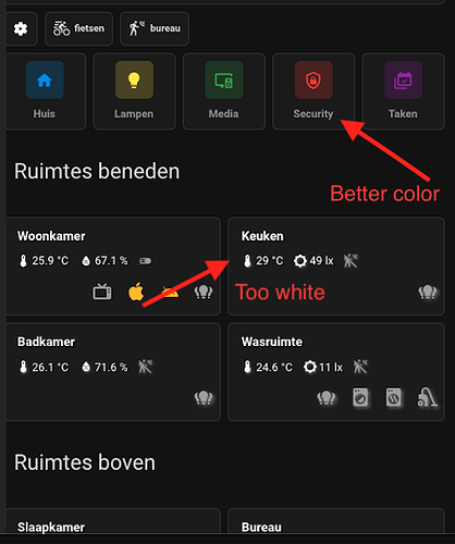
Can are you share code of card Ruimtes beneden
Thanks
Please post your code as a start.
That’s a big help. Can this be combined with the card mod code that @Chriswak kindly provided above, for removing the more-info and disabling the slider control? If so, what is the correct syntax - would it be this:
card_mod:
  style:
    .: |
      .more-info {
        width: 0 !important;
      }
    ha-state-control-climate-temperature$:
      ha-control-circular-slider$: |
        g#interaction {
          display: none !important;
        }
    ":host":
      --state-climate-heat-color: pink;
I’ve tried using that, but the heat color is not applying for me, so wondering if the syntax is incorrect, or if the circular slider code is preventing the heat color from applying?
I can get the heat-color style to apply by itself, but not combined with the other code.
type: thermostat
entity: climate.living_room_thermostat
card_mod:
  style: |
    :host {
      --state-climate-heat-color: purple;
    }
    .more-info {
      width: 0;
    }
    ha-state-control-climate-temperature$:
      ha-control-circular-slider$: |
        g#interaction {
          display: none;
        }
When I try to download card-mod with Hacs it getd in a loop and not download.
Hello Ildar,
I tried using the scale slider with a pdf, but for some reason the iframe never shows any pdf content.
Have you/has anybody ever tested this with pdfs? jpg seem to work.
No, never. (
I forgot to mention that padding: calc(var(--base-unit)*2) calc(var(--base-unit)*1.0); is the calculation the javascript is using, but you can overide it multiple ways. You always can break apart padding: with
 padding-top:
 padding-bottom:
 padding-left:
 padding-right:
I didn’t mess with align commands, but they may help as well.
Okay, first of all, thanks for your response. That works fine. But… I don’t understand how it works. I want to hide the label and buttons but keep the big temperature.
I checked the documentation and also the card-mod helper, but I just can’t figure out how it works.
The DOM-path is ha-state-control-climate-temperature #shadow-root div.container.lg div.info p.label but how can I translate it so card-mod understands that I want to change that?
If you want to know how card-mod works, you have to look at the documentation first and then start with the css tutorials that the author refers to in the documentation. ![]()
English is not my native language so maybe I asked my question in the wrong way.
I know basically how card-mod and CSS work. The issue I have is that I can’t figure out (even with the documentation) how I can translate the DOM-path into the CSS.
Maybe that’s a part of the documentation or a part about how CSS works which I can’t seem the understand, but that is why I asked the question. If someone could show me how I could change the label in that DOM-path I mentioned earlier, I would have a good example how it works.
Untested, but basically #shadow-root is represented by the $:
card_mod:
  style:
    ha-state-control-climate-temperature $:
	  div.container.lg div.info: |
	    p.label {
          <CSS config here>
	    }
The card developer recommends starting a new line after each #shadow-root. Some people leave the space out before the $ - I tend to leave it in to make the code more readable. It makes no practical difference.
… in case if it is not stable otherwise.
Perhaps you will better understand, when you writ it this way
ha-state-control-climate-temperature:
  $:
    ha-control-circular-slider:
      $: |
        g#interaction {
          display: none;
        }
with the elements, classes and ids you dig deeper and if you are seeing a shadow root element, dig deeper with $
So if you compare this with the above, you will see only one shadow root and you can try (without test, so as a starting point).
ha-state-control-climate-temperature:
  $:
    div.container.lg div.info p.label {
      color: red !important
    }
or just (if unique or every label class should be styled)
ha-state-control-climate-temperature:
  $:
    .label {
      color: red !important
    }
Aha! Now I got it. I noticed the $ for the #shadow-root but couldn’t figure out how to go further with those divs. Now I do, thank you for explaining!
@arganto also thank you for explaining it! Much appreciated!
One gotcha for targeting p.label here in thermostat is that this modifies the label above and also below the big number, as shown here:

To prevent changing both you could instead specify (example) p.label:nth-of-type(2) to modify only the second (bottom) one:

I use a lot of theme classes, and find this format to work the most consistently when used in conjunction with these. It’s only a few extra lines, so I reckon why not start with the most stable configuration anyway?
Probably to avoid creation of not not needed card-mod elements.
Well, I am from a “write an optimized C code” generation.
Only few extra lines in yaml, but multiple ingestions in your html. So a lot of unnecessary ingestions, css styles, loading times, traffic, etc. in your DOMs and pages.
If this is not important for you, of course you can always use the most stable config, but if you want to limit code, you can/should use the more granular way.
I guess what’s most important to me in the end is that my pages display properly first time without me needing to use the ‘Refresh’ menu item.
Just for clarification, doesn’t your previously posted example unnecessarily inject html at three levels: by ‘more granular’, would you mean this? (No idea if it works - untested)
ha-state-control-climate-temperature $ div.container.lg div.info: |
  p.label:nth-of-type(2) {
    color: red !important;
  }
(with Chriswak’s gotcha added)
