I have already searched in the community and read the threads below but still couldn’t make it work hence hope somebody with css expertise can give me a hand (must admin styling is not my strength lol).
My goal is to fix the width of the HA sidebar when it’s expanded. The reason behind is that I’d like to have a good full screen display of the expanded sidebar with a picture element card with no space or scrollbar, and I just need to make the default width a bit narrower to fit all content on iPad.
I can see in developer tool that css styling is injected to the shadowroot of ha-sidebar element, however the width takes no effect. I have also tried a few other alternatives based on some examples I found here:
You will not achieve that with card-mod because you need to add the style in the home-assistant-main element, and this element cannot be selected with card-mod.
You need to add a style element with this code inside the shadowRoot of the home-assistant-main element:
:host {
    --mdc-drawer-width: 150px !important; /* add the size that you want */
}
You can do that with some custom JavaScript module.
Here is another method using custom:button-card as a Javascript host
This will inject card_mod itself at home-assistant-main, allowing to set --mdc-drawer-width in various scenarios of sidebar being expanded or not.
Note:
You would only need button-card at your start dashboard, but maybe others. It won’t hurt to have on any dashboard, the caveat being if you need to update you need to do so wherever you have included it.
If you update the button-card in any way you need to reload window.
I have set all CSS as calcs so you can easily see that the width and icon size has been increased by 24px. You may be tempted to do --var: calc(var(--var) + 24px) but this will lead to undefined as it is circular.
Some spacing is defined by ha-space-xx tokens, so to make it easy I just redefined these for ha-sidebar. If the space tokens were redfined on home-assistant-main host then lots would break of course.
I have included shifting icon badges (e.g. Notifications, Settings) by the same amount.
To make this simple, I have left ha-sidebar shadowRoot CSS in this mod, though you could take those to theme for card-mod-sidebar.
I made this as a drop in solution, but you could take all CSS to theme as there would now be a theme variable card-mod-home-assistant-main
There may be other things not showing for me at the moment that I have not handled.
If you use your own javascript method, you could copy over most of this mod, including how to apply card-mod which means you can use native card-mod application including shadow root selectors, rather than doing your own queries.
custom:button-card YAML
type: custom:button-card
icon: mdi:language-javascript
show_icon: true
show_name: false
hidden: true
variables:
  load:
    force_eval: true
    value: |
      [[[
        if (!window.card_mod_injection) {
          window.card_mod_injection = () => {
            const haMain = document.body.querySelector("home-assistant")?.shadowRoot.querySelector("home-assistant-main");
            customElements.whenDefined("card-mod").then((cardMod) => {
              cardMod.applyToElement(
                haMain, // The root element
                "home-assistant-main", // Determines which theme variables should apply (card-mod-<type>, card-mod-<type>-yaml)
                variables.card_mod, // The card mod configuration. See below
                {}, // Any variables passed on to jinja templates, preferably { config: <element configuration> }. Default: {}
                true, // whether the styles should be based in the #shadow-root of el. Default: true
                "type-home-assistant-main" // An extra class to apply to the element. Default: undefined
              )
            });
          }
          window.card_mod_injection();
        }
      ]]]
  card_mod:
    style:
      .: |
        :host(:not([expanded], [modal])) {
          --mdc-drawer-width: calc(56px + 24px);
        }
        :host([expanded]){
          --mdc-drawer-width: calc(256px + 24px) !important;
        }
        ha-sidebar {
          --mdc-icon-button-size: calc(48px + 24px);
          --mdc-icon-size: calc(24px + 24px);
          --ha-space-6: calc(24px + 24px);
          --ha-space-12: calc(56px + 24px);
        }
      ha-sidebar $: |
        :host([expanded]) .menu {
          width: calc(256px + 24px) !important;
        }
        ha-svg-icon + .badge {
          left: calc(24px + 24px) !important;
        }
        ha-fade-in, ha-md-list {
          height: calc(
                  100% - var(--header-height) - var(--safe-area-inset-top, 0px) -
                    180px
                ) !important;
        }
        ha-user-badge {
          width: calc(40px + 24px);
          height: calc(40px + 24px);
        }
grid_options:
  rows: 1
  columns: 1
Thanks - I managed to make the js module to work. It’s a bit tricky for me with little experience with js l because I have to wait in loops for the element to be presented. I will try you method as well, thanks
Also for future readers of this thread: changing this will cause ui working strangely on phones - the issue is this doesn’t seem to control the width of the floating sidebar on phone. And even worse when the phone is in expanded mode, it messes up the layout both horizontally and vertically, and I have no idea how to fix that.
I maintain a JavaScript utility that can help you with that. You can import it directly in any JavaScript module and after this module is loaded, it will be cached by Home Assistant.
You can isolate the change only for desktop taking into account the attributes that are added to the elements on each mode, and if you want to make the change also in mobile, you cannot use --mdc-drawer-width (this variable is unset in mobile), you would need to add another style in another element.
Here you have a snippet that should solve your issue without the hassle of waiting for the elements.
import { asyncShadowRootQuerySelector, asyncQuerySelector } from 'https://unpkg.com/[email protected]/dist/esm/index.js?module';

// Insert a style element inside an element or a shadowRoot with certain code
const insertStyle = (element, code) => {
    const style = document.createElement('style');
    element.appendChild(style);
    style.innerHTML = code;
};

const run = async () => {
    // Set the sidebar width to 150px only in desktop
    const homeAssistantMainShadowRoot = await asyncShadowRootQuerySelector('home-assistant$ home-assistant-main$');
    insertStyle(
        homeAssistantMainShadowRoot,
        ':host([expanded]:not([modal])) { --mdc-drawer-width: 150px; }'
    );
    // Set the sidebar width to 150px only in mobile
    const aside = await asyncQuerySelector(homeAssistantMainShadowRoot, 'ha-drawer$ aside');
    insertStyle(
        aside,
        '.mdc-drawer.mdc-drawer--modal { width: 150px; }'
    );
};

run();
Thank you, just tried your script and it works both on desktop and mobile!
There is only one small glitch on iPhone/ipad, the style " :host([expanded]:not([modal])) " seems to affect the space when rotate the phone from vertical to horizental orientation.
If the floating sidebar is expanded in vertical orientation and rotate to horizental will hide the sidebar but leave empty space which should be filled with the width of the expanded sidebar
If the sidebar is expanded in horizental orientation, roate to vertical will hide it.
So with the styling seems changing orientation will also hide the sidebar and leave the reserved empty space as if it would be open. Not a big issue but worth to note.
No the blank space isn’t shown without the script.
With the script I can see it reserve the space as defined but the sidebar is hiden. When I expand the sidebar, it expands again so the total width becomes:
Sidebar 150px + Empty Space (which is about similar width of the sidebar itself)
This is a Docker instance using Home Assistant 2025.12.0 (and without anything similar to the script that I gave you) and I am able to reproduce what you describe.
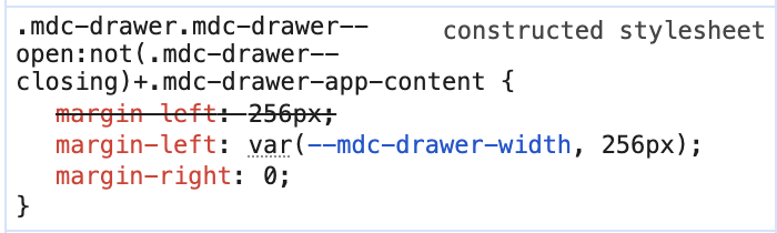
That blank space is caused by this CSS code. It is adding a margin with the same value as --mdc-drawer-width and that is why you see the blank space with the same width as the sidebar.
Knowing that style, you should be able to override it and set it to 0px. By the way, that style is not coming from Home Assistant but from the old @material/mwc-drawer which the Home Assistant ha-drawer extends from.
Hi thanks a lot! This works perfectly now, very much appreciate your help - with my css + js knowledge I would never come up with a solution like that.
Edit: sorry I keep asking - do you know what element I should target to style the sidebar background/fonts? For example would like to change background to transparent (instead of white/black) with blur effect.
Ok, find one more issue. The badge to show how many Notification is now hidden (also Badge with settings) as I think the number is displayed based on the original width 256px. Now the width is reduced and hence those badges no longer shows.
Answer to my own question, below css fixed the issue:
The sidebar can be styled with card-mod, there is a specific theme variable for it.
But just a note. Even if you set the sidebar background to transparent, below the sidebar there are more elements (aside and .mdc-drawer__content). You just need to know that after all these elements you will find the page background. If you expect to find the dashboard background that will not happen. If you want to have the same background as the dashboard, set that same background in the sidebar element.
The sidebar items have a fixed width, that is why even if you change the sidebar width, the items will keep their original size. Just override the width of the sidebar items:
The profile item is also a ha-md-list-item. You should not need the second rule. If you use my code above, the size will be dynamic, it will work regardless the width of the sidebar.
I have a question related to the sidebar hope you don’t mind. In my yaml I have code like below to reduce shrink the tile card for smaller screens. It use the media query to find the screen width and apply the styling based on that. It’s a naive solution as it doesn’t count when sidebar is expanded and occupied some space of the screen, and I have the problem with my iPhone in horizontal mode when sidebar is opened the tiles are messed up.
With the help of LLM I find a solution based on tagging the ha-card as container and query the width of the container, and it works fine for desktop however doesn’t seem to work with mobile device. In case you know how this can be done for iOS/mobile devices, appreciate if you could send me some hints. Many thanks in advance (and sorry for even more ask…)
For your use case, @container seems to be the best solution, and it should work in Safari from version 16 onwards. If it is not working in your device I am afraid that you will need to use JavaScript again.