šŸ”¹ Card-mod - Super-charge your themes!

Yes, I know you told me, but things often kick in when you find it yourselfā€¦

So, I reported back so you could see and comment. Thanks for that.

I did already try what you do for the vacuum card, but probably missed a shadow root, or maybe got the syntax wrong.

Ill redo the work and will let you know, thanks again !

edit

      more-info-default:
        $: |
          ha-attributes {
            display: {{'none' if is_state('input_boolean.hide_more_info_attributes','on')}};
          }

and

      more-info-light:
        $: |
          ha-attributes {
            display: {{'none' if is_state('input_boolean.hide_more_info_attributes','on')}};
          }

ā€¦

it was way more simple than I supposed at first.
very nice!
would be cool if we could somehow wildcard that, but I believe I havent seen that before.

new post for new search:

what has always bothered me is that on many entities I donā€™t have recorder enabled, so I see:

this is not an error, there simply is no history nor logbook entry for that entity. Iā€™ve asked the frontend team before, but they say they can not prevent this, because the frontend doesnā€™t know about the backend.

Now, with card-mod we see ha-more-info-history and ha-more-info-logbook, and their respective div class="info",

and for logbook that is a bit different:

the div is actually called no-entries :wink:

what is was wondering, is whether we can set display: none to ha-more-info-history if the info == ā€˜No state history found.ā€™ ?

or can we not get that info in a jinja template?

would you know?

As these are different shadow root levels, I donā€™t think, that you can do this with card-mod and css.

Donā€™t know.

Why?

ok thanks, I might have to try another way, or maybe give upā€¦

to save resources. I am running on a Pi4, have over 3700 entities and Ha makes that worse in each release (moving from attributes to entities). I try to minimize the recorder usage.

@Ildar_Gabdullin @Mattias_Persson

finally I got this:

    card-mod-root-yaml: |
      paper-tab[aria-label='Presence'] ha-icon $ ha-svg-icon $: |
        path {
        {% if is_state('input_boolean.test', 'on') %}
           d: path('M16,7V3H14V7H10V3H8V7H8C7,7 6,8 6,9V14.5L9.5,18V21H14.5V18L18,14.5V9C18,8 17,7 16,7Z');
        {% else %}
           d: path('M20.84 22.73L15.31 17.2L14.5 18V21H9.5V18L6 14.5V9C6 8.7 6.1 8.41 6.25 8.14L1.11 3L2.39 1.73L22.11 21.46L20.84 22.73M18 14.5V9C18 8 17 7 16 7V3H14V7H10.2L17.85 14.65L18 14.5M10 3H8V4.8L10 6.8V3Z');
        {% endif %}
        }

to work, and have a color set for that icon under the .: | section using

        paper-tab[aria-label='Presence'] {
          color: {{state_attr('sensor.family_home','icon_color')}};
        }

so thatā€™s a start. However, and its a big caveat, it only works in Chromeā€¦ No way I can get it to show in my Safari browser or my App just yet. The app might be a cache thing, always hard to reset that. But Safari is always immediate, so a problem stillā€¦

Mattiasā€™s style does work after all, I had positioned in the wrong section:

    card-mod-root-yaml: |
      paper-tab[aria-label='Presence'] ha-icon$: |
        ha-svg-icon {
        {% if is_state('input_boolean.test', 'on') %}
           content: url("data:image/svg+xml,%3Csvg viewBox='0 0 24 24' xmlns='http://www.w3.org/2000/svg'%3E%3Cpath fill='green' d='M16,7V3H14V7H10V3H8V7H8C7,7 6,8 6,9V14.5L9.5,18V21H14.5V18L18,14.5V9C18,8 17,7 16,7Z'/%3E%3C/svg%3E");
        {% else %}
           content: url("data:image/svg+xml,%3Csvg viewBox='0 0 24 24' xmlns='http://www.w3.org/2000/svg'%3E%3Cpath fill='gray' d='M20.84 22.73L15.31 17.2L14.5 18V21H9.5V18L6 14.5V9C6 8.7 6.1 8.41 6.25 8.14L1.11 3L2.39 1.73L22.11 21.46L20.84 22.73M18 14.5V9C18 8 17 7 16 7V3H14V7H10.2L17.85 14.65L18 14.5M10 3H8V4.8L10 6.8V3Z'/%3E%3C/svg%3E");
        {% endif %}
        }

but, always something, this doesnt work with the color set under the .: |

If this turns out to be the only browser wide syntax to get the icon to change, I must add the color in the content, like Mattias did above for those icons I want to change.

thereā€™s another issue though,

if I change the working test config for the tab ['Presence'] to another ['Settings motion'] (which does work in the coloring templates, card_mod throw an error

hmm. not sure if this is worth the trouble pursuingā€¦ feels a bit too ,much of a hack, while the motto is weā€™re streamliningā€¦

Maybe we should try to carve out the functionality of the old Custom Header, if only for this.

@Mariusthvdb
Sorry for not answering - was busy with restoring my HA setup, many things broke after some latest updates.

Now I faced with a weird bug with card-mod-theme.

Letā€™s create this card:

type: entities
entities:
  - entity: sensor.service_unavailable_value
  - entity: zone.home
    card_mod:
      class: class-row-red
  - type: custom:fold-entity-row
    head:
      entity: sun.sun
    open: true
    card_mod:
      style: |
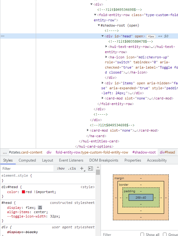
        div#head {
          color: red !important;
        }
    entities:
      - sun.sun
      - sun.sun
      - sun.sun

image

Note that:

  • sensor.service_unavailable_value is always unavailable;
  • class-row-red does not work w/o a card-mod-theme.

Then letā€™s create a simple card-mod-theme:

cm_minimal:

  card-mod-row-yaml: |
    .: |

      :host(.class-row-red) {
        color: red;
        --paper-item-icon-color: red;
      }

      hui-generic-entity-row .text-content {
        {% if states(config.entity) in ['unavailable','unknown'] %}
          color: var(--state-unavailable-color);
        {% endif %}
      }

Now the card looks like:
image

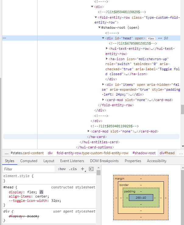
The theme styles are applied, the ā€œdiv#headā€ style is not applied:

Now letā€™s change a theme - remove the 2nd style:

cm_minimal:

  card-mod-row-yaml: |
    .: |

      :host(.class-row-red) {
        color: red;
        --paper-item-icon-color: red;
      }

And now the card looks like:
image

The only left theme style is applied, the ā€œdiv#headā€ style is applied too:

Why is this happening?

P.S. I reinstalled fold-entity-row, cleaned a cache with no effect.


Updated 20.02.22:
Registered an issue:

Updated 22.04.22:
Solution found and described in the issue.

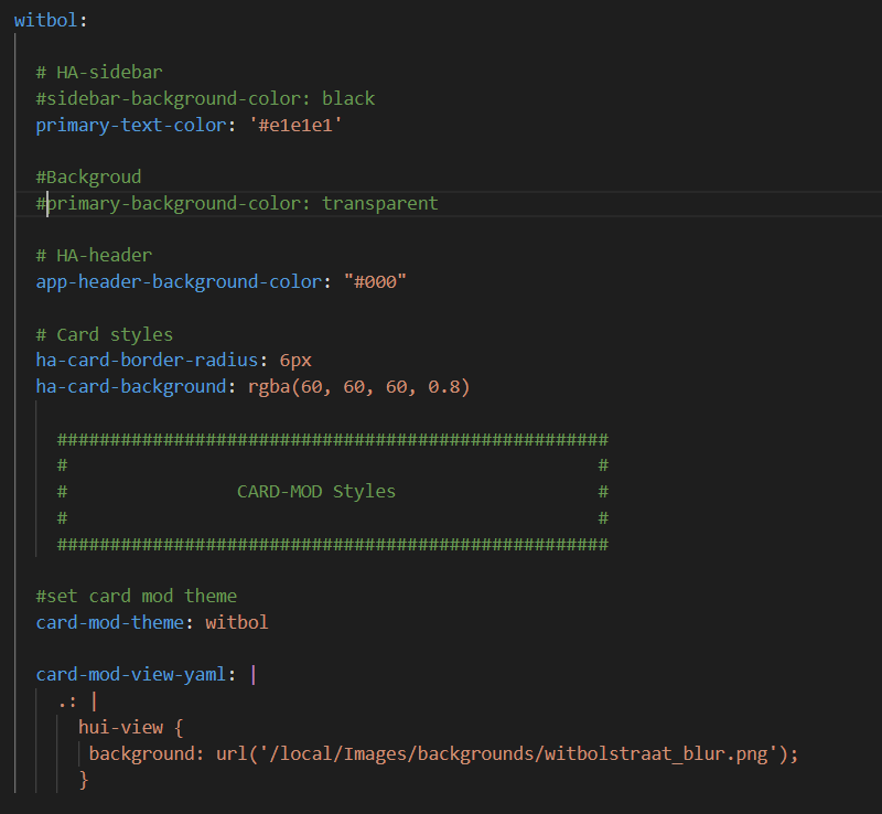
I have this theme made:

I see in the developersā€™ tools that the background image is added but overridden by the primary-background-color.

Knipsel

But can not find out where this is and why?

not using the class option at all just yet, so I figure letā€™s start with something thatā€™s system wide in my config.

  card-mod-card: |
    .card-header {
      font-weight: 300;
      letter-spacing: 0px;
      /*background: radial-gradient(var(--primary-color),var(--card-background-color));*/
    }

is what I use for all my headers, and in every individual card I add:

card_mod:
  style: |
    .card-header {
      background-color: var(--background-color-off);
      color: var(--text-color-off);
      padding-top: 0px;
      padding-bottom: 0px;
      margin: 0px 0px 16px 0px;
    }

or that exact same thing, but without a margin line.

which I guess would be globalized to:

  card-mod-card: |
    .card-header(.class-header-margin) {
      font-weight: 300;
      letter-spacing: 0px;
      background-color: var(--background-color-off);
      color: var(--text-color-off);
      padding-top: 0px;
      padding-bottom: 0px;
      margin: 0px 0px 16px 0px;
    }

    .card-header(.class-header-no-margin) {
      font-weight: 300;
      letter-spacing: 0px;
      background-color: var(--background-color-off);
      color: var(--text-color-off);
      padding-top: 0px;
      padding-bottom: 0px;
    }

however, if I try to use those in my card configs like

type: entities
title: Hue motion sensor switches
state_color: true
show_header_toggle: true
card_mod:
  class: class-header-no-margin

or

type: entities
title: Hue motion sensor switches
state_color: true
show_header_toggle: true
class: class-header-no-margin

nothing happensā€¦
is there some syntax error here?
please have a look, thanks!

Hello. Iā€™m looking for help.
Iā€™m trying to change the text color in the state badge according with the sensor state but canā€™t find the solution.
Can anyone help me?
Thatā€™s my configuration, and I want when the window is open(aberta) the color of the letters change to green.
Thanks


This is not about card-mod-theme, you should ask these questions in another topic.
Your case was described here.

Thank you for your help.

@Mariusthvdb
AFAIK class is a property of a whole card - not itā€™s header.

cm_card_class:

  card-mod-card-yaml: |
    .: |
      ha-card.class-card-1.type-entities .card-header {
        background-color: grey;
        color: red;
      }
  - type: entities
    title: class-1
    card_mod:
      class: class-card-1
    entities:
      - entity: sun.sun
      - entity: sun.sun

ŠøŠ·Š¾Š±Ń€Š°Š¶ŠµŠ½ŠøŠµ

Answering from a mobile, not sure - but just in case try adding !important

thanks Ildar, this is promising indeed!
Because I need these on more than only type: entities cards, I tested:

    card-mod-card-yaml: |
      .: |
        ha-card.class-header-margin .card-header {
          font-weight: 300;
          letter-spacing: 0px;
          background-color: var(--background-color-off);
          color: var(--text-color-off);
          padding-top: 0px;
          padding-bottom: 0px;
          margin: 0px 0px 16px 0px;
        }

        ha-card.class-header-no-margin .card-header {
          font-weight: 300;
          letter-spacing: 0px;
          background-color: var(--background-color-off);
          color: var(--text-color-off);
          padding-top: 0px;
          padding-bottom: 0px;
        }

too, and this seems to work fine.

only thing this blocks now is another default card header:

  card-mod-card: |
    .card-header {
      font-weight: 300;
      letter-spacing: 0px;
      /*background: radial-gradient(var(--primary-color),var(--card-background-color));*/
    }

so all my cards without the class now cant use this anymoreā€¦ always a challenge

Combine two styles in one card-mod-card-yaml

I dont think I follow.

what I need:

  • the 2 different classes, to set on many of my cards.
  • the default mod, which needs to be applied to all card with a header, so also the ones without any of the 2 classes above

before I used the 2 classes, the card-mod-card was active on all cards (as I want) and I set extra header mods in the individual cards verbosely. I now want to do that with the 2 classes.

I think this works:

    card-mod-card-yaml: |
      .: |
        ha-card.class-header-margin .card-header {
          background-color: var(--background-color-off);
          color: var(--text-color-off);
          padding-top: 0px;
          padding-bottom: 0px;
          margin: 0px 0px 16px 0px;
        }

        ha-card.class-header-no-margin .card-header {
          background-color: var(--background-color-off);
          color: var(--text-color-off);
          padding-top: 0px;
          padding-bottom: 0px;
        }

        ha-card .card-header {
          font-weight: 300;
          letter-spacing: 0px;
          /*background: radial-gradient(var(--primary-color),var(--card-background-color));*/
        }

which is kind of cool, and even allows me to do this now:

  - type: custom:auto-entities
    card:
      type: entities
      title: Running Automations
      card_mod: &header
        class: class-header-margin
        style: |
          .card-content {
            max-height: 400px;
            overflow-y: scroll;
          }

(set the (now generic) class, and an additional scrolling mod in the individual card). Really nice!

To make some more magic, I copy that complete set with an anchor to several cards below :wink:

This is what I was talking about - describe 2 class-card and 1 default card:

  - type: vertical-stack
    title: class-card
    cards:
      - type: entities
        title: class-1
        card_mod:
          class: class-card-1
        entities: &ref_entities
          - entity: sun.sun
          - entity: sun.sun
            card_mod:
              class: class-row-red
      - type: entities
        title: class-2
        card_mod:
          class: class-card-2
        entities: *ref_entities
      - type: entities
        title: default
        entities: *ref_entities
cm_card_class:

  card-mod-card-yaml: |
    .: |
      ha-card.class-card-1.type-entities .card-header {
        background-color: grey;
        color: red;
      }
      ha-card.class-card-2.type-entities .card-header {
        background-color: yellow;
        color: magenta;
      }
      ha-card.type-entities .card-header {
        background-color: green;
        color: cyan;
      }

  card-mod-row-yaml: |
    .: |
      :host(.class-row-red) {
        color: red;
        --paper-item-icon-color: red;
      }

1 Like

well, thats what I did in my post above yours, so yep, confirm that to be working just fine now.

even without the .type-entities

Ive updated my gist with what I use currently

After much searching I didnā€™t find any recommendations on how to do this.

The code below allows you to change the CSS of an Icon in the Lovelace Header based on a particular state.

  card-mod-theme: ios-dark-mode
  card-mod-root: |
      paper-tab[aria-label="Heating"] {
          {% if ( (states('climate.bedroomheatpump') != 'off') or (states('climate.loungeheatpump') != 'off') ) %}
          color: orange;
          {% endif %}
        	}

A couple of explanations.

The [aria-label=ā€œHeatingā€] filters the CSS to only apply to the paper-tab div that meets that attribute. You can read more on CSS attribute selection here: https://www.geeksforgeeks.org/css-attribute-selector/

The JINJA2 then tests a regular IF statement to apply the CSS

so I suddenly experienced odd behavior in 1 of my dashboards on mobile (not on desktop) where my tab icons could no longer move left/right, even though the chevrons are visible.

Turns out this template caused it:

        /* only show when on Chrome (a bit if a hack since we dont have 'this.device_id' */
        paper-tab[aria-label='Cast'] {
          {% set device = 'sensor.browser_chrome_nc' %}
          {% if states(device) in ['unavailable','unknown'] or
                is_state_attr(device,'visibility','hidden') %} display: none
          {% elif not is_state_attr(device,'path','/ui-develop/cast') %} color: blue
          {% else %} color: red
          {% endif %};
        }

even though it works perfectly in itself, showing/hiding/coloring the icon as per conditions.

which was as good as it could get, trying to show the Cast tab only on a Chrome browser. I still dont understand why it interferes with the regular app-header behavior, but it did.

If anyone could explain, please dont hold back :wink: