I tried out streamlined-card. With card-mod v4.0.0-beta.1 you will need to target included cards via ha-card directly or using one of the the yaml structure in the comments, which will now be different than for standard cards. See below for explanation and then comments.
Standard card structure
Using tile card as an example.
Does not apply card-mod at card level (tile) as you would need many different CSS rules which would make theming a nightmare.
Base CSS styles via :host { }.
hui-card           ⇐ card-mod v4 patches here
  ↳ tile           ⇐ this is `:host` for `hui-card` card-mod
    ↳ shadowRoot   ⇐ card-mod applies here
      ↳ ha-card    ⇐ card-mod v4 also patches here but ignores due to known standard structure
Custom card strcture - button-card
As hui-card is still patched you could apply CSS vars via :host { }.
Likewise, you could use yaml selector paths from hui-card. See comments below.
Legacy ha-card patch and apply is at ha-card level where ha-card { } will work.
hui-card                 ⇐ card-mod v4 patches here
  ↳ button-card          ⇐ this is `:host` for `hui-card` card-mod
    ↳ shadowRoot         ⇐ card-mod v4 applies here
      ↳div
        ↳ ha-card        ⇐ card-mod v4 patches and applies here, does not ignore as it is not a standard structure. This is what the infamous v3.5 did not do.
          ↳ shadowRoot
Custom card strcture - streamline-card with tile template
As hui-card is still patched you could apply CSS vars via :host { }.
Likewise, you could use yaml selector paths from hui-card. See comments below.
Legacy ha-card patch and apply is at ha-card level where ha-card { } will work.
hui-card                 ⇐ card-mod v4 patches here
  ↳ streamline-card      ⇐ this is `:host` for `hui-card` card-mod
    ↳ shadowRoot         ⇐ card-mod v4 applies here
      ↳ tile
        ↳ shadowRoot
          ↳ ha-card      ⇐ card-mod v4 patches and applies here, does not ignore as it is not a standard structure. This is what the infamous v3.5 did not do.
            ↳ shadowRoot
Comments
Custom cards that are wrappers like streamlined-card should adopt wrapping in each card in hui-card. This give all benfits of users then including visibility conditions or even tempating the new disabled config option. These only work 100% when using hui-card as a wrapper. This is what expander-card (MelleD fork) now does and has 100% success. NOTE: If you see anything like a history card not updating on first load, that is due to not taking this appaorach
As far as card-mod goes, reviewing this post I could see a possible change to avoid confusion in that card-mod-card theme variable applies to new hui-card patching and perhaps introduce card-mod-card-legacy for the legacy ha-card patching, which is still currently card-mod-card. @Mariusthvdb, @LiQuid_cOOled and others may be able to chime in on this.
Althernative to above point, when you know there is a parent hui-card patch you can adjust your themes to match. e.g. for streamlined-card, the below will work for patching from hui-card, the * matching the unknown card type (to card-mod) in the streamlined-card structure.
Thank you for the insanely detailed response. I dont know that I understand it all but will try to test some of the suggestions tomorow and put in a FR for streamline to adopt wrapping each card in hui-card
since talking about this, we might as well look at the original decluttering-card which streamlined copied mostly.
Given the momentum in the collaboration at this moment, I hope we could get that to do as you suggest:
not sure about that. Imho, introducing new techniques to maintain legacy seems the wrong approach, though it would probably help a bit during the transition
to me it seems the better way to have certain stuff break, and fix them properly. Might be a bit more work for the enduser, and of course we need maintenance being active on some custom cards.
otoh, I cant oversee the amount of effort card_mod would need to undergo adding the card-mod-card-legacy and maintaining that… if it’s doable, than by all means.
I do fear it will make us lazy though, and dont move to the modern styles because no longer required
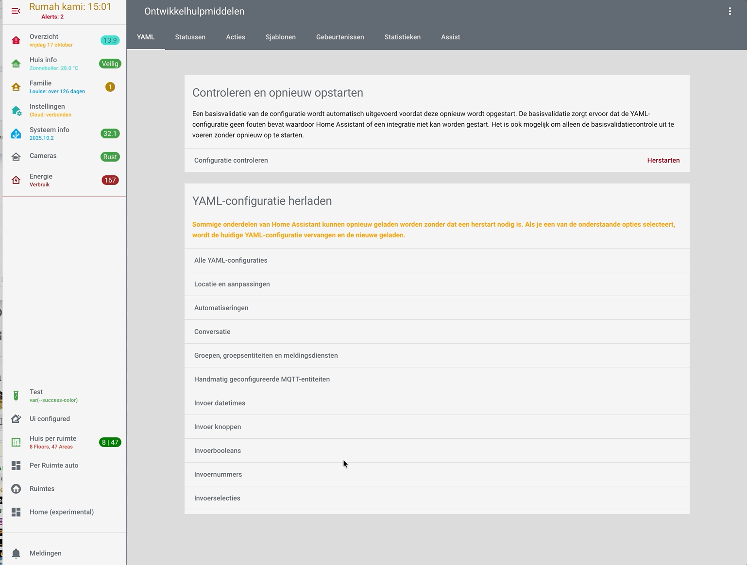
That whole “Developer tools” section could use a tremendous amount of love and attention.
But I really like your scrollable list! (Even though, I have no idea why the page structure is like this in the first place.)
with card_mod 4.0.0 beta 4 we can even do this, set a dynamic and conditional background to our views. And we can set debug to the templates with {# card_mod.debug #}
I posted this in the card-mod (regular) thread, should have done here directly, so allow me this once.
  card-mod-view-yaml: |
    .: |
      {# card_mod.debug #}
      {% set feest = is_state('binary_sensor.feest_alerts','on') %}
      {% set seizoen = states('sensor.season_astronomical') %}
      {% set dark = is_state('binary_sensor.donker_thema','on') %}
      {% set extension = '_dark' if dark else '' %}
      hui-view {
        {% set path = panel.viewUrlPath %}
        {% if path in ['weer','buienradar','weer_cams'] %}
          {% if is_state('input_boolean.weer_view_background','on') %}
          background: repeat url({{state_attr('camera.buienradar','entity_picture')}}) fixed;
          {% endif %}
        {% elif path in ['feest','familie_overzicht','kalender'] %}
          {% if feest %} background: repeat url('/local/images/balloons.png') fixed;
          {% endif %}
        {% elif path == 'tijd' %}
          background: repeat url('/local/season/{{seizoen}}_2.png') fixed;
        {% elif path in ['onderweg','proximity'] %}
          background: center/cover no-repeat url('/local/wallpapers/map{{extension}}.png') fixed;
        {% endif %}
      }
Sorry, missed that “panel” variable.
Good, then it needs to be detailed that THIS particular styling (depending on a web url of a page) is available in v. 4. Just a clarification for less experienced card-mod users.
Problem is that many people do not read docs and come here for ready examples/solutions. Not to mention people using ChatGPT which uses a code from internet. So, our posts here in forum should be more clear.
Agree. The main card-mod post included v4.0.0-beta.4 changes including the Panel variable feature. Do you recommend I also post in this theme forum? I would not to double up though.
If you mean “post an announcement of a new release here on this thread “ - may be a useful info. My only intention was to say that out examples should be clear for an average person. Although I do not appreciate a trend to make people more consumers than creators. Sorry for my English.
every release note of the beta includes the whats new features, so nothing to add there I believe, we can not cater for every lazy user and think of everything people might Not read…
just like Ildar did not read my post clearly, and commented before understanding what I actually posted.
besides that mistake, it wasn’t possible before at all.
Yes we could set a card-mod theme to the theme option of a regular view (as that was what I did for years). But that has its downsides, which I have described here several times.
So, being able to set a dynamic And conditional background to a view now Is new, and a major feature I would say.
in my Gist file I documented what I did before (card-mod theme to the theme of a view) and currently do with version 4.00
Not going to explain again how inexperienced people may understand your post, already did that, and have no intention to continue discussing this obvious thing. The only thing that points to card-mod 4 is one line in your template containing “panel”. If it is ok for you, not a problem at all.
Hello
I’ve been redirected from the other thread where Ildar is providing an extensive description of modding particular elements. Including top menu - which confused me…
Here is a deal: How to address a change of top menu bar height, the way, not to influence system views (like Settings, read below).
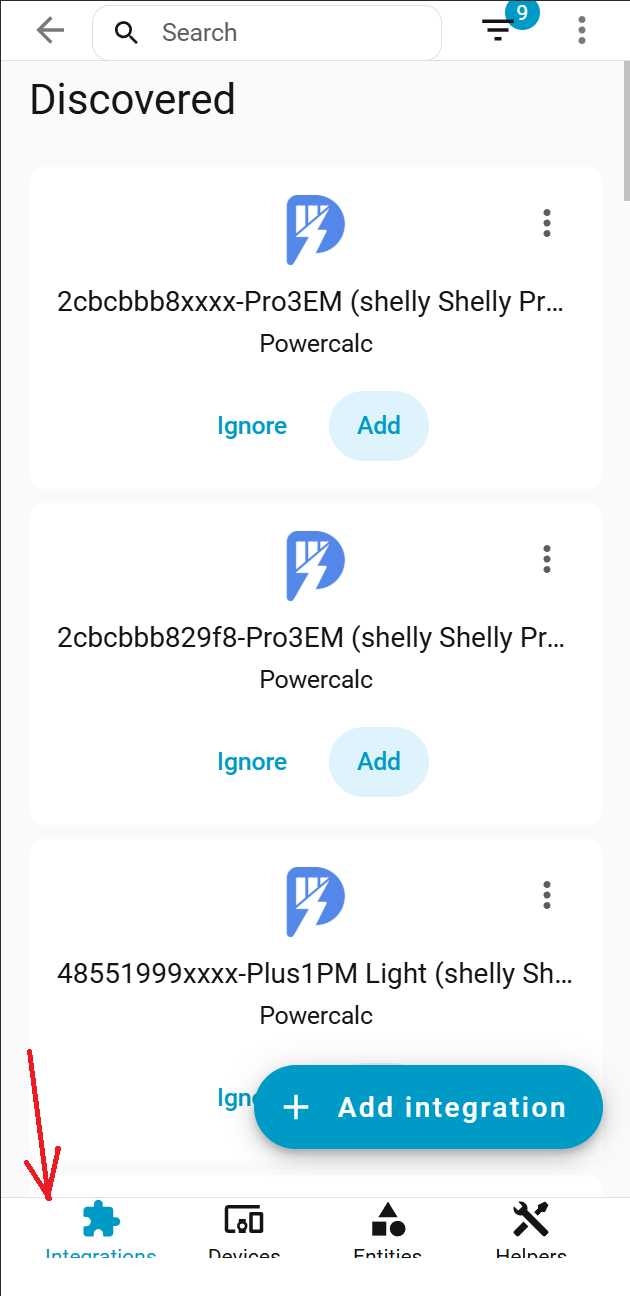
A lot of solutions found around suggest changing the header-height css variable. Unfortunately, it influences the top menu of system pages like Integrations, Devices, Entities, and Helpers, of the Settings page. What is worse, in mobile mode, mentioned top menu lands at the bottom, augmented with icons.
I tried to modify the size of the top menu without using the header-height. But there are a lot of places to change, incl padding of hui-view-container (don’t even know is it possible)