ok thanks, I might have to try another way, or maybe give up…
to save resources. I am running on a Pi4, have over 3700 entities and Ha makes that worse in each release (moving from attributes to entities). I try to minimize the recorder usage.
ok thanks, I might have to try another way, or maybe give up…
to save resources. I am running on a Pi4, have over 3700 entities and Ha makes that worse in each release (moving from attributes to entities). I try to minimize the recorder usage.
@Ildar_Gabdullin @Mattias_Persson
finally I got this:
    card-mod-root-yaml: |
      paper-tab[aria-label='Presence'] ha-icon $ ha-svg-icon $: |
        path {
        {% if is_state('input_boolean.test', 'on') %}
           d: path('M16,7V3H14V7H10V3H8V7H8C7,7 6,8 6,9V14.5L9.5,18V21H14.5V18L18,14.5V9C18,8 17,7 16,7Z');
        {% else %}
           d: path('M20.84 22.73L15.31 17.2L14.5 18V21H9.5V18L6 14.5V9C6 8.7 6.1 8.41 6.25 8.14L1.11 3L2.39 1.73L22.11 21.46L20.84 22.73M18 14.5V9C18 8 17 7 16 7V3H14V7H10.2L17.85 14.65L18 14.5M10 3H8V4.8L10 6.8V3Z');
        {% endif %}
        }
to work, and have a color set for that icon under the .: | section using
        paper-tab[aria-label='Presence'] {
          color: {{state_attr('sensor.family_home','icon_color')}};
        }
so that’s a start. However, and its a big caveat, it only works in Chrome… No way I can get it to show in my Safari browser or my App just yet. The app might be a cache thing, always hard to reset that. But Safari is always immediate, so a problem still…
Mattias’s style does work after all, I had positioned in the wrong section:
    card-mod-root-yaml: |
      paper-tab[aria-label='Presence'] ha-icon$: |
        ha-svg-icon {
        {% if is_state('input_boolean.test', 'on') %}
           content: url("data:image/svg+xml,%3Csvg viewBox='0 0 24 24' xmlns='http://www.w3.org/2000/svg'%3E%3Cpath fill='green' d='M16,7V3H14V7H10V3H8V7H8C7,7 6,8 6,9V14.5L9.5,18V21H14.5V18L18,14.5V9C18,8 17,7 16,7Z'/%3E%3C/svg%3E");
        {% else %}
           content: url("data:image/svg+xml,%3Csvg viewBox='0 0 24 24' xmlns='http://www.w3.org/2000/svg'%3E%3Cpath fill='gray' d='M20.84 22.73L15.31 17.2L14.5 18V21H9.5V18L6 14.5V9C6 8.7 6.1 8.41 6.25 8.14L1.11 3L2.39 1.73L22.11 21.46L20.84 22.73M18 14.5V9C18 8 17 7 16 7V3H14V7H10.2L17.85 14.65L18 14.5M10 3H8V4.8L10 6.8V3Z'/%3E%3C/svg%3E");
        {% endif %}
        }
but, always something, this doesnt work with the color set under the .: |
If this turns out to be the only browser wide syntax to get the icon to change, I must add the color in the content, like Mattias did above for those icons I want to change.
there’s another issue though,
if I change the working test config for the tab ['Presence'] to another ['Settings motion'] (which does work in the coloring templates, card_mod throw an error
hmm. not sure if this is worth the trouble pursuing… feels a bit too ,much of a hack, while the motto is we’re streamlining…
Maybe we should try to carve out the functionality of the old Custom Header, if only for this.
@Mariusthvdb
Sorry for not answering - was busy with restoring my HA setup, many things broke after some latest updates.
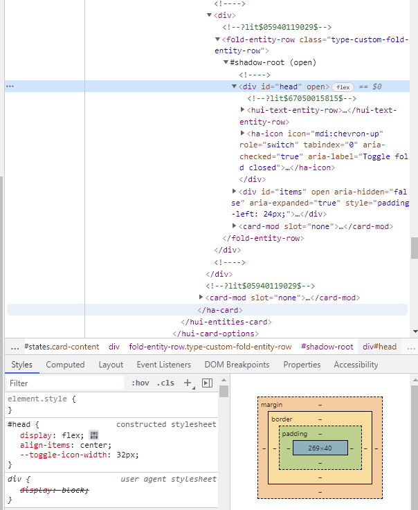
Now I faced with a weird bug with card-mod-theme.
Let’s create this card:
type: entities
entities:
  - entity: sensor.service_unavailable_value
  - entity: zone.home
    card_mod:
      class: class-row-red
  - type: custom:fold-entity-row
    head:
      entity: sun.sun
    open: true
    card_mod:
      style: |
        div#head {
          color: red !important;
        }
    entities:
      - sun.sun
      - sun.sun
      - sun.sun

Note that:
sensor.service_unavailable_value is always unavailable;class-row-red does not work w/o a card-mod-theme.Then let’s create a simple card-mod-theme:
cm_minimal:

  card-mod-row-yaml: |
    .: |

      :host(.class-row-red) {
        color: red;
        --paper-item-icon-color: red;
      }

      hui-generic-entity-row .text-content {
        {% if states(config.entity) in ['unavailable','unknown'] %}
          color: var(--state-unavailable-color);
        {% endif %}
      }
Now the card looks like:

The theme styles are applied, the “div#head” style is not applied:
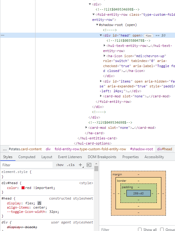
Now let’s change a theme - remove the 2nd style:
cm_minimal:

  card-mod-row-yaml: |
    .: |

      :host(.class-row-red) {
        color: red;
        --paper-item-icon-color: red;
      }
And now the card looks like:

The only left theme style is applied, the “div#head” style is applied too:
Why is this happening?
P.S. I reinstalled fold-entity-row, cleaned a cache with no effect.
Updated 20.02.22:
Registered an issue:
Updated 22.04.22:
Solution found and described in the issue.
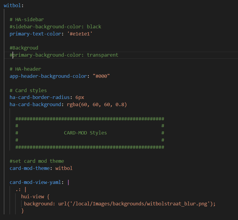
I have this theme made:
I see in the developers’ tools that the background image is added but overridden by the primary-background-color.

But can not find out where this is and why?
not using the class option at all just yet, so I figure let’s start with something that’s system wide in my config.
  card-mod-card: |
    .card-header {
      font-weight: 300;
      letter-spacing: 0px;
      /*background: radial-gradient(var(--primary-color),var(--card-background-color));*/
    }
is what I use for all my headers, and in every individual card I add:
card_mod:
  style: |
    .card-header {
      background-color: var(--background-color-off);
      color: var(--text-color-off);
      padding-top: 0px;
      padding-bottom: 0px;
      margin: 0px 0px 16px 0px;
    }
or that exact same thing, but without a margin line.
which I guess would be globalized to:
  card-mod-card: |
    .card-header(.class-header-margin) {
      font-weight: 300;
      letter-spacing: 0px;
      background-color: var(--background-color-off);
      color: var(--text-color-off);
      padding-top: 0px;
      padding-bottom: 0px;
      margin: 0px 0px 16px 0px;
    }

    .card-header(.class-header-no-margin) {
      font-weight: 300;
      letter-spacing: 0px;
      background-color: var(--background-color-off);
      color: var(--text-color-off);
      padding-top: 0px;
      padding-bottom: 0px;
    }
however, if I try to use those in my card configs like
type: entities
title: Hue motion sensor switches
state_color: true
show_header_toggle: true
card_mod:
  class: class-header-no-margin
or
type: entities
title: Hue motion sensor switches
state_color: true
show_header_toggle: true
class: class-header-no-margin
nothing happens…
is there some syntax error here?
please have a look, thanks!
Hello. I’m looking for help.
I’m trying to change the text color in the state badge according with the sensor state but can’t find the solution.
Can anyone help me?
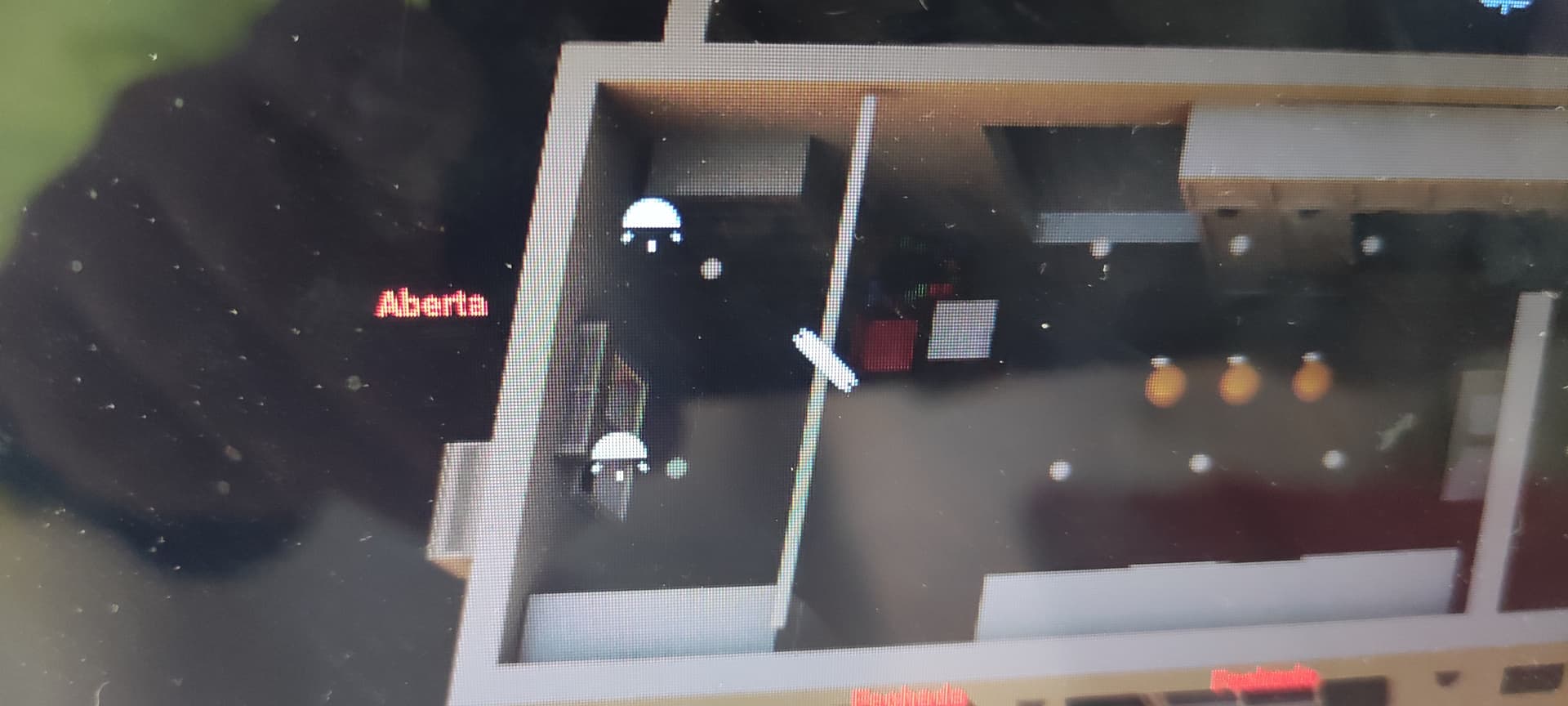
That’s my configuration, and I want when the window is open(aberta) the color of the letters change to green.
Thanks
This is not about card-mod-theme, you should ask these questions in another topic.
Your case was described here.
Thank you for your help.
@Mariusthvdb
AFAIK class is a property of a whole card - not it’s header.
cm_card_class:

  card-mod-card-yaml: |
    .: |
      ha-card.class-card-1.type-entities .card-header {
        background-color: grey;
        color: red;
      }
  - type: entities
    title: class-1
    card_mod:
      class: class-card-1
    entities:
      - entity: sun.sun
      - entity: sun.sun

Answering from a mobile, not sure - but just in case try adding !important
thanks Ildar, this is promising indeed!
Because I need these on more than only type: entities cards, I tested:
card-mod-card-yaml: |
.: |
ha-card.class-header-margin .card-header {
font-weight: 300;
letter-spacing: 0px;
background-color: var(--background-color-off);
color: var(--text-color-off);
padding-top: 0px;
padding-bottom: 0px;
margin: 0px 0px 16px 0px;
}
ha-card.class-header-no-margin .card-header {
font-weight: 300;
letter-spacing: 0px;
background-color: var(--background-color-off);
color: var(--text-color-off);
padding-top: 0px;
padding-bottom: 0px;
}
too, and this seems to work fine.
only thing this blocks now is another default card header:
card-mod-card: |
.card-header {
font-weight: 300;
letter-spacing: 0px;
/*background: radial-gradient(var(--primary-color),var(--card-background-color));*/
}
so all my cards without the class now cant use this anymore… always a challenge
Combine two styles in one card-mod-card-yaml
I dont think I follow.
what I need:
before I used the 2 classes, the card-mod-card was active on all cards (as I want) and I set extra header mods in the individual cards verbosely. I now want to do that with the 2 classes.
I think this works:
card-mod-card-yaml: |
.: |
ha-card.class-header-margin .card-header {
background-color: var(--background-color-off);
color: var(--text-color-off);
padding-top: 0px;
padding-bottom: 0px;
margin: 0px 0px 16px 0px;
}
ha-card.class-header-no-margin .card-header {
background-color: var(--background-color-off);
color: var(--text-color-off);
padding-top: 0px;
padding-bottom: 0px;
}
ha-card .card-header {
font-weight: 300;
letter-spacing: 0px;
/*background: radial-gradient(var(--primary-color),var(--card-background-color));*/
}
which is kind of cool, and even allows me to do this now:
- type: custom:auto-entities
card:
type: entities
title: Running Automations
card_mod: &header
class: class-header-margin
style: |
.card-content {
max-height: 400px;
overflow-y: scroll;
}
(set the (now generic) class, and an additional scrolling mod in the individual card). Really nice!
To make some more magic, I copy that complete set with an anchor to several cards below 
This is what I was talking about - describe 2 class-card and 1 default card:
- type: vertical-stack
title: class-card
cards:
- type: entities
title: class-1
card_mod:
class: class-card-1
entities: &ref_entities
- entity: sun.sun
- entity: sun.sun
card_mod:
class: class-row-red
- type: entities
title: class-2
card_mod:
class: class-card-2
entities: *ref_entities
- type: entities
title: default
entities: *ref_entities
cm_card_class:

  card-mod-card-yaml: |
    .: |
      ha-card.class-card-1.type-entities .card-header {
        background-color: grey;
        color: red;
      }
      ha-card.class-card-2.type-entities .card-header {
        background-color: yellow;
        color: magenta;
      }
      ha-card.type-entities .card-header {
        background-color: green;
        color: cyan;
      }

  card-mod-row-yaml: |
    .: |
      :host(.class-row-red) {
        color: red;
        --paper-item-icon-color: red;
      }
well, thats what I did in my post above yours, so yep, confirm that to be working just fine now.
even without the .type-entities
Ive updated my gist with what I use currently
After much searching I didn’t find any recommendations on how to do this.
The code below allows you to change the CSS of an Icon in the Lovelace Header based on a particular state.
  card-mod-theme: ios-dark-mode
  card-mod-root: |
      paper-tab[aria-label="Heating"] {
          {% if ( (states('climate.bedroomheatpump') != 'off') or (states('climate.loungeheatpump') != 'off') ) %}
          color: orange;
          {% endif %}
        	}
A couple of explanations.
The [aria-label=“Heating”] filters the CSS to only apply to the paper-tab div that meets that attribute. You can read more on CSS attribute selection here: https://www.geeksforgeeks.org/css-attribute-selector/
The JINJA2 then tests a regular IF statement to apply the CSS
so I suddenly experienced odd behavior in 1 of my dashboards on mobile (not on desktop) where my tab icons could no longer move left/right, even though the chevrons are visible.
Turns out this template caused it:
        /* only show when on Chrome (a bit if a hack since we dont have 'this.device_id' */
        paper-tab[aria-label='Cast'] {
          {% set device = 'sensor.browser_chrome_nc' %}
          {% if states(device) in ['unavailable','unknown'] or
                is_state_attr(device,'visibility','hidden') %} display: none
          {% elif not is_state_attr(device,'path','/ui-develop/cast') %} color: blue
          {% else %} color: red
          {% endif %};
        }
even though it works perfectly in itself, showing/hiding/coloring the icon as per conditions.
which was as good as it could get, trying to show the Cast tab only on a Chrome browser. I still dont understand why it interferes with the regular app-header behavior, but it did.
If anyone could explain, please dont hold back
Hey - I have a question on card-mod and themes.
I want to apply generic CSS to any theme - but don’t get it done. The theme code should not be theme specific. It seem that card-mod allow only to inject CSS for a particular theme but not for all themes.
Is there any way to do this? Basically I look for a way to use this more generic:
my-awesome-theme:
  card-mod-theme: my-awesome-theme
For example:
default:
  card-mod-theme: default
… knowing that this does not work 
Reason why I’m asking:
I don’t want to copy the same CSS code into multiple themes. It should be valid for all themes.
Thanks
anything you configure in your theme:
my-awesome-theme:
  card-mod-theme: my-awesome-theme
will be injected in another theme, by adding that card-mod-theme:
frontend:
  themes:
    my_theme:
      card-mod-theme: my-awesome-theme
      # rest of the settings
you can see the card-mod-theme as 1 big anchor, but better, because it can be configured in a dedicated file.
You can even add that to a true anchor and copy it easily with any other setting you would use (but dont add to the card-mod-theme)
See below: since I have all of my themes (except the card-mod-theme) in 1 file, I copied that to all of them using:
Dark blue:

  <<: &generic
    card-mod-theme: custom-header
    ha-card-border-radius: 0px
    ha-card-box-shadow: 0 4px 8px 0 rgba(0,0,0,0.2), 0 6px 20px 0 rgba(0,0,0,0.19)
    restriction-lock-row-margin-left: calc(100% - 25px) #95%
    restriction-regular-lock-color: red
    restriction-lock-opacity: 0.8
    alert-color: red
    error-color: var(--primary-color)


All other themes
  <<: *generic
Wow - thank you so much for this fast response.
I’ve already tried it and it’s working like a charm. This is amazing!
This really will help me a lot!
One last question that I did not yet sort out: Any chance to add this to the default theme? Or inject <<: *generic into the default theme?