Thanks! Not sure what you mean though - here’s my theme yaml, I can edit the colour of the icons with that path (ha-svg-icon) but not add animation
Christmas:
  modes:
    dark:
      sidebar-background-color: '#090e3b'
      scrollbar-thumb-color: 'var(primary-color)'
      app-header-background-color: '#090e3b'
      app-header-edit-background-color: 'var(--app-header-background-color)'
      app-header-text-color: '#99eeff'
      card-background-color: '#090e3b'
      primary-text-color: '#99eeff'
      accent-color: '#e4002b'
    light:
      sidebar-background-color: '#99eeff'
      scrollbar-thumb-color: 'var(primary-color)'
      app-header-background-color: '#99eeff'
      app-header-edit-background-color: 'var(--app-header-background-color)'
      card-background-color: '#99eeff'
      text-primary-color: '#000000'
  ha-card-border-color: 'var(--card-background-color)'
  state-switch-active-color: '#008000'
  state-binary_sensor-active-color: '#008000'
  lovelace-background: center / cover no-repeat fixed url('/local/media/images/christmas-background.jpg')
  ha-card-header-font-family: "Dancing Script"
  card-mod-theme: Christmas
  card-mod-sidebar-yaml: |
    .: |
      .menu .title {
        font-family: Dancing Script;
      }
      a[data-panel='panel'] paper-icon-item .item-text {
        font-family: Dancing Script;
        font-size: 26px;
      }
      .spacer {
        background: center / cover url("/local/media/images/christmasdecor.png");
      }
      a[data-panel='dashboard-home'] paper-icon-item ha-icon {
        color: lime !important;
      }
      a[data-panel='dashboard-home'] paper-icon-item .item-text {
        color: lime;
      }
      a[data-panel='status-page'] paper-icon-item ha-icon {
        color: red !important;
      }
      a[data-panel='status-page'] paper-icon-item .item-text {
        color: red;
      }
      a[data-panel='todo'] paper-icon-item ha-svg-icon {
        color: red !important;
      }
      a[data-panel='todo'] paper-icon-item .item-text {
        color: red;
      }
      a[data-panel='calendar'] paper-icon-item ha-svg-icon {
        color: lime !important;
      }
      a[data-panel='calendar'] paper-icon-item .item-text {
        color: lime;
      }
      a[data-panel='map'] paper-icon-item ha-svg-icon {
        color: red !important;
      }
      a[data-panel='map'] paper-icon-item .item-text {
        color: red;
      }
      a[data-panel='history'] paper-icon-item ha-svg-icon {
        color: lime !important;
      }
      a[data-panel='history'] paper-icon-item .item-text {
        color: lime;
      }
      a[data-panel='core_configurator'] paper-icon-item ha-icon {
        color: red !important;
      }
      a[data-panel='core_configurator'] paper-icon-item .item-text {
        color: red;
      }
      a[data-panel='hacs'] paper-icon-item ha-icon {
        color: lime !important;
      }
      a[data-panel='hacs'] paper-icon-item .item-text {
        color: lime;
      }
      a[data-panel='media-browser'] paper-icon-item ha-svg-icon {
        color: red !important;
      }
      a[data-panel='media-browser'] paper-icon-item .item-text {
        color: red;
      }
      a[data-panel='developer-tools'] paper-icon-item ha-svg-icon {
        color: lime !important;
      }
      a[data-panel='developer-tools'] paper-icon-item .item-text {
        color: lime;
      }
      a[data-panel='config'] paper-icon-item ha-svg-icon {
        color: red !important;
      }
      a[data-panel='config'] paper-icon-item .item-text {
        color: red;
      }
      .notifications-container paper-icon-item ha-svg-icon {
        color: lime;
      }
      .notifications-container paper-icon-item .item-text {
        color: lime;
      }
      a[data-panel='panel'] paper-icon-item .item-text {
        color: red;
      }
      {% if now().strftime('%d') == '25' %}
        paper-listbox {
          background: url("/local/media/images/fallingsnow.gif") !important;
        }
        @keyframes rgb1 {
          0%, 49% {
            color: lime;
          }
          50%, 100% {
            color: red;
          }
        }
        @keyframes rgb2 {
          0%, 49% {
            color: red;
          }
          50%, 100% {
            color: lime;
          }
        }
        a[data-panel='dashboard-home'] paper-icon-item .item-text {
          animation: rgb2 5s linear infinite;
        }
        a[data-panel='status-page'] paper-icon-item .item-text {
          animation: rgb1 5s linear infinite;
        }
        a[data-panel='todo'] paper-icon-item .item-text {
          animation: rgb1 5s linear infinite;
        }
        a[data-panel='calendar'] paper-icon-item .item-text {
          animation: rgb2 5s linear infinite;
        }
        a[data-panel='map'] paper-icon-item .item-text {
          animation: rgb1 5s linear infinite;
        }
        a[data-panel='history'] paper-icon-item .item-text {
          animation: rgb2 5s linear infinite;
        }
        a[data-panel='core_configurator'] paper-icon-item .item-text {
          animation: rgb1 5s linear infinite;
        }
        a[data-panel='hacs'] paper-icon-item .item-text {
          animation: rgb2 5s linear infinite;
        }
        a[data-panel='developer-tools'] paper-icon-item .item-text {
          animation: rgb2 5s linear infinite;
        }
        a[data-panel='config'] paper-icon-item .item-text {
          animation: rgb1 5s linear infinite;
        }
        .notifications-container paper-icon-item .item-text {
          animation: rgb2 5s linear infinite;
        }
        a[data-panel='panel'] paper-icon-item .item-text {
          animation: rgb1 5s linear infinite;
        }
      {% endif %}
  card-mod-root: |
    .main-title {
      font-family: Dancing Script;
    }
The link to a possible solution was already provided:
Have you defined your @keyframes rgb1 { and @keyframes rgb2 { ?
odwide
February 1, 2024, 5:27am
1616
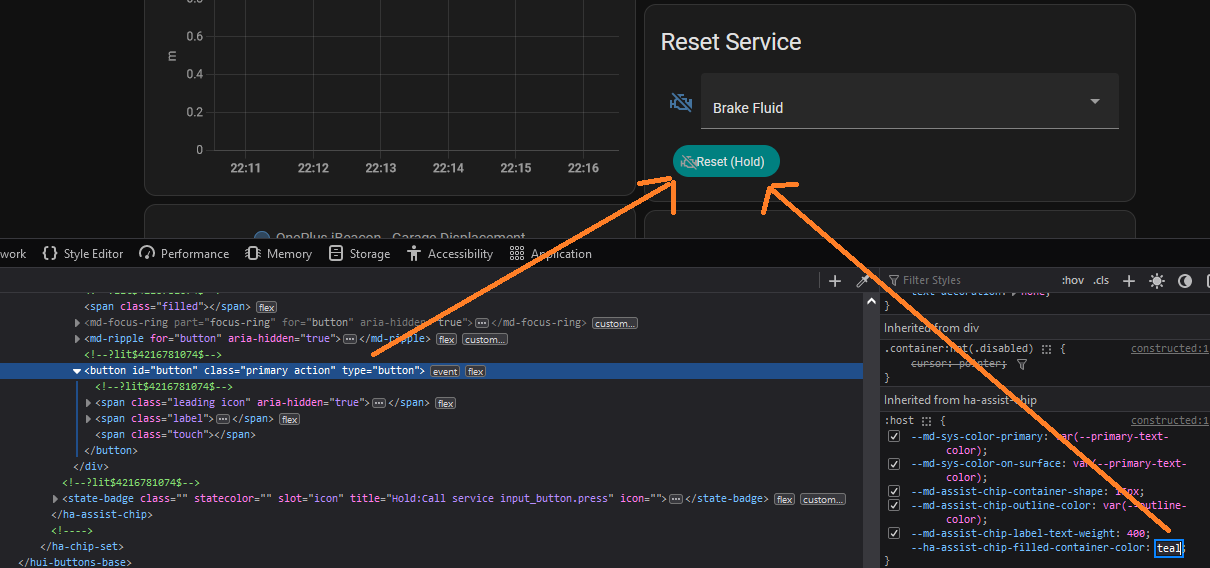
How to change the fill color of this button row in an entities card? I can do it through the browser inspector but can’t figure out how to translate that into the card-mod style.
- type: entities
  entities:
    - entity: input_select.car_service_reset_drop_down_mirage
      name: ' '
    - type: conditional
      conditions:
        - entity: input_select.car_service_reset_drop_down_mirage
          state_not: Select
      row:
        type: buttons
        entities:
          - entity: input_button.car_service_reset_mirage
            card_mod:
              style: |-
                button {
                  --ha-assist-chip-filled-container-color: teal;
                }
Wrong thread, not about themes.
how to style a button-row inside Entities card
how to style a conditional row inside Entities card
1 Like
If you can’t provide any input just don’t bother. And like I said the code is fine. Maybe you should learn how card-mod works.
Yeah it’s in the code just before the end, but I omitted the parts with the icon referring to the key frames as it didn’t work. Dw if it’s too difficult! Thanks!
The “input” was already provided. If you unable to see/understand it & yet react in a such rude way - surely I will not bother)))
1 Like
RomainRou
February 3, 2024, 10:07am
1622
Hello everyone, being a newbie in the world of theme creation I am doing a little research, the cards on my Dashboard are modified with mushroom and card-mod everything is good to adjust to the pixel, but I am facing a problem , on the tree of theme codes for my map configuration which are 99% identical I would like to change the map configuration to theme to lighten the Dashboard code, I thank you in advance if you can help me gentlemen the coders even just a bit that would help me a lot I’ve been looking for several days, I’ve been testing things but without success. I’ll give you one of my cards as an example
type: horizontal-stack
cards:
- type: custom:vertical-stack-in-card
cards:
- type: custom:mushroom-template-card
entity: light.le_salon
icon: mdi:sofa
icon_color: |-
{% if is_state('light.le_salon', 'on') %}
#FFAE0080
{% else %}
#0000
{% endif %}
primary: Salon
secondary: >-
{{ states('sensor.thermometre_salon_temperature') }}°C/{{
states('sensor.thermometre_salon_humidity') }}%
layout: horizontal
tap_action:
action: more-info
double_tap_action:
action: none
hold_action:
action: none
card_mod:
style:
mushroom-state-info$: |
.primary {
position: relative;
top: -50px;
left: -155px;
overflow: visible !important;
white-space: normal !important;
background-color: #00000090;
width: 44%;
border-radius: 5px 5px 5px 5px;
}
.secondary {
position: relative;
overflow: visible !important;
top: -49px;
left: -155px;
background-color: #00000090;
width: 78%;
border-radius: 5px 5px 5px 5px;
}
mushroom-shape-icon$: |
.shape {
position: relative;
left: -43px;
top: 55px;
}
.: |
:host {
--mush-icon-size: 146px;
}
style: |
mushroom-badge-icon {
left: 60px;
top: 25px;
}
ha-card {
background: none;
}
- type: custom:mushroom-chips-card
chips:
- type: conditional
conditions:
- condition: state
entity: light.le_salon
state: 'on'
chip:
type: template
entity: light.le_salon
tap_action:
action: none
icon: mdi:ceiling-light
icon_color: |-
{% if is_state(entity, 'on') %}
orange
{% endif %}
hold_action:
action: none
double_tap_action:
action: none
- type: conditional
conditions:
- condition: state
entity: media_player.samsung_7_series_65
state: 'on'
chip:
type: template
entity: media_player.samsung_7_series_65
icon: mdi:play-pause
icon_color: |-
{% if is_state('media_player.samsung_7_series_65', 'on') %}
orange
{% endif %}
hold_action:
action: none
double_tap_action:
action: none
tap_action:
action: none
- type: conditional
conditions:
- condition: state
entity: alarm_control_panel.alarmo
state: armed_away
chip:
type: alarm-control-panel
entity: alarm_control_panel.alarmo
tap_action:
action: none
content_info: none
card_mod:
style:
.: |
ha-card {
width: 66px;
margin-left: 85%;
top: -170px;
background: none;
--chip-border-width: 0;
}
card_mod:
style: |
ha-card {
height: 178px ;
margin: auto;
background-image: url(https://i.ibb.co/NjM7Dd6/salon.png);
background-size: cover;
background-position: center;
}
- type: custom:vertical-stack-in-card
cards:
- type: custom:mushroom-template-card
icon: mdi:silverware-variant
icon_color: >-
{% if is_state('light.la_salle_a_manger', 'on') or
is_state('switch.prise_connectee_mystrom', 'on') or
is_state('switch.prise_salle_a_manger', 'on') %}
#FFAE0080
{% else %}
#0000
{% endif %}
primary: Salle a manger
layout: horizontal
tap_action:
action: more-info
double_tap_action:
action: none
hold_action:
action: none
badge_icon: |+
badge_color: |+
entity: light.la_salle_a_manger
secondary: ''
card_mod:
style:
mushroom-state-info$: |
.primary {
position: relative;
top: -50px;
left: -155px;
overflow: visible !important;
white-space: normal !important;
background-color: #00000090;
width: 110%;
border-radius: 5px 5px 5px 5px;
}
.secondary {
position: relative;
overflow: visible !important;
top: -49px;
left: -155px;
border-radius: 5px 5px 5px 5px;
}
mushroom-shape-icon$: |
.shape {
position: relative;
left: -43px;
top: 55px;
}
.: |
:host {
--mush-icon-size: 146px;
}
style: |
mushroom-badge-icon {
left: 60px;
top: 25px;
}
ha-card {
background: none;
}
- type: custom:mushroom-chips-card
chips:
- type: conditional
conditions:
- condition: state
entity: light.la_salle_a_manger
state: 'on'
chip:
type: template
entity: light.la_salle_a_manger
tap_action:
action: none
icon: mdi:ceiling-light
icon_color: |-
{% if is_state(entity, 'on') %}
orange
{% elif is_state(entity, 'off') %}
grey
{% else %}
grey
{% endif %}
hold_action:
action: none
double_tap_action:
action: none
- type: conditional
conditions:
- condition: state
entity: switch.prise_connectee_mystrom
state: 'on'
chip:
type: template
entity: switch.prise_connectee_mystrom
tap_action:
action: none
icon_color: |-
{% if is_state(entity, 'on') %}
orange
{% elif is_state(entity, 'off') %}
grey
{% else %}
grey
{% endif %}
icon: mdi:power-socket-eu
hold_action:
action: none
double_tap_action:
action: none
- type: conditional
conditions:
- condition: state
entity: switch.prise_salle_a_manger
state: 'on'
chip:
type: template
icon_color: |-
{% if is_state(entity, 'on') %}
orange
{% elif is_state(entity, 'off') %}
grey
{% else %}
grey
{% endif %}
icon: mdi:power-socket-eu
entity: switch.prise_salle_a_manger
tap_action:
action: none
hold_action:
action: none
double_tap_action:
action: none
card_mod:
style:
.: |
ha-card {
width: 66px;
margin-left: 85%;
top: -170px;
background: none;
--chip-border-width: 0;
}
card_mod:
style: |
ha-card {
height: 178px ;
margin-left: auto;
margin-right: auto;
background-image: url(https://i.ibb.co/rmk15p2/salle-a-manger.png);
background-size: cover;
background-position: center;
}
- type: custom:vertical-stack-in-card
cards:
- type: custom:mushroom-template-card
entity: light.cuisine
icon: mdi:pot-steam
icon_color: |
{% if is_state('light.cuisine', 'on') %}
#FFAE0080
{% else %}
#0000
{% endif %}
primary: Cuisine
layout: horizontal
tap_action:
action: more-info
double_tap_action:
action: none
hold_action:
action: none
badge_icon: |+
badge_color: |+
card_mod:
style:
mushroom-state-info$: |
.primary {
position: relative;
top: -50px;
left: -155px;
overflow: visible !important;
white-space: normal !important;
background-color: #00000090;
width: 55%;
border-radius: 5px 5px 5px 5px;
}
.secondary {
position: relative;
overflow: visible !important;
top: -49px;
left: -155px;
border-radius: 5px 5px 5px 5px;
}
mushroom-shape-icon$: |
.shape {
position: relative;
left: -43px;
top: 55px;
}
.: |
:host {
--mush-icon-size: 146px;
}
style: |
mushroom-badge-icon {
left: 60px;
top: 25px;
}
ha-card {
background: none;
}
secondary: ''
- type: custom:mushroom-chips-card
chips:
- type: conditional
conditions:
- condition: state
entity: light.cuisine
state: 'on'
chip:
type: template
entity: light.cuisine
tap_action:
action: none
icon: mdi:vanity-light
icon_color: |-
{% if is_state(entity, 'on') %}
orange
{% elif is_state(entity, 'off') %}
grey
{% else %}
grey
{% endif %}
hold_action:
action: none
double_tap_action:
action: none
- type: conditional
conditions:
- condition: state
entity: light.plan_de_travail
state: 'on'
chip:
type: template
icon_color: |-
{% if is_state(entity, 'on') %}
orange
{% elif is_state(entity, 'off') %}
grey
{% else %}
grey
{% endif %}
entity: light.plan_de_travail
icon: mdi:vanity-light
tap_action:
action: none
hold_action:
action: none
double_tap_action:
action: none
card_mod:
style:
.: |
ha-card {
width: 66px;
margin-left: 85%;
top: -170px;
background: none;
--chip-border-width: 0;
}
card_mod:
style: |
ha-card {
height: 178px ;
margin-left: auto;
margin-right: auto;
background-image: url(https://i.ibb.co/19NXD2Z/cuisine.png);
background-size: cover;
background-position: center;
}
- type: custom:popup-card
entity: light.le_salon
dismissable: true
card:
type: vertical-stack
cards:
- type: custom:mushroom-light-card
entity: light.le_salon
show_brightness_control: true
use_light_color: true
show_color_control: false
collapsible_controls: true
icon: mdi:ceiling-light
show_color_temp_control: true
- type: custom:mushroom-alarm-control-panel-card
states:
- armed_away
- armed_night
entity: alarm_control_panel.alarmo
- type: custom:mushroom-media-player-card
entity: media_player.samsung_7_series_65
name: télé salon
size: normal
title: La salon
- type: custom:popup-card
entity: light.la_salle_a_manger
dismissable: true
card:
type: vertical-stack
cards:
- type: custom:mushroom-light-card
entity: light.la_salle_a_manger
show_brightness_control: true
use_light_color: true
show_color_control: false
name: ' La salle a manger'
collapsible_controls: true
icon: mdi:ceiling-light
show_color_temp_control: true
- type: horizontal-stack
cards:
- type: custom:mushroom-entity-card
entity: switch.prise_salle_a_manger
icon: mdi:power-socket-fr
name: Prise salle à manger
double_tap_action:
action: none
hold_action:
action: none
tap_action:
action: toggle
- type: custom:mushroom-entity-card
entity: switch.prise_connectee_mystrom
icon: mdi:power-socket-fr
name: Prise mystrom
tap_action:
action: toggle
hold_action:
action: none
double_tap_action:
action: none
title: La salle a manger
- type: custom:popup-card
entity: light.cuisine
dismissable: true
card:
type: vertical-stack
cards:
- type: custom:mushroom-light-card
entity: light.cuisine
show_brightness_control: true
use_light_color: true
show_color_control: false
name: ' La cuisine'
collapsible_controls: true
show_color_temp_control: true
- type: custom:mushroom-light-card
entity: light.plan_de_travail
show_brightness_control: true
use_light_color: true
show_color_control: false
name: ' Le plan de travail'
collapsible_controls: true
show_color_temp_control: true
title: La cuisine
AleXSR700
February 4, 2024, 9:48pm
1623
Can anybody help me out with this, please?
I am unable to make this work
And I cannot find any other solution to text_box contents that are too long for the field
nsf
February 5, 2024, 9:58pm
1624
I had this code working fine in a mushroom template card, but after the latest update I can’t change the color or the font size. I have been searching but could not find a solution.
card_mod:
  style: |
    ha-card {
      --primary-text-color: white;
      --secondary-text-color: white;
      --title-font-size: 30px;
      --subtitle-font-size: 15px:
    }
There were a few changes with the 3.4.1 update and you had a colon vs a semi-colon.
card_mod:
  style: |
    ha-card {
      --card-primary-color: white !important;
      --card-secondary-color: white !important;;
     --title-font-size: 30px;
     --subtitle-font-size: 15px;
      }
check out this topic for direct Mushroom card info.
1 Like
@xlyralycanx I like your theme. I added a simple fan animation to the theme. I thought it may help you address your formatting and get your animation working.
Test Theme:
  modes:
    dark:
      sidebar-background-color: '#090e3b'
      scrollbar-thumb-color: 'var(primary-color)'
      app-header-background-color: '#090e3b'
      app-header-edit-background-color: 'var(--app-header-background-color)'
      app-header-text-color: '#99eeff'
      card-background-color: '#090e3b'
      primary-text-color: '#99eeff'
      accent-color: '#cc7000'
    light:
      sidebar-background-color: '#99eeff'
      scrollbar-thumb-color: 'var(primary-color)'
      app-header-background-color: '#99eeff'
      app-header-edit-background-color: 'var(--app-header-background-color)'
      card-background-color: '#99eeff'
      text-primary-color: '#000000'
  ha-card-border-color: 'var(--card-background-color)'
  state-switch-active-color: '#008000'
  state-binary_sensor-active-color: '#008000'

  card-mod-theme: Test Theme
  card-mod-sidebar-yaml: |
    .: |
      #.menu .title {
       # font-family: Dancing Script;
      }
      #a[data-panel='panel'] paper-icon-item .item-text {
       # font-family: Dancing Script;
        #font-size: 26px;
      }
      #.spacer {
       # background: center / cover url("/local/media/images/christmasdecor.png");
      }
      a[data-panel='dashboard-home'] paper-icon-item ha-icon {
        color: #cc7000 !important;
      }
      a[data-panel='dashboard-home'] paper-icon-item .item-text {
        color: #cc7000;
      }
      a[data-panel='status-page'] paper-icon-item ha-icon {
        color: #000080 !important;
      }
      a[data-panel='status-page'] paper-icon-item .item-text {
        #color: #000080;
      }
      a[data-panel='todo'] paper-icon-item ha-svg-icon {
        color: #000080 !important;
      }
      a[data-panel='todo'] paper-icon-item .item-text {
        color: #000080;
      }
      a[data-panel='calendar'] paper-icon-item ha-svg-icon {
        color: #cc7000 !important;
      }
      a[data-panel='calendar'] paper-icon-item .item-text {
        color: #cc7000;
      }
      #a[data-panel='map'] paper-icon-item ha-svg-icon {
       # color: #000080 !important;
      #}
      #a[data-panel='map'] paper-icon-item .item-text {
        #color: #000080;
      #}
      #a[data-panel='history'] paper-icon-item ha-svg-icon {
        #color: #cc7000 !important;
      #}
      #a[data-panel='history'] paper-icon-item .item-text {
        #color: #cc7000;
      #}
      a[data-panel='core_configurator'] paper-icon-item ha-icon {
        color: #cc7000 !important;
      }
      a[data-panel='core_configurator'] paper-icon-item .item-text {
        color: #cc7000;
      }
      a[data-panel='hacs'] paper-icon-item ha-icon {
        color: #cc7000 !important;
      }
      a[data-panel='hacs'] paper-icon-item .item-text {
        color: #cc7000;
      }
      #a[data-panel='media-browser'] paper-icon-item ha-svg-icon {
        #color: #000080 !important;
      #}
      #a[data-panel='media-browser'] paper-icon-item .item-text {
        #color: #000080;
      #}
      a[data-panel='developer-tools'] paper-icon-item ha-svg-icon {
        color: #cc7000 !important;
      }
      a[data-panel='developer-tools'] paper-icon-item .item-text {
        color: #cc7000;
      }
      #a[data-panel='config'] paper-icon-item ha-svg-icon {
        #color: #000080 !important;
      #}
      #a[data-panel='config'] paper-icon-item .item-text {
        #color: #000080;
      #}
      .notifications-container paper-icon-item ha-svg-icon {
        color: #cc7000;
      }
      .notifications-container paper-icon-item .item-text {
        color: #cc7000;
      }
      #a[data-panel='panel'] paper-icon-item .item-text {
        #color: #000080;
      #}

  card-mod-card: |

    ha-card {
        border: none !important;
        background-color: none !important;
        --mdc-icon-size: 26px;
        --shape-color: none !important;
        --title-font-weight: 200;
        --card-primary-font-weight:300;
        --title-font-size: 16px;
        --title-padding: 12px 12px 4px;
        border-radius: 4px !important;
        box-shadow: none !important;
        --card-secondary-line-height: 11px !important;
        --card-secondary-font-size: 11px !important;
        --mush-icon-symbol-size: 38px;
        --control-height: 36px;

                 }
    .: |
    :host {
        border-radius: 4px !important;
        --rgb-primary-text-color: none !important;
          }


  card-mod-row-yaml: |
    "*:first-child$": |
      @keyframes spin {
        0% {
          transform: rotate(0deg);
        }
        100% {
          transform: rotate(359deg);
        }
      }
      @keyframes spinr {
        0% {
          transform: rotate(0deg);
        }
        100% {
          transform: rotate(-359deg);
        }
      }
      state-badge {
        {% if config.entity.startswith('fan.') and is_state('sensor.fan_direction', 'forward') %}
          animation: spin 3s infinite linear, coloring 8s linear infinite alternate;
        {% else %}
         animation: spinr 3s infinite linear, coloring 8s linear infinite alternate;
        {% endif %}
      }

      @keyframes coloring {
            0% {
              color: red;
            }
            17% {
              color: orange;
            }
            34% {
              color: yellow;
            }
            51% {
              color: green;
            }
            68% {
              color: lightblue;
            }
            85% {
              color: blue;
            }
            100% {
              color: violet;
            }
          }
Here is one sidebar icon spinning
Test Theme:
  modes:
    dark:
      sidebar-background-color: '#090e3b'
      scrollbar-thumb-color: 'var(primary-color)'
      app-header-background-color: '#090e3b'
      app-header-edit-background-color: 'var(--app-header-background-color)'
      app-header-text-color: '#99eeff'
      card-background-color: '#090e3b'
      primary-text-color: '#99eeff'
      accent-color: '#cc7000'
    light:
      sidebar-background-color: '#99eeff'
      scrollbar-thumb-color: 'var(primary-color)'
      app-header-background-color: '#99eeff'
      app-header-edit-background-color: 'var(--app-header-background-color)'
      card-background-color: '#99eeff'
      text-primary-color: '#000000'
  ha-card-border-color: 'var(--card-background-color)'
  state-switch-active-color: '#008000'
  state-binary_sensor-active-color: '#008000'

  card-mod-theme: Test Theme
  card-mod-sidebar-yaml: |
    .: |
      a[data-panel='hacs'] paper-icon-item ha-icon {
        color: #cc7000 !important;
        animation: spin 3s infinite linear;
      }
      @keyframes spin {
        0% {
          transform: rotate(0deg);
        }
        100% {
          transform: rotate(359deg);
        }
      }
Hello everyone,
I recently updated Card Mod to the latest version, which didn’t break anything except for one single area where I’m highlighting the 'Real Feel" temperature.
Below is my YAML for the card:
card:
  square: false
  columns: 1
  type: grid
  cards:
    - type: custom:layout-card
      layout_type: custom:grid-layout
      cards:
        - type: custom:weather-card
          entity: weather.home
          forecast: false
          details: false
          current: true
          card_mod:
            style: |
              ha-card {
                background: none;
                border: none;
                --font-size: 10px;
                text-align: left;
               }
        - type: custom:mushroom-template-card
          fill_container: true
          primary: '{{ states(''sensor.home_realfeel_temperature'') }} °C'
          secondary: Real Feel
          card_mod:
            style: |
              ha-card {
                --card-primary-font-size: 50px;
                --card-secondary-font-size: 15px;
                --card-primary-line-height, 50px;
                background: none;
                border: none;
                text-align: center;
               }
      layout:
        grid-template-columns: 55% auto
        grid-template-rows: auto
Also below is a screenshot of the card with the issue, as well as some of the HTML for visibility.
Any help would be greatly appreciated! Many of you are much smarter than I, so I’m hoping someone here knows the solution!
You have a typo
--card-primary-line-height, 50px;
should be--card-primary-line-height: 50px;
1 Like
MrDC
February 10, 2024, 2:59pm
1630
Could anyone advise on how to hide/remove the three stacked lines as seen below from the top left of the Lovelace dashboard? Could this be achieved using Card-mod?
Solution of customizing this button was posted here.
Oh man…i can’t believe this whole thing was a simple typo…
MrDC
February 10, 2024, 4:18pm
1633
Ildar_Gabdullin:
huge card-mod thread
Thanks
Given that a try & unfortunately it doesn’t seem to work. Unless I’m missing something.
card-mod-root-yaml: |
    .: |
      .header .toolbar .action-items {
        display: none;
      }
I’m using this dashboard on a tablet. So don’t want users to be able to get to other parts of HA that they shouldn’t via the menu. So by removing this it just gives access to only what they need.
Ildar_Gabdullin:
sidebar
MrDC:
.header .toolbar
Can you see a difference?

