Custom card: Room Card

Thank you so much for taking the time to adapt this!!!

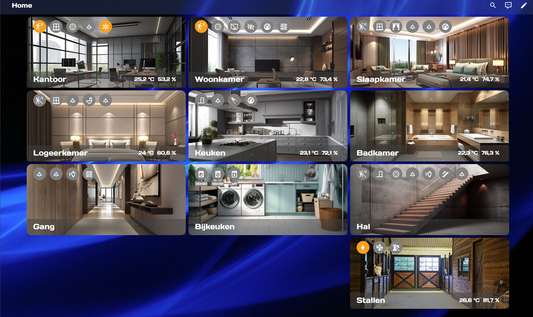
Here is the current status of my customisation
image

I assume that the main icon and the title can no longer be moved to the centre of the map with 2 entity lines. I have tried but my CSS knowledge is rudimentary and therefore failed.

Do you have a solution for dealing with roller shutters? I still have to integrate them into my living room card. I have a window and a door in my living room. I’m thinking about not displaying them individually but via a group, just like the rest of the sockets. Otherwise there will be too many entity “buttons”.

The size is perfect for a smart phone. But there is more space on a tablet or PC. Is there a way to define the CSS classes so that it automatically distinguishes whether it is output on a phone or on a tablet?

1 Like

You should be able to adjust the position of the icon and title with margin:

The icon, title, and entity rows are all contained in “.title” so you need only add to margin-top there and subtract the same amount from “.entities-row:nth-child(2)” margin-top to adjust the title position. To me 20px and -48px looks about right but YMMV.

My recommendation for anything more complicated is to use a bubble card popup when the room card is clicked. I don’t have shutters so can’t speak to those. Alternatively, clicking for more info isn’t too bad. You could maybe use css animations or something but that’s a bit outside of my wheelhouse.

I don’t know about css classes but conditional cards/sections can do that just fine. So just duplicate the cards and have them edited to your liking?

I’m trying add animation to some of my ceiling fan icons, but can’t seem to get anything to work. I’d really like them to spin, but I found an example from @marcokreeft87 about making an icon blink so I figured I’d start with that. @marcokreeft87 's original code is in Post #457.

Here’s the code I’m using:

type: custom:room-card
title: Living Room
info_entities:
  - entity: binary_sensor.living_room_occupancy
    show_icon: true
    icon:
      conditions:
        - icon: mdi:motion-sensor
          condition: equals
          value: 'on'
        - icon: mdi:motion-sensor-off
          condition: equals
          value: 'off'
  - sensor.living_room_temperature
  - sensor.living_room_humidity
entities:
  - entity: fan.living_room_ceiling_fan
    name: Ceiling Fan
    show_icon: true
    tap_action:
      action: toggle
    card_mod:
      style: |
        {% if is_state('fan.living_room_ceiling_fan','on') %}
          ha-card {
            animation: blink 1s linear infinite;
          }
          @keyframes blink {
            50% {opacity: 0;}
          } 
        {% endif %}

Unfortunately, no matter what I try the ceiling fan doesn’t blink.

You have the wrong indentation, you have to use card_mod under custom room-card…

blink for ha-card
type: custom:room-card
title: Living Room
info_entities:
  - entity: binary_sensor.movement_backyard
    .
    .

entities:
  - entity: fan.ceiling_fan
    name: Ceiling Fan
    show_icon: true
    tap_action:
      action: toggle
card_mod:
  style: |
    {% if is_state('fan.ceiling_fan','on') %}
      ha-card {
        animation: blink 1s linear infinite;
      }
      @keyframes blink {
        50% {opacity: 0;}
      }
    {% endif %}

- type: custom:room-card
  title: Living Room
  info_entities:
    - entity: binary_sensor.movement_backyard
    .
    .
  entities:
    - entity: fan.ceiling_fan
      name: Ceiling Fan
      show_icon: true
      tap_action:
        action: toggle
      icon:
        conditions:
          - condition: equals
            value: 'on'
            styles:
              color: yellow
              animation: blink 0.75s ease infinite
  card_mod:
    style: |
      @keyframes blink {
        50% {opacity: 0;}
      }
      @keyframes spin {
          from {
              transform:rotate(0deg);
          }
          to {
              transform:rotate(360deg);
          }
      }

change to spin if you want …
animation: spin 2s linear infinite
CleanShot 2024-07-09 at 22.36.47

@VietNgoc Thank you! That worked perfectly.

Is there a way to improve the visualization on my cell phone?

   - type: custom:room-card
            title: Wohnzimmer
            entity: light.deckenlampe_wohnzimmer
            icon: mdi:wall-sconce-flat
            show_icon: true
            tap_action:
              action: toggle
            entities:
              - entity: light.wohnzimmer_lampen
                name: Stehlampen
                icon: mdi:lamp
                show_icon: true
                tap_action:
                  action: toggle
              - entity: light.deckenlampe_wohnzimmer
                name: Deckenlampe
                icon: mdi:ceiling-light
                show_icon: true
              - script.kaffeehausmusik
              - entity: media_player.wohnzimmer
                name: Apple TV
                icon: mdi:television
                show_icon: true
            info_entities:
              - entity: sensor.temp_sensor_temperatur
                show_icon: true
              - sensor.temp_sensor_temperatur
              - entity: sensor.temp_sensor_luftfeuchtigkeit
                show_icon: true
              - sensor.temp_sensor_luftfeuchtigkeit
          - type: custom:mushroom-media-player-card
            entity: media_player.wohnzimmer
            primary_info: state
            secondary_info: name
            icon_type: icon
            use_media_info: true
            show_volume_level: true
            media_controls:
              - on_off
              - play_pause_stop
            volume_controls:
              - volume_set
            tap_action:
              action: call-service
              service: media_player.media_play_pause
              target: {}

´´´

I’m currently playing around with this, but I cant find a way to align the icons in different rows. The content_alignment does nothing.

How to fix this problem with the card on my cell phone? I placed the icons further to the left to make room for the last one, but it refuses to stay on the same line.

2024-08-08

The code:

type: custom:room-card
title: Livingroom
show_icon: true
entity: light.sanca_led
tap_action:
  action: toggle
card_mod:
  style: |
    .entities-row{
      margin-left: -10px;
      margin-top: 10px;
      padding: 0px 16px 12px 10px !important;
      !border: 1px solid red;
      height: 35px
    }
    .entities-row .entity{
      width: 35px;
      height: 35px;
      margin-left: 10px !important;
      margin-right: 0px !important;
      --mdc-icon-size: 50%;
    }
    .entities-row .entity .icon-small{
      width: auto;
      height: auto;
      margin-top: -3px;
      margin-left: 1z0px;
    }
    .entities-info-row{
      padding: 0 !important;
      margin: -20px -3px;
    }
    .entities-info-row .entity{
      !border: 1px solid red;
      padding: 0 !important;
      --mdc-icon-size: 50% !important;
    }
    .entities-info-row .entity .icon-small{
      width: 35px;
      height: 35px;
      margin-left: -5px;
      margin-top: -8px;
    }
    .main-icon{
      height: 63px !important;
      width: 80px !important;
      margin-top: 18px !important;
    }
    .main-state{
      margin-top: -16px;
      max-width: none;
      max-height: none;      
    }
    .title{
      font-weight: bold;
      !border: 1px solid red;
      margin-top: 16px;
    }
card_styles:
  '--ha-card-header-font-size': 16px
styles:
  template: >
    if (entity.state == 'on' & entity.attributes.rgb_color!=null) return
    'background-color: rgba(' + entity.attributes.rgb_color + ',0.15);
    border-radius: 50%; --mdc-icon-size: 50%;';  if (entity.state == 'on' &
    entity.attributes.rgb_color==null) return 'background-color:
    rgba(var(--rgb-accent-color),0.15); border-radius: 50%; --mdc-icon-size:
    50%;';  else return 'background-color: rgba(var(--rgb-disabled-color),0.2);
    border-radius: 50%; --mdc-icon-size: 50%;'
icon:
  template:
    icon: return 'mdi:sofa'
    styles: >
      return 'width: 100%; height: 100%; margin-top: auto; margin-left: .01em;
      color: var(--disabled-color)';
templates:
  - name: info_icon_entity
    template:
      show_icon: true
      state_color: false
      hide_if:
        conditions:
          - condition: equals
            value: off2
      styles:
        template: |
          return 'width: auto; --mdc-icon-size: 50%;'
      icon:
        template:
          styles: >
            if (entity.state == "on") return 'color: var(--accent-color)
            !important;'; else return 'color: var(--blue-color) !important;';
  - name: info_text
    template:
      show_icon: true
      state_color: false
      styles:
        template: |
          return 'width: auto; font-size: 90%; color: red;';
      icon:
        template:
          styles: |
            return 'color: var(--red-color) !important;';          
  - name: info_text_entity
    template:
      show_icon: true
      state_color: false
      styles:
        template: |
          return 'width: auto; font-size: 90%; color: grey;';
  - name: light_button
    template:
      show_icon: true
      state_color: true
      show_name: false
      styles:
        template: >
          if (entity.state == 'on') return 'background-color: rgba(' +
          entity.attributes.rgb_color + ',0.15); border-radius: 50%; border: 1px
          solid var(--divider-color);';  else return 'background-color:
          rgba(var(--rgb-disabled-color),.2); border-radius: 50%; border: 1px
          solid var(--disabled-color);';
      icon:
        template:
          styles: |
            return 'color: var(--disabled-color) !important;';
  - name: media_button
    template:
      show_icon: true
      state_color: true
      show_name: false
      styles:
        template: >
          return 'background-color: rgba(var(--rgb-primary-color),.2);
          border-radius: 50%; border: 1px solid var(--divider-color); ';
      icon:
        template:
          icon: >
            if (entity.state == "playing") return 'mdi:speaker-play'; else
            return 'mdi:speaker-pause';
          styles: |
            return 'color: var(--disabled-color) !important;';
  - name: entity_button
    template:
      show_icon: true
      state_color: true
      show_name: false
      tap_action:
        action: toggle
      styles:
        template: >
          if (entity.state == "on") return 'background-color:
          rgba(var(--rgb-accent-color),.2); border-radius: 50%;  border: 1px
          solid var(--divider-color);';  else return 'background-color:
          rgba(var(--rgb-disabled-color),.2); border-radius: 50%;  border: 1px
          solid var(--divider-color);';
      icon:
        template:
          styles: >
            if (entity.state == "on") return 'color: var(--red-color)
            !important; width: auto; height: auto;'; else return 'color:
            var(--disabled-color) !important; width:

In CSS, when in doubt, start slapping border: 1px red solid; onto everything until you figure out what its doing.

Would have loved to see the code for this card setup…
image

It’s changed a bit since I posted the screenshot, but here’s what the Kitchen card currently looks like:

type: custom:room-card
title: Kitchen
entity: light.kitchen_ceiling
icon: mdi:tune
show_icon: true
state_color: false
tap_action:
  action: navigate
  navigation_path: '#kitchen'
info_entities:
  - entity: binary_sensor.kitchen_motion_occupancy
    show_icon: true
    state_color: true
entities:
  - entity: light.kitchen_ceiling
    show_icon: true
    name: Ceiling
    tap_action:
      action: toggle
  - entity: light.kitchen_table
    show_icon: true
    name: Table
    tap_action:
      action: toggle
  - entity: light.kitchen_island
    show_icon: true
    name: Island
    tap_action:
      action: toggle
  - entity: light.undercabinet_lights
    show_icon: true
    name: Cabinet
    tap_action:
      action: toggle
cards:
  - type: custom:mini-media-player
    entity: media_player.kitchen_google_hub
    show_states:
      - playing

I was able to do it by using card_mod and adjusting padding and margins.

        card_mod:
          style: |
            ha-card {
              background: rgba(1,1,1,.6);
              --card-primary-font-size: 10px;
              --card-secondary-font-size: 9px;
              border: 1.35px solid white;
              box-shadow: 0px 0px 0px 0px rgba(0,0,0,0);
              border-radius: 16px;
              --card-primary-color: white !important;
              --mdc-icon-size: 30px;
              --primary-text-color: white;
              --card-secondary-color: white;
              --secondary-text-color: white;
              font-family: raleway-light.woff2;
            }
            ha-state-icon {
            } 
            .card-header {
              font-size: 18px;
              margin-top: -5px;
            }
            .entities-row .entity {
              margin-right: -1px;
              margin-left: -1px;
              padding-left: -2px;
              padding-right: -2px;
              margin-bottom: 0px;
            }
            .content-left .entity {
              font-size-adjust:.6
            }

Hi, I can’t install Room-card on my HA instance. I get these messages:
2024-09-02 10_13_06-HACS – Home Assistant
2024-09-02 10_13_16-HACS – Home Assistant

Am I doing something wrong? Or is it because of HACS 2.0?

Greets
Daniel

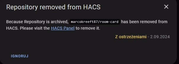
today I have information that repository is archived… but why? is anyone have any information? thats very nice integration and makes dash very nice... so whats happened?

image

2 Likes

As with many community contributed things, it looks like the author has decided they don’t want to or don’t have time to maintain it anymore. Given the $0 any of us are paying for it, that’s absolutely within their purview to decide. They archived the Github repo, so there will be no more updates unless someone forks it and takes it over. Basically, it’ll keep working until it doesn’t.

Looks like it’s time to look at some of the new built in options for displaying items. I think there will be some ways to get close to what this card does.

1 Like

I was just on my way creating a new overview dashboard with this card. Sure hope it will continue to function and/or someone will pick up the great work. It would really suck having to start over again.

1 Like

Well… butts. I may try to resurrect this if I find free time. I looked for a solution like this for a long time and I do not think there are others out there that do what I want.

Came here to say my condolences. I’ve been using this card for a HUD for a while, and had plans to tweak it to be the default view for my phone when I got a chance…

The new dashboard that HA is working on these days looks okay, but I liked how condensed this one was

yeah really disappointed about this, room-card was fantastic!

1 Like

Very sorry to see this nice custom card get archived. I am so sick of having to do complete rewrites due to change like this. Hope it keeps working for a while.
Yes, I know it’s “free” and understand things change and people lose interest or have no time to maintain such work. Wish I could somehow set my system up to be somewhat insulated from difficulties like this.