Your welcome 
Hello, super cool card! Can I ask for the code? I can’t even adjust the transparency. Or change the font design. 
Here is my card, but I didn’t work on it any further afterwards:
type: custom:room-card
title: Wohnzimmer
show_icon: true
state_color: false
entity: light.wohnzimmer_licht
tap_action:
  action: call-service
  service: light.toggle
  service_data:
    entity_id:
      - light.wohnzimmer_strips
card_mod:
  style: |
    .entities-row{
      margin-left: auto;
      padding: 0px 16px 12px 16px !important;
      height: 28px;
    }
    .entities-row:nth-child(2){
      margin-top: -48px;
    }
    .entities-row .entity{
      width: 30px;
      height: 30px;
      margin-left: 10px !important;
      margin-right: 0px !important;
      --mdc-icon-size: 60%;
    }
    .entities-row .entity .icon-small{
      width: auto;
      height: auto;
      margin-top: -5px;
      margin-left: 1px;
    }
    .entities-info-row{
      padding: 0 !important;
      margin: -22px -3px;
    }
    .entities-info-row .entity{
      !border: 1px solid red;
      padding: 0 !important;
      --mdc-icon-size: 80% !important;
      margin-left: 8px !important;
      margin-right: 0px !important;
    }
    .entities-info-row .entity .icon-small{
      width: 20px;
      height: 44px;
      !border: 1px solid red;
    }
    .main-icon{
      height: inherit !important;
      width: 45px !important;
      margin-top: 0px !important;
    }
    .main-state{
      margin-top: 1px;
      max-width: none;
      max-height: none;
      border-radius: 50%;
      height: 45px;
    }
    .title{
      font-weight: 500;
      !border: 1px solid red;
      margin-top: 20px;
    }
card_styles:
  "--ha-card-header-font-size": 17px
  "--mdc-icon-size": 65%
styles:
  template: >
    if (entity.state == 'on' & entity.attributes.rgb_color!=null) return
    'background-color: rgba(' + entity.attributes.rgb_color + ',0.15) ';   if
    (entity.state == 'on' & entity.attributes.rgb_color==null) return
    'background-color: rgba(var(--rgb-accent-color),0.15); ';  else return
    'background-color: rgba(var(--rgb-disabled-color),0.2);'
icon:
  template:
    icon: return 'mdi:sofa'
    styles: >
      if (entity.state == 'on' & entity.attributes.rgb_color!=null) return
      'margin-left: .01em; color: rgba(' + entity.attributes.rgb_color + ',1) ';
      if (entity.state == 'on' & entity.attributes.rgb_color==null) return
      'margin-left: .01em; color: var(--accent-color) '; else return
      'margin-left: .01em; color: var(--disabled-color)';
templates:
  - name: info_icon_entity
    template:
      show_icon: true
      state_color: false
      styles:
        template: |
          return 'width: auto; --mdc-icon-size: 50%;'
      icon:
        template:
          styles: >
            if (entity.state == "on") return 'color: var(--accent-color)
            !important;';  if (entity.state == "unavailable") return 'color: red
            !important;'; else return 'color: var(--disabled-color)
            !important;';
  - name: info_window_icon_entity
    template:
      show_icon: true
      state_color: false
      styles:
        template: |
          return 'width: auto; --mdc-icon-size: 50%;'
      icon:
        template:
          styles: >
            if (entity.state == "on") return 'color: var(--accent-color)
            !important;';  if (entity.state == "unavailable") return 'color: red
            !important;';  if (entity.state == "off") return 'color: green
            !important;';else return 'color: var(--disabled-color)
            !important;';
  - name: info_media_icon_entity
    template:
      show_icon: true
      state_color: true
      show_name: false
      styles:
        template: >
          if (entity.state == "playing") return 'background-color: transparent';
          if (entity.state != "playing") return 'background-color:
          rgba(var(--rgb-disabled-color),.2);';
      icon:
        template:
          icon: >
            if (entity.state == "playing") return 'mdi:speaker-play'; else
            return 'mdi:speaker-pause';
          styles: |
            return 'color: var(--disabled-color) !important;';
  - name: info_text_entity
    template:
      show_icon: false
      state_color: true
      styles:
        template: |
          if (entity.state == "unavailable") return 'color: red !important;';
          else return 'width: auto; font-size: 75%; color: grey;';
  - name: light_button
    template:
      show_icon: true
      state_color: true
      show_name: false
      styles:
        template: >
          if (entity.state == 'on') return 'background-color: rgba(' +
          entity.attributes.rgb_color + ',0.15); border-radius: 50%; border: 1px
          solid var(--divider-color);';  else return 'background-color:
          rgba(var(--rgb-disabled-color),.2); border-radius: 50%; border: 1px
          solid var(--divider-color);';
      icon:
        template:
          styles: |
            return 'color: var(--disabled-color) !important;';
  - name: cover_button
    template:
      show_icon: true
      state_color: false
      show_name: false
      styles:
        template: >
          if ((entity.state == "closed") || (entity.attributes.current_position
          < 50)) return 'background-color: rgba(var(--rgb-accent-color),.2);
          border-radius: 50%;  border: 1px solid var(--divider-color);';  else
          return 'background-color: rgba(var(--rgb-disabled-color),.2);
          border-radius: 50%;  border: 1px solid var(--divider-color);';
      icon:
        template:
          icon: >
            if (entity.attributes.current_position < 10 ) { if
            (entity.entity_id.includes('fenster')) return
            'kuf:fts_garage_door_100'; else return 'mdi:window-shutter'};   if
            (entity.attributes.current_position < 20 ) return
            'kuf:fts_shutter_90';   if (entity.attributes.current_position < 30
            ) return 'kuf:fts_shutter_80';   if
            (entity.attributes.current_position < 40 ) return
            'kuf:fts_shutter_70';    if (entity.attributes.current_position < 50
            ) return 'kuf:fts_shutter_60';   if
            (entity.attributes.current_position < 60 ) return
            'kuf:fts_shutter_50';   if (entity.attributes.current_position < 70
            ) return 'kuf:fts_shutter_40';   if
            (entity.attributes.current_position < 80 ) return
            'kuf:fts_shutter_30';   if (entity.attributes.current_position < 90
            ) return 'kuf:fts_shutter_20';   else { if
            (entity.entity_id.includes('fenster')) return 'kuf:fts_shutter_10';
            else return 'mdi:window-shutter-open'};
  - name: entity_button
    template:
      show_icon: true
      state_color: true
      show_name: false
      styles:
        template: >
          if (entity.state == "on") return 'background-color:
          rgba(var(--rgb-accent-color),.2); border-radius: 50%;  border: 1px
          solid var(--divider-color);';  else return 'background-color:
          rgba(var(--rgb-disabled-color),.2); border-radius: 50%;  border: 1px
          solid var(--divider-color);';
      icon:
        template:
          styles: >
            if (entity.state == "on") return 'color: var(--accent-color)
            !important; width: auto; height: auto;'; else return 'color:
            var(--disabled-color) !important; width: auto; height: auto;';
  - name: climate_button
    template:
      show_icon: true
      state_color: true
      show_name: false
      styles:
        template: >
          if (entity.state == 'cooling') return 'background-color:
          rgba(--rgb-primary-color,.2) !important; border-radius: 50%; border:
          1px solid var(--divider-color);';   else return 'background-color:
          rgba(var(--rgb-disabled-color),.2) !important; border-radius: 50%;
          border: 1px solid var(--disabled-color);';
      icon:
        template:
          styles: |
            return 'color: var(--disabled-color) !important;';
info_entities:
  - entity: binary_sensor.eg_wohnzimmer_bewegungsmelder
    template: info_icon_entity
  - entity: binary_sensor.eg_wohnzimmer_fenster_fensterkontakt
    template: info_window_icon_entity
  - entity: binary_sensor.eg_wohnzimmer_terrassentur_fensterkontakt
    template: info_window_icon_entity
  - entity: binary_sensor.eg_wohnzimmer_fenster_beschattung_status
    template: info_icon_entity
  - entity: media_player.wohnzimmer
    template: info_media_icon_entity
  - entity: sensor.wohnzimmer_tenmperatur
    template: info_text_entity
rows:
  - entities:
      - entity: light.wohnzimmer_spots
        tap_action:
          action: toggle
        template: light_button
      - entity: light.wohnzimmer_strips
        tap_action:
          action: toggle
        template: entity_button
      - entity: light.wohnzimmer_aussenlicht_2
        tap_action:
          action: toggle
        template: entity_button
  - entities:
      - entity: switch.steckdosenleiste_fernseher
        tap_action:
          action: toggle
        template: entity_button
      - entity: switch.sonosleiste
        tap_action:
          action: toggle
        template: entity_button
      - entity: switch.steckdosenleiste_couch
        tap_action:
          action: navigate
          navigation_path: "#Wohnzimmer-Steckdosen"
        template: entity_button
      - entity: climate.wohnzimmer_heizung
        template: climate_button
      - entity: cover.wohnzimmer_schiebetur_rollo
        template: cover_button
      - entity: cover.eg_wohnzimmer_fenster_rollo
        template: cover_button
sooooo many style settings. thank you very much
Hi,
Frist I want to say thank you @marcokreeft87 for keeping this running, I’m enjoying the card a lot and starting to build my dashboard.
I have a question I was hoping someone could help me with. I have the template below, the style works for the text, the style works for the icon type but not the icon color. Is this becuase I can’t change the color of the icon, or have I got the syntax wrong?
type: custom:room-card
rows: null
title: People
templates:
  - name: home_visual_change
    template:
      show_icon: true
      state_color: true
      show_state: true
      styles:
        template: >
          if (entity.state == 'home') return 'color: green';  else return
          'color: orangered';
      icon:
        template:
          icon: >
            if (entity.state == 'home') return 'mdi:home-account';
            else return 'mdi:home';
          styles: >
            if (entity.state == 'home') return 'color: green';
            else return 'color: orangered';
entities:
  - entity: device_tracker.jon_iphone
    name: Jon
    template: home_visual_change
  - entity: device_tracker.emma_iphone13
    template: home_visual_change
    name: Emma
  - entity: device_tracker.william_iphone
    template: home_visual_change
    name: Limlim
  - entity: device_tracker.joe_iphone
    template: home_visual_change
    name: Dodo
  - entity: device_tracker.bob_iphone
    template: home_visual_change
    name: Bob
It’s ok, I fixed it - the state_color: true was the issue.
J
Hi Again
How would you guys go about showing multiple attributes about the same entity, for example;

I have a list of people and if they are home, then the distance from home below. Obviously they don’t align, what would be you approach whilst keeping this top to bottom layout?
Thanks
J
Could you provide your yaml for this example? A workaround tho some might say it’s a sloppy hack would be to use the custom:gap-card to spread out the bottom line (distance).
Sorry for slow reply, I just spotted the notification in my junk!
Here is the YAML, if I let is show an icon, then all is ok.
type: custom:room-card
title: People
templates:
  - name: home_visual_change
    template:
      show_icon: true
      state_color: false
      show_state: false
      styles:
        template: >
          if (entity.state == 'home') return 'color: green';  else return
          'color: orangered';
      icon:
        template:
          styles: >
            if (entity.state == 'home') return 'color: green'; else return
            'color: orangered';
          icon: >
            if (entity.state == 'home') return 'mdi:home-account';   else return
            'mdi:home';
rows:
  - entities:
      - entity: device_tracker.jon_iphone
        template: home_visual_change
        name: Jon
      - entity: device_tracker.emma_iphone13
        template: home_visual_change
        name: Emma
      - entity: device_tracker.william_iphone
        template: home_visual_change
        name: Limlim
      - entity: device_tracker.joe_iphone
        template: home_visual_change
        name: Dodo
      - entity: device_tracker.bob_iphone
        template: home_visual_change
        name: Bob
  - entities:
      - entity: sensor.jon_iphone_zone_distance
        show_name: false
        show_icon: false
        show_state: true
      - entity: sensor.emma_iphone13_home_distance
        show_name: false
        show_icon: false
        show_state: true
      - entity: sensor.william_iphone_zone_distance
        show_name: false
        show_icon: false
        show_state: true
      - entity: sensor.joe_iphone_zone_distance
        show_name: false
        show_icon: false
        show_state: true
      - entity: sensor.bob_iphone_zone_distance
        show_name: false
        show_icon: false
        show_state: true
Try this:
type: custom:room-card
title: People
templates:
  - name: home_visual_change
    template:
      show_icon: true
      state_color: false
      show_state: false
      styles:
        template: >
          if (entity.state == 'home') return 'color: green';  else return 'color: orangered';
      icon:
        template:
          styles: >
            if (entity.state == 'home') return 'color: green'; else return 'color: orangered';
          icon: >
            if (entity.state == 'home') return 'mdi:home-account'; else return 'mdi:home';
rows:
  - entities:
      - entity: device_tracker.jon_iphone
        template: home_visual_change
        name: Jon
        style: "width: 20%;"
      - entity: device_tracker.emma_iphone13
        template: home_visual_change
        name: Emma
        style: "width: 20%;"
      - entity: device_tracker.william_iphone
        template: home_visual_change
        name: Limlim
        style: "width: 20%;"
      - entity: device_tracker.joe_iphone
        template: home_visual_change
        name: Dodo
        style: "width: 20%;"
      - entity: device_tracker.bob_iphone
        template: home_visual_change
        name: Bob
        style: "width: 20%;"
  - entities:
      - entity: sensor.jon_iphone_zone_distance
        show_name: false
        show_icon: false
        show_state: true
        style: "width: 20%;"
      - entity: sensor.emma_iphone13_home_distance
        show_name: false
        show_icon: false
        show_state: true
        style: "width: 20%;"
      - entity: sensor.william_iphone_zone_distance
        show_name: false
        show_icon: false
        show_state: true
        style: "width: 20%;"
      - entity: sensor.joe_iphone_zone_distance
        show_name: false
        show_icon: false
        show_state: true
        style: "width: 20%;"
      - entity: sensor.bob_iphone_zone_distance
        show_name: false
        show_icon: false
        show_state: true
        style: "width: 20%;"
Here is a different way to display it, though you’ll need to edit the yaml to ensure the entities and sensors are yours - I don’t have the same sensors:
type: vertical-stack
cards:
  - type: horizontal-stack
    cards:
      - type: custom:mushroom-template-card
        primary: |
          {{ states.device_tracker.galaxy_s24u.attributes.friendly_name }}
        secondary: |
          {{ states('sensor.device_tracker.galaxy_s24u_zone_distance') }} mi
        icon: |
          {% if states('device_tracker.galaxy_s24u') == 'home' %}
            mdi:home-account
          {% else %}
            mdi:home
          {% endif %}
        icon_color: |
          {% if states('device_tracker.galaxy_s24u') == 'home' %}
            green
          {% else %}
            orangered
          {% endif %}
        fill_container: false
        entity: device_tracker.jon_iphone
        multiline_secondary: false
        layout: horizontal
      - type: custom:mushroom-template-card
        primary: |
          {{ states.device_tracker.galaxy_s24u.attributes.friendly_name }}
        secondary: |
          {{ states('sensor.device_tracker.galaxy_s24u_zone_distance') }} mi
        icon: |
          {% if states('device_tracker.galaxy_s24u') == 'home' %}
            mdi:home-account
          {% else %}
            mdi:home
          {% endif %}
        icon_color: |
          {% if states('device_tracker.galaxy_s24u') == 'home' %}
            green
          {% else %}
            orangered
          {% endif %}
        fill_container: false
        entity: device_tracker.emma_iphone13
        multiline_secondary: false
        layout: horizontal
        card_mod:
          style: |
            ha-card {
              height: 50px !important;
            }
  - type: horizontal-stack
    cards:
      - type: custom:mushroom-template-card
        primary: |
          {{ states.device_tracker.galaxy_s24u.attributes.friendly_name }}
        secondary: |
          {{ states('sensor.device_tracker.galaxy_s24u_zone_distance') }} mi
        icon: |
          {% if states('device_tracker.galaxy_s24u') == 'home' %}
            mdi:home-account
          {% else %}
            mdi:home
          {% endif %}
        icon_color: |
          {% if states('device_tracker.galaxy_s24u') == 'home' %}
            green
          {% else %}
            orangered
          {% endif %}
        fill_container: false
        entity: device_tracker.emma_iphone13
        multiline_secondary: false
        layout: horizontal
        card_mod:
          style: |
            ha-card {
              margin: 30px;
            }
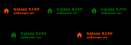
Here’s what the end product should look like (with the names showing of each person. I don’t use a friendly name for my phone - that’s why it says Galaxy S24U as the name):
Guys, the HACS team is very slow with approving PRs and they won’t give room card a bit more prio because of the situation
( there was a guy that made a PR for the removal of room card from HACS because he was asking a lot of questions that he could have answered himself by reading the readme. He was mad i didnt answer all of them, made bug reports that werent bugs and such )
I need your help convincing the HACS team. Please comment here why we want room card back in HACS:
afraid this won’t help, just make it available as custom repo, and be done with it.
some wait for almost a year or more iirc. my last one took 10 months
it’s just the way this integration goes, no use fighting that
ofc it is remarkable the PR requesting removal did get approved… can you link that? so we can see what, who and why?
We are neighbors in the HACS file haha
right, so this happened because the card was archived… seems nothing personal?
no other way around it then
Thank you!!!
1 Like
I’m hoping someone can help me with a nagging issue that I can not seem to beat.
I have my room card nearly perfect for my needs, but there are two issues I do not know how to resolve.
- I cannot get the temp data to center in its bubble.
- What is the size of a section in grid mode? I’m having issues getting this card to the right height and width, so they work at one section wide per card.
This is what is happening:

type: custom:room-card
title: Living Room
show_icon: true
state_color: true
entity: binary_sensor.presence_sensor_lr_presence_sensor_6
tap_action:
  action: nul
  service: nul
  service_data:
    entity_id:
      - nul
card_mod:
  style: |
    .entities-row{
      margin-left: -20px;
      height: 75px;
      width: 300px;
    }
    .entities-row:nth-child(2){
      margin-top: 0px;
    }
    .entities-row .entity{
      width: -5px;
      height: 40px;
      margin-left: 15px !important;
      margin-right: 0px !important;
      --mdc-icon-size: 60%;
    }
    .entities-row .entity .icon-small{
      width: 45px;
      height: 45px;
      margin-top: -0px;
      margin-left: -0px;
    }
    .entities-info-row{
      padding: 0px;
      width: 195px;
      margin: -05px;
      margin-right: -35px !important;
      margin-top: -10px !important;
    }
    .entities-info-row .entity{
      !border: 1px solid red;
      padding: -15 !important;
      --mdc-icon-size: 60% !important;

      margin-right: 0px !important;
    }
    .entities-info-row .entity .icon-small{
      width: 40px;
      height: 40px;
      !border: 1px solid red;
    }
    .main-icon{
      height: 50px ;
      width:50px !important;
      margin-top: 5px !important;
    }
    .main-state{
      margin-top: 1px;
      max-width: none;
      max-height: none;
      border-radius: 100%;
      height: 55px;
    }
    .title{
      font-weight: 500;
      margin-top: 0px;
    }
card_styles:
  "--ha-card-header-font-size": 16px
  "--mdc-icon-size": 50%
styles:
  template: >
    if (entity.state == 'on' & entity.attributes.rgb_color!=null) return
    'background-color: rgba(' + entity.attributes.rgb_color + ',0.15) ';   if
    (entity.state == 'on' & entity.attributes.rgb_color==null) return
    'background-color: rgba(var(--rgb-accent-color),0.15); ';  else return
    'background-color: rgba(var(--rgb-disabled-color),0.2);'
icon:
  template:
    icon: null
templates:
  - name: info_icon_entity
    template:
      show_icon: true
      state_color: false
      styles:
        template: |
          return 'width: auto; --mdc-icon-size: 50%;'
      icon:
        template:
          styles: >
            if (entity.state == "on") return 'color: var(--accent-color)
            !important;';  if (entity.state == "unavailable") return 'color: red
            !important;'; else return 'color: var(--disabled-color)
            !important;';
  - name: info_window_icon_entity
    template:
      show_icon: false
      state_color: false
      styles:
        template: |
          return 'width: auto; --mdc-icon-size: 50%;'
      icon:
        template:
          styles: >
            if (entity.state == "on") return 'color: var(--accent-color)
            !important;';  if (entity.state == "unavailable") return 'color: red
            !important;';  if (entity.state == "off") return 'color: green
            !important;';else return 'color: var(--disabled-color)
            !important;';
  - name: info_text_entity
    template:
      show_icon: false
      state_color: true
      styles:
        template: |
          if (entity.state == "unavailable") return 'color: red !important;';
          else return 'width: auto; font-size: 75%; color: grey;';
  - name: light_button
    template:
      show_icon: true
      state_color: true
      show_name: false
      styles:
        template: >
          if (entity.state == 'on') return 'background-color: rgba(' +
          entity.attributes.rgb_color + ',0.15); border-radius: 50%; border: 1px
          solid var(--divider-color);';  else return 'background-color:
          rgba(var(--rgb-disabled-color),.2); border-radius: 50%; border: 1px
          solid var(--divider-color);';
      icon:
        template:
          styles: |
            return 'color: var(--disabled-color) !important;';
  - name: cover_button
    template:
      show_icon: true
      state_color: false
      show_name: false
      styles:
        template: >
          if ((entity.state == "closed") || (entity.attributes.current_position
          < 50)) return 'background-color: rgba(var(--rgb-accent-color),.2);
          border-radius: 50%;  border: 1px solid var(--divider-color);';  else
          return 'background-color: rgba(var(--rgb-disabled-color),.2);
          border-radius: 50%;  border: 1px solid var(--divider-color);';
      icon:
        template:
          icon: >
            if (entity.attributes.current_position < 10 ) { if
            (entity.entity_id.includes('fenster')) return
            'kuf:fts_garage_door_100'; else return 'mdi:window-shutter'};   if
            (entity.attributes.current_position < 20 ) return
            'kuf:fts_shutter_90';   if (entity.attributes.current_position < 30
            ) return 'kuf:fts_shutter_80';   if
            (entity.attributes.current_position < 40 ) return
            'kuf:fts_shutter_70';    if (entity.attributes.current_position < 50
            ) return 'kuf:fts_shutter_60';   if
            (entity.attributes.current_position < 60 ) return
            'kuf:fts_shutter_50';   if (entity.attributes.current_position < 70
            ) return 'kuf:fts_shutter_40';   if
            (entity.attributes.current_position < 80 ) return
            'kuf:fts_shutter_30';   if (entity.attributes.current_position < 90
            ) return 'kuf:fts_shutter_20';   else { if
            (entity.entity_id.includes('fenster')) return 'kuf:fts_shutter_10';
            else return 'mdi:window-shutter-open'};
  - name: entity_button
    template:
      show_icon: true
      state_color: true
      show_name: false
      styles:
        template: >
          if (entity.state == "on") return 'background-color:
          rgba(var(--rgb-accent-color),.2); border-radius: 50%;  border: 1px
          solid var(--divider-color);';  else return 'background-color:
          rgba(var(--rgb-disabled-color),.2); border-radius: 50%;  border: 1px
          solid var(--divider-color);';
      icon:
        template:
          styles: >
            if (entity.state == "on") return 'color: var(--accent-color)
            !important; width: auto; height: auto;'; else return 'color:
            var(--disabled-color) !important; width: auto; height: auto;';
  - name: climate_button
    template:
      show_icon: false
      state_color: true
      show_name: false
      styles:
        template: >
          return 'background-color: ; rgba(var(--rgb-disabled-color)) ;
          border-radius: 10px 10px 10px 10px; font-size: 12px;
          height: 14px ; padding: 5% ; border: 1px solid
          var(--disabled-color);';

      icon:
        template:
          styles: |
            return 'color: var(--disabled-color) !important;';
info_entities:
  - entity: light.govee_glide_lively
    state_color: true
    name: Status LEDs
    icon: mdi:led-strip
    show_icon: true
    tap_action:
      action: toggle
  - entity: sensor.curtain_status
    state_color: false
    name: Curtains
    show_icon: true
    tap_action:
      action: nul
    icon:
      conditions:
        - condition: equals
          value: open
          icon: mdi:curtains
          styles:
            color: gold
        - condition: equals
          value: closed
          icon: mdi:curtains-closed
          state_color: true
  - entity: switch.a_c
    name: Fan
    show_icon: true
    tap_action:
      action: toggle
    icon:
      conditions:
        - condition: equals
          value: "on"
          icon: mdi:air-conditioner
          styles:
            color: blue
        - condition: equals
          value: "off"
          icon: mdi:air-conditioner
  - entity: sensor.livingrm_temp_humidity_temperature
    template: climate_button
rows:
  - entities:
      - entity: light.living_room_floor_lamps
        name: floor lamps
        show_icon: true
        state_color: false
        tap_action:
          action: toggle
        icon:
          conditions:
            - condition: equals
              value: "on"
              icon: mdi:floor-lamp
              styles:
                color: gold
            - condition: equals
              value: "off"
              icon: mdi:floor-lamp
              state_color: true
      - entity: light.corner_floor_lamp
        state_color: true
        name: Corner Lamp
        icon: mdi:lamp
        show_icon: null
        tap_action:
          action: toggle
      - entity: switch.overhead_light
        name: Overhead Light
        icon: mdi:ceiling-fan-light
        show_icon: null
        tap_action:
          action: toggle
      - entity: switch.overhead_fan
        name: Fan
        show_icon: true
        tap_action:
          action: toggle
        icon:
          conditions:
            - condition: equals
              value: "on"
              icon: mdi:fan
              styles:
                color: red
                animation: spin 1.5s linear infinite
            - condition: equals
              value: "off"
              icon: mdi:fan
              card_mod:
                style: |
                  @keyframes blink {
                    50% {opacity: 0;}
                  }
                  @keyframes spin {
                      from {
                          transform:rotate(0deg);
                      }
                      to {
                          transform:rotate(360deg);
                      }
                  }
1 Like
Fixed it:
type: custom:room-card
title: Living Room
show_icon: true
state_color: true
entity: binary_sensor.presence_sensor_lr_presence_sensor_6
tap_action:
  action: nul
  service: nul
  service_data:
    entity_id:
      - nul
card_mod:
  style: |

    @keyframes blink {
                       20% {opacity: 0;}
                     }
                     @keyframes spin {
                         from {
                             transform:rotate(0deg);
                         }
                         to {
                             transform:rotate(360deg);
                         }
                     }
     .entities-row{
       margin-left: -25px;
       padding: 0px 0px 0px 0px ;
       height: 60px;
       width: auto;
     }
     .entities-row:nth-child(2){
       margin-top: 0px;
     }
     .entities-row .entity{
       width: auto;
       height: 200px;
       margin-left: 20px !important;
       margin-right: 0px !important;
       --mdc-icon-size: 55%;
     }
     .entities-row .entity .icon-small{
       width: 50px;
       height: auto;
       margin-top: -0px;
       margin-left: -0px;
     }
     .entities-info-row{
       padding: 0px;
       width: 230px;
       margin: -10px -06px;
       margin-right: -60px !important;
     }
     .entities-info-row .entity{
       !border: 1px solid red;

       --mdc-icon-size: 60% !important;
       margin-left: -0px !important;

     }
     .entities-info-row .entity .icon-small{
       width: 50;
       height: auto;
       !border: 1px solid red;
     }
     .main-icon{
       height: 50px ;
       width:50px !important;
       margin-top: 5px !important;
     }
     .main-state{
       margin-top: 1px;
       max-width: none;
       max-height: none;
       border-radius: 100%;
       height: auto;
     }
     .title{
       font-weight: 500;
       margin-top: -2px;
     }
card_styles:
  "--ha-card-header-font-size": 16px
  "--mdc-icon-size": 50%
styles:
  template: >
    if (entity.state == 'on' & entity.attributes.rgb_color!=null) return
    'background-color: rgba(' + entity.attributes.rgb_color + ',0.15) ';   if
    (entity.state == 'on' & entity.attributes.rgb_color==null) return
    'background-color: rgba(var(--rgb-accent-color),0.15); ';  else return
    'background-color: rgba(var(--rgb-disabled-color),0.2);'
icon:
  template:
    icon: null
templates:
  - name: info_icon_entity
    template:
      show_icon: true
      state_color: false
      styles:
        template: |
          return 'width: auto; --mdc-icon-size: 50%;'
      icon:
        template:
          styles: >
            if (entity.state == "on") return 'color: var(--accent-color)
            !important;';  if (entity.state == "unavailable") return 'color: red
            !important;'; else return 'color: var(--disabled-color)
            !important;';
  - name: info_window_icon_entity
    template:
      show_icon: false
      state_color: false
      styles:
        template: |
          return 'width: auto; --mdc-icon-size: 50%;'
      icon:
        template:
          styles: >
            if (entity.state == "on") return 'color: var(--accent-color)
            !important;';  if (entity.state == "unavailable") return 'color: red
            !important;';  if (entity.state == "off") return 'color: green
            !important;';else return 'color: var(--disabled-color)
            !important;';
  - name: info_text_entity
    template:
      show_icon: false
      state_color: true
      styles:
        template: |
          if (entity.state == "unavailable") return 'color: red !important;';
          else return 'width: auto; font-size: 75%; color: grey;';
  - name: light_button
    template:
      show_icon: true
      state_color: true
      show_name: false
      styles:
        template: >
          if (entity.state == 'on') return 'background-color: rgba(' +
          entity.attributes.rgb_color + ',0.15); border-radius: 50%; border: 1px
          solid var(--divider-color);';  else return 'background-color:
          rgba(var(--rgb-disabled-color),.2); border-radius: 50%; border: 1px
          solid var(--divider-color);';
      icon:
        template:
          styles: |
            return 'color: var(--disabled-color) !important;';
  - name: cover_button
    template:
      show_icon: true
      state_color: false
      show_name: false
      styles:
        template: >
          if ((entity.state == "closed") || (entity.attributes.current_position
          < 50)) return 'background-color: rgba(var(--rgb-accent-color),.2);
          border-radius: 50%;  border: 1px solid var(--divider-color);';  else
          return 'background-color: rgba(var(--rgb-disabled-color),.2);
          border-radius: 50%;  border: 1px solid var(--divider-color);';
      icon:
        template:
          icon: >
            if (entity.attributes.current_position < 10 ) { if
            (entity.entity_id.includes('fenster')) return
            'kuf:fts_garage_door_100'; else return 'mdi:window-shutter'};   if
            (entity.attributes.current_position < 20 ) return
            'kuf:fts_shutter_90';   if (entity.attributes.current_position < 30
            ) return 'kuf:fts_shutter_80';   if
            (entity.attributes.current_position < 40 ) return
            'kuf:fts_shutter_70';    if (entity.attributes.current_position < 50
            ) return 'kuf:fts_shutter_60';   if
            (entity.attributes.current_position < 60 ) return
            'kuf:fts_shutter_50';   if (entity.attributes.current_position < 70
            ) return 'kuf:fts_shutter_40';   if
            (entity.attributes.current_position < 80 ) return
            'kuf:fts_shutter_30';   if (entity.attributes.current_position < 90
            ) return 'kuf:fts_shutter_20';   else { if
            (entity.entity_id.includes('fenster')) return 'kuf:fts_shutter_10';
            else return 'mdi:window-shutter-open'};
  - name: entity_button
    template:
      show_icon: true
      state_color: true
      show_name: false
      styles:
        template: >
          if (entity.state == "on") return 'background-color:
          rgba(var(--rgb-accent-color),.2); border-radius: 50%;  border: 1px
          solid var(--divider-color);';  else return 'background-color:
          rgba(var(--rgb-disabled-color),.2); border-radius: 50%;  border: 1px
          solid var(--divider-color);';
      icon:
        template:
          styles: >
            if (entity.state == "on") return 'color: var(--accent-color)
            !important; width: auto; height: auto;'; else return 'color:
            var(--disabled-color) !important; width: auto; height: auto;';
  - name: climate_button
    template:
      show_icon: false
      state_color: true
      show_name: false
      styles:
        template: >
          return 'background-color: rgba(var(--rgb-disabled-color),.5) ;
          border-radius: 10px 10px 10px 10px; font-size: 13px; width: 55px ;
          height: auto ; padding: .2% ; border: 1px solid
          var(--disabled-color);';

            if (entity.state < 72) return 'color: blue'; if (entity.state >= 72)
            return 'color: grey'; if (entity.state >= 75) return 'color: orange';
            if (entity.state >= 78) return 'color: red';
      icon:
        template:
          styles: |
            return 'color: var(--disabled-color) !important;';
info_entities:
  - entity: light.govee_glide_lively_2
    state_color: true
    name: Status LEDs
    icon: mdi:led-strip
    show_icon: true
    tap_action:
      action: toggle
  - entity: sensor.curtain_status
    state_color: false
    name: Curtains
    show_icon: true
    tap_action:
      action: nul
    icon:
      conditions:
        - condition: equals
          value: open
          icon: mdi:curtains
          styles:
            color: gold
        - condition: equals
          value: closed
          icon: mdi:curtains-closed
          state_color: true
  - entity: switch.a_c
    name: Fan
    show_icon: true
    tap_action:
      action: toggle
    icon:
      conditions:
        - condition: equals
          value: "on"
          icon: mdi:air-conditioner
          styles:
            color: blue
        - condition: equals
          value: "off"
          icon: mdi:air-conditioner
  - entity: sensor.livingrm_temp_humidity_temperature
    template: climate_button
rows:
  - entities:
      - entity: light.living_room_floor_lamps
        name: floor lamps
        show_icon: true
        state_color: false
        tap_action:
          action: toggle
        icon:
          conditions:
            - condition: equals
              value: "on"
              icon: mdi:floor-lamp
              styles:
                color: gold
            - condition: equals
              value: "off"
              icon: mdi:floor-lamp
              state_color: true
      - entity: light.corner_floor_lamp
        state_color: true
        name: Corner Lamp
        icon: mdi:lamp
        show_icon: null
        tap_action:
          action: toggle
      - entity: light.overhead_light_lr
        name: Overhead Light
        icon: mdi:ceiling-fan-light
        show_icon: null
        tap_action:
          action: toggle
      - entity: switch.overhead_fan
        name: Fan
        show_icon: true
        tap_action:
          action: toggle
        icon:
          conditions:
            - condition: equals
              value: "on"
              icon: mdi:fan
              styles:
                color: red
                animation: spin 1.5s linear infinite
            - condition: equals
              value: "off"
              icon: mdi:fan

2 Likes
Hello,
I am trying to play with css, but I am having some issues when the theme is switched to dark.
How can I solve?
This a card code:
type: custom:room-card
title: Cam. principale
entity: light.luci_camera_principale
icon: mdi:bed-outline
show_icon: false
tap_action:
  action: navigate
  navigation_path: /dashboard-piano-primo/camera-principale
card_mod:
  style: |
    ha-card {
      /* varibili colore */
      --rp-content-left-entity-brd: rgba(114, 125, 115, 0.1);
      --rp-content-right-testo-luci-on: rgba(114, 125, 115, 1);
      --rp-content-right-bg: rgba(114, 125, 115, 0.2);
      --rp-content-right-entity-bg-luci-on: rgba(114, 125, 115, 0.2);

      --rp-card-header-bg: rgba(208, 221, 208, 0.5);
      --rp-content-left-entity-bg: rgba(208, 221, 208, 0.02);
      --rp-content-left-entity-bg-luci-on: rgba(208, 221, 208, 0.5);


      /* colore fisso */
      --rp-content-left-testo: rgba(56, 56, 56, 1);
      --rp-content-right-bg-luci-on: rgba(255, 157, 35, 0.9);
      --rp-content-left-entity-bg-antifurto: rgba(190, 49, 68, 0.8);

      /* inizio css */
      overflow: hidden;
      min-height: 160px;
      .card-header {
        padding: 2px 4% 6px 5%;
        background: var(--rp-card-header-bg);
        font-weight: 300;
        .title {
          font-size: 26px;
          line-height: 2em;
          opacity: 0.7;
          overflow-wrap: normal;
          word-break: normal;
          white-space: normal;
          max-width: 60%;
        }
        .entities-info-row {
          padding: 0px;
          right: 20px;
          top: 0px;
          div {
            margin: 0px 0px 0px 6px;
            padding-top: 0px;

          }
          .state {
            font-size: 20px;
            opacity: 1;
          }
        }
      }
      .content-left {
        /* color: var(--rp-content-left-testo); */
        margin: 10px 0px 10px 0px;
        padding: 0px 4% 0px 4%;
        width: 100%;
        box-sizing: border-box;
        z-index: 1;
        .entity {
          background: var(--rp-content-left-entity-bg);
          border: 1px solid var(--rp-content-left-entity-brd);
          border-radius: 8px;
          min-width: 26%;
          margin: 10px 4% 0px 0;
          min-height: 80px;
          padding: 0px;
          box-sizing: border-box;
          span{
            margin: 0 0 10px 0;
            font-size: 100%;
            overflow-wrap: normal;
            word-break: normal;
            white-space: normal;
          }
        }
      }
      .content-right {
        height: 112px;
        width: 112px;
        position: absolute;
        right: 0;
        bottom: 0;
        margin: 0  -20px -28px 0;
        padding: 0px;
        z-index: 0;
        background-color: var(--rp-content-right-bg);
        background-color: ;
        border-radius: 112px;
        background-image: url('data:image/svg+xml;utf-8,<svg xmlns="http://www.w3.org/2000/svg" viewBox="0 0 24 24"><path d="M7 14C8.66 14 10 12.66 10 11C10 9.34 8.66 8 7 8C5.34 8 4 9.34 4 11C4 12.66 5.34 14 7 14M7 10C7.55 10 8 10.45 8 11C8 11.55 7.55 12 7 12C6.45 12 6 11.55 6 11C6 10.45 6.45 10 7 10M19 7H11V15H3V5H1V20H3V17H21V20H23V11C23 8.79 21.21 7 19 7M21 15H13V9H19C20.1 9 21 9.9 21 11Z" fill="rgba(114, 125, 115, 0.5)" /> </svg>');
        background-repeat: no-repeat;
        background-position: center;
        background-size: 40px auto;
        .entity {
          width: 100%;
          height: 100%;
          margin: 0px;
          padding:  0px;
          justify-content: center;
          background-color: var(--rp-content-right-entity-bg-luci-on);
          border-radius: 112px;
          background-image: url('data:image/svg+xml;utf-8,<svg xmlns="http://www.w3.org/2000/svg" viewBox="0 0 24 24"><path d="M7 14C8.66 14 10 12.66 10 11C10 9.34 8.66 8 7 8C5.34 8 4 9.34 4 11C4 12.66 5.34 14 7 14M7 10C7.55 10 8 10.45 8 11C8 11.55 7.55 12 7 12C6.45 12 6 11.55 6 11C6 10.45 6.45 10 7 10M19 7H11V15H3V5H1V20H3V17H21V20H23V11C23 8.79 21.21 7 19 7M21 15H13V9H19C20.1 9 21 9.9 21 11Z" fill="rgba(45, 45, 45, 0.4)" /> </svg>');
          background-repeat: no-repeat;
          background-position: center;
          background-size: 40px auto;
          span:first-child {
            margin: 24px 0 0 0;
            padding: 0px;
            font-size: 12px;
            font-weight: 300;
            width: 100%;
            display: block;
            position: absolute;
            top: 0;
            left: 0px;
          }
          span {
            margin: 8px 0 0 0;
            padding: 0px;
            font-size: 22px;
            font-weight: 300;
            display: block;
            width: 100%;
            color: var(--rp-content-right-testo-luci-on);
          }
        }
      }
rows:
  - entities:
      - entity: sensor.luci_accese_camera_principale
        show_name: true
        show_icon: false
        show_state: true
        name:
          template: return 'luci accese';
        styles:
          template: |
            if (entity.state > 0)
            return 'background-color: var(--rp-content-right-bg-luci-on)';
        hide_if:
          conditions:
            - condition: below
              value: 1
    content_alignment: right
  - entities:
      - entity: light.luci_camera_principale
        name: principale
        icon: mdi:ceiling-light-outline
        show_icon: true
        state_color: false
        tap_action:
          action: toggle
        hold_action:
          action: more-info
        styles:
          template: |
            if (entity.state == 'on')
              return 'background-color: var(--rp-content-left-entity-bg-luci-on)';
  - entities:
      - entity: binary_sensor.konnected_8d4324_konnected_sec_2_zona_09
        name: finestra
        show_icon: true
        state_color: true
        hide_if:
          conditions:
            - condition: equals
              value: "off"
        styles:
          "--paper-item-icon-color": var(--rp-content-left-entity-bg-antifurto);
      - entity: binary_sensor.konnected_8d4324_konnected_sec_2_zona_12
        name: porta-finestra
        show_icon: true
        state_color: true
        hide_if:
          conditions:
            - condition: equals
              value: "off"
        styles:
          "--paper-item-icon-color": var(--rp-content-left-entity-bg-antifurto);
      - entity: binary_sensor.konnected_8d4324_konnected_sec_2_zona_08
        name: finestra bagno
        show_icon: true
        state_color: true
        hide_if:
          conditions:
            - condition: equals
              value: "off"
        styles:
          "--paper-item-icon-color": var(--rp-content-left-entity-bg-antifurto);
info_entities:
  - entity: sensor.segnaposto_sensore_temperatura
and with light theme it render like so:

but when I switch to dark theme is a little bit of a mess, especially on small screens like mobile phones.

How can I solve? is it possible to create 2 styles 1 for light and the other for the dark theme?
ok I did some progress but now after few cards, I have a lot of duplicate css code.
is it possible to create a single css file with the common parts and use it on a specific dashboard?

1 Like