someone know why I cant use homekit card?

I installed with HACS and I added the resources, what I doing wrong?
someone know why I cant use homekit card?
I installed with HACS and I added the resources, what I doing wrong?
Hi all,
Looking for a solution where I can nest the homekit cards. I basically want to have a homekit dashboard where my entities are grouped. From there I will like to get a popup for say lights, wher a new homekit card will allow me to select the individual lights and set their properties in a second popup. Possible?
Thx !
Any chance you look at my sidebar card issue? In the other topic…
Newbe here, but is there any way to make this a normal card instead of a popup?
TIA!
Hello,
I have been experimenting with this card for a while now and I like how it integrates, but I have a problem.
Was reading and reading, customization guides, etc, but I keep having problems with mobile layout.
I know this was a bug submitted by someone on the earliest versions, but for people posting screenshots here I see their mobile versions being nice and expanded to the edge of the screen.
For me unfortunately in mobile version I get 3 small buttons in center with spaces on sides, my mobile tile size is 90px, any ideas how to make it use up the entire screen space?
Hi @gmobilize
the tile size is default 90px and the amount of tiles on a row for mobile is set to 3.
If it looks different on other screens than the screen is just smaller so it looks to be a better fit.
What you can do is edit the --tile-width-mobile and --tile-height-mobile in the css to a bigger value than 90 so it fits better on your screen.
Thanks for quick reply, at least it explains the perfect fit on other screens I guess.
About what you suggested: I actually tried doing so, and increased the tile size by 1px both ways and it immediately went to the next row, so cant manipulate the sizes much.
Are there any other options except dealing with it?  As probably there is no invisible padding on the sides by default? Or if there is maybe that can be pushed to the maximum.
EDIT:
Tested on my gfs iPhone 11 Pro and there it looks much better at 90px
The tiles are wrapped in a div that has a fixed width  mistake by me but for now you can fix it.
Add this to the style part:
@media (max-width: 768px) {
            .homekit-card {
                width:358px!important;
            }
}
the 358px is the default width it already has so if you increase the mobile tile width with 10px you need to add 3 * 10px to the 358 so it will be 388px. if you increase it with 1 px it needs to be 361px
Sure
Here it is
Thanks for the heads up, I am still experimenting with visual appearance, that is why I dont have a dedicated CSS yet, but how do I implement this in my existing code without breaking anything?
type: custom:homekit-card
panel: true
style: |
:host {
--tile-background: rgba(10, 10, 10, 0.22);
--tile-border-radius: 12px;
--tile-width: 100px;
--tile-height: 100px;
--tile-on-background: var(--card-background-color);
--tile-name-text-color: var(--disabled-text-color);
--tile-on-name-text-color: var(--primary-text-color);
--tile-state-text-color: var(--disabled-text-color);
--tile-on-state-text-color: var(--paper-item-icon-active-color);
--tile-state-changed-text-color: var(--primary-text-color);
--tile-unavailable-state-text-color: rgba(255, 0, 0, 1);
--tile-value-text-color: var(--primary-text-color);
--tile-icon-color: var(--disabled-text-color);
--tile-on-icon-color: var(--paper-item-icon-active-color);
--tile-width-mobile: 100px;
--tile-height-mobile: 100px;
--tile-icon-size: 30px;
--tile-padding-top: 0
--tile-image-radius: 0;
}
.icon.image {
position: absolut
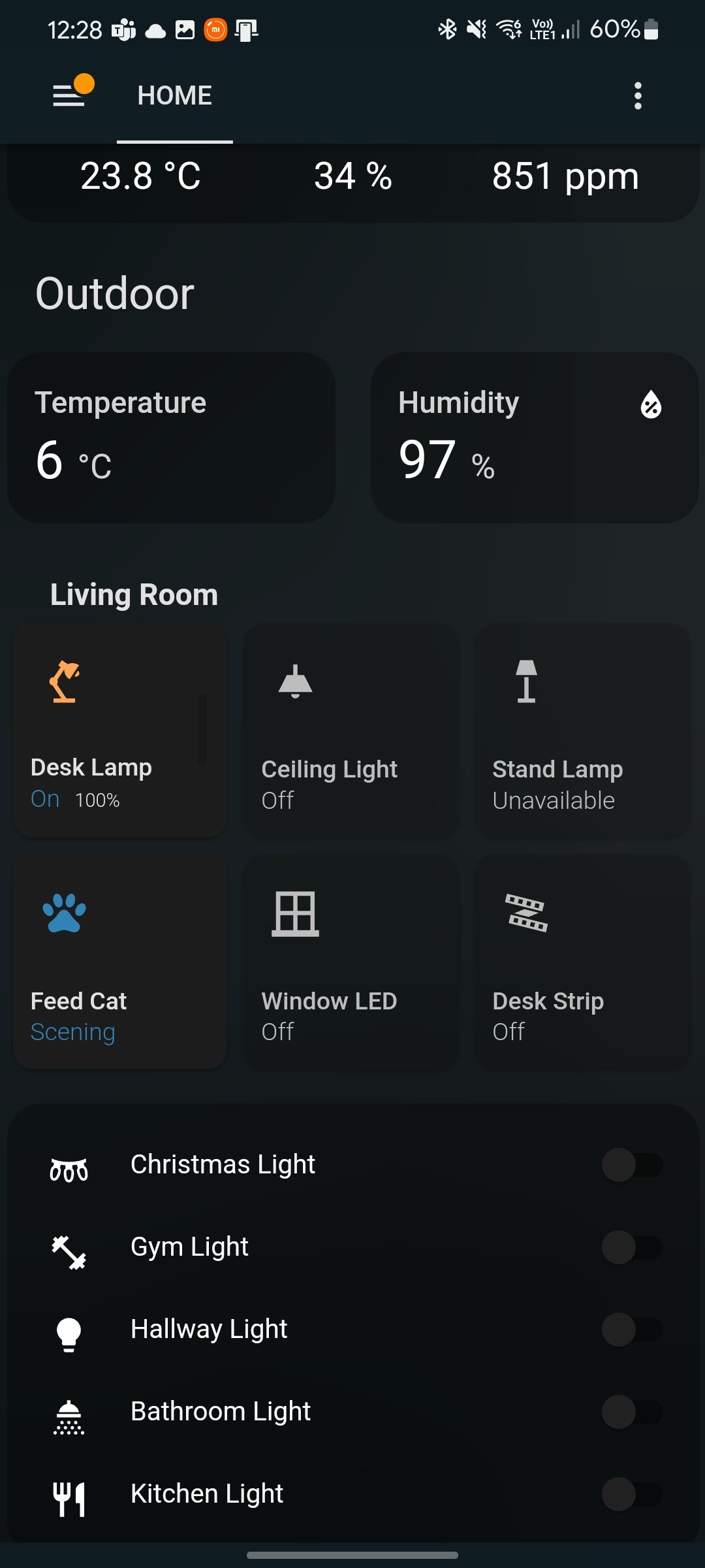
entities:
- title: Living Room
entities:
- entity: light.midesklamppro
name: Desk Lamp
icon: mdi:desk-lamp
slider: true
- entity: light.yeelight_ceiling_native
name: Ceiling Light
icon: mdi:ceiling-light
slider: true
- entity: light.yeelight_color_native
name: Stand Lamp
icon: mdi:floor-lamp
slider: true
- entity: scene.cdd0xeacoprbuxko
tap_action:
action: call-service
service: scene.turn_on
service_data:
entity_id: scene.cdd0xeacoprbuxko
name: Feed Cat
icon: mdi:paw
- entity: light.window_led_strip
name: Window LED
icon: mdi:window-closed-variant
slider: true
- entity: light.yeelight_stripe_native
name: Desk Strip
icon: mdi:led-strip-variant
slider: true
@DBuit Thank you for this awesome panel card! I’m not sure if you’ve seen the issue I’ve opened on Github but it seems that your card isn’t working on a Google Nest hub with Home Assistant Cast. I’ve looked around a bit and found this in the FAQ here :
If you’re a custom card developer: the most common mistake is that LitElement is extracted from an element that is not available on the page.
As I’m not familiar with JavaScript it’s difficult for me to find the real problem… Would you mind taking a look or give me some pointers?
Thank you in advance!
Okay, think I sort of understand what you mean, will experiment more with this.
Anyway are you planning to make the width automatic in future update?
Hi @belgianrubs
thanks for mentioning the litElement thing i had the same problem and got a fix so in next release it should work
Just add in the style part.
Thank you! If you want me to test out a beta version, let me know 
Hello Everyone,
Just pushed new release with some fixes: Release Version 0.6.2 · DBuit/Homekit-panel-card · GitHub
@belgianrubs this should fix the cast
@gmobilize this fixed the issue when changing the mobile tile size so no need to change the style anymore
@DBuit Hi m8. A wierd bugg i iOS Thats Alvesta been there when Ussing your code for getting a westher card is this
https://drive.google.com/file/d/1sGiFFBxgTa7h6qwyEgT4j1eMRAzNFB2I/view?usp=drivesdk
In this video it jumps from showing a week and look good and ok. But the. A sek after it jumps to showing inte 3 days. Is there a way to handel it to stay in the look it has when the page is just refreshed?