I recently moved places and decided to integrate HomeAssistant into my new home.
However, I was shocked that there was no (good) expandable/collapsible card available, so I’ve made my own…
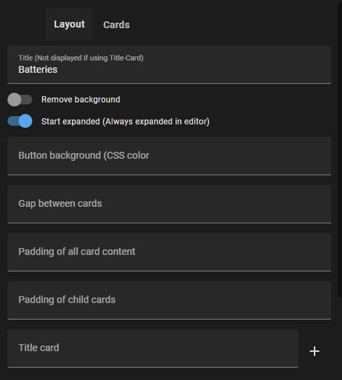
It also supports title-cards and even to overlay the expand/collapse button over aforementioned title-card!
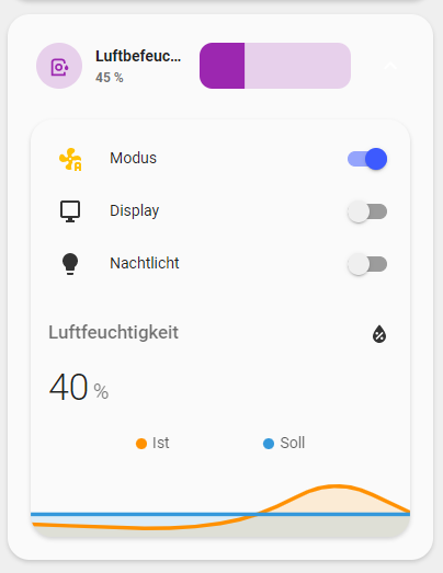
I do use this for Light-groups
The overlay expand-button above any title-card is the config-option that makes this card truly stand out.
Full graphic editing is also supported! (Too many custom cards skimp on the ease of use…)
Same here! Unfortunately I have limited coding skills so I was hoping someone like you would come along some day. Will test this for sure, have lots of ways I want to implement this!
Although there is swipe-card where you can swipe between cards (horizontal and vertical), one thing I really mis is:
a card where you can create a container with maximum height, and when the content is larger than the height of the container, you can just scroll inside. So the card itself will never exceed the height of the container, but you can scroll through the content.
Thanks for this, I love it. Just one thing, when I add a markdown as the title card, the expand/collapse arrow at the end disappears. Am I doing something wrong?
Also, is there a way that the markdown area can do the expand/collapse too, as well as the bit at the end, like it does if you just use title instead of title-card?
Here’s my yaml:
type: custom:expander-card
title: Sitting Room
cards:
  - type: entities
    entities:
      - entity: light.dining_table_pendants
      - entity: light.sitting_room_light_sockets
        name: Lamps
      - entity: light.sitting_room_end_downlights
        name: End downlights
      - entity: light.sitting_room_pendant
        name: Pendant
      - entity: light.sitting_room_middle_downlights
        name: Middle downlights
      - entity: light.sitting_room_nearest_downlights
        name: Nearest downlights
      - entity: switch.big_slider_sunny_evening
      - entity: switch.open_external_blinds
      - entity: switch.close_external_blinds
      - entity: switch.big_slider_sunny_day
      - entity: cover.big_slider_blind_left_action
        name: LEFT Big slider blind
      - entity: cover.big_slider_blind_right_action
        name: RIGHT Big slider blind
      - entity: input_boolean.leave_blinds_open
      - entity: cover.lounge_left
        name: Left end blind
      - entity: cover.lounge_right
        name: Right end blind
      - entity: sensor.28_b61377910402_temperature
        name: East slab sensor
      - entity: sensor.28_7eae77910802_temperature
        name: West slab sensor
      - entity: climate.sitting_kitchen
gap: '0'
padding: '0'
child-padding: '0'
title-card:
  type: markdown
  content: '**Sitting Room**'
Hi Alia5, I use minimalist UI and with me the arrow/button is always displayed in tag mode still in white.
If I for example gray background, then it changes nothing.
Can you possibly help me with this?
Nice work Alia5 !
Thanks for this.
Quick question, is there a way to “programaticaly” expand/collapse ?
What I would like is for example if the toggle “REVEIL” (wake) is on then it’s expanded, and collapsed if its off:
and when turned on:
Hello I am nesting some cards inside the expander card…mushroom cards inside a horizontal stack card and I am having a problem viewing the cards on my phone. When using over a certain number of characters on the mushroom cards the mushroom card on the right runs over the expander card.
So I wonder if there’s anything that can be done to fix that or how to prevent it from happening without basically making the text on my cards useless?
Is this still being maintained? I love the idea, but similar to 400hpmustang, when I expand my entity card the expanded card exceeds the width of my theme.
I’ve found out that when a title card is used, the color defaults to white. If you leave the title card empty, it will change to the theme color. I hope this can be fixed, because I really like this card.
I suppose that’s what I’m seeing. I’m completely unable to modify the color of the expander button or the card once it is expanded. I’d like to use it, but since the color can’t be changed now I’m looking for an alternative.


 Dynamically replace lovelace cards depending on occasion (github.com)

