Hi!
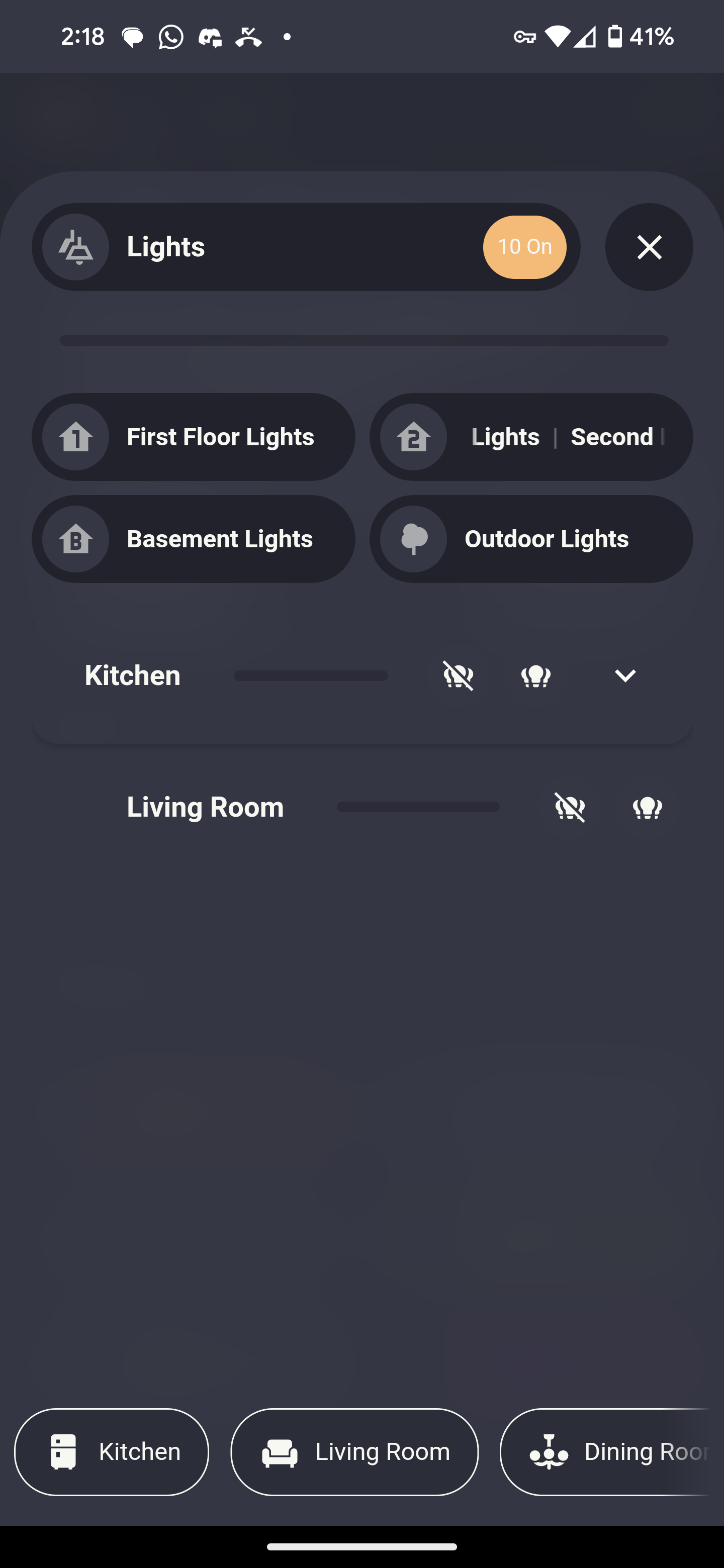
I really love the expander card :)! I was wondering, is there a way to customize the card itself? For some parts of my view the card itself is too large (in a horizontal way), and I haven’t found out how to make the card smaller.
I would like to have the ‘Laadpaal’ card, which is an expander card, in the same style as I did for the ‘Klimaat’ card. I have two questions:
- Is it possible to make the card smaller in a horizontal way? I added a style component but that is not working
- Is it possible to style the card its borders and box-shadow, as in the Klimaat card?
Thanks!
type: custom:expander-card
title-card:
  type: custom:button-card
  entity: sensor.public_charger_1
  icon: none
  show_name: false
  show_state: false
  tap_action:
    action: toggle
  styles:
    card:
      - background: none
      - box-shadow: none
      - border: none
      - height: 20px
      - width: 370px
      - position: relative
  extra_styles: |
    :root {
      --custom-light-background: rgba(0, 0, 0, 0);
      --custom-dark-background: rgba(0, 0, 0, 0);
    }
    @media (prefers-color-scheme: dark) {
      :root {
        --custom-light-background: rgba(0, 0, 0, 0);
        --custom-dark-background: rgba(0, 0, 0, 0);
      }
    }
  custom_fields:
    name_label: >
      <div style="position: absolute; left: 10px; top: 5px; font-size: 18px;
      font-weight: normal; font-family: Arial; color:
      var(--button-card-text-color);">
        Laadpaal
      </div>
    state_label: |
      [[[
        const stateValue = entity.state.split(' / ')[0];
        let textColor;
        if (stateValue === '0') {
          textColor = 'rgb(223,37,32)';
        } else {
          textColor = 'rgb(98,200,85)';
        }
        return `<div style="position: absolute; left: 295px; top: 5px; font-size: 16px; font-weight: bold; font-family: Arial; color: ${textColor};">
                  ${entity.state}
                </div>`;
      ]]]
cards:
  - type: custom:button-card
    entity: sensor.public_chargers_2
    icon: none
    show_name: false
    show_state: false
    styles:
      card:
        - background: none
        - box-shadow: none
        - border: none
        - height: 65px
        - width: 370px
        - position: relative
    extra_styles: |
      :root {
        --custom-light-background: rgba(0, 0, 0, 0);
        --custom-dark-background: rgba(0, 0, 0, 0);
      }
      @media (prefers-color-scheme: dark) {
        :root {
          --custom-light-background: rgba(0, 0, 0, 0);
          --custom-dark-background: rgba(0, 0, 0, 0);
        }
      }
    custom_fields:
      name_label: >
        <div style="position: absolute; left: 3px; top: 20px; font-size: 18px;
        font-weight: normal; font-family: Arial; color:
        var(--button-card-text-color);">
          Laadpaal
        </div>
      state_label: |
        [[[
          const stateValue = entity.state.split(' / ')[0];
          let textColor;
          if (stateValue === '0') {
            textColor = 'rgb(223,37,32)';
          } else {
            textColor = 'rgb(98,200,85)';
          }
          return `<div style="position: absolute; left: 288px; top: 20px; font-size: 16px; font-weight: bold; font-family: Arial; color: ${textColor};">
                    ${entity.state}
                  </div>`;
        ]]]
  - type: custom:button-card
    entity: sensor.public_chargers_3
    icon: none
    show_name: false
    show_state: false
    styles:
      card:
        - background: none
        - box-shadow: none
        - border: none
        - height: 65px
        - width: 370px
        - position: relative
    extra_styles: |
      :root {
        --custom-light-background: rgba(0, 0, 0, 0);
        --custom-dark-background: rgba(0, 0, 0, 0);
      }
      @media (prefers-color-scheme: dark) {
        :root {
          --custom-light-background: rgba(0, 0, 0, 0);
          --custom-dark-background: rgba(0, 0, 0, 0);
        }
      }
    custom_fields:
      name_label: >
        <div style="position: absolute; left: 3px; top: 20px; font-size: 18px;
        font-weight: normal; font-family: Arial; color:
        var(--button-card-text-color);">
          Laadpaal
        </div>
      state_label: |
        [[[
          const stateValue = entity.state.split(' / ')[0];
          let textColor;
          if (stateValue === '0') {
            textColor = 'rgb(223,37,32)';
          } else {
            textColor = 'rgb(98,200,85)';
          }
          return `<div style="position: absolute; left: 288px; top: 20px; font-size: 16px; font-weight: bold; font-family: Arial; color: ${textColor};">
                    ${entity.state}
                  </div>`;
        ]]]
  - type: custom:button-card
    entity: sensor.public_chargers_4
    icon: none
    show_name: false
    show_state: false
    styles:
      card:
        - background: none
        - box-shadow: none
        - border: none
        - height: 65px
        - width: 370px
        - position: relative
    extra_styles: |
      :root {
        --custom-light-background: rgba(0, 0, 0, 0);
        --custom-dark-background: rgba(0, 0, 0, 0);
      }
      @media (prefers-color-scheme: dark) {
        :root {
          --custom-light-background: rgba(0, 0, 0, 0);
          --custom-dark-background: rgba(0, 0, 0, 0);
        }
      }
    custom_fields:
      name_label: >
        <div style="position: absolute; left: 3px; top: 20px; font-size: 18px;
        font-weight: normal; font-family: Arial; color:
        var(--button-card-text-color);">
          Laadpaal
        </div>
      state_label: |
        [[[
          const stateValue = entity.state.split(' / ')[0];
          let textColor;
          if (stateValue === '0') {
            textColor = 'rgb(223,37,32)';
          } else {
            textColor = 'rgb(98,200,85)';
          }
          return `<div style="position: absolute; left: 288px; top: 20px; font-size: 16px; font-weight: bold; font-family: Arial; color: ${textColor};">
                    ${entity.state}
                  </div>`;
        ]]]
  - type: custom:button-card
    entity: sensor.public_chargers_5
    icon: none
    show_name: false
    show_state: false
    styles:
      card:
        - background: none
        - box-shadow: none
        - border: none
        - height: 65px
        - width: 370px
        - position: relative
    extra_styles: |
      :root {
        --custom-light-background: rgba(0, 0, 0, 0);
        --custom-dark-background: rgba(0, 0, 0, 0);
      }
      @media (prefers-color-scheme: dark) {
        :root {
          --custom-light-background: rgba(0, 0, 0, 0);
          --custom-dark-background: rgba(0, 0, 0, 0);
        }
      }
    custom_fields:
      name_label: >
        <div style="position: absolute; left: 3px; top: 20px; font-size: 18px;
        font-weight: normal; font-family: Arial; color:
        var(--button-card-text-color);">
          Laadpaal
        </div>
      state_label: |
        [[[
          const stateValue = entity.state.split(' / ')[0];
          let textColor;
          if (stateValue === '0') {
            textColor = 'rgb(223,37,32)';
          } else {
            textColor = 'rgb(98,200,85)';
          }
          return `<div style="position: absolute; left: 288px; top: 20px; font-size: 16px; font-weight: bold; font-family: Arial; color: ${textColor};">
                    ${entity.state}
                  </div>`;
        ]]]


 ;). So looks somehow duplicated
 Do as you want to!