Feedback for forums upgrade

Hi Missy, thanks for coming back at this.
Of course I understand that this is the result of a new theme and the changes that were done.
TBC: I was just giving my findings and it's not something that I cannot overcome.

FYI: before the contents were the same and it also showed the most recent activity at the top.
It's just a visual thing and maybe I'm the only one who experiences it this way.
TBH (last abbreviation): I cannot describe how it looked exactly before, it's just that the new style has become less inviting to open/read (to me).

I understand that feeling, it mostly Affects me as before i used to "Hoover over the Topic Header" in People's Topics , The one "listing of Topics" (New/New-activity)
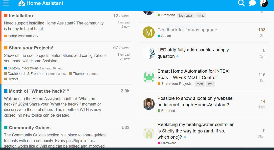
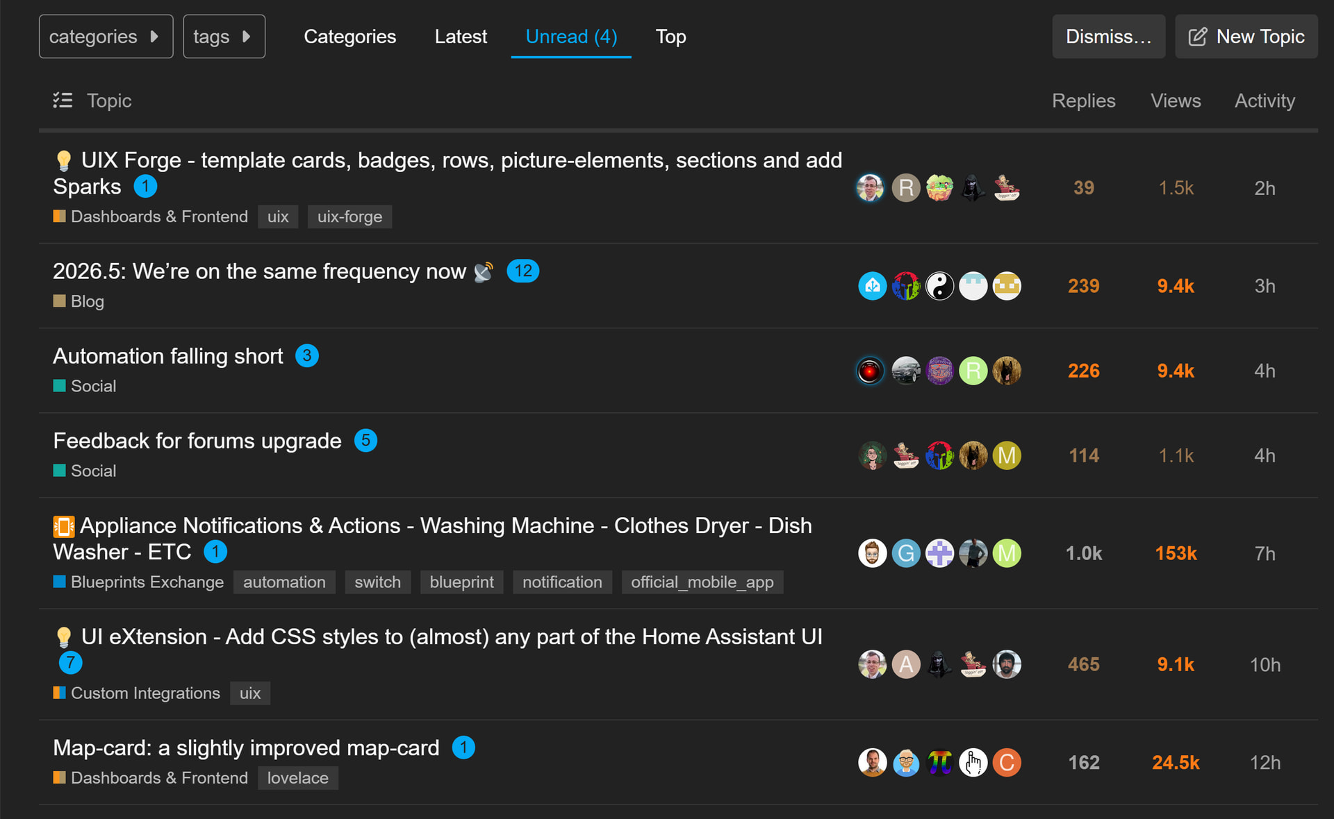
After the Change, where this Option is Gone, i Only see the small part of Peoples Header, and Not any Parts of their First Post, .... Meaning this "New Way" only gives you a Topic Header , "Click Bait" Approach, Like all News-Site has used for ages
Now We Have To Click The Topic, to get a little "More Info", And obvious Yes This might Lead To that Discource Forum Will Get More Click, But the User-Experience get worse

More Important, IF/When i just see a Header I already now Noticed, That i the Loss of more info, by hoover over the Topic-Headers, makes me Skip More Topics.
It's Plain stupid one now have to Click the Topic, Instead of given that More-Info (of OP's first Post) while Hoovering over the Topic-Header

And The Good Thing ( For Me ) i Loose Interest in i.e Helping/Assisting/Reading .... Just Like With the News-Site, ( Which more and more Just Use Headers, as a result of Click-Bait culture ( Cash/Statistic-Counter ) I Read the Headers and mostly thats it , I mean Why Bother to click just to find out that the Topic/Article's Header Was highly misleading, Or even totally Different than the short Header

I will never get Tired of using Homeassistant , but i already enjoy the feeling and thoughts that pretty soon i will find that i spend less time "replying/reading" in Topics, because i skip alot Topics, do to that so called User-Experience ( Lack of relevant/more Info )

Truly, it's in Line with the "News" example, and The " Modern UI Experience ", People get less and less informed, Or have to use more and more effort/clicks to get Info
Ironically the People which are attracted by this New-Ages " User-experience " Is People which in fact Needs More Info

" Hey I Search a Bunch of Topics in Here ( Atleast they might have read the Topic Header ), And Didn't find any that Describe my Issues, So i Open this Topic, Please Help " .... Don't hope i end there in near future, but who knows

Bring Back the Hoover-Info of OP's first Post ... Please
Don't try to Force me into a Click-Bait Generation Behavior

You mean this:

(done from https://community.home-assistant.io/latest)

whereas from https://community.home-assistant.io/categories, which I don't use, you don't get that preview.

Very minor issue that I hoped would just go away.

When I react to a post it works as expected for all reactions except :+1:

When I choose :+1: it shows :heart: instead, but if I click the count, the popup correctly shows that I reacted with :+1: so maybe it's only me that sees :heart: instead of :+1: and only for my reactions.

If others have reacted with :+1: I see that under the post as normal, along with any other reactions. EDIT: well I thought so, but @LiQuid_cOOled just reacted to this reply with :+1: but it is showing as "1 :heart:" under this reply! I've definitely also seen :+1: there, so not sure what's the circumstances are.

My reactions other than :+1: display as expected.

2 Likes

Yes sir, was just confirming you weren't the only one experiencing that glitch. :+1:

1 Like

No, as the "option/feature" is gone i can't obviously show it
But below is my "View"

Before when you Hoover (mouse over Any Topic Header, in the listing, to the Right, Peoples Topics) , you could read the first couple 5 or more lines of OP's First Post
Now Nothing, Just The Headers

Same here, gone in Categories, but still showing in Latest

1 Like

Damn You'r Right ! , never noticed , Guess i have to get use to use " Latest "

1 Like

Basically why I switched to that Tab :roll_eyes: I'm anti-click bait too :rofl:

1 Like

Well, I basically been using the defaults since joining the Forum,hardly ever tried to configure or change anything.
So now that the last few weeks "interruption" of my inner peace, has caused negative Vibes ( In Common ) regards my activity here , i kind of don't "like" you guided me there :joy:
I feel it "interrupts" the already started process of "redrawing", and leave/degrade my self to Member :laughing:

I meant the same as what @LiQuid_cOOled is saying: in latest, you still get the preview, unless this will be changed too... :man_facepalming:

1 Like

I called out why this is behaving this way here: Feedback for forums upgrade - #87 by MissyQ

Was it like this before on the Categories page? I recall that right panel actually being smaller in general, but I could be remembering incorrectly. This could be another one of those theme “features” I can maybe adjust.

I do have an option to change the category page from “Categories and Latest Topics” to “Categories and Latest Topics (sorted by topic created date)”. I have no idea if it will fix things, but I can give it a shot…

Yes , now you say it , it might have been Smaller also , but it's nothing that disturb my "Routines" :slight_smile:
But i was use to just Hoover Down over the Headers, Reading some more Details ( Parts OP's first Post ) to get a better "insight" of the Topic , before deciding whether i should "Jump In"

Sometimes i actually ended up in the Latest Topics, when i clicked the "More" In the bottom , But most of the time i just Hoover through the lines in Category, and click refresh browser next time i entered the Tab
I do know i can change to have Latest Topics as "start page" if i remember right, and it might actually be better to get used to this ( after 5-6 years ) instead of blindly just "use it as is" :joy:

Frankly there is the side menu with mostly same content as Left-Pane in Category ( Hardly used ), Maybe focus on the/that menu could be an idea, during next overhaul
And i still miss "Vital" Links to the home-assistant.io Documentation/Integration in here Prio-placed, as i have an idea that many people would actually try to see if they can find answers there, if these Url's has a "Prominent " Place in the Landing Page in here

Edit: i Just Changed my " Default Home Page " To Latest Topic ... Waiting for the Change to creep into my scull :grin:

1 Like

Thanks.

I'm not sure this happens with other reactions but maybe. I'll report back if it doesn't.

Ok here's one that I've been experiencing since before the update but hoping something can be done about it, or maybe some direction on what I can do about it.

My "Unread" messages count almost never matches my actual unread messages count.

I get that too, a refresh always fixes it.

@MissyQ I take your earlier comment to mean that this happens for any reaction when it is the first and only reaction so far.

I'm not sure if you meant that, but can now say that is not the case. It is only happening for :+1: and it doesn't matter how many or which different reactions are already there. When I choose :+1: it displays as :heart: (but as you say had been registered as :+1:). Other reactions always show correctly.

Yep, expected. That’s because Like (thumbs up) and Like (heart) are treated the same on the backend.

I’ll see if I can get that improved. :ok_hand:

2 Likes

is there any bug that causes this post to stay on top..

it's rather annoying really, and I cant manage to click it away, not even after logging out an back in again, or stuff like that.
we've seen it by now....

(nothing personal against Jorg of course....)