thanks for the quick reply.
thanks for the fix Thomas, you were quick! too bad we need to be precise now…
or… can we downgrade.
(asking because I am not sure what the new features/benefits are, and the card didn’t seem to cause any trouble.)
Know what?
I figured out a way.
Look for the new `clickable´ option in 20.0.2.
But the initial guess should be pretty good too, so you probably don’t need it.
wow (can’t film the actual click, but you’ll see what happens) 
thanks!

great. thank you so much
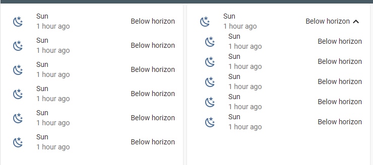
I realized that a vertical spacing between rows is less than a spacing in a Entities card:
Here is a code:
type: horizontal-stack
cards:
  - type: entities
    entities:
      - entity: sun.sun
        secondary_info: last-changed
      - entity: sun.sun
        secondary_info: last-changed
      - entity: sun.sun
        secondary_info: last-changed
      - entity: sun.sun
        secondary_info: last-changed
      - entity: sun.sun
        secondary_info: last-changed
      - entity: sun.sun
        secondary_info: last-changed
  - type: entities
    entities:
      - type: 'custom:fold-entity-row'
        head:
          entity: sun.sun
          secondary_info: last-changed
        padding: 10
        open: true
        clickable: true
        entities:
          - entity: sun.sun
            secondary_info: last-changed
          - entity: sun.sun
            secondary_info: last-changed
          - entity: sun.sun
            secondary_info: last-changed
          - entity: sun.sun
            secondary_info: last-changed
          - entity: sun.sun
            secondary_info: last-changed
I can fix this by card-mod:
        style:
          '#items':
            hui-text-entity-row:
              $: |
                hui-generic-entity-row {
                  margin: 8px 0px;
                }
Now it looks better:
But I would be happy if these margins will be fixed in the card itself )).
The whole code with card-mod:
type: horizontal-stack
cards:
  - type: entities
    entities:
      - entity: sun.sun
        secondary_info: last-changed
      - entity: sun.sun
        secondary_info: last-changed
      - entity: sun.sun
        secondary_info: last-changed
      - entity: sun.sun
        secondary_info: last-changed
      - entity: sun.sun
        secondary_info: last-changed
      - entity: sun.sun
        secondary_info: last-changed
  - type: entities
    entities:
      - type: 'custom:fold-entity-row'
        head:
          entity: sun.sun
          secondary_info: last-changed
        padding: 10
        open: true
        clickable: true
        entities:
          - entity: sun.sun
            secondary_info: last-changed
          - entity: sun.sun
            secondary_info: last-changed
          - entity: sun.sun
            secondary_info: last-changed
          - entity: sun.sun
            secondary_info: last-changed
          - entity: sun.sun
            secondary_info: last-changed
        style:
          '#items':
            hui-text-entity-row:
              $: |
                hui-generic-entity-row {
                  margin: 8px 0px;
                }
Update (20.11.21):
The “tight vertical spacing” problem is solved in fold-entity-row ver. 2.0.12


Really strange.
I see the difference also with old version of fold-entity-row used when I made this post about card-mod.
Here is a pic from that post:

It was w/o a margin even 20.12.20.
May it depend on a theme? I am using stock theme.
I am having the same issue, the color of the icon of the head won’t change based on the state.
Were you able to solve this meanwhile? Or has this been identified as a missing feature yet?
Example, the below doesn’t work:
     - type: custom:fold-entity-row
        head: binary_sensor.template_someone_in_bed
        icon: 'mdi:bed'
        name: Bed Occupancy
        state_color: true                     <<< this doesn't work
        entities:
          - domain.name1
          - domain.name2
          - etc
padding: 0 will get rid of the margin
Wrong.
Second time I am hearing about “padding: 0”…
There is no margin for “padding: 0” & “padding: 10”.
And why these two different things can be connected - left padding & margin between rows?
It will - if indentation is corrected:
type: entities
entities:
  - type: 'custom:fold-entity-row'
    head:
      entity: binary_sensor.iiyama_1_ping_availability_status
      secondary_info: last-changed
      state_color: true
    padding: 0
    open: true
    clickable: true
    entities:
      - entity: sun.sun
        secondary_info: last-changed
      - entity: sun.sun
        secondary_info: last-changed

These last 3 lines are related to the “head” but have a wrong indentation:
It’s right and your screenshots prove it!
That’s what I thought initially too David. However he is trying to adjust the vertical padding, not horizontal.
Thank you! One small correction, this is a margin , according to Inspector.
One more picture - compare vertical spacing between rows:

type: entities
entities:
  - entity: sun.sun
    secondary_info: last-changed
  - entity: sun.sun
    secondary_info: last-changed
  - entity: sun.sun
    secondary_info: last-changed
  - entity: sun.sun
    secondary_info: last-changed
  - type: 'custom:fold-entity-row'
    head:
      entity: sun.sun
      secondary_info: last-changed
    padding: 0
    open: true
    clickable: true
    entities:
      - entity: sun.sun
        secondary_info: last-changed
      - entity: sun.sun
        secondary_info: last-changed
      - entity: sun.sun
        secondary_info: last-changed
      - entity: sun.sun
        secondary_info: last-changed
      - entity: sun.sun
        secondary_info: last-changed
can you fold-entity-row some glance info?

I want to hide the above glance info

type: entities
entities:
  - sun.sun
  - type: 'custom:fold-entity-row'
    head:
      type: section
      label: unfold me
    padding: 5
    open: true
    entities:
      - type: divider
      - sun.sun
      - type: 'custom:hui-element'
        card_type: glance
        entities:
          - entity: sun.sun
          - entity: sun.sun
hui element… cool thanks I’ll give it a try!
that worked thanks!:

now additional question regarding the box around the glance icons, I used the following style:
    style: |
      ha-card {
        #box-shadow: none;
        background: none;
        padding-top: 0px;
        padding-bottom: 0px;
        margin: -10px 0px -0px -40px;
        font-size: 12px !important;
      }
and i got the above, I want to reduce the white space around the icon, but cannot seem to do so. I can remove background and put a negative margin such as:
margin: -30px 0px -20px -40px;
and i get this (note the box shadow is #'d out to show how it overlaps the button which gets blocked):

so my question is. instead of move the glance card around and clicking the ability to hide the controller status, can i reduce the white space around the icon within the glance in order to reduce the white space?


