Seems that you applied a style to a wrong element - rotation is not centered, there is a shift.
Cannot react on this, know nothing about card-mod-themes…
Same on my setup, strange.
Seems that you applied a style to a wrong element - rotation is not centered, there is a shift.
Cannot react on this, know nothing about card-mod-themes…
Same on my setup, strange.
yes, ofc I noticed that, thought it might be the icon not being perfectly centered. Its the same in Chrome. And the code is the exact code you use…
Yesterday was the 2nd time I experimented with layout-card - it is better to discuss these issues in a corresponding thread.
That is why I wrote that this is not the best solution…
I do not know how to align controls automatically.
on the coloring of the template-entity-row entity’s icon:
for the sake of experiment (and see if the code itself is corrrect) I changed to:
              @keyframes coloring {
                0% {
                  background: red;
                }
                17% {
                  background: orange;
                }
                34% {
                  background: yellow;
                }
                51% {
                  background: green;
                }
                68% {
                  background: lightblue;
                }
                85% {
                  background: blue;
                }
                100% {
                  background: violet;
                }
which looks like:

in Safari, and

in Chrome.
which could proof to be useful as a way around the issue…
Thank you, I will 
As a first feedback, I can say that the solution for the width issue was using layout_type: custom:grid-layout. This also does not require me to define the width.
This is an old issue.
Now I am using this style in my setup for each row:
                hui-generic-entity-row {
                  margin-top: 0px;
                  margin-bottom: 8px;
                }
See the difference here:
type: horizontal-stack
cards:
  - type: entities
    entities:
      - type: section
        label: persons
      - entity: person.ildar
      - entity: person.mama
      - entity: person.papa
  - type: entities
    entities:
      - type: custom:fold-entity-row
        head:
          type: section
          label: persons
        padding: 0
        open: true
        entities:
          - entity: person.ildar
          - entity: person.mama
          - entity: person.papa
  - type: entities
    entities:
      - type: custom:fold-entity-row
        head:
          type: section
          label: persons
        padding: 0
        open: true
        entities:
          - entity: person.ildar
          - entity: person.mama
          - entity: person.papa
    card_mod:
      style:
        fold-entity-row:
          $:
            div#items hui-text-entity-row:
              $: |
                hui-generic-entity-row {
                  margin-top: 0px;
                  margin-bottom: 8px;
                }

Earlier this style worked too but stopped working (the issue):
  - type: entities
    entities:
      - type: custom:fold-entity-row
        head:
          type: section
          label: persons
        padding: 0
        open: true
        entities:
          - entity: person.ildar
          - entity: person.mama
          - entity: person.papa
        card_mod:
          style:
            div#items hui-text-entity-row:
              $: |
                hui-generic-entity-row {
                  margin-top: 0px;
                  margin-bottom: 8px;
                }
Update (20.11.21):
The “tight vertical spacing” problem is solved in fold-entity-row ver. 2.0.12
Test exactly this code and tell me about the difference please:
type: entities
entities:
  - type: custom:template-entity-row
    entity: sun.sun
    name: name
    secondary: some value
    state: state
    icon: mdi:fan
    card_mod:
      style:
        div#wrapper: |
          state-badge {
            animation: rotation 0.5s linear infinite, resizing 1s linear infinite alternate, coloring 8s linear infinite alternate;
          }
          @keyframes rotation {
            0% {
              transform: rotate(0deg);
            }
            100% {
              transform: rotate(360deg);
            }
          }
          @keyframes resizing {
            0% {
              --mdc-icon-size: 10px;
            }
            25% {
              --mdc-icon-size: 15px;
            }
            50% {
              --mdc-icon-size: 20px;
            }
            75% {
              --mdc-icon-size: 26px;
            }
            100% {
              --mdc-icon-size: 32px;
            }
          }
          @keyframes coloring {
            0% {
              color: red;
            }
            17% {
              color: orange;
            }
            34% {
              color: yellow;
            }
            51% {
              color: green;
            }
            68% {
              color: lightblue;
            }
            85% {
              color: blue;
            }
            100% {
              color: violet;
            }
          }

Icon is coloring (but I have Not customized sun.sun, so not trouble with custom-ui expected  )
)

the exact card-mod on a boolean (which I have customized) remains without result
But again is not centered (((((((((
There is smth strange with your setup, my friend…
My proposal is - create a CLEAN test setup and check how it works…
will do, and just fired up Firefox as a 3d browser.
On the Folds and vertical spacing:
to give you an idea though, I have 262 fold-entity-rows, and only this card gives me a headache…
I have them populated with auto-entities cards, or listed entities, what have you. given the fact there is now error in the inspector at all on this config, debugging is very difficult.
Figured it out in themes
  card-mod-theme: noctis-grey

  card-mod-more-info-yaml: |
    ha-more-info-history:
      $: |
        .header > a, a:visited {
          color: var(--secondary-text-color) !important;
          font-size: 12px;
        }
    ha-more-info-logbook:
      $: |
        .header > a, a:visited {
          color: var(--secondary-text-color) !important;
          font-size: 12px;
        }
Not that agressive anymore

But it is only working here, but not within the tabs like

Any hint?
Hello @thomasloven! Thank you very much for the feedback.
Yes, navigation for hui-element became a bit confusing - but I managed to rebuild all my code, it looks fine again!
Please let me know if you find something that doesn’t work. It’s a bit rickety with timing issues right now.
Thomas, now I got only these issues about card-mod:
fold-entity-row, restriction-card as a row, config-template-card as a row.Thank you again for your valuable work!
P.S. I am creating a post explaining using card-mod for hui-element for different row types as well as using them inside decluttering template with mod-card. This post will be added into the consolidation post.
Styling hui-element card:
This post is about using hui-element card to represent a row inside an Entities card:
slider or box)Here they are (updated 04.03.22 for “chips” buttons and new HA2022.3 design):
type: entities
entities:
  - type: custom:hui-element
    row_type: section
    label: section
  - type: custom:hui-element
    row_type: sensor-entity
    entity: input_number.test_number
    name: sensor-entity
  - type: custom:hui-element
    row_type: number-entity
    entity: input_number.test_number
    name: number-entity (slider)
  - type: custom:hui-element
    row_type: number-entity
    entity: input_number.test_number_2
    name: number-entity (box)
  - type: custom:hui-element
    row_type: toggle-entity
    entity: input_boolean.test_boolean
    name: toggle-entity
  - type: custom:hui-element
    row_type: input-select-entity
    entity: input_select.test_value
    name: input-select-entity
  - type: custom:hui-element
    row_type: input-text-entity
    entity: input_text.test_text
    name: input-text-entity
  - type: custom:hui-element
    row_type: weather-entity
    entity: weather.home_met
    name: weather-entity
  - type: custom:hui-element
    row_type: buttons
    entities:
      - entity: sun.sun
        show_name: true
      - entity: sun.sun
        show_name: true
      - entity: sun.sun
        show_name: true
  - type: custom:hui-element
    row_type: conditional
    conditions:
      - entity: input_boolean.test_boolean
        state: 'on'
    row:
      entity: sun.sun
      name: conditional
section row inside stack-in-card to separate areas.There are 4 methods of styling hui-element rows:
:host - to style a particular row.mod-card level - to style a row inside a decluttering template.Using :host - to style a particular row:
Note: the hui-element card is a kind of transparent element - all styles go “directly to the row”.
type: entities
entities:
  - type: custom:hui-element
    row_type: sensor-entity
    entity: sun.sun
    name: Colored row
    card_mod:
      style: |
        :host {
          color: red;
        }
  - type: custom:hui-element
    row_type: section
    label: section
    card_mod:
      style: |
        :host {
          --divider-color: magenta;
        }
  - type: custom:hui-element
    row_type: toggle-entity
    entity: input_boolean.test_boolean
    name: Colored toggle
    card_mod:
      style: |
        :host {
          --switch-unchecked-button-color: yellow;
          --switch-checked-button-color: red;
        }

Using long DOM navigation - to style a particular row:
Note: the hui-element card is a kind of transparent element - all styles go “directly to the row”.
type: entities
entities:
  - type: custom:hui-element
    row_type: sensor-entity
    entity: sun.sun
    name: Colored name
    card_mod:
      style:
        hui-generic-entity-row:
          $: |
            .info {
              color: red;
            }
  - type: custom:hui-element
    row_type: toggle-entity
    entity: input_boolean.test_boolean
    name: Colored toggle
    card_mod:
      style:
        hui-generic-entity-row:
          ha-entity-toggle:
            $:
              ha-switch:
                $: |
                  .mdc-switch .mdc-switch__track {
                    background-color: yellow !important;
                    border-color: red !important;
                  }
  - type: custom:hui-element
    row_type: section
    label: section
    card_mod:
      style: |
        .divider {
          background-color: cyan !important;
        }
  - type: custom:hui-element
    row_type: number-entity
    entity: input_number.test_number
    name: Colored state
    card_mod:
      style: |
        hui-generic-entity-row .flex .state {
          color: magenta;
        }

Using long DOM navigation from the parent Entities card or Picture elements card level - to style a particular row or all rows:
Section:
type: entities
entities:
  - entity: sun.sun
  - type: custom:hui-element
    row_type: section
    label: section
  - entity: sun.sun
  - entity: sun.sun
  - type: custom:hui-element
    row_type: section
    label: section
  - entity: sun.sun
  - entity: sun.sun
card_mod:
  style:
    .card-content hui-element:
      $: |
        .divider {
          background-color: cyan !important;
        }

Sensor:
type: entities
entities:
  - type: custom:hui-element
    row_type: sensor-entity
    entity: sun.sun
    name: Colored name
  - type: custom:hui-element
    row_type: sensor-entity
    entity: sun.sun
    name: Colored name
  - type: custom:hui-element
    row_type: sensor-entity
    entity: sun.sun
    name: Colored name
card_mod:
  style:
    .card-content hui-element:
      $:
        hui-generic-entity-row:
          $: |
            .info {
              color: red;
            }

Toggle:
type: entities
entities:
  - type: custom:hui-element
    row_type: toggle-entity
    entity: input_boolean.test_boolean
    name: Colored toggle
  - type: custom:hui-element
    row_type: toggle-entity
    entity: input_boolean.test_boolean_2
    name: Colored toggle
  - type: custom:hui-element
    row_type: toggle-entity
    entity: input_boolean.test_boolean_3
    name: Colored toggle
card_mod:
  style:
    .card-content hui-element:
      $:
        hui-generic-entity-row:
          ha-entity-toggle:
            $:
              ha-switch:
                $: |
                  .mdc-switch .mdc-switch__track {
                    background-color: yellow !important;
                    border-color: red !important;
                  }

Using long DOM navigation from the parent mod-card level - to style a row inside a decluttering template:
Slider:
Template:
decl_entity_row__slider_xxx:
  card:
    type: custom:mod-card
    card:
      type: custom:hui-element
      row_type: number-entity
      entity: '[[SENSOR]]'
      name: '[[VALUE_NAME]]'
    card_mod:
      style:
        hui-element:
          $: |
            hui-generic-entity-row {
              color: [[VALUE_COLOR_TEXT]];
              --paper-item-icon-color: [[VALUE_COLOR_ICON]];
            }
Using the template:
type: entities
entities:
  - type: custom:decluttering-card
    template: decl_entity_row__slider_xxx
    variables:
      - SENSOR: input_number.test_number
      - VALUE_NAME: "cyan name, magenta icon"
      - VALUE_COLOR_TEXT: cyan
      - VALUE_COLOR_ICON: magenta

Input-select:
Template:
  decl_entity_row__input_select_xxx:
    card:
      type: custom:mod-card
      card:
        type: custom:hui-element
        row_type: input-select-entity
        entity: '[[INPUT_SELECT]]'
        name: '[[VALUE_NAME]]'
      card_mod:
        style:
          hui-element:
            $:
              hui-generic-entity-row:
                $: |
                  state-badge {
                    color: '[[VALUE_COLOR]]';
                  }
Using the template:
type: entities
entities:
  - type: custom:decluttering-card
    template: decl_entity_row__input_select_xxx
    variables:
      - INPUT_SELECT: input_select.test_value
      - VALUE_NAME: xxxxxx
      - VALUE_COLOR: magenta

More examples are described here.
Hello,
Anyone could tell me if it is possible to apply a conical gradient to a mdi:checkbox-blank-circle icon ?
Need to represent a “multicolor” button.
Thanks !
Hello,
I have a some question, maybe there I can found a solution.
Firstly, sorry for my english. I home you can understand me.
Im using my own frontend theme, but with frontend update since 2021.11 I got some problem with view of elements.
Seems like more-info dialogs and select menu updated and uses same color source (–mdc-theme-surface).
On my screenshow I show where I have problems.
I just want to leave black transparent color on more-info and browser-mod-popup background (rgba(26,26,26,0.5)), but I want to change color of selection menu in actions/condition of automations and automation menu in automation list.
But if I change --mdc-theme-surface, color change applies for all this elements (including background color of more info, what i dont want to do).
Please, help me, is it possible use card-mod to change mdc-select background color, but leave black background color of dialogs?
--paper-item-icon-color seems to stopped working since HA 2021.11.
Other things still work on the same element (entity icon):
                :host {
                  --paper-item-icon-color: red; # NOT WORKING ANYMORE
                  --mdc-icon-size: 40px; # still working
                }
How to disable a toggle button:
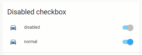
type: entities
title: Disabled checkbox
show_header_toggle: false
entities:
  - entity: input_boolean.test_boolean
    name: disabled
    card_mod:
      style:
        hui-generic-entity-row:
          ha-entity-toggle:
            $:
              ha-switch:
                $: |
                  .mdc-switch .mdc-switch__thumb input {
                    pointer-events: none;
                  }
                .: |
                  ha-switch {
                    --switch-unchecked-button-color: var(--disabled-text-color);
                    --switch-checked-button-color: var(--disabled-text-color);
                  }
  - entity: input_boolean.test_boolean
    name: normal
Also, you can “grey” all row’s elements & disable tap_action:
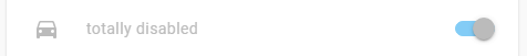
  - entity: input_boolean.test_boolean
    name: totally disabled
    tap_action:
      action: none
    card_mod:
      style:
        hui-generic-entity-row:
          ha-entity-toggle:
            $:
              ha-switch:
                $: |
                  .mdc-switch .mdc-switch__thumb input {
                    pointer-events: none;
                  }
                .: |
                  ha-switch {
                    --switch-unchecked-button-color: var(--disabled-text-color);
                    --switch-checked-button-color: var(--disabled-text-color);
                  }
        .: |
          :host {
            color: var(--disabled-text-color);
            --paper-item-icon-color: var(--disabled-text-color);
          }


