In the State of the Open Home I’ve just shared a Home Assistant concept of the future. It’s something we’re working on for over a year to help us decide what and how we want to build. And you can try it yourself.
Some highlights in this concept:
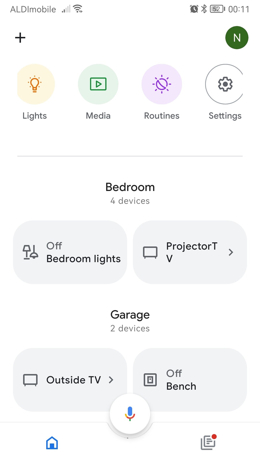
Introducing smart defaults. A great default dashboard based on your rooms, devices and inspired by the latest smart home trends . Add a touch of drag & drop. And suggested automations based on your home.
Make it about devices instead of entities. This way we can show relevant information in the more-info dialog to give a quick overview.
Make settings easier in the UI and make you spend less time in the settings menu. For example move devices and automations to the main menu and add an appearance menu for default theme and menu order.
Use the modern design language Material Design 3. Bring Home Assistant to the latest UI trend.
Great on every device. This prototype is mobile. We have designs to have it also great on bigger screens. What screen do you think need to be improved on what device?
Its a pretty big prototype. What part do you like and what do you think can be better?
OK, I’ll give it a shot. You may find I’m a bit of a contrarian. I’m more interested in the basic functionality than the presentation. I tend to get skeptical when I sense “change for change’s sake” or “lipstick on a pig” type projects.
Better defaults for a first-time user is a good goal. Just don’t assume every user wants things your way. For example, I don’t care about media, and I don’t organize things by room. I want to see, for example, my whole heating system at a glance.
I really don’t care about devices. They’re just the hardware which gets me what I’m really after, the entities. A good example would be a combination door and temperature sensor. I have all the temperature entities on one card. I don’t care that one of them is also a door sensor.
I’m agnostic about where you put the settings. I’d look at how they’re handled in other common devices, like smart phones, and try to follow a similar pattern. This would make it more “intuitive” for beginners.
I am not a fan of “modern” or “trendy” designs. They go stale quickly and serve only to pad the designer’s resume. See my “Change for change’s sake” comment, above. Existing users almost universally hate these kinds of changes.
I agree that all the different client platforms should get equal attention. I find with the current UI it’s easy to bounce between laptop, tablet and phone.
The mushroom like look is nice but it should be possible to more easily change the font sizes. On a tablet the mushroom text can sometimes be difficult to read and I don’t want to put on my reading glasses to just turn on a lamp. (You can laugh but you will also get there eventually )
It all seems like a good direction of travel for newcomers to HA, although I am not sure that those who have been users for some time are going to pay much attention. They have already sorted their dashboards with the existing massive selection of cards and custom components. The same goes for automations - suggesting automations based on blueprints is great, although again, many users are way beyond that. I for one hardly use YAML these days, choosing pyscript or node-red instead.
I like the focus on devices, although I am surprised that areas have not had a mention at all. Why not take advantage of the fact that a device is in an area (e.g. room) and use that to inform the dashboard?
A suggestion to help new users (who probably don’t have strict entity naming): when building a dashboard, it would be helpful if they could pick an entity by working down the tree of area, device and then entity - and that was somehow reflected in the displayed UI.
There are a lot of people building mushroom based dashboards at the moment (I’m one of them), so the look and feel is current, and I am sure will be appreciated by many. I do agree about the font sizes though - I can hardly see the standard chip card
Better defaults for a first-time user is a good goal. Just don’t assume every user wants things your way. For example, I don’t care about media, and I don’t organize things by room. I want to see, for example, my whole heating system at a glance.
Assumptions can be deadly, I agree. This concepts got these out-of-the-box defaults to get the best overall experience and new users get to know some basic features of Home Assistant. If you don’t use Media, you can swap it with another menu item or even hide it. Like it’s possible right now to customise your UI.
This concept also got filters on top to only show climate, lights, security and media devices. What do you think of this for your heating system?
I am not a fan of “modern” or “trendy” designs. They go stale quickly and serve only to pad the designer’s resume. See my “Change for change’s sake” comment, above. Existing users almost universally hate these kinds of changes.
Home Assistant has grown in a great piece of software with some pain points. These can’t be fixed all in once and we keep learning and iteration to make it even better. About UI trends you can argue if you like it or not, that is really opinion based. In our case we use Material Design and they improved it in version 3. Personally I find it refreshing, but not revolutionary. I’ve seen the “change for change’s sake” comment a couple of times now, that is in my opinion an innovation killer. When is something change for change’s sake and when it’s one to change?
Good question. Nobody wants to kill real innovation.
I guess my answer would be that “good” change either fixes something which is broken, or brings new functionality that the users of the application want, and can use.
Change for change’s sake is something that a designer wants, because, well, that’s their job. They’re not going to get an article in a trade publication, or give a speech at a designer’s conference, by building what those stupid users want. They need to get noticed, to build their careers. Think about architects. We’ve all seen articles about some shocking new design for a skyscraper or art museum. The surrounding residents all point out that it’s ugly, and the building always has problems structurally, with its materials, and its usability.
I’ve had the opportunity to work in small development groups where we were either users ourselves, or closely aligned with our users. I’ve also worked in “ivory tower” development groups where the day-to-day job the users needed to do was not well understood. I’ll let you guess which one was more successful.
Finally, consider Microsoft desktop applications. Anyone old enough will remember the days when users couldn’t wait to get their hands on the latest version. It made their jobs easier and gave them functionality they didn’t have before. Now users dread new versions. There’s no new functionality. Things are hidden and dumbed down to make a more modern, trendy look. Everything takes more clicks, more effort to accomplish.
Right on this forum, there are hundreds of feature requests and WTH’s. These are things users are specifically asking for. I would prioritize those over a trendy, modern UI.
Love this look and feel and continuing in the MD3 direction. Auto populating a useful dashboard like that will be amazing. Can’t wait for this to come along (hopefully) not too far away!
I’m going to jump in and argue the opposite. An elegant, clean, modern UI makes people WANT to use it. I love HA and there’s tons of automations going on behind the scenes, but my wife doesn’t want to use it. Elegance attracts users that aren’t nerds like us, which in turn attracts investors and commercial users and “official plugins” and support.
I highly disagree with elegant, modern, clean UI and an efficient UX that’s tailored (and easily adapted) to daily usage is “change for change’s sake”.
If half our users are “task based” and the other half are “device/entity based”, then we offer base templates for each type. Don’t remove our power to adjust and tweak and tailor, but PLEASE invest in elegance. I’d love to have a wallmounted tablet but it need to look phenomenal or it’s just not going up.
Same goes for any type of commercial application (meaning, automation installed in rich people’s homes) - HA won’t make it in this use-case until it looks compatible with the rest of their houses.
I’m OK with that. I agree a good UI is important. There are things I’d prioritize ahead of it, but there’s no reason HA can’t make progress in many different areas at once.
Just don’t take away functionality, or dumb it down to make it look “easier” to the uninitiated.
yeah - i guess my summary would be that the “users” of the UI are not the users of HomeAssistant. I’d love to have no UI… 100% automation and voice. We’re far from it (i am, especially with my cheap devices all over the house), so the next best thing is a great UI/UX for the residents of hte house, not the HA Admins.
I’m mostly there, not many times we need to reference the UI. Building smart automations takes time and a lot of tweaking. We could never remember the correct voice commands so stopped using them; I think users go through these phases of cramped ui’s with everything shown and a million voice commands, eventually they thin out their UI’s and get rid of a lot of their voice commands instead favoring truly ‘smart’ automation that just works with minimal interaction. Adding a few well located manual trigger buttons here and there has worked for us, but mostly the house does what it should with no interaction required. Lots of sensors and sensible device controls. Could I do more, yes, but I’ll always want some manual control for when the system is down, and it does go down occasionally.
 . Add a touch of drag & drop. And suggested automations based on your home.