Hello 
I started Home Assistant due to its functionalities on tracking resource consumption.
While I managed to get my pellet boiler connected (thank you!), I did not find any way suiting my needs to add my electricity and water consumption.
Of course, there is great ways with hardware sensors and probably also for manual entries via databases and Grafana. But currently both projects are a little too advanced for me to start 
So for the time being I opted for a pragmatic approach with Google Spreadsheets manually filled by a Google Form integrated as a webpage into Home Assistant. I know, for all the real developers out there this is probably rather non elegant approach but it serves my use case of generating awareness for resource consumption in the family.
The result looks like this:

This post is split in two:
- Use a Google Spreadsheet to average daily consumption
- Get diagrams into Home Assistant
I will go with the electricity counter but for water it is the very same approach.
Use a Google Spreadsheet to average daily consumption
For ease of use, I decided to use a Google Form for data entry and print the link as a QR code. I put it next to the electricity counter so I can simply it scan with my phone. If you want to enter decimals you will need to check data entry with a regular expression
^-?[\d,{1-9}]$


We will need responses in a separate sheet to work with them:


I like to keep my data separate from the calculations. Therefore, I created another sheet which imports the responses (and strips down dates to an integer values).
You will have to copy the formula for „Date, value“ all the way down and add more rows if you need more history. This also applies for the next sheet
The result with some example entries should look something like this (formulas for copying below)


The formulas are
=IMPORTRANGE("[link to response sheet]";"A:A")

=ROUNDDOWN(VALUE(A2))
What comes next is the actual break-down of the data across days. I know, that not all of these columns are necessary but they make it easier to understand what’s going on Also, this approach only works for daily entries (not several per day).
What the two auxiliary columns do is taking the difference between two actual readings and the days between them. Then, they divide values.
The sheet should look like this (formulas below - attention to the formula in A3):


The more complex formulas for copying are
=TO_DATE(ROUNDDOWN(MAX('Import responses'!A2:A1000)))

=IFERROR(VLOOKUP(B2,'Import responses'!$B$1:$C$1000,2,0),"")

=IF(C2="",MIN($C$2:C2)-MAX($C2:C$1000),C2-MAX($C3:C$1000))

=IFERROR(MATCH(MAX($C3:$C$1000),$C$2:$C$1000,0)-MATCH(MIN($C$2:$C2),$C$2:$C$1000,0),"")
Now, we are almost done. You can pivot the data as you like. For example, show the previous 5 days:


And create a chart for it:
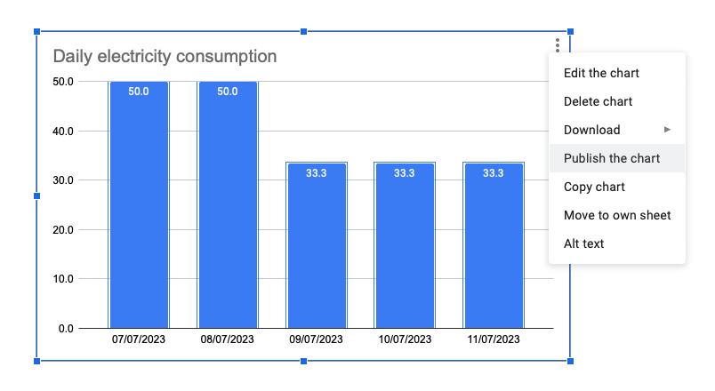

We will need the „Publish the chart“ option for the next step.
Get diagrams into Home Assistant
Getting the diagram into Home Assistant is probably easy if you have done it before. My challenge was getting the width right. I used the layout-card integration from the community store.
The code for a manual card in grid layout that worked for me is
type: custom:layout-card
layout_type: custom:vertical-layout
cards:
  - type: iframe   url: >-    [your link from „publish the chart“]
aspect_ratio: 100%
 layout:   width: 500
max_cols: 1
Feedback, ideas and suggestions for improvement are very welcome