iOS 16 Home Theme

Following on from my previous Lovelace/Dashboard setup I was inspired by the new design of the Home app in iOS 16, and the excellent Minimalist theme, to make an attractive, easy-to-use theme for Home Assistant.

Benefits of this setup:

  • No additional themes required - works with the default HA themes
  • Only two custom components needed - button-card and layout-card
  • Dynamically rearranges tiles according to screen size - no need to maintain separate Dashboards for desktop and mobile (or deal with a mobile interface on desktop)
  • Easily-customisable summary cards that read entities from Groups to summarise lights, climate devices and more
  • Pretty (IMHO)

Things I’m working on:

  • Multiple size options for each card
  • Complete documentation in each card and templates for views for ease of installation

Happy to answer any questions about this setup and I can share installation instructions in a further post if desired. I would be really grateful for your collective opinions and would also be keen to try and implement any suggestions for improvements that you might have!

Al


6 Likes

@ajoyce This looks great. What would I need from you to be able to give this a go on my home assistant instance? Thank you for your response ahead of time!

Looks nice. I am also currently in the design phase of creating something similar, working with Mushroom and animations. Look here: Imgur: The magic of the Internet

2 Likes

Cool!

I started something similar just before the iOS 16 version was revealed, happened to look very similar:

1 Like

I’m very new to custom themes, so any instructions would be amazing!

1 Like

Nice! What config for the grid layout do you guys use?

Hi, can you share any updates and yaml to make this possible?

Sorry for abandoning this thread, installation instructions as follows:

Install button-card and layout-card either manually or through HACS and set your dashboard to YAML mode

For ease of navigation I link my YAML file to a directory of YAML files, one for each page, in a folder called views. Each button comes from a template in a folder called cards. So your main YAML file should look like this:

button_card_templates: !include_dir_merge_named cards/

title: Your Home Title
background: center / cover no-repeat fixed url('https://img.wallpapersafari.com/desktop/1920/1080/17/26/i2OY8K.jpg')
# replace with your own wallpaper URL as desired

views: !include_dir_list views/

From here, make your cards and views folders and then copy in the files from ha-themes/ios16theme at main ¡ aegjoyce/ha-themes ¡ GitHub to get started.

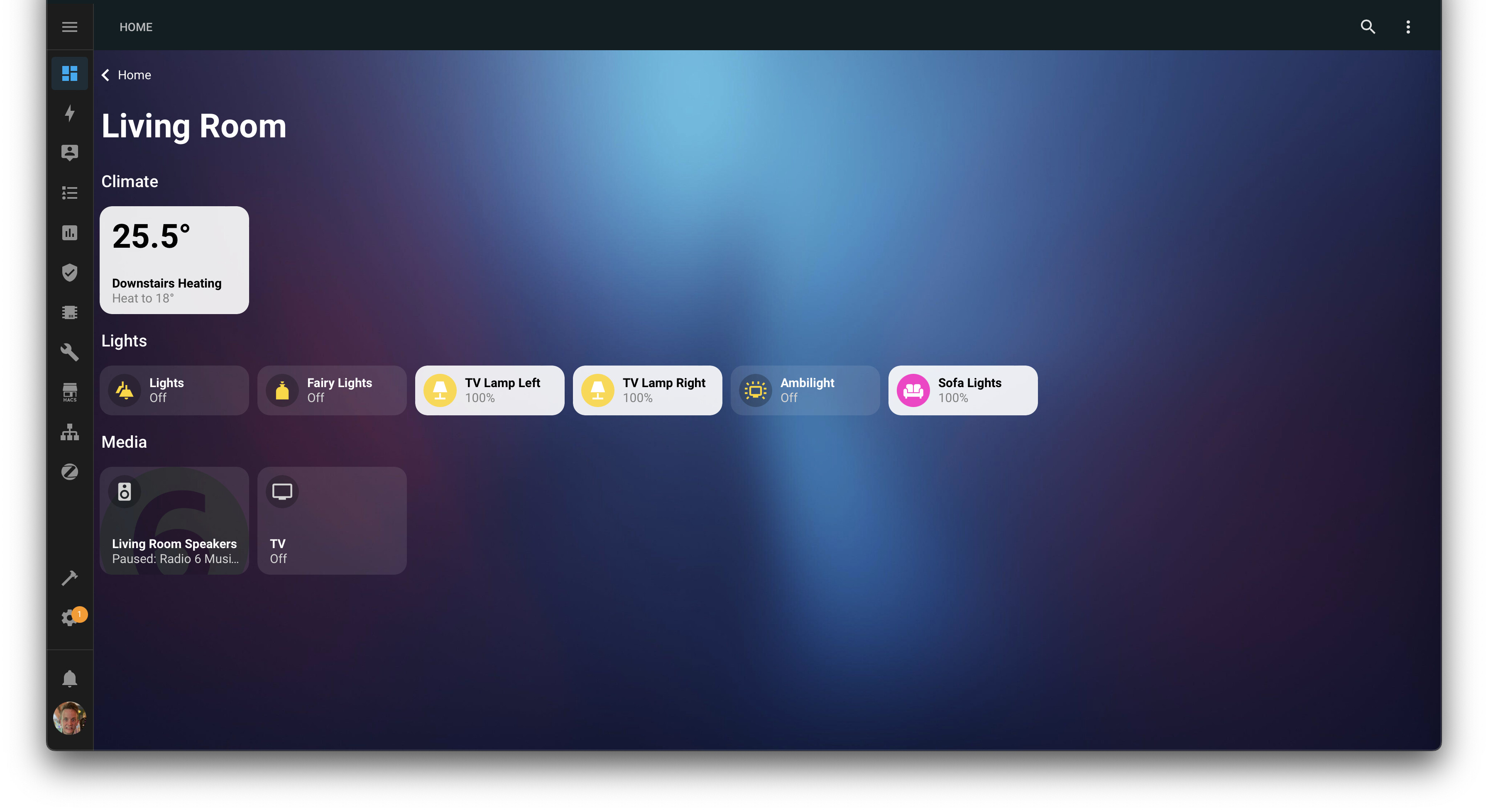
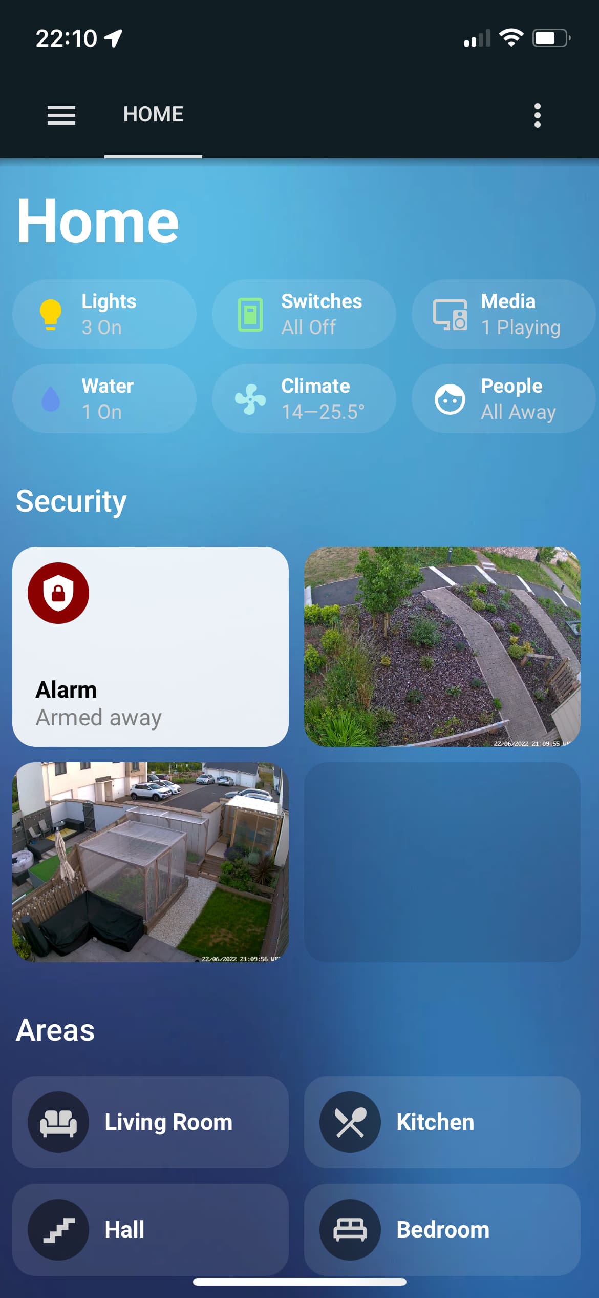
I’ve included a template for the Home panel and an example Living Room panel in this repository. You shouldn’t need to make changes to any of the card templates apart from navigate_home.yaml (change navigation_path to the url of your home panel) and area.yaml (change navigation_path to [[[ return "/[your dashboard name]/" + variables.path ]]])

Let’s look at the structure of each page:

title: Title
path: home
panel: true
visible: true
cards:
  - type: vertical-stack
    cards:

## TITLE ##

      - type: 'custom:button-card'
        template: navigate_home
        tap_action:
          action: none
        hold_action:
          action: none
        show_name: false
        show_icon: false

      - type: 'custom:button-card'
        name: Title
        template: title

## SUMMARY BUTTONS ##

      - type: custom:layout-card
        layout_type: custom:grid-layout
        layout:
          grid-template-columns: repeat(auto-fill, 120px)
          grid-template-rows: repeat(auto-fill, 45px)
          grid-gap: 10px
        cards:

          - entity: group.all_lights
            type: 'custom:button-card'
            template: group_summary
            name: Lights
            variables:
              icon_color: gold

          - entity: group.all_switches
            type: 'custom:button-card'
            template: group_summary
            name: Switches
            variables:
              icon_color: lightgreen

          - entity: group.all_media_players
            type: 'custom:button-card'
            template: group_summary
            name: Media
            variables:
              status_text: Playing
              filter_value: playing

          - entity: group.all_water
            type: 'custom:button-card'
            template: group_summary
            name: Water
            variables:
              icon_color: cornflowerblue

          - entity: group.all_climate
            type: 'custom:button-card'
            template: group_summary
            name: Climate
            variables:
              icon_color: paleturquoise
              climate: true

          - entity: group.all_persons
            type: 'custom:button-card'
            template: group_summary
            name: People
            variables:
              icon_color: white
              status_text: 'Home'
              filter_value: 'home'
              if_none: 'All Away'

## SECURITY ##

      - type: 'custom:button-card'
        name: Security
        template: subtitle

      - type: custom:layout-card
        layout_type: custom:grid-layout
        layout:
          grid-template-columns: repeat(auto-fill, 180px)
          grid-template-rows: repeat(auto-fill, 130px)
          grid-gap: 10px
        cards:

          - entity: alarm_control_panel.yale_smart_alarm
            name: Alarm
            type: 'custom:button-card'
            template: alarm

          - entity: camera.front_garden_camera
            type: 'custom:button-card'
            template: camera

          - entity: camera.back_garden_camera
            type: 'custom:button-card'
            template: camera

          - entity: camera.3d_printer_camera
            type: 'custom:button-card'
            template: camera
            variables:
              zoom: 140%

## AREAS ##

      - type: 'custom:button-card'
        name: Areas
        template: subtitle

      - type: custom:layout-card
        layout_type: custom:grid-layout
        layout:
          grid-template-columns: repeat(auto-fill, 180px)
          grid-template-rows: repeat(auto-fill, 60px)
          grid-gap: 10px
        cards:

          - type: 'custom:button-card'
            template: area
            name: Living Room
            icon: mdi:sofa
            variables:
              path: living_room

          - type: 'custom:button-card'
            template: area
            name: Kitchen
            icon: mdi:silverware
            variables:
              path: kitchen

          - type: 'custom:button-card'
            template: area
            name: Hall
            icon: mdi:stairs
            variables:
              path: hall

          - type: 'custom:button-card'
            template: area
            name: Bedroom
            icon: mdi:bed-king-outline
            variables:
              path: bedroom

          - type: 'custom:button-card'
            template: area
            name: Ensuite
            icon: mdi:shower-head
            variables:
              path: ensuite

          - type: 'custom:button-card'
            template: area
            name: Guest Bedroom
            icon: mdi:bed-queen-outline
            variables:
              path: guest_bedroom

          - type: 'custom:button-card'
            template: area
            name: Study
            icon: mdi:desk
            variables:
              path: study

          - type: 'custom:button-card'
            template: area
            name: Loft
            icon: mdi:home-roof
            variables:
              path: loft

          - type: 'custom:button-card'
            template: area
            name: Greenhouse
            icon: mdi:greenhouse
            variables:
              path: greenhouse

          - type: 'custom:button-card'
            template: area
            name: Outdoor
            icon: mdi:flower
            variables:
              path: outdoor

## OTHER ##

      - type: 'custom:button-card'
        name: Other
        template: subtitle

      - type: custom:layout-card
        layout_type: custom:grid-layout
        layout:
          grid-template-columns: repeat(auto-fill, 180px)
          grid-template-rows: repeat(auto-fill, 60px)
          grid-gap: 10px
        cards:

          - type: 'custom:button-card'
            template: area
            name: Tasks
            icon: mdi:clipboard-check-outline
            variables:
              path: tasks

          - type: 'custom:button-card'
            template: area
            name: Settings
            icon: mdi:cog
            variables:
              path: settings

## PADDING ##

      - type: 'custom:button-card'
        template: navigate_home
        tap_action:
          action: none
        hold_action:
          action: none
        show_name: false
        show_icon: false

Change titles and entity ids as desired. Move sections around as required but pay attention to indentation to avoid breaking things. Keep the padding section at the bottom to prevent buttons overlapping the bottom of the wallpaper. Change card templates as needed to find the one you need.

If all of this is totally alien to you I would brush up on YAML dashboards and look into how button-card works - there’s plenty of information available on the forum and externally. Happy to help with smaller technical issues on this thread. Good luck!

2 Likes

Many thanks for sharing it. It looks great on my iPad mini that is too old to use the home app.

Now I havetwo requests:

1/ Could you add a card for covers? I have used the switch template but it’s very limited

2/ I am trying to display the next event in my agenda in a card but I can’t figure out how to make it larger so that the time and place are displayed.

Thanks!

Hey, thanks for using it, looks great on your setup! I see you’ve fixed the outline issue but in case you haven’t I have now updated the GitHub repo so you don’t get the outlines.

Give me some ideas of what you would like to see for a cover and agenda card and I can give it a go for you!

Thanks for your reply and update of your repo.

For the agenda card, a bigger card with more room for the “state” would do it. I could then see the details of the event.
I am using this integration GitHub - tybritten/ical-sensor-homeassistant: an iCal Sensor for Home Assistant together events as sensors.

For the cover card , something like that would be great

Thanks again.

Any chance you share your config?

Any chance you could add Tile cards to the available cards of your theme? I think that would accomplish what I am after.

Thanks!

If you want to use a tile card you can, just need to change the YAML. But I haven’t tested it and it probably won’t work with the layout.

I’m working on some new versions of the cards with more functionality but they will be custom

1 Like

Oh, nice! Can’t wait for those.

Hey @ajoyce

Great work on this theme. It took me a few hours as newbie, but I finally got it mostly working and modified to my liking.

My one issue is this, I have a single nest thermostat that I am trying to include in the “group summary” at the top of the main page. When I change the entity id to my thermostat, I get the following error displayed instead of the climate summary:

ButtonCardJSTemplateError: TypeError: Cannot read properties of undefined (reading 'filter') in 'if (variables.climate === true) {
    function getState(value) {
        return (states[value].sta...'

Screen Shot 2022-12-16 at 8.02.40 PM

PS. If there is a way to take into account the state of shades so it displays “Open” or “Closed” isntead of On or Off, I would appreciate it.

The card is designed to read values of group entities, it won’t work with other entity types. Try making a group containing your thermostat and then specify the group entity as the card entity. For example:

      - entity: group.all_climate
        type: 'custom:button-card'
        template: group_summary
        name: Climate
        variables:
          icon_color: paleturquoise
          climate: true

i dont know where to place your code :slight_smile: button_card_templates: !include_dir_merge_named cards/

title: Your Home Title
background: center / cover no-repeat fixed url(‘https://img.wallpapersafari.com/desktop/1920/1080/17/26/i2OY8K.jpg’)

replace with your own wallpaper URL as desired

views: !include_dir_list views/

is it in configuration.yaml
views and cards i copy to folders in config folder
but i am not able to start your dash

Make a new yaml dashboard as per instructions here Multiple Dashboards - Home Assistant
Then put the code you pasted into [name of your new dashboard].yaml

Hi Alasdair, i really like your work and the way how you did this. I have some questions / suggestions for further development:

  1. Feature: groups (rows with columns)
    Currently all cards of a named row are aligned horizontal, taking the space needed. This is ok for rows with many cards. But when you have rows with only a few cards, i prefer to have 2 (or more) rows next to each other so they represent columns within a row. Have a look a this (last screenshots at the bottom):
    GitHub - DBuit/Homekit-panel-card: Homekit panel card for home assistant
    I tried to realize this by nesting layout cards, but failed with the css grid definition. The goal is that all groups are wrapping like the tiles within the groups and that you can define the max cols per group.

  2. I would like to use your card templates with the ui editor. I don‘t want to completly switch to yaml based dasboards but its necassary to use the includes in the view config i suppose. Is there another way having both of two worlds beside putting all templates at the beginning of the view config? Maybe 3…

  3. Maybe you could build a custom card that can be used in ui editing mode. I suppose it would be a great step forward having the option to place a „tile board card“ (or however you name it) and being able to use either your templates, my own templates, your templates with some tweaks or any other card as a tile.
    To keep all the benefits this card should do nothing more than loading the templates. So this card could also be a general „template loading card“ for the custom button card by only specifying the folder with the templates. Maybe something like this already exists and i haven‘t found yet.