knowing the limits of built-in history graph, I’m using mini-graph-card to render water usage graphs from values generated by utility_meter integration.
I’ve got three graphs: usage per hour, daily usage, monthly usage. all in bar format.
hourly usage works almost fine [I’m displaying last 24h, so I’ve got 24-bars; shame that they are not formated for strict hours [like: 0:00 - 1:00, 1:00 - 2:00 etc.] but I can live with that, it’s just a value to see if there’s something wrong happening [I did have a major leak earlier, so seeing the graph helps to prevent any more damage ;)]
but I can’t get daily and monthly usage to display correct values, or even to show the right number of bars… I know that I can change the number of points per hour, but it kinda sucks & still, values displayed are not accurate and not equal to real measured ones…
is there any other way or addon that I can incorporate in lovelace to do it?
I knew it somebody will mention that & still I don’t know why I didn’t add that I know grafana but it’s too slow for me (tried that, graphs are terribly sluggish with refresh) & also I don’t want to use a big workhorse for a small job
oh, and AFAIR there’s no clean method to use grafana’s graphs in lovelace [I remember there was some trick with grabbing images and putting them as camera static etc.; maybe it’s changed for now, but still - because of mentioned reasons grafana is a no-go for me].
so thanks for the suggestion, but right now the question & search remains opened
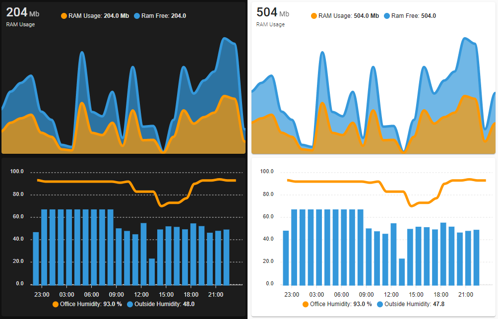
@Shaad you showed a hourly humidity for the last 24hrs - and sure, it works fine for me too [not perfect, but fine it is]. the issue I was writing about over a year ago is connected with weekly and monthly charts - try to configure the chart so it has 7 bars [for weekly] and 30 bars [for monthly] - that’s when the “fun” begins
can you share your over 7 days card config for mini-graph please?
I’ll compare it with mine and maybe that would answer my, not-so-crucial, problem [more like an OCD issue ;)]
the thing with ApexCharts is, I saw it earlier, but I don’t want to add another integration/script/addon just to display two charts [those connected to my original question]; and on the second hand - I am not too happy to rewrite all my charts from mini-graph to apex, to remove redundand addons/modules, as right now I have too many of them to make it quickly while other things have higher priority, if you know what I mean
thanks! now I can’t remember why I did that - but after comparing with your config, I had an unnecessary mess with points_per_hour. after throwing it out my weekly graph is fine monthly chart still is not what it should be, but I guess that it’s because there’s no way to group data by month [rather than date/hour/interval]
haha don’t worry. I almost forgot about this post, and because those charts were not crucial, as I mentioned [the most important thing was meter’s numeric state displayed on them, so charts were only a cool visual addition], it kinda fell down from the todo list


 A Lovelace card to display advanced graphs and charts based on ApexChartsJS for Home Assistant