How can I make the bars in ink levels rounded and the text overlay black on bars. I installed card-mod

Is possible to change text color inside bar?
Hey, is there a way to set the direction to come from the left side? It looks odd this way.
Is There any plans to set target with value_tamplate (i’m thinking about last_value attributes), or even any created sensor?
Hi. I am using your bar-card, and it is very good. I have come across one issue I cannot seem to resolve. I would like to use the value of a sensor to set the max value. Is this something that can be done?
That worked perfectly - thank you very much! 
Is there any chance to set the decimal sepator right or according to user preferecnes ?
I always get these #,000.00 figures and my wife goes crazy cause depending on what card you use the meaning will change to the opposite and as she calls
nothing feels natural or like coming home cause she has to think twices about every figure
What she had made so upset were the scales and the energy meters, so Watt hours.
I hope to find a way to use the bar card in a natural way we are used too which means #.###,0 only formats and nothing else.
Thanks for everyone who is helping us to achieve that goal !
Hello, I’m looking for a way to display this chart as in the example. In addition to the actual values, the aim is to show the upper and lower limits. So far I have only found the possibility to change the colors via severity or to specify a target value with “target”. But I don’t know how to implement several different ranges.

Thanks a lot in advance.
Good morning all,
I am trying to change the color of the icon of my sensor (not binary.sensor) for example to blue. I have tried a lot of things, but I can’t find a solution. Do you have an idea ?

Thanks a lot in advance
Hi guys,
In a disk %age usage bar card, I would like to display the actual value of the free disk space.
Something like: Free space: 62GB/212,0G (Usage: 69%)
Is that doable?
(Sorry if the question is not clear)
No comments? Ideas?

2 Likes
Some tricks with the card - displaying TWO text lines:
This is implemented by the decl_bar_additional_info decluttering card with the aid of card-mod.
How to use:
- type: custom:decluttering-card
template: decl_bar_additional_info
variables:
- SENSOR_USAGE: sensor.iiyama_ohm_ssd_corsair_load_used_space
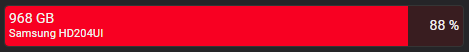
- VALUE_TEXT_1: 968 GB
- VALUE_TEXT_2: Samsung HD204UI
decl_bar_additional_info:
  default:
    - VALUE_TEXT_2: ''
  card:
    type: custom:mod-card
    card:
      type: custom:decluttering-card
      template: decl_bar_usage
      variables:
        - SENSOR_USAGE: '[[SENSOR_USAGE]]'
        - VALUE_NAME: '[[VALUE_TEXT_1]]'
    card_mod:
      style:
        decluttering-card $ bar-card $: |
          bar-card-name {
            line-height: 1.1rem;
          }
          bar-card-name::after {
            content: "{% set CONTENT = '\A ' + '[[VALUE_TEXT_2]]' -%}
                      {{ CONTENT }}";
            white-space: pre;
            font-size: 0.8rem;
          }
Internally using the decl_bar_usage template:
decl_bar_usage:
  default: &ref_default
    - VALUE_NAME: ''
    - VALUE_SHOW_NAME: inside
    - VALUE_SHOW_STATE: inside
    - VALUE_COLOR_1: green
    - VALUE_COLOR_2: orange
    - VALUE_COLOR_3: red
    - VALUE_LIMIT_1: 33
    - VALUE_LIMIT_1_1: 34
    - VALUE_LIMIT_2: 66
    - VALUE_LIMIT_2_1: 67
  card:
    type: custom:bar-card
    entity: '[[SENSOR_USAGE]]'
    name: '[[VALUE_NAME]]'
    icon: ''
    unit_of_measurement: ''
    direction: right
    entity_row: true
    height: 40px
    width: 100%
    color: ''
    complementary: false
    decimal: 0
    target: 0
    limit_value: false
    min: '0'
    max: '100'
    severity:
      - color: '[[VALUE_COLOR_1]]'
        from: 0
        to: '[[VALUE_LIMIT_1]]'
        icon: ''
        hide: false
      - color: '[[VALUE_COLOR_2]]'
        from: '[[VALUE_LIMIT_1_1]]'
        to: '[[VALUE_LIMIT_2]]'
        icon: ''
        hide: false
      - color: '[[VALUE_COLOR_3]]'
        from: '[[VALUE_LIMIT_2_1]]'
        to: 100
        icon: ''
        hide: false
    positions:
      icon: 'off'
      indicator: 'off'
      name: '[[VALUE_SHOW_NAME]]'
      minmax: 'off'
      value: '[[VALUE_SHOW_STATE]]'
    animation:
      state: 'off'
      speed: 3
Surely the same technics may be used to display last-changed for the sensor:

decl_bar_additional_info__last_changed:
  card:
    type: custom:mod-card
    card:
      type: custom:decluttering-card
      template: decl_bar_usage
      variables:
        - SENSOR_USAGE: '[[SENSOR_USAGE]]'
        - VALUE_NAME: '[[VALUE_TEXT_1]]'
    card_mod:
      style:
        decluttering-card $ bar-card $: |
          bar-card-name {
            line-height: 1.1rem;
          }
          bar-card-name::after {
            content: "{% set SENSOR_NAME = '[[SENSOR_USAGE]]' -%}
                      {%- if not states(SENSOR_NAME) in ['unavailable','unknown'] -%}
                        {%- set DOMAIN = SENSOR_NAME.split('.')[0] -%}
                        {%- set SENSOR_NAME = SENSOR_NAME.split('.')[1] -%}
                        {%- set LAST_CHANGED = states[DOMAIN][SENSOR_NAME].last_changed -%}
                        {%- set LAST_CHANGED_FORMATTED = relative_time(LAST_CHANGED) -%}
                        {%- set LAST_CHANGED_FORMATTED = '\A '+LAST_CHANGED_FORMATTED+' ago' -%}
                      {%- else -%}
                        {%- set LAST_CHANGED_FORMATTED = '' -%}
                      {%- endif -%}
                      {{ LAST_CHANGED_FORMATTED }}";
            white-space: pre;
            font-size: 0.8rem;
          }
Update 26.05.22: changed a code for decl_bar_usage - removed mod-card.
6 Likes
After searching and searching I can’t find it: How can the bar-card be installed manually?
That is, installing it without HACS.
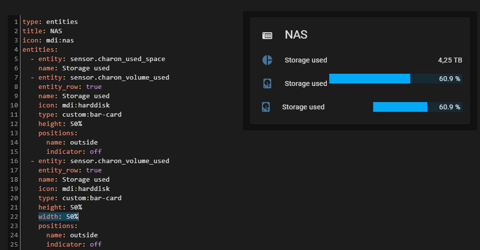
I wanted to put entities and bar-enties into the same card. I tried using the example from the readme, by using an entities type card and set the type of one of my entities to custom:bar-card. which does properly add the bar, but results in a different styling (padding around the whole row + different distance between text and icon)

The readme’s example looks like this though: https://github.com/custom-cards/bar-card/raw/master/images/entity_row.gif?raw=true
Before filing an actual issue, I’d like to know if there’s a different way to combine normal antities and bars into one card.
Try using entity_row: true option
Good tip, thanks! I missed that property.
Unfortunately, it doesn’t seem to fix it completely yet. There’s still a misalignment when using width. As you can see, the lower “storage used” has a different distance to the name/label.
One of my bars (Pollution) are of numeric value.
Is it possible to use CSS Elements to change the value to text depending on the numeric values ,and if so, how?
 style: |
          :card {
            --card-value:
              {% set  temp = state_attr('air_quality.nmi_outside','air_quality_index')|float %}
              {% if   temp > 0 %} Low
              {% elif temp > 3 %} Medium
              {% elif temp > 6 %} High
              {% elif temp > 9 %} Severer
              {% endif %}
              ;
          }

1 Like
My usage of this card is rudimentry…
type: custom:bar-card
entities:
  - entity: sensor.baby_room_window_sensor_power
  - entity: sensor.cadenza_motion_sensor_power
  - entity: sensor.deck_back_door_sensor_power
  - entity: sensor.dresser_motion_sensor_738d0b01_power
...
Is there a way to auto populate the entities… example:
{% for state in states.sensor | selectattr('attributes.device_class', '==', 'battery') %}
  {% if 0 <= state.state | int(-1) %}
    {{ state.entity_id }}
  {% endif %}
{% endfor %}