Nope is not working. The HACS resources are correctly installed ‘custom-template-card’. I even uninstalled and reinstalled it again to be sure that the card is available.
Alright. There’s something programmatically wrong with the install. I’m not saying you did something wrong. But something isn’t playing nice in the background. And that’s way outside my league.
hi, when can i override the border radius theme (ios dark theme) inside of the card?
i can try whith the follow code, but it’s wrong. i can modify the border but not the radius of bar.
      card_mod:
        style: >
          bar-card-currentbar, bar-card-card, bar-card-contentbar,
          bar-card-backgroundbar, bar-card-background, bar-card-current  {
            margin-left: 10px !important;
            margin-right: 20px !important;
            margin-bottom: 10px;
            border-radius: 0px;
            }
          bar-card-currentbar, bar-card-backgroundbar {
            border-radius: 0px;
          }
or
      style: |
        bar-card-backgroundbar {
          border-radius: 0px;
        }
i would to find the border squared, but the ios dark blue theme.
i can try since 5 hours, but i wrong.
Hi guys,
short question: Is it possible to map the value or to show another value (like a helper entity)? I would like to use a string variant instead of the number. Like number 0-66 = ‘Good’.
Hi all,
Struggling to get the animation to work, eventually want it triggered based on binary sensor, but even the basic ‘on’ is not working for me at the moment… Any hints?
          - type: custom:config-template-card
            variables:
              charge_target: states['sensor.i5_m60_xdrive_charging_target'].state
            entities:
              - ${charge_target}
            card:
              type: custom:bar-card
              column: 1
              animation:
                state: 'on'
                speed: 2
              entities:
                - entity: sensor.i5_m60_xdrive_remaining_battery_percent
                  name: Battery
                  icon: mdi:ev-plug-ccs2
                  height: 40px
                  min: 0
                  max: 100
                  target: ${charge_target}
                  severity:
                    - color: Red
                      from: 0
                      to: 25
                    - color: Orange
                      from: 26
                      to: 49
                    - color: Green
                      from: 51
                      to: 100
              card_mod:
                style: |-
                  bar-card-currentbar, bar-card-backgroundbar {
                    border-radius: 12px;
                    border: 0px solid;
                  }
Thanks for the very useful work! Tried to implement this card in a mushroom style dashboard, after some css tweaking this seems to work on a basic level. The standard mushroom collection doesn’t have a counter/gauge/severity tile, so I hope this tweak can be useful to some.

For anyone interested, my code for this card:
type: custom:bar-card
entities:
  - entity: counter.regenwater_filter
    icon: mdi:water-check
    positions:
      icon: outside
      indicator: 'off'
      minmax: 'off'
      name: 'off'
      value: 'off'
    min: 0
    max: 365
    target: 180
    height: 8
severity:
  - color: rgb(76,175,80)
    from: 0
    to: 179
  - color: rgb(255,152,0)
    from: 180
    to: 239
  - color: rgb(244,67,54)
    from: 240
    to: 365
card_mod:
  style: >
    {% set entity = {
      "state": states('counter.regenwater_filter') | int(9999999999),
      "name": "Levensduur",
      "unit": " d"
      }
    %} {% set severity = {
      "green": 0,
      "orange": 180,
      "red": 240
      }
    %} {% set colors = {
      "green": "76,175,80",
      "orange": "255,152,0",
      "red": "244,67,54"
      }
    %}

    ha-card .card-content {
      padding: 10px!important;
      cursor: pointer;
    }

    ha-card {
      transition-duration: 0.05s;
    }

    ha-card:hover {
      {% if entity.state == 9999999999 %}
        background-color: rgba(200,200,200, 0.02);
      {% elif entity.state < severity.orange %}
        background-color: rgba({{colors.green}}, 0.02);
      {% elif entity.state < severity.red %}
        background-color: rgba({{colors.orange}}, 0.02);
      {%- else -%}
        background-color: rgba({{colors.red}}, 0.02);
      {%- endif %}
    }

    bar-card-background {
      margin-left: 13px !important;
    }

    bar-card-backgroundbar, bar-card-currentbar, bar-card-contentbar,
    bar-card-targetbar {
      border-radius: 8px;
    }

    bar-card-currentbar, bar-card-backgroundbar, bar-card-contentbar,
    bar-card-targetbar, bar-card-animationbar {
      {% if entity.state == 9999999999 %}
        left: 1.5em !important;
        width: calc(100% - 1.5em);
      {% else %}
        {% set state_width = 1 + (entity.state|string|count + entity.unit|count) * 0.4 %}
        left: {{state_width}}em !important;
        width: calc(100% - {{state_width}}em);
      {%- endif %}
    }

    bar-card-markerbar {
      display: none;
    }

    bar-card-background::before {
      content: "{{ entity.name }}";
      display: flex;
      font-family: Roboto, sans-serif;
      font-size: 14px;
      font-weight: 500;
      height: 20px;
      letter-spacing: 0.1px;
      line-height: 20px;
      margin-bottom: 6px;
    }

    bar-card-background::after {
      {% if entity.state == 9999999999 %}
        content: "N/A"
      {%- else %}
        content: "{{ entity.state }}{{ entity.unit}}";
      {%- endif %}
      font-family: Roboto, Noto, sans-serif;
      font-size: 12px;
      font-weight: 400;
      height: 16px;
      letter-spacing: 0.4px;
      line-height: 16px;
      display: inline-block;
      position: absolute;
      margin-top: -4px;
      width: fit-content;
    }

    bar-card-iconbar {
      {% if entity.state == 9999999999 %}
        color: rgba(200,200,200, 1);
        background-color: rgba(200,200,200, 0.2);
      {% elif entity.state < severity.orange %}
        color: rgba({{colors.green}}, 1);
        background-color: rgba({{colors.green}}, 0.2);
      {% elif entity.state < severity.red %}
        color: rgba({{colors.orange}}, 1);
        background-color: rgba({{colors.orange}}, 0.2);
      {%- else -%}
        color: rgba({{colors.red}}, 1);
        background-color: rgba({{colors.red}}, 0.2);
      {%- endif %}
      border-radius: 50%;
      max-height: 36px;
      max-width: 36px;
    }
Update 13/01/2025: some minor css changes to reflect the new design guidelines of the mushroom cards.
17 Likes
Hello folks,
currently I am trying to build something like this (taken from Huawei Solar Dashboard)

Focus is at the bar graph itself.
Since ApexCharts for HA does - as far as I know - not support stacked bar graph like this I am currently using bar-card with card-mod and config-template-card [Actually the template card is in this state unnecessary, but it is still in for testing purpose]
However I am facing some issues.
This is what I currently have achieved (bottom 2 bars), using 2 templates to calculate the %-values.

Is there any way I can replace the displayed value for Min/Max (in this case 11% and 89 or 90%), without it affecting the bar length?
Because if I replace the MIN with config-template-card there is never a bar shown since the Min-value equals thecurrent value.
type: custom:config-template-card
variables:
  - states['sensor.pv_energy_daily'].state
entities:
  - ${vars[0].entity_id}
card:
  title: Version 3
  type: custom:bar-card
  decimal: 2
  positions:
    icon: 'off'
  entities:
    - entity: sensor.pv_energy_daily
    - entity: sensor.grid_export_energy_daily
      complementary: false
    - entity: sensor.home_selfuse_energy_daily
      complementary: false
      max: ${vars[0] }
    - entity: sensor.percent_selfuse_vs_export
      unit_of_measurement: '%'
      positions:
        icon: 'off'
        indicator: 'off'
        minmax: inside
        value: inside
        name: 'off'
        title: inside
    - entity: sensor.percent_export_vs_selfuse
      unit_of_measurement: '%'
      positions:
        icon: 'off'
        indicator: 'off'
        minmax: inside
        value: inside
        name: 'off'
        title: inside
  card_mod:
    style: |
      .contentbar-direction-right {
       flex-direction: column;
      }
      .min-direction-right {
        margin: 0px;
        margin-left: 4px;
        margin-right: auto;
        margin-bottom: -20px;
        bottom: 10px;
      }
        bar-card-value {
        margin: -11px;
        margin-left:
      }
      bar-card-name {
        margin: 0px;
      }
      bar-card-max {
        margin: 0px;
        margin-left: auto;
        margin-top: 0px;
        top: 10px;
        font-size: 15px
      }
      bar-card-min {
        margin: auto;
        margin-left: auto;
        margin-top: auto;
        top: 10px;
        font-size: 15px
      }
      bar-card-divider {
        display: none;
      }
Any help would be appreciated.
Is it possible to change the name within the Bar Card depending on the value of the Entity.
If negative then name ‘To Grid’ and if Positive then change the name to 'From Grid

Hi folks, I’m sharing a retro LED look for batteries level, all done in CSS.
edited : made it simpler thanks to @edwardtich for sharing is mask code which it’s based on.


Here’s the code:
######  Add those variables in your Theme


  alert-color: 178, 34, 34
  green-color: 34, 139, 34
  orange-color: 207, 91, 0
  yellow-color: 230, 187, 0

  battery-gradient-vertical: linear-gradient(360deg, rgba(var(--alert-color),1) 0%, rgba(var(--alert-color),1) 35%, rgba(var(--orange-color),1) 50%, rgba(var(--yellow-color),1) 65%, rgba(var(--green-color),1) 100%)
  battery-gradient-horizontal: linear-gradient(90deg, rgba(var(--alert-color),1) 0%, rgba(var(--alert-color),1) 35%, rgba(var(--orange-color),1) 50%, rgba(var(--yellow-color),1) 65%, rgba(var(--green-color),1) 100%)
  battery-mask-horizontal: repeating-linear-gradient( 90deg,  rgba(0, 0, 0, 0.3) 0%, black 2%, rgba(0, 0, 0, 0.3) 4%, transparent 4%, transparent 5%)
  battery-mask-vertical: repeating-linear-gradient( 360deg,  rgba(0, 0, 0, 0.3) 0%, black 2%, rgba(0, 0, 0, 0.3) 4%, transparent 4%, transparent 5%)


  ######    Vertical Bar

type: custom:stack-in-card
cards:
  - type: custom:bar-card
    columns: 4
    decimal: 0
    entity_row: false
    positions:
      icon: outside
      name: 'off'
      minmax: 'off'
      indicator: 'off'
    direction: up
    height: 200px
    entities:
      - entity: sensor.energie_victron_chalet_state_of_charge
        name: Batteries
      - entity: sensor.energie_victron_chalet_battery_voltage
        name: Voltage
        decimal: 1
        min: 20
        max: 28
      - entity: sensor.energie_victron_chalet_amperage_restant_sur_416
        name: Ampérage
        max: 416
      - entity: sensor.energie_victron_chalet_wattage_restant_416
        name: Wattage
        icon: mdi:lightning-bolt
        max: 9984

    card_mod:
      style: |
        ha-card {
          background: black !important;
        }
        bar-card-backgroundbar {
          background: var(--battery-gradient-vertical);
          mask-image: var(--battery-mask-vertical);
          border-radius: 0px;
          filter: brightness(0.65);
          opacity: 0.35;
        }
        bar-card-currentbar {
          background: var(--battery-gradient-vertical);
          mask-image: var(--battery-mask-vertical);
          clip-path: polygon(0 100%, 100% 100%, 100% calc(100% - var(--bar-percent)), 0 calc(100% - var(--bar-percent)));
          border-radius: 0px;
        }
        bar-card-value {
          margin: 20px;
          font-size: 1.25rem;
          font-weight: 800;
        }
        ha-icon {
          color: var(--primary-text-color);
        }


    ######    Horizontal Bar


type: custom:stack-in-card
cards:
  - type: custom:bar-card
    columns: 1
    decimal: 0
    entity_row: false
    positions:
      icon: outside
      name: 'off'
      minmax: 'off'
      indicator: 'off'
    direction: right
    height: 60px
    entities:
      - entity: sensor.energie_victron_chalet_state_of_charge
        name: Batteries
      - entity: sensor.energie_victron_chalet_battery_voltage
        name: Voltage
        decimal: 1
        min: 20
        max: 28
      - entity: sensor.energie_victron_chalet_amperage_restant_sur_416
        name: Ampérage
        max: 416
      - entity: sensor.energie_victron_chalet_wattage_restant_416
        name: Wattage
        icon: mdi:lightning-bolt
        max: 9984
    card_mod:
      style: |
        ha-card {
          background: black !important;
        }
        bar-card-backgroundbar {
          background: var(--battery-gradient-horizontal);
          mask-image: var(--battery-mask-horizontal);
          border-radius: 0px;
          filter: brightness(0.65);
          opacity: 0.35;
        }
        bar-card-currentbar {
          background: var(--battery-gradient-horizontal);
          mask-image: var(--battery-mask-horizontal);
          clip-path: polygon(0 0, var(--bar-percent) 0, var(--bar-percent) 100%, 0 100%);
          border-radius: 0px;
        }
        bar-card-value {
          margin: 20px;
          font-size: 1.25rem;
          font-weight: 800;
        }
        ha-icon {
          color: var(--primary-text-color);
        }
4 Likes
Hi all,
Is there a way to round the number shown in bar-card? I am using it for air quality and I’d like the numbers be a whole number.

Thank you!
      - entity: sensor.solaredge_ac_power
        name: Solar Productie
        indicator: inside
        icon: mdi:solar-power-variant
        decimal: ''
really like the card from you. I tried to create a bar from 100 to 0 (%) from right to left but i dont get this working. Do you have a example code for this?
Glad you like it. It seems the bar Card isn’t able to show a right tot left bar, but i got it working by changing one css parameter, pretty much just flipping the bar horizontally.
Just add the following lines to the css selector already in the code:
bar-card-backgroundbar, bar-card-currentbar, bar-card-contentbar,
    bar-card-targetbar {
      border-radius: 8px;
      -webkit-transform: scaleX(-1);
      -moz-transform: scaleX(-1);
      -o-transform: scaleX(-1);
      transform: scaleX(-1);
    }

2 Likes
Also if you want to create a bar from right to left, just use
min: 100
max: 0
I finally got it working.

So I had to use Config-template-card to alter the values for Min, Max and Target.
When altering Min, Max the bar would never display, therefore I calculate a new value for the target value to indicate the percentage, in this case it was around 42 I think. So the target has to be set at 42 (from the 100-0 scale) to represent 71% length.
Here is the code for the sensor that I use as target value:
l is the left value, r the right.
the sensors I use for l and r are complementary, that means the always add up to 100. You probably can also do it with just one sensor and then just substract 100 for the other.
      - name: percent_calculated_bar
        unique_id: percent_calculated_bar
        state: >
          {% set l = states('sensor.percent_selfuse_vs_export')|float(0) %}
          {% set r = states('sensor.percent_export_vs_selfuse')|float(0) %}
          {% set m = ( ( states('sensor.percent_export_vs_selfuse')|float(0) - states('sensor.percent_selfuse_vs_export')|float(0))|abs)|round(0) %}

          {% if l > r %}
           {{  ( l - ( l * m / 100  )   )|round(0) }}
          {% endif %}

          {% if r >= l %}
           {{  ( l + ( l * m / 100 )   )|round(0) }}
          {% endif %}
The code of the card is as follows (did not mess with coloring yet):
Used cards apart from bar card are config-template-card and card-mod
type: custom:stack-in-card
mode: vertical
cards:
  - type: custom:mushroom-entity-card
    entity: sensor.solar_yield_energy_daily
    name: Energieertrag
    layout: vertical
    icon_type: none
    title: Custom Stack in
    card_mod:
      style: |
        :host {
          --stack-card-margin: 0px;
          --ha-card-border-radius: 0px;
          --ha-card-border-width: 0px;
          --ha-card-border-color: green
        } ha-card {
          margin: -10px
        }
  - type: custom:config-template-card
    variables:
      - states['sensor.percent_export_vs_selfuse'].state
      - states['sensor.percent_selfuse_vs_export'].state
      - states['sensor.percent_calculated_bar'].state
    entities:
      - ${vars[0].entity_id}
      - ${vars[1].entity_id}
      - ${vars[2].entity_id}
    card:
      type: custom:bar-card
      decimal: 2
      entity_row: 3
      positions:
        icon: 'off'
      entities:
        - entity: sensor.percent_selfuse_vs_export
          unit_of_measurement: '%'
          max: ${vars[0] }
          min: ${vars[1] }
          target: ${vars[2] }
          positions:
            icon: 'off'
            indicator: 'off'
            minmax: inside
            value: 'off'
            name: 'off'
            title: inside
          color: green
      card_mod:
        style: |
          ha-card {
            border-top: 0px;
            border-bottom: 0px;
            border-width: 10px;
            border-color: transparent;
            border-radius: 5px;


          }
          .contentbar-direction-right {
           flex-direction: column;
          }
          :host {
            --stack-card-margin: 0px;


          }
          .min-direction-right {
            margin: 0px;
            margin-left: 4px;
            margin-right: auto;
            margin-bottom: -20px;
            bottom: 10px;
          }
            bar-card-value {
            margin: -11px;
            margin-left:
          }
          bar-card-name {
            margin: 0px;
          }
          bar-card-markerbar {
            display: none;
          }
          bar-card-max {
            margin: 0px;
            margin-left: auto;
            margin-top: 0px;
            top: 10px;
            font-size: 15px;
            color: black;
          }
          bar-card-min {
            margin: auto;
            margin-left: auto;
            margin-top: auto;
            top: 10px;
            font-size: 15px;
            color: black
          }
          bar-card-currentbar {
            background: lightgreen;
          }
          bar-card-divider {
            display: none;
          }
  - type: custom:stack-in-card
    mode: horizontal
    cards:
      - type: custom:mushroom-entity-card
        entity: sensor.home_selfuse_energy_daily
        name: Eigenverbrauch
        icon_type: none
      - type: custom:mushroom-entity-card
        name: Netzeinspeisung
        icon_type: none
        alignment: end
        layout: vertical
        entity: sensor.grid_export_energy_daily
        card_mod:
          style:
            mushroom-state-info$: |
              .container {
                align-items: end;
              }
    card_mod:
      style: |
        :host {
          --stack-card-margin: 0px;
          --ha-card-border-radius: 0px;
          --ha-card-border-width: 0px;
          --ha-card-border-color: purple;
        } ha-card {
          border: true;
          border-width: 0px;
          stack-card-margin: 0px;
          border-color: blue;
          margin: -10px 0px -10px 0px

        }
card_mod:
  style: |
    :host {
      --stack-card-margin: 0px;
      --ha-card-border-radius: 0px;
      --ha-card-border-width: 0px;
      --ha-card-border-color: green
    } ha-card {
      border: true;
      border-width: 0px;
      stack-card-margin: px;
      border-color: red;
      box-shadow: none;
      padding-top: 0px;
      padding-bottm: 0px;
      margin:

    }
Found one issue though. If both values are 50% the bar looks like this…

2 Likes
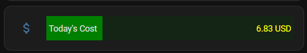
Does anyone know how I can display a currency symbol $ in front an entity being used in the bar card, or even just display a different entity’s value? I have another entity which contains the exact value I want to display, i.e. “$5.9 USD”
I’ve tried card-mod, card-templater without much success.

I was able to get this working on a forked version of the gauge card, where the author added an configuration item called: “valueEntity”:

If this is not currently possible, I can open a feature request.
Please show your card-mod try, I may point at possible error.
Here is what I’m using:
type: custom:config-template-card
entities:
  - sensor.energy_cost_4244_today_string
card:
  type: custom:bar-card
  max: 30
  severity:
    - color: Red
      from: 21
      to: 30
    - color: Orange
      from: 11
      to: 20
    - color: Green
      from: 0
      to: 10
  entities:
    - entity: sensor.energy_cost_4244_today
  card_mod:
    style: |
      bar-card-value {
        color: yellow;
      }
Which renders as:
Try
          - type: custom:bar-card
            title: prefix
            entities:
              - entity: input_number.test_level_1
            card_mod:
              style: |
                bar-card-value:before {content: "$ "}

This worked like a charm!! Thank you so much 