hey @Mariusthvdb this buttons look great can you share the code for one of these buttons ?
thank you
Standard popup cards are a bit simpler than browser-mod (though deprecated). I use it in my setup to show sliders after a hold_action for e.g. lights.
But indeed having a slider would be a cool idea. Though I am still waiting on the one person that will create a vertical slider as that is one of the things I miss from HomeKit (all other stuff I definitely don’t miss from Homekit 
 )
)
Is it possible to add a third color depending on the entity value?
        custom_fields:
          notification:
            - background-color: >
                [[[
                  if (states['[[entity_2]]'].attributes.battery >= 20)
                   return "green";
                  return "red";
                ]]]

thanks
1 Like
if you read several posts above the partner has already shared the code

Will you share the code of your card with entity_picture with battery status? I really like this…
Thanks…
sure:
buttons:
  - type: horizontal-stack
    cards:

      - type: custom:button-card
        template: horizontal-filler

      - type: custom:button-card
        template: button_body
        entity: automation.count_warnings
        name: Count warnings
        state:
          - value: 'on'
            spin: true
        styles:
          state:
            - color: >
                [[[ if (entity.state == 'on') return 'rgb(251, 210, 41)'; return 'grey';]]]
          icon:
            - color: >
                [[[ if (entity.state == 'on') return 'rgb(251, 210, 41)'; return 'grey';]]]

      - type: custom:button-card
        template: button_body
        entity: script.reset_warning_counter
        name: Reset warnings

      - type: custom:button-card
        color_type: blank-card

      - type: custom:button-card
        color_type: blank-card

      - type: custom:button-card
        template: horizontal-filler
template:
button_body:
  color: auto
  size: 30%
  aspect_ratio: 1/1
  show_state: true
  show_label: true
  tap_action:
    action: more-info
    haptic: light
  hold_action:
    action: more-info
    haptic: success
  styles:
    icon:
      - color: grey
    lock:
      - color: red
    card:
      - color: grey
#      - border-radius: 6px
      - background-color: 'var(--paper-card-background-color)'
      - padding-left: 5px
#      - box-shadow: '0 4px 8px 0 rgba(0, 0, 0, 0.2), 0 6px 20px 0 rgba(0, 0, 0, 0.19)'      #- box-shadow: 0px 0px 2px 1px
    name:

      - text-overflow: unset
      - white-space: unset
      - word-break: break-word

      - text-align: start
      - justify-self: start
      - font-weight: bold
      - font-family: Helvetica
      - font-size: 13px
    label:
      - text-align: start
      - font-size: 11px
      - font-family: Helvetica
      - justify-self: start
    state:
      - text-align: start
      - font-size: 11px
      - font-family: Helvetica
      - justify-self: start
      - text-transform: capitalize
      - font-weight: bold
    grid:
      - grid-template-areas: '"i" "n" "s" "l"'
      - grid-template-columns: 1fr
      - grid-template-rows: 1fr min-content min-content
    img_cell:
      - justify-content: start
      - align-items: start
box-shadow and border-radius are set in my theme, so commented out here. If you dont use that in your theme, and want it, uncomment here.
the buttons sometimes override the settings in the template (check color eg) but the template is used in other button configs too, and then set all as default.
in this case I use a button_body with action more-info, an all, automation and script. You could set a tap-action to action, and have the button act immediately,(without the need to set the action on the more-info)
can we have a service for triggering an automation on a button click, just like when we would do so in the service page?
I find myself experimenting but not succeeding using the available actions and service_data but don’t think I am on the right track.
looking to shorten something like:
              type: custom:button-card
              template: button-template
              entity_id: automation.trigger_this_automation
              tap_action:
                action: trigger
closest I would gather would be:
              tap_action:
                action: call-service
                service: automation.trigger
                service_data:
                  entity_id: automation.trigger_this_automation
or
              type: custom:button-card
              template: button-body
              entity: automation.trigger_this_automation
              tap_action:
                action: call-service
                service: automation.trigger
                service_data:
                  entity_id: entity
which seems to work alright.
a simple tap-action: trigger would be magic.
i´m trying to make a simple thermostat button. i´d like to show it the current temperature not the current sate tho.
is there a way to do it?
like instead of show_state: true something like show_state: sensor.current_temperature

Why should automation.trigger be any different than light.toggle or any other service call?
I don’t see the value in sparing 3 lines.
You can use:
entity: climate.all
show_state: false
show_label: true
label: '[[[ return entity.attributes.current_temperature + "°C" ]]]'
1 Like

any way to change “home” to “Home”?
- custom_fields:
          blocked: |
            [[[
              return `<span>David: <span style='color: var(--text-color-sensor);'>${states['person.david'].state}</span></span>`
            ]]]
          queries: |
            [[[
              return `<span>Batterie: <span style='color: var(--text-color-sensor);'>${states['sensor.battery_level'].state}%</span></span>`
            ]]]
        icon: 'mdi:account'
        name: Hassio
        show_name: false
        styles:
          card:
            - padding-left: 10px
            - border-radius: 5px
            - height: 95px
            - font-size: 13px
          custom_fields:
            blocked:
              - align-self: start
              - justify-self: start
            queries:
              - padding-bottom: 2px
              - align-self: start
              - justify-self: start
          grid:
            - grid-template-areas: '"i i" "n n" "blocked blocked" "queries queries" '
            - grid-template-columns: 1fr
            - grid-template-rows: 1fr min-content min-content
          icon:
            - align-self: start
            - justify-self: start
          img_cell:
            - justify-content: start
            - align-items: start
            - margin: none
          label:
            - font-size: 11px
            - padding: 1px 10px
            - justify-self: start
          name:
            - justify-self: start
            - font-size: 15px
          state:
            - justify-self: start
            - text-transform: lowercase
        type: 'custom:button-card'
Yes, quite easy:
blocked: |
  [[[
    const st = states['person.david'].state;
    const stFormated = st.charAt(0).toUpperCase() + st.slice(1);
    return `<span>David: <span style='color: var(--text-color-sensor);'>${stFormated}</span></span>`
  ]]]
2 Likes
thanks!
is there also a way to change “pending updates”

to just “updates”?
  - type: 'custom:button-card'
    entity: sensor.hacs
    show_name: false
    show_state: true
    styles:
      state:
        - text-transform: none
    template: button_template
that would actually be a great idea: to use that short notation on all services. If no further action data is required than the entity, simply use
tap_action: script.without_further_data_required
this is btw like the script works in HA also, direct calls after the service: key.
it would save 4 lines 
that wouldn’t be the ain consideration though, otoh, having many buttons, it would save quite a bit of yaml space.
Hi i need help with a button card template, i want to display at the top right corner of the lights button, the current number of lights that are on, i tried looking at examples with no success.

This is the code that i’m using for the button:
  lightspopup:
    card:
      type: 'custom:button-card'
      color: auto
      size: 30%
      icon: '[[icon]]'
      entity: '[[entity]]'
      show_last_changed: true
      aspect_ratio: 1/1
      show_state: true
      name: '[[name]]'
      show_label: true
      tap_action:
        action: call-service
        service: browser_mod.popup
        service_data:
          title: Lights
          style:
            background: var(--background-image)
            color: AliceBlue
            border-radius: 15px
            --ha-card-border-radius: 15px
            --ha-card-background: '#646464'
          card:
            type: entities
            entities:
              - entity: light.bedroom_lights
                icon: mdi:ceiling-light
              - entity: light.corner_living_room_lights
                icon: mdi:ceiling-light
              - entity: switch.sonoff_100017d309
                name: Night Light
                icon: mdi:led-outline
              - light.gateway_light_04cf8c9829a2
              - light.gateway_light_34ce00fa5d87
            style: |
              ha-card {
                --paper-item-icon-color: AliceBlue;
                  color: AliceBlue;
              }
            state:
              - value: 'on'
                styles:
                  card:
                    - box-shadow: 0px 0px 3px 2px var
                  name:
                    - color: AliceBlue
                  state:
                    - color: AliceBlue
                  label:
                    - color: AliceBlue
                id: on-icon
              - value: 'off'
                styles:
                  card:
                    - box-shadow: '0px 0px 3px 2px var'
                    # - opacity: 0.3
                  label:
                    - color: 'AliceBlue'
                  name:
                    - color: 'AliceBlue'
                  state:
                    - color: 'AliceBlue'
                  icon:
                    - color: 'AliceBlue'
                id: off-icon
          deviceID:
            - this
            - dashboard
      hold_action:
        action: more-info
        haptic: success
      styles:
        card:
          - padding-left: 10px
          # - background-color: 'rgba(255,255,240,0.9)'
          # - background-color: '#fff5bc'
          - background-color: 'rgb(100,100,100)'
          - border-radius: 15px
        name:
          - justify-self: start
          - font-weight: bold
          - font-size: 13px
          - color: AliceBlue
        label:
          - font-size: 11px
          - font-family: Helvetica
          - padding: 0px 10px
          - justify-self: start
        state:
          - font-size: 11px
          - font-family: Helvetica
          - padding: 1px 10px
          - justify-self: start
          - text-transform: capitalize
          - font-weight: bold
        grid:
          - grid-template-areas: '"i" "n" "s" "l"'
          - grid-template-columns: 1fr
          - grid-template-rows: 1fr min-content min-content
        img_cell:
          - justify-content: start
          - align-items: start
        icon:
          - color: AliceBlue
code in lovelace:
          - type: horizontal-stack
            cards:
              - type: custom:decluttering-card
                template: lightspopup
                variables:
                  - name: Lights
                  - icon: mdi:lamp
I created template sensor that count the lights that are on, template entity : “sensor.lights_on” i just don’t know how integrate the sensor into the code above that it will show at the top of the right entity button just like in the example from @jimz011 view.
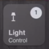
can someone help ?
1 Like
I want to set a different color to one of two entities inside one template and tried this:
                    styles:
                      name: >
                        [[[
                          if (states['media_player.sonos_stereo'].state == 'playing')
                          elif (states['media_player.studio'].state == 'playing')
                            return "red";
                          else
                            return "green";
                        ]]]
But this doesn’t work at all…
Can someone help me to understand how to handle such type of template?
Hi, you have a Xiaovv camera?
What are you using as still_image_url?
Try
styles:
  name:
    color: >
      (Your template here)
Yes, that’s what i tried, but i think the template is wrong… Can you advice me about the right template?
Hi Yoni Mo
I couldn’t see that anyone had responded to you…
I use this as the button label for lights which will display in the top right hand corner - if the entity has a brightness attribute:
    label: >
      [[[ var bri = Math.round(entity.attributes.brightness / 2.55);  if
      (entity.state === 'on') return (bri ? (bri+"%") : '') ]]]
Looks like this (the bench lights don’t have brightness attributes while the kitchen lights do):

If I hold my finger/mouse on a button I get the more-info box which provides the brightness slider…

The button template for all of my lights: (one template covers every light):
(And I’m sure there are more efficient ways of doing this so am open to suggestions)
  light_button:
    hold_action:
      action: more-info
    label: >
      [[[ var bri = Math.round(entity.attributes.brightness / 2.55);  if
      (entity.state === 'on') return (bri ? (bri+"%") : '') ]]]
    layout: icon_label
    show_label: true
    show_name: true
    state:
      - styles:
          card:
            - box-shadow: '0px 0px 10px 3px #F9C536'
          icon:
            - color: '#F9C536'
        value: 'on'
    styles:
      card:
        - border-radius: 15px
        - margin: 5px 5px 0px 0px
        - padding: 0px 0px
        - '--paper-card-background-color': 'rgba(40, 40, 40, 0.7)'
      grid:
        - grid-template-rows: 42px auto 0px
        - grid-template-columns: 42px auto
      icon:
        - width: 30px
        - color: white
      label:
        - font-size: 12px
        - font-weight: bold
        - color: white
      name:
        - justify-self: start
        - align-self: end
        - padding: 9px 10px
        - font-size: 12px
        - font-weight: bold
        - color: white
    tap_action:
      action: toggle
And each button is then just 5 lines in the config:
      - entity: light.stairwell_lights_81
        icon: 'mdi:stairs'
        name: Stairwell
        template: light_button
        type: 'custom:button-card'
2 Likes
Your first if statement doesn’t return anything, that’s likely causing a problem.