And next for inspiration
No custom backgrpund only Card button

1 Like

Here, a test of cards and inserted trplate for counting where it is necessary to move everywhere or charge the phone
2 Likes
Counter question: How do you define button_card_templates in your lovelace dashboard? 
Lovely! I definitely need some plants inside.
1 Like
o this must be what I was looking for all the time… now how to write that. Can not find custom_element in your repo though…
this is what I have now
type: custom:stack-in-card
mode: horizontal
keep:
  background: true
  margin: true
style: |
  ha-card {
    color: darkblue;
    background: url('/local/images/vijver.jpg');
    background-size: cover;
    box-shadow: none;
    margin: -16px -16px 0px -16px;
  }
cards:

  - type: custom:button-card
    template:
      - button_switch
      - spin
    style: |
      ha-card {
        box-shadow: none;
        opacity: 0.9;
        }
    entity: switch.vijverpomp_links
    triggers_update: sensor.vijverpomp_links_actueel
    name: Pomp left

  - type: custom:button-card
    template:
      - button_switch
      - spin
    style: |
      ha-card {
        box-shadow: none;
        opacity: 0.9;
        }
    entity: switch.vijverpomp_rechts
    triggers_update: sensor.vijverpomp_rechts_actueel
    name: Pomp right
showing as

Id love the opacity of the background to be more, but can not right now, because the other items inherit that…
could you help me out on 1 button please?
Here’s an example
custom_fields:
karta3:
card:
label: |-
Stévie jako sladidlo je na rozdíl od cukru <br> téměř
nekalorická,nepřispívá k tvorbě zubního <br> kazu a je vhodná i
pro diabetiky. <br>
name: O STÉVII SLADKÉ
show_icon: false
show_label: true
show_name: true
styles:
card:
- box-shadow: none
- background-color: transparent
grid:
- grid-template-areas: ' "n" "l " '
- grid-template-columns: 1fr
- grid-template-rows: 1fr
label:
- text-shadow: '1px 1px rgb(0,0,0,0.5)'
- justify-self: center
- align-self: end
- color: white
- font-size: 12px
name:
- text-shadow: '1px 1px rgb(0,0,0,0.5)'
- align-self: start
- color: white
- font-size: 16px
- font-weight: 700
type: 'custom:button-card'
karta2:
card:
custom_fields:
leva:
card:
custom_fields:
radek1:
card:
custom_fields:
ikona:
card:
aspect_ratio: 1/1
entity: switch.kotel
icon: 'mdi:watering-can'
show_name: false
show_state: false
state:
- styles:
icon:
- color: 'rgb(255, 255, 0)'
value: 'on'
styles:
card:
- border-radius: 50%
- background-color: 'rgb(104, 177, 156,0.3)'
- box-shadow: none
icon:
- width: 20px
- height: 20px
- color: black
type: 'custom:button-card'
entity: switch.kotel
label: zalévání
name: >
[[[ if (states['switch.kotel'].state === 'on') return `
<span>aktivní</span>`; return ` <span> neaktivní</span>`;
]]]
show_icon: false
show_label: true
styles:
card:
- box-shadow: none
- background-color: transparent
grid:
- grid-template-areas: '". ikona l "". ikona n "'
- grid-template-columns: 20% 15% 1fr
- grid-template-rows: 1fr 1fr
icon:
- width: 20px
- height: 20px
label:
- font-size: 10px
- color: 'rgb(51, 255, 173)'
- justify-self: start
- align-self: end
- padding-left: 10px
name:
- font-size: 10px
- color: 'rgb(51, 255, 173)'
- justify-self: start
- align-self: start
- padding-left: 10px
type: 'custom:button-card'
radek2:
card:
custom_fields:
ikona:
card:
aspect_ratio: 1/1
entity: input_boolean.automatizace_topeni
icon: 'mdi:water-pump'
show_name: false
show_state: false
state:
- styles:
icon:
- color: 'rgb(255, 255, 0)'
value: 'on'
styles:
card:
- border-radius: 50%
- background-color: 'rgb(100, 149, 237)'
- box-shadow: none
icon:
- width: 20px
- height: 20px
type: 'custom:button-card'
entity: input_boolean.automatizace_topeni
icon: 'mdi:watering-can'
label: automatizace
name: >
[[[ if (states['input_boolean.automatizace_topeni'].state
=== 'on') return ` <span>zapnuta</span>`; return ` <span>
vypnuta</span>`; ]]]
show_icon: false
show_label: true
styles:
card:
- box-shadow: none
- background-color: transparent
grid:
- grid-template-areas: '". ikona l "". ikona n "'
- grid-template-columns: 20% 15% 1fr
- grid-template-rows: 1fr 1fr
icon:
- width: 20px
- height: 20px
label:
- font-size: 10px
- color: 'rgb(51, 255, 173)'
- justify-self: start
- align-self: end
- padding-left: 10px
name:
- font-size: 10px
- color: 'rgb(51, 255, 173)'
- justify-self: start
- align-self: start
- padding-left: 10px
type: 'custom:button-card'
radek3:
card:
custom_fields:
ikona:
card:
aspect_ratio: 1/1
entity: input_boolean.automatizace_topeni
icon: 'mdi:cup-water'
show_name: false
show_state: false
state:
- styles:
icon:
- color: 'rgb(255, 255, 0)'
value: 'on'
styles:
card:
- border-radius: 50%
- background-color: 'rgb(104, 177, 156,0.3)'
- box-shadow: none
icon:
- width: 20px
- height: 20px
type: 'custom:button-card'
entity: sensor.hana_prutok
icon: 'mdi:watering-can'
label: výška vody
name: |
[[[ return states['sensor.hana_prutok'].state +' cm'
]]]
show_icon: false
show_label: true
styles:
card:
- box-shadow: none
- background-color: transparent
grid:
- grid-template-areas: '". ikona l "". ikona n "'
- grid-template-columns: 20% 15% 1fr
- grid-template-rows: 1fr 1fr
icon:
- width: 20px
- height: 20px
label:
- font-size: 10px
- color: 'rgb(51, 255, 173)'
- justify-self: start
- align-self: end
- padding-left: 10px
name:
- font-size: 10px
- color: 'rgb(51, 255, 173)'
- justify-self: start
- align-self: start
- padding-left: 10px
type: 'custom:button-card'
name: levá půlka
show_name: false
styles:
card:
- background-color: transparent
- box-shadow: none
grid:
- grid-template-areas: '" radek1 "" radek2 "" radek3 "'
- grid-template-columns: 1fr
- grid-template-rows: 1fr
type: 'custom:button-card'
nazev:
card:
entity: binary_sensor.pir3_occupancy
icon: 'mdi:water-outline'
name: STAV ROSTLINY
show_icon: false
show_name: true
styles:
card:
- background-color: transparent
- box-shadow: none
grid:
- grid-template-areas: '"n"'
- grid-template-columns: 1fr
name:
- text-shadow: '1px 1px rgb(0,0,0,0.5)'
- justify-self: center
- color: white
- font-size: 16px
- font-weight: 700
type: 'custom:button-card'
prava:
card:
entity: sensor.pir3_illuminance
name: OSVĚTLENÍ
show_icon: false
show_name: true
show_state: true
custom_fields:
graph1:
card:
type: 'custom:mini-graph-card'
hours_to_show: 48
style: |
ha-card{
background: transparent;
box-shadow: none;
color: white;
font-size: 9px !important; ;
}
align_state: center
decimals: 1
entities:
- entity: sensor.pir3_illuminance
hour24: true
line_color: 'rgb(255,255,255,0.5)'
line_width: 2
name: OSVĚTLENÍ
show:
average: true
extrema: true
icon: false
name: false
state: false
styles:
card:
- font-size: 10px
- background-color: 'rgb(255,255,255,0.2)'
- border-radius: 15px 0px 0px 15px
- box-shadow: none
grid:
- grid-template-areas: ' "n" "s" "graph1" '
- grid-template-columns: 1fr
- grid-template-rows: 1fr
name:
- text-shadow: '1px 1px rgb(0,0,0,0.5)'
- justify-self: center
- align-self: center
- color: 'rgb(51, 255, 173)'
state:
- text-shadow: '1px 1px rgb(0,0,0,0.5)'
- font-size: 20px
- font-weight: 700
- border-radius: 50%
- color: 'rgb(51, 255, 173)'
type: 'custom:button-card'
styles:
card:
- box-shadow: none
- background: transparent
grid:
- grid-template-areas: ' "nazev nazev nazev " "leva . prava " "leva . prava " " leva . prava " '
- grid-template-columns: 1fr 2% 1fr
- grid-template-rows: 10% 1fr
type: 'custom:button-card'
obrazek:
card:
custom_fields:
status:
card:
entity: binary_sensor.pir3_occupancy
icon: 'mdi:water-outline'
name: >
[[[
if (states['binary_sensor.pir3_occupancy'].state === 'on')
return ` <span style=" font-size: 12px; ">varování </span>`;
return ` <span style="font-size: 12px; ">
normální</span>`; ]]]
show_icon: true
show_name: true
state:
- styles:
card:
- font-size: 10px
- color: red
- border-color: 'rgb(248, 0, 0)'
- background-color: 'rgb(255, 255, 255, 0.3)'
icon:
- color: red
value: 'on'
styles:
card:
- font-size: 10px
- border-style: solid
- border-width: 2px
- background-color: 'rgb(255,255,255,,0.3)'
- border-radius: 15px
- border-color: 'rgb(0, 75,64)'
- box-shadow: none
- color: 'rgb(0, 75,64)'
- font-weight: 500
grid:
- grid-template-areas: '" i n "'
- grid-template-columns: 1fr 1fr
icon:
- color: 'rgb(0, 75,64)'
- justify-self: end
- with: 20px
- height: 20px
name:
- justify-self: start
type: 'custom:button-card'
label: Stevia rebaudiana
name: STÉVIE SLADKÁ
show_icon: false
show_label: true
show_name: true
show_state: false
styles:
card:
- height: 200px
- border-radius: 0px 0px 50px 50px
- box-shadow: none
- background-size: contain
- background-repeat: no-repeat
- background-image: url("/local/ui/stevie2.png")
- background-position: bottom right
grid:
- grid-template-areas: '". n n n " ". l l l " ". status . . " '
- grid-template-columns: 5% 1fr 1fr
- grid-template-rows: 1fr 1fr 1fr
label:
- font-size: 16px
- justify-self: start
- align-self: start
name:
- justify-self: start
- font-weight: 700
- align-self: end
- font-size: 24px
type: 'custom:button-card'
styles:
card:
- box-shadow: none
- border-radius: 0px 0px 50px 50px
- background-image: >-
linear-gradient(to bottom,rgb(255,255,255,0) 0%, rgb(255,255,255,0) 20%,
rgb(0, 122, 204) 20%, rgb(0, 122, 204) 60% , rgb(77, 210, 255) 100%
grid:
- grid-template-areas: '"obrazek " "karta2 " "karta3 "'
- grid-template-columns: 1fr
- grid-template-rows: 1fr
type: 'custom:button-card'
Oh! Thank you very much!
i put this code at the beginning (this is two templates, I have tens)
button_card_templates:
  force_transparent_background:
    styles:
      icon:
        - color: var(--primary-text-color)
    extra_styles: |
      ha-card {
         background-color: transparent  !important;
         background: transparent  !important;
      }
  force_state_background:
    styles:
      card:
        - background-color: var(--card-background-color)
        - opacity: 1
        - background-color: 'rgba(255,255,255,0.2)'
      icon:
        - color: var(--primary-text-color)
      name:
        - color: var(--primary-text-color)
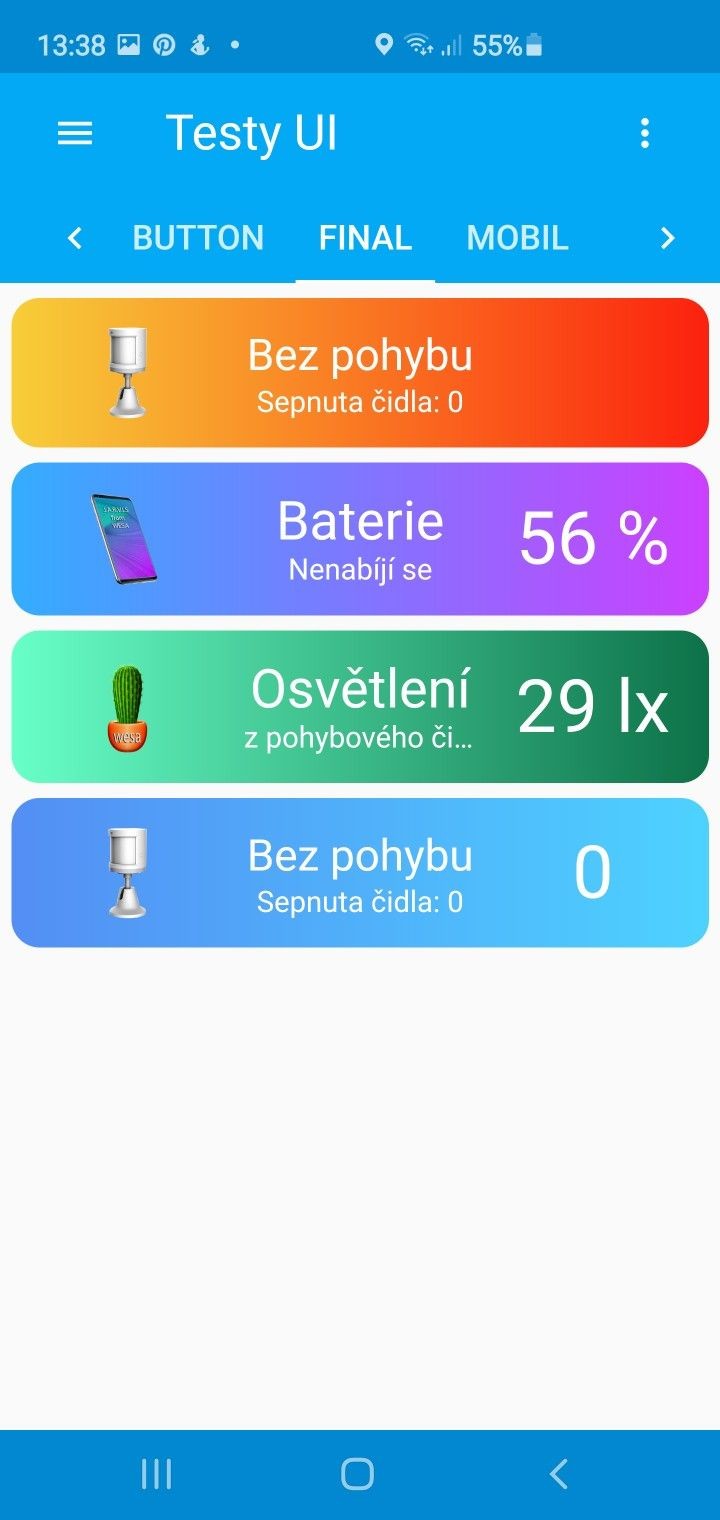
And screenshot

This is one possible way (I don’t have custom:stack so I used custom:layout):
type: custom:layout-card
layout_type: horizontal
cards:
  - type: custom:button-card
    aspect_ratio: 1/1
    custom_fields:
      bgi: ''
      anrichte:
        card:
          type: button
          entity: light.anrichte
          icon: mdi:lamp
    styles:
      custom_fields:
        bgi:
          - background-image: url(/local/images/cat.jpg)
          - position: absolute
          - left: 0
          - top: 0
          - width: 100%
          - height: 100%
          - background-size: cover
          - background-position: center
          - opacity: 0.8
        anrichte:
          - width: 30%
          - position: absolute
          - left: 20%
          - top: 60%
          - opacity: 0.6

At first sight I only notice the repeating same CSS properties.
However, since a few versions, I have noticed that my main dashboard initially shows the system-generated (automatic) dashboard again. I then have to reload once or twice.
thanks. you’re using custom_fields though, I am not sure that is what Romrider suggested when he said custom_elements, especially the position: absolute ?
extra_styles is suggested by soo, but that of course is something else altogether also… Still confused about this tbh.
did try it of course:
  - type: custom:button-card
    template:
      - button_switch
      - spin
    style: |
      ha-card {
        box-shadow: none;
        }
    custom_fields:
      bgi: ''
    styles:
      custom_fields:
        bgi:
          - position: absolute
          - left: 0
          - top: 0
          - width: 100%
          - height: 100%
          - background-size: cover
          - background-position: center
          - opacity: 0.1
but no opacity at all I am afraid
Yes I was referring to custom_fields. Something like that:
styles:
  card:
    - position: relative
  custom_fields:
    bg:
      - position: absolute
      - background: your background
custom_fields:
  bg: ''
Ok, thanks. can’t make it happen… using
  - type: custom:button-card
    template:
      - button_switch
      - spin
    styles:
      card:
        - position: relative
      custom_fields:
        bg:
          - position: absolute
          - opacity: 1
    custom_fields:
      bg: ''
#    style: |
#      ha-card {
#        box-shadow: none;
#        }
    entity: switch.vijverpomp_links
    triggers_update: sensor.vijverpomp_links_actueel
    name: Pomp left
there’s simply nothing changed to the background. Must add that I don’t want any special background to the button, simply inherit what is set in the templates, only add opacity.

Ive tested if the templates are in the way, but they are not, no opacity either. Adding - background: ivory makes no difference either.

tbh,I don’t understand why the box-shadow is still none, because I commented that…but thats caused by
keep:
  background: true
probably of the stack-in-card?, which is good, and wanted for obvious reasons. would this interfere with the custom_fields settings maybe?
I’m thinking of moving to use templates…
Is there a way to have more than one templates file?
I’m think specifically for the use of packages. I’d like (if possible) to have a templates file that contains templates that are only relevant for that package and another that is used elsewhere?
If there is I can’t find a way. I’ve tried all sorts of combinations of !include and !include_dir_name.
Also it seems from my experiments that button_card_templates: must be in ui-lovelace.yaml. Is that correct (i.e. it can’t be in one or more view.yaml)?
Thanks.
In your last both attempts I cannot find the background image. Could you show the relevant piece of code, please?
I don’t have a background image for the buttons, they only should have a color, like they do…
the background image for the horizontal stack is like here Lovelace: Button card - #5611 by Mariusthvdb


So you mixed up the examples with your code and this won’t t work.
adding to the above, you can/must do that for all dashboards:
button_card_templates: !include lovelace/buttons/button_card_templates.yaml
you can reference the same file in all of your templates, there’s really not much sense in organizing these cf the packages. to give you an idea, here’s my templates file, which holds templates that are used in all dashboards, give or take a few, that are only used in a single dashboard. But, when changing the Lovelace config, moving a card from one to the other dashboard, you dont have to think about the templates location at all.