Lovelace: Button card

How to remove this title bar showing ( info | settings | related ) for the camera feed popup , i want only the video to show.
image

cards:
          - type: custom:button-card
            entity: camera.dahua_substream2
            show_live_stream: true
            show_name: false            
            size: 100%            
            styles:
              card:
                - height: 155px
                - padding-top: 0px
                - padding-bottom: 0px

Hi all.

In order to have a more orderly structure, I would like to separate the custom button templates into different files, but the attempts I have made seem not to work.

I have try this in main view

button_card_templates
- !include templace_irrigation.yaml
- !include template_climate.yaml

But not work.

I’ve tried loading the template files only in the view where they are needed

Irrigation View

button_card_templates
- !include templace_irrigation.yaml

Climate View

button_card_templates
- !include template_climate.yaml

Am I doing something wrong or there is no way to separate the templates by areas?

Regards.

First question is, are you using yaml mode? Include statements only work in yaml mode.

I am sorry, yes, i work only in yaml mode

Perhaps the following for a start:

button_card_templates: !include templace_irrigation.yaml

See if that works.

I use button_card_templates: !include_dir_merge_named button_templates/ to include the entire directory and it works very well.

Yes, only one “Include” line working fine.
My question is if I can divide the templates for different interesting area (climate, irrigation, alarms etc. etc.) on different files and import all separate.

Just to have more order in the yaml files

For that you can use the code to include an entire directory, similar to what I use.

1 Like

Hi Everyone, maybe someone can help me with this.

I have slider entity for a heat pump which starts at 0.0 then goes through up to 2.0

1

I would like to create an entity with buttons instead of using the slider. So button 1 would set 0.0, button 2 would set a value of 1.0 and button 3 a value of 2.0

Any ideas on how? I probably will have to create scripts for each, but not sure how do that.

Any help would be appreciated.

You might want to check out this option. It will be much easier to replace your slider. The card might be a bit overkill for what you want to achieve.

1 Like

Thanks will give it a go and see how it works.

I followed the instructions for installing and even put in my config. Not showing up. Any ideas?

I’d say step one is to clear cache and reload. If that doesn’t work, step two is installing via HACS (if you haven’t already). There might also be a thread on this somewhere on the forum.

I did install through HACS. Will try the cache clear.

Tried all that still no luck. I have added another card in the same method and that seems to work. But not this one.

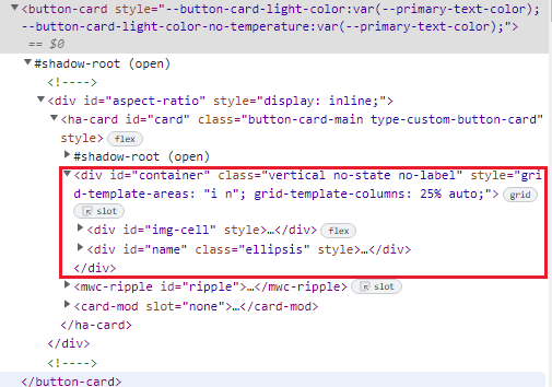
I’ve never encountered that problem myself, but I do remember reading about this problem many times, for various custom cards. Try searching the forum for this error and don’t look only to results for this specific card.

1 Like

Hi, is it possible to use a condition in a “picture-elements”?
I would like to display a Card based on the selection of a " tap_action" on the image, is this possible?

Found a strange glitch - wonder if it was mentioned before.

A simple card:

  type: custom:button-card
  entity: sun.sun
  show_icon: false
  styles:
    grid:
      - grid-template-areas: '"n"'
      - grid-template-columns: 100%

image

with this DOM:
image

Note that only “div#name” is present here - as it is expected.

Now consider this a bit more complex card:

type: custom:button-card
variables:
  SHOW_ICON: true
entity: sun.sun
show_icon: '[[[ return variables.SHOW_ICON ]]]'
styles:
  grid:
    - grid-template-areas: |-
        [[[
          if (variables.SHOW_ICON == true)
            return '"i n"';
          else
            return '"n"';
        ]]]
    - grid-template-columns: |-
        [[[
          if (variables.SHOW_ICON == true)
            return '25% auto';
          else
            return '100%';
        ]]]

which - dependingly on a “SHOW_ICON” variable - may be this:
image
or this:
image

But in both cases DOM has a “div#img_cell” element - which is kind of strange:
image

image

The problem is that this unwanted “div#img_cell” (when “show_icon: false”) may interfere…

Was going to create an issue for this - but I see that the last change in repo was 17/02/21, is it still maintained?

Hi all.

I have a doubt.
I have a counter (in decimal hours) from utility_meters, I need to convert it in hours:minutes:seconds and this working:

                label: >
                  [[[
                    var decimalTimeString = entity.state;
                    var n = new Date(0,0);
                    n.setSeconds(+decimalTimeString * 60 * 60);
                    return n.toTimeString().slice(0, 8);
                  ]]]

but is not possible to use it in state: i received error.
Am i doing something wrong or it is not possible to use the patterns in the state field?

It’s just my doubt, because, in any case, I can use the value in the label field, in the name field or in a custom field

Regards.

There is an inconsistency with variables.
Has it already been discussed here?

Consider this code:

type: custom:button-card
variables:
  var1: |-
    [[[
      return 'xxx';
    ]]]
  var2: |-
    [[[
       if (variables)
        return variables.var1;
       else 
        return 'yyy';
    ]]]
entity: sun.sun
name: '[[[ return variables.var2 ]]]'

Sometimes it shows this:
image

Sometimes this:
image

IMHO it happens due to “variables” object may not be ready yet when addressing a variable inside another variable.

Why a “use var_1 inside a var_2” functionality may be useful?
Imagine a button-card-template with specified “var_2” (could be anything).
Then in descendant templates you will have to re-define the “var_1” to get a new behaviour.

looks great. any progress?

2 Likes