For timers i use custom:flipdown-timer-card from HACS. Try and see if it fits your needs.
Changing the values helped a bit! but the icon is still spinnig off center. I could not find a way to align the icon in the center.
Maybe check mine. But I didn’t try spin it. 
custom_fields:
      alert:
      - border-radius: 50%
      - position: absolute
      - height: 14px
      - width: 14px
      - line-height: 14px
      - margin-left: 8px
      - margin-top: -4px
      - justify-self: start
      - align-self: start
      - border-radius: "50%"
      - background-color: "var(--white)"
      - color:  "var(--red)"
      - display: "[[[ return variables.alert ? 'block' : 'none'; ]]]"
      - animation: blink 2s ease infinite
Good evening everybody!
I am trying to make a list with all the states that a device can have and activate a custom field when the device is in one of those states. I am trying this for a while now but I can not get the var sensor in the ulm_state_sensor working.
With the code I have now I can get it to work when I place the entity directly in the var sensor of the custom button. But when I want to use the variables.ulm_state_sensor the entire icon disappears from the dashboard.
Does anyone know how to get the var sensor to work with the entity from variables.ulm_state_sensor?
Custom button code
dot_active_test:

  variables:
    ulm_state_sensor: "[[[ return variables.ulm_state_sensor; ]]]"
    ulm_state_sensor_test: >
      [[[
        var sensor = states[variables.ulm_state_sensor].state
        var state = {
          "none": "1",
          "docked": "1 ",
          "cleaning": "1",
          "default": "0"

        }
        return (state[sensor] || state["default"]);
      ]]]

  styles:
    custom_fields:
      dot_test:
        - border-radius: "50%"
        - position: "absolute"
        - left: "25px"
        - top: "-3px"
        - height: "17px"
        - width: "17px"
        - border: "2px solid var(--card-background-color)"
        - font-size: "17px"
        - line-height: "17px"
        - background-color: >
            [[[
              return "rgba(var(--color-green),1)";
            ]]]

  extra_styles: |
    [[[ return `
      @keyframes spinning {
        10% {
          transform: rotate(36deg) ;
        }
        20% {
          transform: rotate(72deg) ;
        }
        20% {
          transform: rotate(108deg) ;
        }
        40% {
          transform: rotate(144deg) ;
        }
        50% {
          transform: rotate(180deg) ;
        }
        60% {
          transform: rotate(216deg) ;
        }
        70% {
          transform: rotate(252deg);
        }
        80% {
          transform: rotate(288deg);
        }
        90% {
          transform: rotate(324deg) ;
        }

        100% {
          transform: rotate(360deg) ;
        }

      }

    `]]]

  custom_fields:
    dot_test: >
      [[[
        if (variables.ulm_state_sensor_test == 1){
          return `<ha-icon icon="mdi:reload"   style=" animation: spinning 3s linear infinite; width: 17px; height: 17px; color: var(--primary-background-color);"></ha-icon>`
        }
      ]]]
  size: "21px"
Dashboard code
            - type: 'custom:button-card'
              template: device_card_vacuum
              variables:
                ulm_card_binary_sensor_alert: true
                ulm_mode: input_select.vacuum_mode
                ulm_state_sensor: vacuum.robot_vacuum
              entity: vacuum.robot_vacuum
Thanks for the example! i haven’t managed to get the icon align’t in the middle but with some tweaking it isn’t very noticeable anymore. Maybe I will figure it out someday gheghe
1 Like
My apologies in advance if my question / use case is not designed for the custom:button-card. I currently have an Insteon based system connected to HA through an ISY994i which causes Insteon “scenes” to appear as “entities” within HA.
This works ok and the scenes can be manipulated using the regular entities card, but their are some weird “side effects” that I’m trying to overcome using custom:button-card with a Horizontal Stack. Ideally scenes should only have an “on” / “off” button and no status information or iconagraphy. The picture below shows both the current state using the built-in HA Entites Card versus a mock-up of what I’d like to see using Horizontal Stacks with custom:button-card

I have the beginning bits of the YAML code put together shown below:
type: horizontal-stack
cards:
  - type: custom:button-card
    color_type: label-card
    color: rgb(0, 0, 0)
    name: Movie Time in Rumpus Room
  - type: custom:button-card
    color_type: blank-card
  - type: custom:button-card
    color_type: blank-card
  - type: custom:button-card
    color_type: card
    color: rgb(0, 97, 0)
    name: 'On'
  - type: custom:button-card
    color_type: card
    color: rgb(97, 0, 0)
    name: 'Off'
I have a couple of questions:
-
Using the YAML above, scenes with long names are cut off. I would like instead for the scene name to be able to fill up the available space to the left of the “On” button. How would I be able to do that?
-
I read up briefly on “templates” with custom:botton-card, and it seems to me that if I have a list of 30 or so Scenes that I wanted to list out using this format that a template would be a good way to do this. Is this correct? Or is there a better way?
Thank you for taking the time to answer my questions.
There’s two ways you can approach problem 1: keep the code you have and set overflow: visible to your text field. Untested, so you might have to do some trial and error and the biggest drawback is if the text is long enough, it will cover your on and off buttons also.
The more elegant way would be to increase the width of your label-card and justify the text to the left.
As for problem 2: yes, it makes sense to create a template for this. But I’d recommend first to get your card looking like you want it and then move on to creating s template.
1 Like
Thank you for the tips on how to do this. After a little experimentation, I was able to come up with the following YAML which does what I’m looking for:
type: horizontal-stack
cards:
  - type: custom:button-card
    color_type: label-card
    color: rgb(0, 0, 0)
    name: All Bathroom lights
  - styles:
      name:
        - overflow: visible
        - text-align: left
        - vertical-align: text-top
        - width: 270px
  - type: custom:button-card
    color_type: card
    color: rgb(0, 97, 0)
    name: 'On'
    tap_action:
      action: call-service
      service: switch.turn_on
      service_data:
        entity_id: switch.all_bathroom_lights
  - styles:
       card:
        - height: 28px
        - margin-top: 7px
        - width: 70px
  - type: custom:button-card
    color_type: card
    color: rgb(97, 0, 0)
    name: 'Off'
    tap_action:
      action: call-service
      service: switch.turn_off
      service_data:
        entity_id: switch.all_bathroom_lights
  - styles:
       card:
        - height: 28px
        - margin-top: 7px
        - width: 70px
And this provided the look that I was going for, which is shown in the picture below:

Need to figure out how to turn this into a template . . . 
2 Likes
In the card below I am receiving the following error when I click any of the On/Off/Dim/Bright buttons. Does anyone know what could be going wrong?
Failed to call service light/turn_on connection lost
Also, what’s the correct syntax to call multiple entity_id’s when using service-data?
type: grid
columns: 2
cards:
  - type: button
    show_name: true
    show_icon: true
    name: Kitchen & Entry
    icon: mdi:sofa
    entity_id: light.light_entry_lamp_hue
    hold_action:
      action: call-service
      service: scene.turn_on
      service-data:
        entity_id: scene.entry_room_bright
    tap_action:
      action: fire-dom-event
      browser_mod:
        service: browser_mod.popup
        data:
          browser_id: THIS
          dismissable: true
          content:
            type: vertical-stack
            cards:
              - type: custom:mod-card
                card:
                  type: horizontal-stack
                  cards:
                    - type: custom:button-card
                      entity_id: light.light_entry_corner_hue
                      name: 'Off'
                      show_name: true
                      show_icon: false
                      tap_action:
                        action: call-service
                        service: light.turn_off
                        service-data:
                          entity_id: >-
                            light.light_entry_lamp_hue
                            light.light_entry_corner_hue
                            light.kitchen_can_lights
                    - type: custom:button-card
                      entity_id: light.light_entry_corner_hue
                      name: 'On'
                      show_name: true
                      show_icon: false
                      tap_action:
                        action: call-service
                        service: light.turn_on
                        service-data:
                          entity_id: >-
                            light.light_entry_lamp_hue
                            light.light_entry_corner_hue
                            light.kitchen_can_lights
                    - type: custom:button-card
                      entity_id: scene.entry_room_dim
                      name: Dim
                      show_name: true
                      show_icon: false
                      tap_action:
                        action: call-service
                        service: scene.turn_on
                        service-data:
                          entity_id: scene.entry_room_dim
                    - type: custom:button-card
                      entity_id: scene.entry_room_bright
                      name: Bright
                      show_name: true
                      show_icon: false
                      tap_action:
                        action: call-service
                        service: scene.turn_on
                        service-data:
                          entity_id: scene.entry_room_bright
                card_mod:
                  style: >
                    ha-card { --ha-card-background: rgb(65, 68, 74); filter:
                    drop-shadow(2.5px 2.5px 0.125rem rgb(48, 48, 51)); }
              - type: horizontal-stack
                cards:
                  - type: custom:button-card
                    show_name: true
                    show_icon: true
                    tap_action:
                      action: toggle
                    entity: switch.salt_lamp
                    icon: mdi:lava-lamp
              - type: custom:mushroom-light-card
                entity: light.light_entry_corner_hue
                name: Corner Lamp
                icon: mdi:lamp-outline
                fill_container: true
                use_light_color: true
                show_brightness_control: true
                show_color_temp_control: true
                show_color_control: true
                collapsible_controls: false
                layout: horizontal
                primary_info: name
                card_mod:
                  style: >
                    ha-card { --ha-card-background: rgb(51, 49, 49); filter:
                    drop-shadow(2.5px 2.5px 0.125rem rgb(179, 179, 179)); }
              - type: custom:mushroom-light-card
                entity: light.light_entry_lamp_hue
                name: Table Lamp
                icon: mdi:lamp-outline
                fill_container: true
                use_light_color: true
                show_brightness_control: true
                show_color_temp_control: true
                show_color_control: true
                collapsible_controls: false
                layout: horizontal
                primary_info: name
                card_mod:
                  style: >
                    ha-card { --ha-card-background: rgb(51, 49, 49); filter:
                    drop-shadow(2.5px 2.5px 0.125rem rgb(179, 179, 179)); }
              - type: custom:mushroom-light-card
                entity: light.kitchen_can_lights
                name: Kitchen Cans
                icon: mdi:lamp-outline
                fill_container: true
                use_light_color: false
                show_brightness_control: true
                show_color_temp_control: false
                show_color_control: false
                collapsible_controls: false
                layout: horizontal
                primary_info: name
                card_mod:
                  style: >
                    ha-card { --ha-card-background: rgb(51, 49, 49); filter:
                    drop-shadow(2.5px 2.5px 0.125rem rgb(179, 179, 179)); }
          card_mod:
            style:
              ha-dialog$: |
                div.mdc-dialog div.mdc-dialog__scrim {
                  backdrop-filter: blur(10px);
                }
                div.mdc-dialog__container {
                  align-items: center;
                }
Trying to use the “source” attribute from my Android/Google TV and this won’t work, what am I doing wrong?
type: custom:button-card
entity: media_player.android_tv_192_168_2_123
name: >-
  [[[ return
  `${states['media_player.android_tv_192_168_2_123'].attributes.source}` ]]]
show_entity_picture: true
styles:
  grid:
    - grid-template-areas: '"i gutter n"'
    - grid-template-columns: min-content 24px 1fr
  card:
    - background: var(--ha-card-background)
    - padding: 24px
    - '--mdc-ripple-press-opacity': 0
  icon:
    - width: 70px
    - height: 70px
    - border-radius: 16px
    - border: 5px solid var(--ha-icon-active-color)
  name:
    - font-size: 16px
    - color: var(--hki-primary-text-color)
    - width: 100%
    - text-align: left
state:
   - operator: template
       value: >
         return states['media_player.android_tv_192_168_2_123'].attributes.source
         === 'Netflix'
       entity_picture: /local/netflix.png
       styles:
         card:
           - background: rgba(229,9,20)
         icon:
           - border: 5px solid rgba(229,9,20,0.5)
I think you are just looking for the state of the timer.
I have this in a custom button card:

The spinning hour glass with the timer countdown below is just that:
custom_fields:
  pause:
    card:
      type: custom:button-card
      entity: timer.timer_30_min
      show_state: true
      show_name: false
      tap_action:
        action: call-service
        service: input_boolean.toggle
        service_data:
          entity_id: input_boolean.adguard_pause
      styles:
        card:
          - box-shadow: none
          - border: none
          - margin-left: 0%
          - width: 35px
        state:
          - font-size: 10px
        icon:
          - width: 100%
      state:
        - value: idle
          styles:
            icon:
              - color: var(--paper-item-icon-color)
            state:
              - color: white
        - value: active
          styles:
            icon:
              - color: red
            state:
              - color: red
          spin: true
1 Like
(untested) Shouldn’t it be
attributes[‘source’]
?
It did not like that…
type: custom:button-card
entity: media_player.android_tv_192_168_2_123
name: >-
  [[[ return
  `${states['media_player.android_tv_192_168_2_123'].attributes[‘source’]` ]]]
show_entity_picture: true
styles:
  grid:
    - grid-template-areas: '"i gutter n"'
    - grid-template-columns: min-content 24px 1fr
  card:
    - background: var(--ha-card-background)
    - padding: 24px
    - '--mdc-ripple-press-opacity': 0
  icon:
    - width: 70px
    - height: 70px
    - border-radius: 16px
    - border: 5px solid var(--ha-icon-active-color)
  name:
    - font-size: 16px
    - color: var(--hki-primary-text-color)
    - width: 100%
    - text-align: left
state:
  - operator: template
    value: |
      [[[
        var bri = states['media_player.android_tv_192_168_2_123'].attributes[‘source’];
        return 'Google TV Launcher';
      ]]]
    entity_picture: /local/googletvlauncher.png
    styles:
      card:
        - background: rgb(66, 133, 244)
      icon:
        - border: 5px solid rgb(15,157,88)
  - operator: template
    value: |
      [[[
        var bri = states['media_player.android_tv_192_168_2_123'].attributes[‘source’];
        return 'Twitch';
      ]]]
    entity_picture: /local/twitch.png
    styles:
      card:
        - background: rgba(169,112,255)
      icon:
        - border: 5px solid rgba(169,112,255,0.5)
  - operator: template
    value: >
      return states['media_player.android_tv_192_168_2_123'].attributes[‘source’]
      === 'Netflix'
    entity_picture: /local/netflix.png
    styles:
      card:
        - background: rgba(229,9,20)
      icon:
        - border: 5px solid rgba(229,9,20,0.5)
  - operator: template
    value: |
      [[[
        var bri = states['media_player.android_tv_192_168_2_123'].attributes[‘source’];
        return 'YouTube';
      ]]]
    entity_picture: /local/youtube.png
    styles:
      card:
        - background: rgb(255,0,0)
      icon:
        - border: 5px solid rgba(255,0,0,0.5)
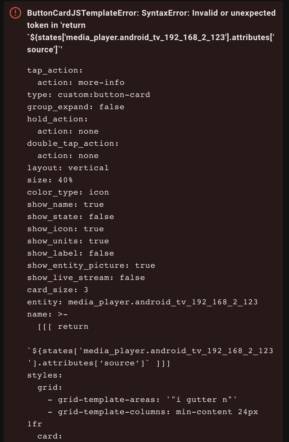
These are the wrong apostrophs. I don’t know, which you used, but you can only use these " or this ', like so:
['source']
This happens a lot with people working on Apple computers, seeing this apostrophes problem here more often, always with Apple 
1 Like
Yeah, my problem is, I’m not a native speaker, so I’m really struggeling with the different names for different apostrophes…  I don’t even know the correct names in my own language.
Yes I am using Mac lol, but that didn’t work either.
type: custom:button-card
entity: media_player.android_tv_192_168_2_123
name: >-
  [[[ return
  `${states['media_player.android_tv_192_168_2_123'].attributes['source']` ]]]
show_entity_picture: true
styles:
  grid:
    - grid-template-areas: '"i gutter n"'
    - grid-template-columns: min-content 24px 1fr
  card:
    - background: var(--ha-card-background)
    - padding: 24px
    - '--mdc-ripple-press-opacity': 0
  icon:
    - width: 70px
    - height: 70px
    - border-radius: 16px
    - border: 5px solid var(--ha-icon-active-color)
  name:
    - font-size: 16px
    - color: var(--hki-primary-text-color)
    - width: 100%
    - text-align: left
state:
  - operator: template
    value: |
      [[[
        var bri = states['media_player.android_tv_192_168_2_123'].attributes['source'];
        return 'Google TV Launcher';
      ]]]
    entity_picture: /local/googletvlauncher.png
    styles:
      card:
        - background: rgb(66, 133, 244)
      icon:
        - border: 5px solid rgb(15,157,88)
  - operator: template
    value: |
      [[[
        var bri = states['media_player.android_tv_192_168_2_123'].attributes['source'];
        return 'Twitch';
      ]]]
    entity_picture: /local/twitch.png
    styles:
      card:
        - background: rgba(169,112,255)
      icon:
        - border: 5px solid rgba(169,112,255,0.5)
  - operator: template
    value: >
      return states['media_player.android_tv_192_168_2_123'].attributes['source']
      === 'Netflix'
    entity_picture: /local/netflix.png
    styles:
      card:
        - background: rgba(229,9,20)
      icon:
        - border: 5px solid rgba(229,9,20,0.5)
  - operator: template
    value: |
      [[[
        var bri = states['media_player.android_tv_192_168_2_123'].attributes['source'];
        return 'YouTube';
      ]]]
    entity_picture: /local/youtube.png
    styles:
      card:
        - background: rgb(255,0,0)
      icon:
        - border: 5px solid rgba(255,0,0,0.5)
This seems like a mix of custom-template-card & button-card.
What about just
  [[[ return
  states['media_player.android_tv_192_168_2_123'].attributes['source'] ]]]
2 Likes
Thanks for the response, so I have tried this and it shows the right app name at the top sure, but for some reason the image doesn’t change…
type: custom:button-card
entity: media_player.android_tv_192_168_2_123
name: >-
  [[[ return
  states['media_player.android_tv_192_168_2_123'].attributes['source'] ]]]
show_entity_picture: true
styles:
grid:
- grid-template-areas: '"i gutter n"'
- grid-template-columns: min-content 24px 1fr
card:
- background: var(--ha-card-background)
- padding: 24px
- '--mdc-ripple-press-opacity': 0
icon:
- width: 70px
- height: 70px
- border-radius: 16px
- border: 5px solid var(--ha-icon-active-color)
name:
- font-size: 16px
- color: var(--hki-primary-text-color)
- width: 100%
- text-align: left
state:
- operator: template
value: |-
[[[ return states['media_player.android_tv_192_168_2_123'].attributes['source'];
return 'Google TV Launcher'; ]]]
entity_picture: /local/googletvlauncher.png
styles:
card:
- background: rgb(66, 133, 244)
icon:
- border: 5px solid rgb(15,157,88)
- operator: template
value: |-
[[[ return states['media_player.android_tv_192_168_2_123'].attributes['source'];
return 'Twitch'; ]]]
entity_picture: /local/twitch.png
styles:
card:
- background: rgba(169,112,255)
icon:
- border: 5px solid rgba(169,112,255,0.5)
- operator: template
value: |-
[[[ return states['media_player.android_tv_192_168_2_123'].attributes['source'];
return 'Netflix'; ]]]
entity_picture: /local/netflix.png
styles:
card:
- background: rgba(229,9,20)
icon:
- border: 5px solid rgba(229,9,20,0.5)
- operator: template
value: |-
[[[ return states['media_player.android_tv_192_168_2_123'].attributes['source'];
return 'YouTube'; ]]]
entity_picture: /local/youtube.png
styles:
card:
- background: rgb(255,0,0)
icon:
- border: 5px solid rgba(255,0,0,0.5)
- operator: template
value: |-
[[[ return states['media_player.android_tv_192_168_2_123'].attributes['source'];
return 'Disney+'; ]]]
entity_picture: /local/disneyplus.png
styles:
card:
- background: rgb(255,0,0)
icon:
- border: 5px solid rgba(255,0,0,0.5)
When you use operator: template the value should return true or false.
So a correct example will be
state:
  - operator: template
    value: |-
      [[[ return states['media_player.android_tv_192_168_2_123'].attributes['source'] == 'Google TV Launcher'; ]]]
    entity_picture: /local/googletvlauncher.png
2 Likes