figure a separate post would make it easy to find.
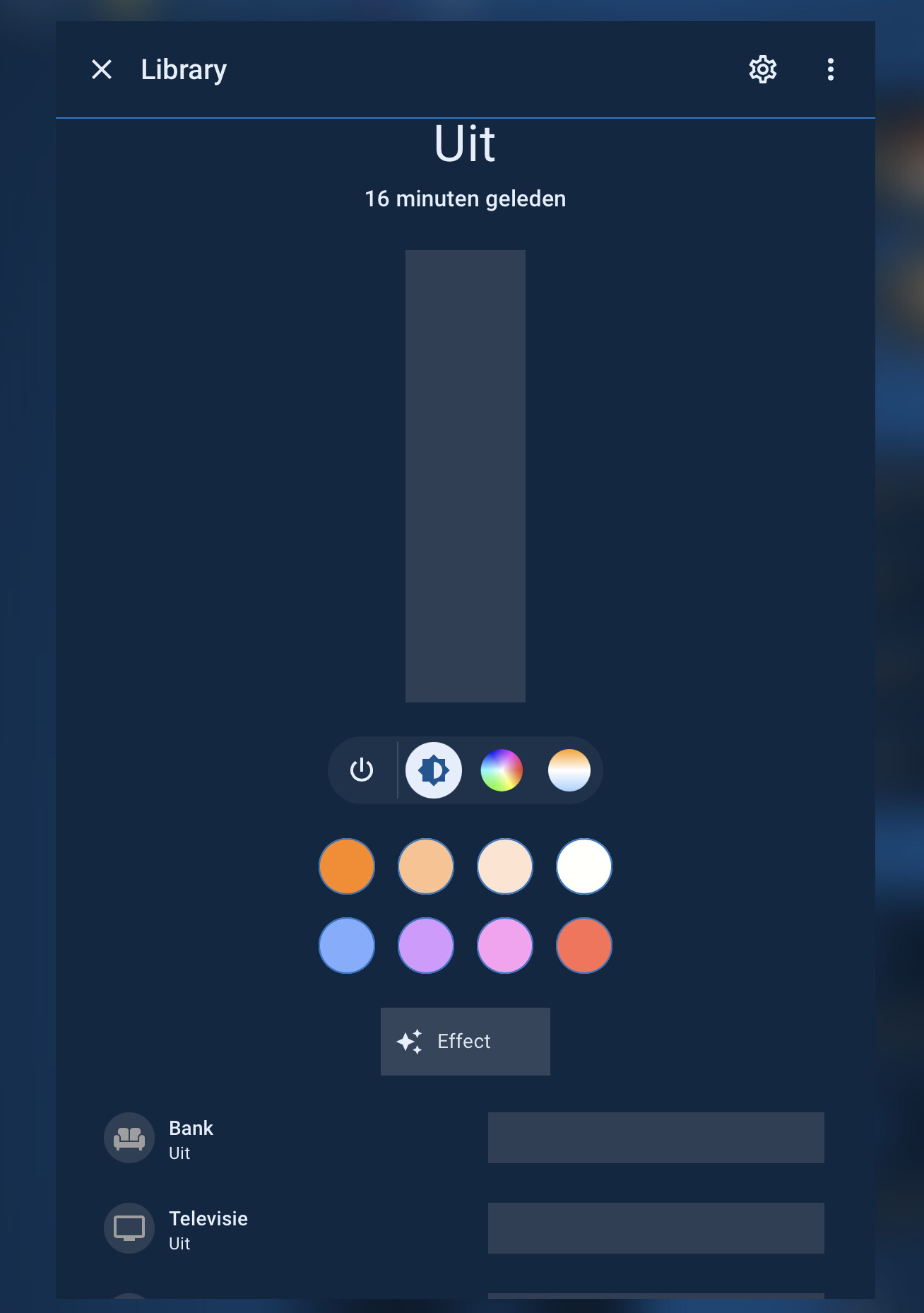
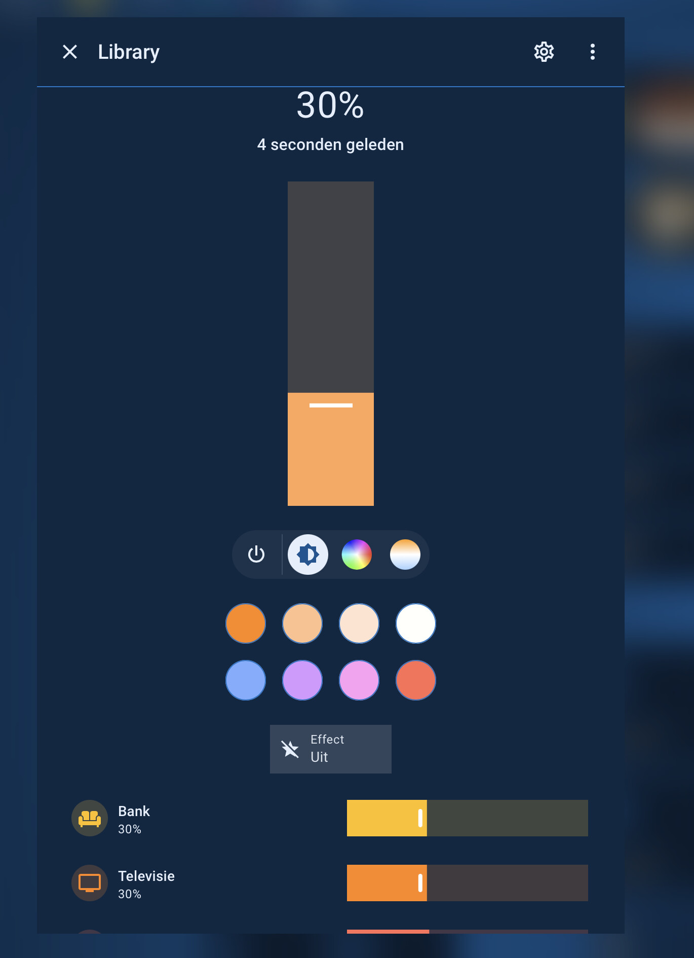
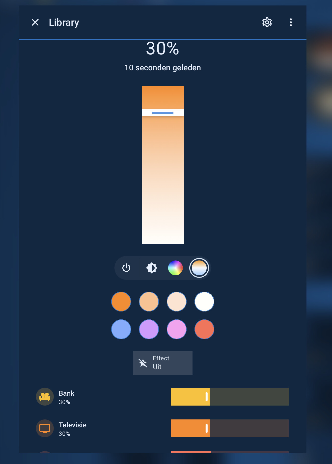
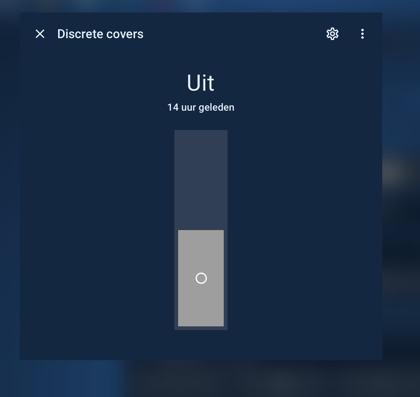
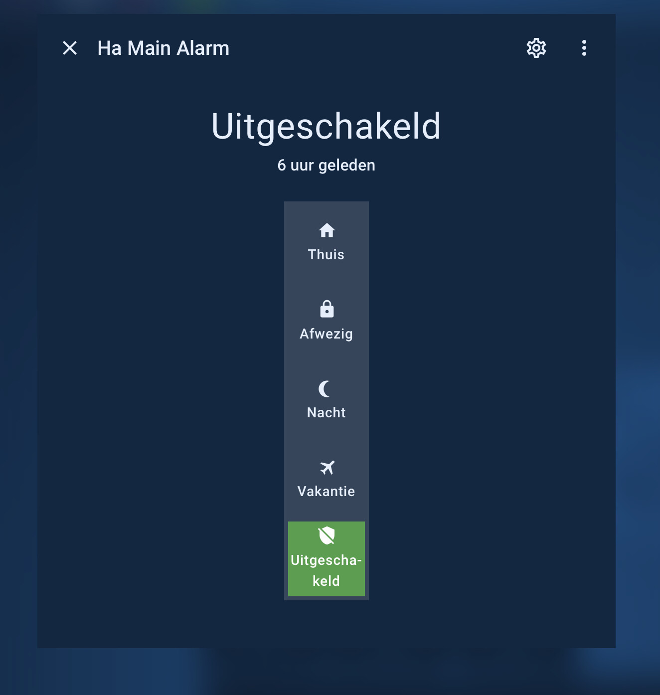
The default more-info slider on the domains is way too fat for me and it even got fatter a couple of releases ago. In the modifications I use
more-info-control-thickness: 85px
which I set in my themes.
My themes are squared, so I like the slider/toggles to be squared also (even the small details like the track handle …)
Also, in my dark themes, I can not read the slider popup, so I had to set a different color/background
Hope this helps people that look to do the same
Below my current set of card_mod modifications to the more-info dialogs on the domains I use:
light (all 3 modes required for card-mod to pick up)
switch
input_boolean
fan
cover
siren
alarm_panel
  card-mod-more-info-yaml: |
    ha-dialog-header: |
      {# adding this, because Kiosk-mode does not apply to /config dashboards #}
      .breadcrumb {
        {% if is_state('input_boolean.hide_dialog_header_breadcrumb_navigation','on') %}
        display: none !important
        {% endif %};
      }

    ha-more-info-info $ more-info-content $:

      more-info-input_boolean,more-info-switch,more-info-siren $:

        ha-state-control-toggle $: |
          ha-control-switch {
            --control-switch-border-radius: var(--border-radius-square) !important;
            --control-switch-thickness: var(--more-info-control-thickness) !important;
          }

      more-info-fan $:

        ha-control-select-menu $: |
          .select-anchor {
            border-radius: var(--border-radius-square) !important;
          }
        ha-state-control-fan-speed $: |
          ha-control-slider {
            --control-slider-border-radius: var(--border-radius-square) !important;
            --control-slider-thickness: var(--more-info-control-thickness) !important;
          }

        ha-state-control-fan-speed $ ha-control-slider $: |

          .slider .slider-track-bar::after {
            border-radius: var(--border-radius-square) !important; /* --slider-track-bar-border-radius*/
          }
          .tooltip {
            border-radius: var(--border-radius-square) !important;
            background: var(--card-background-color) !important;
            /*color: var(--primary-text-color) !important;*/
          }

      more-info-alarm_control_panel $:
        ha-state-control-alarm_control_panel-modes $: |
          ha-control-select {
            --control-select-border-radius: var(--border-radius-square) !important;
            --control-select-thickness: var(--more-info-control-thickness) !important;
          }

      more-info-cover $:

        ha-state-control-cover-position $: |
          ha-control-slider {
            --control-slider-border-radius: var(--border-radius-square) !important;
            --control-slider-thickness: var(--more-info-control-thickness) !important;
          }

        ha-state-control-cover-position $ ha-control-slider $: |
          .slider .slider-track-bar::after {
            border-radius: var(--border-radius-square) !important; /* --slider-track-bar-border-radius*/
          }
          .tooltip {
            border-radius: var(--border-radius-square) !important;
            background: var(--card-background-color) !important;
            /*color: var(--primary-text-color) !important;*/
          }

      more-info-light $:

        ha-state-control-light-brightness $: |
          ha-control-slider {
            --control-slider-border-radius: var(--border-radius-square) !important;
            --control-slider-thickness: var(--more-info-control-thickness) !important;
          }

        ha-state-control-light-brightness $ ha-control-slider $: |
          .slider .slider-track-bar::after {
            border-radius: var(--border-radius-square) !important;
          }
          .tooltip {
            border-radius: var(--border-radius-square) !important;
            background: var(--card-background-color) !important;
            /*color: var(--primary-text-color) !important;*/
          }

        light-color-rgb-picker $: |
          .native-color-picker {
            color: var(--primary-color) !important;
          }

        light-color-temp-picker $: |
          ha-control-slider {
            --control-slider-border-radius: var(--border-radius-square) !important;
            --control-slider-thickness: var(--more-info-control-thickness) !important;
            /*--control-slider-background: red !important;
            --control-slider-color: red !important;*/
          }

        light-color-temp-picker $ ha-control-slider $: |
          .slider {
            --handle-size: 4px;
          }
          .slider .slider-track-cursor {
            --cursor-size: 14px !important;
            /*background: yellow !important;*/
          }
          .slider .slider-track-cursor::after {
            border-radius: var(--border-radius-square) !important;
          }
          .tooltip {
            border-radius: var(--border-radius-square) !important;
            background: var(--card-background-color) !important;
            /*color: var(--primary-text-color) !important;*/
          }

        ha-control-select-menu $: |
          .select-anchor {
            border-radius: var(--border-radius-square) !important;
          }

    $: |
      .mdc-dialog {
        backdrop-filter: blur(17px) !important;
        -webkit-backdrop-filter: blur(17px) !important;
      }
      .mdc-dialog .mdc-dialog__content {
        /*padding: var(--dialog-content-padding, 24px);*/
      }
the children on the more-info panels are tile cards, and I have set those with their own modifications, there’s a other post I did on that