Copied your exact code and change the names to suit my own calendar and it works perfectly.
type: custom:mushroom-chips-card
chips:
  - type: template
    content: >-
      {{ state_attr('calendar.garbage_collection','message')}} in  {{
      ((state_attr('calendar.garbage_collection', 'end_time') | as_datetime |
      as_local - now()).total_seconds() / 60) | int }} minutes.
    card_mod:
      style: |
        ha-card {
          --ha-card-border-width: 0;
          --chip-background: none;
          --chip-height: 75px;
          --chip-padding:12px;
          --chip-box-shadow:none;
          --chip-border-width:0;
          border-width: 0;
        }
1 Like
Sure. Use the zone icon. Here is what I use.
        badge_icon: |2-
                    {% if is_state('person.john','home') %}
                      {{ state_attr('zone.home', 'icon') }}
                    {% else %}
                      mdi:home-off-outline
                    {% endif %}
        badge_color: |-
          {% if is_state('device_tracker.john','home') %}
            green
          {% else %}
            orange
          {% endif %}
StefanHabel
February 5, 2023, 9:42am
5399
How do i add an extra secondary line?
aware we can use:
    mush-rgb-state-cover-open: var(--mush-rgb-blue)
    mush-rgb-state-cover-closed: var(--mush-rgb-disabled)
but, given the new options in core theme coloring,
  state-cover-open-color: gold
  state-cover-opening-color: pink
  state-cover-closing-color: blue
  state-cover-unknown-color: slategrey
  state-cover-closed-color: black
  state-cover-inactive-color: maroon
I was wondering if we also can set a variable on opening and closing. didnt find anything in the Mushroom theme docs on that, so maybe Paul should add it
mmo
February 5, 2023, 2:55pm
5401
This is nice. Please can you tweak the icon size/color of the fold entity row if there are more of them. E.g. 3 folding rows with entities inside 1 card. This example affects only first fold entity row.
Many thanks
1 Like
imne
February 5, 2023, 6:36pm
5402
this looks great please share all the details of how you got this working, helpers etc
rhysb
February 5, 2023, 10:54pm
5403
Yes, you can apply the same styling to all like this:
card_mod:
  style:
    div:
      fold-entity-row$: |
        ha-icon {
Or to a specific child like this:
card_mod:
  style:
    div:nth-child(2):
      fold-entity-row$: |
        ha-icon {
chicknlil25
February 5, 2023, 11:09pm
5404
You may need to tweak it to start_time instead of end_time, depending on how things are set up in your calendar. Mine come from Todoist, and it sometimes like to say the events are starting right now instead of when they actually are, so the end_time tends to be more accurate for me.
JSAnyone
February 5, 2023, 11:32pm
5405
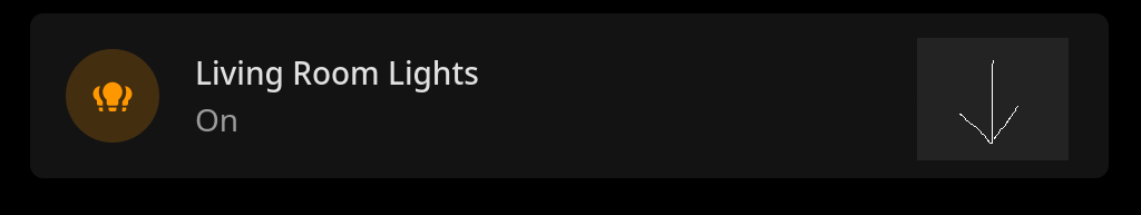
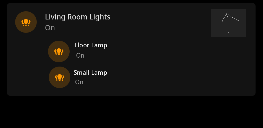
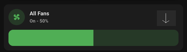
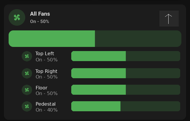
Having something like fold-entity-row implemented into Mushroom was also discussed on GitHub, but without much progress yet:
opened 02:36PM - 19 Jun 22 UTC
enhancement
### Is your feature request related to a problem?
Right now, if I want to hav… e a toggle for a light group but also be able to control the individual lights, I have to either make separate cards or give up on controlling the different lights.
### Describe the solution you'd like
Cards that can expand into the different entities inside of the group.
### Describe alternatives you've considered
Add a separate card for each light, or use browser-mod to show a card in a popup on hold/double tap
### Additional context
[Poor quality] mockup:
For the light group from the Helpers tab, you would use the `entity_id` field:
mase
February 6, 2023, 11:20am
5407
right now i use a template card for a room that shows various informations.
Icon-color:{{ '#ff9800' if is_state(entity,'on') else '' }}
recently i added an led-strip to the room, that i don´t want to control using the template card but i´d like to see on the icon if the stripe is on.
so, if the light OR the stripe in the room is on, the icon color should change.
is something like this possible?
{{ '#ff9800' if is_state(entity,'on') or is_state('light.wled_tv', 'on') else '' }}
maurizio53
February 6, 2023, 12:51pm
5408
Following a post in this thread i found this code for the fold-entity-row card:
                      - type: custom:fold-entity-row
                        head:
                          type: custom:mushroom-entity-card
                          entity: group.nuvole_giorno
                          name: Nuvolosità Giorno
                          icon: mdi:script-outline
                          icon_color: light-blue
                        padding: 0
                        entities:
                          - type: custom:auto-entities
                            card:
                              type: custom:mushroom-entity-card
                              cards: []
                              layout_type: masonry
                            sort:
                              method: first
                            filter:
                              include:
                                - group: group.nuvole_giorno
                                  options:
                                    type: custom:mushroom-entity-card
                                    icon_color: light-blue
                                    tap_action:
                            card:
                              type: custom:layout-card
                              cards: []
                              layout_type: masonry
                            sort:
                              method: first
#                              reverse: true
                        card_mod:
                          style: |
                            :host {
                              --masonry-view-card-margin: -12px 8px 0px 8px;
                              --ha-card-border-width: 0;
                              --ha-card-background: none;
                              --ha-card-box-shadow: 0;
                            }
                    card_mod:
                      style:
                        fold-entity-row$: |
                          ha-icon {
                            background: none !important;
                            margin-right: 24px !important;
                            --toggle-icon-width: 21px !important;
                            color: rgb(var(--rgb-disabled-color));
                          }
                        .: |
                          .card-content {
                            padding: 0;
                          }
And what i get is this:
How to put the content inside the card? What to change in the code?
3beezer
February 6, 2023, 3:06pm
5410
Is it possible to have a mushroom-cover-card control multiple entities? I have four shades that I would like to operate as one (so that they are always at the same height).
mase
February 6, 2023, 3:39pm
5411
yes, simple group them up and controll the group with the cover-cards.
You could create a Threshold helper for that. That creates a new binary sensor that is on/off if the value of another specified sensor is above or below a certain value.
Then the condition on the chip would just check if the helper entity was on or off.
Mine is similar to this, but I’m also using the icon of the specific zone when not at home too. I have a handful of the most common zones already defined (e.g. work place, schools, grocery stores) with distinct icons:
{% set zn = states(entity) %}
Which theme are you currently using?
gatd4
February 6, 2023, 5:43pm
5415
I created a theme and added just
mush-control-height: 15px
modes:
    light: {}
    dark: {}
and it successfully reduces the size of the bar height for the light
KoenChiau
February 6, 2023, 7:57pm
5416
Dear Mush and CSS friends,
I love your guidance to achieve the following (as the beginnings of a person card):
I currently have a mushroom-template-card as the base:
And a mushroom-chip-card as the “person” picture:
Is there any way to visually combine them as shown above ?
I do not care what type of card the picture will be, as long as it the result is achieved.
My code for the “base” mushroom-template-card:
type: custom:vertical-stack-in-card
cards:
  - type: custom:mushroom-template-card
    entity: person.admin
    icon: none
    icon_color: |
      {% if is_state(entity, 'home') %}
        #03A9F4
      {% else %}
        grey
      {% endif %}
    primary: ''
    secondary: ''
    layout: horizontal
    tap_action:
      action: navigate
      navigation_path: /home-yaml/lichten
    badge_icon: mdi:home
    badge_color: |
      {% if is_state(entity, 'home') %}
        #357b8c
      {% else %}
        grey
      {% endif %}
    card_mod:
      style:
        mushroom-state-info$: |
          .primary {
            font-size: 14px !important;
            position: relative;
            top: -50px;
            left: -110px;
            overflow: visible !important;
            white-space: normal !important;
          }
          .secondary {
            position: relative;
            overflow: visible !important;
            top: -52px;
            left: -155px;
          }
        mushroom-shape-icon$: |
          .shape {
            position: relative;
            left: -72px;
            top: 8px;
            box-shadow: 0px 0px 8px 6px rgba(50,150,150,0.96) !important;
          }
        .: |
          :host {
            --mush-icon-size: 96px;
            --secondary-text-color: red;
          }
          mushroom-badge-icon {
            left: 1px !important;
            top: 1px !important;
          }
          ha-card {
            --badge-icon-size: 20px;
            --badge-size: 28px;
          }
card_mod:
  style: |
    ha-card {
      height: 92px !important;
      width: 192px !important;
    }
tmchow
February 6, 2023, 8:12pm
5417
tmchow:
I tried with and without ' ' for secondary info:
type: custom:mushroom-template-card
primary: ''
secondary: ' '
icon: mdi:sofa
icon_color: red
fill_container: true
type: custom:mushroom-template-card
primary: ''
secondary: ''
icon: mdi:sofa
icon_color: red
fill_container: true
Anyone have a solution for getting consistent card heights when secondary info is meant to be blank? I’m new to mushroom cards and this has got to be something someone else has encountered (and solved!).

 ?
?


