I misunderstood and will take a look again.
1 Like
I’m close, but think its best to create a sensor that determines the device class so it’s easier to filter. Play with this a bit in the Template tool. It may spart a better solution…
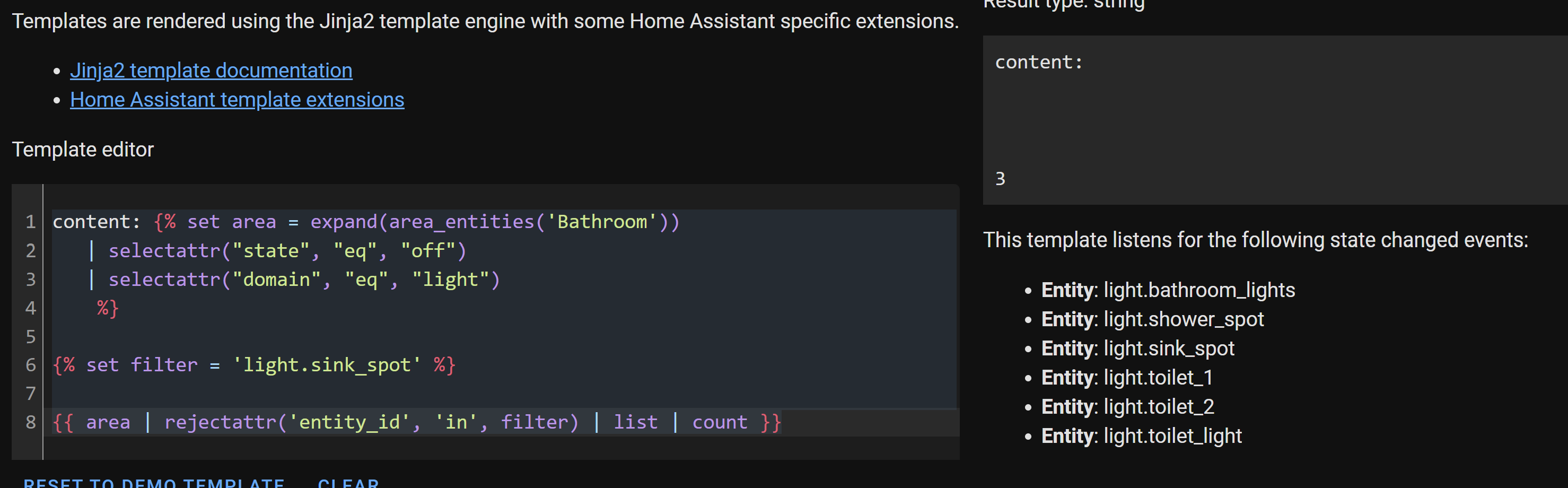
content: {% set area = expand(area_entities('Bathroom'))
   | selectattr("state", "eq", "off")
   | selectattr("domain", "eq", "light")
    %}

{% set filter = 'light.sink_spot' %}
{{ area | rejectattr('entity_id', 'in', filter) | list | count }}
Love mushroom cards, however on the chips there’s something I can’t get my head around.
I’d like to create a chip with two lines:
Lights
2 on
However the content seems to be sanitized so I can’t seem to use linebreaks.
Is there something like a title I can utilize or some other workaround to have two lines in a chip?
I’ve creating this card, but it renders differently on each platform/browser. I edit everything on Safari so that is how it should be.
This happens with my other cards also, card-mod changes don’t seem reflect correct for some reason. Seems like maybe a WebKit or WebView issue or maybe just my code?
Code:
square: false
type: grid
cards:
  - type: custom:mushroom-template-card
    primary: ''
    secondary: ''
    icon: mdi:lightbulb-group-outline
    icon_color: orange
    tap_action:
      action: navigate
      navigation_path: /lovelace/lights
    layout: vertical
    entity: light.home
    style:
      mushroom-shape-icon$: |
        .shape {
         --shape-color: none !important;
        }
      mushroom-state-info$: |
        .container {
          width: 100%;
        }
      .: |
        ha-card {
          --icon-size: 45px;
          width: fit-content;
          border-radius: 100px;
  - type: custom:mushroom-template-card
    primary: ''
    secondary: ''
    icon: mdi:play-box-outline
    icon_color: blue
    tap_action:
      action: navigate
      navigation_path: /lovelace/media
    layout: vertical
    style:
      mushroom-shape-icon$: |
        .shape {
         --shape-color: none !important;
        }
      mushroom-state-info$: |
        .container {
          width: 100%;
        }
      .: |
        ha-card {
          --icon-size: 45px;
          width: fit-content;
          border-radius: 100px;
  - type: custom:mushroom-template-card
    primary: ''
    secondary: ''
    icon: mdi:shield-lock-outline
    icon_color: teal
    tap_action:
      action: navigate
      navigation_path: /lovelace/camera
    layout: vertical
    style:
      mushroom-shape-icon$: |
        .shape {
         --shape-color: none !important;
        }
      mushroom-state-info$: |
        .container {
          width: 100%;
        }
      .: |
        ha-card {
          --icon-size: 45px;
          width: fit-content;
          border-radius: 100px;
  - type: custom:mushroom-template-card
    primary: ''
    secondary: ''
    icon: mdi:devices
    icon_color: purple
    tap_action:
      action: navigate
      navigation_path: /lovelace/devices
    layout: vertical
    style:
      mushroom-shape-icon$: |
        .shape {
         --shape-color: none !important;
        }
      mushroom-state-info$: |
        .container {
          width: 100%;
        }
      .: |
        ha-card {
          --icon-size: 45px;
          width: fit-content;
          border-radius: 100px;
  - type: custom:mushroom-template-card
    primary: ''
    secondary: ''
    icon: mdi:cog-outline
    icon_color: grey
    tap_action:
      action: navigate
      navigation_path: /lovelace/lights
    layout: vertical
    entity: light.home
    style:
      mushroom-shape-icon$: |
        .shape {
         --shape-color: none !important;
        }
      mushroom-state-info$: |
        .container {
          width: 100%;
        }
      .: |
        ha-card {
          --icon-size: 45px;
          width: fit-content;
          border-radius: 100px;
columns: 5
Any help would be appreciated, thanks.
Issue is that you are using only style: | and not using card_mod: first.
Using only style: | was recently fully deprecated. So now you HAVE to use it like this (should always have done really):
card_mod:
  style: |
    ha-card {
    }
The only reason it works on mac/ios is because it is incredibly hard to fully clear the cache on mac/ios, so its still showing you the old webpage, because the cache is saved.
So in short.
Update code from this:
style: |
  ha-card {
  }
To this:
card_mod:
  style: |
    ha-card {
    }
And be sure to read the breaking changes when updating anything including stuff from HACS like card mod. 
1 Like
Thanks, but everything now changed to the second image using the new ‘breaking change’ code. How do I go abouts getting the first look back for every device?
Now clear your browser cache as directed when updating card mod.
Using the mushroom-template-card is there a way to have 2 badges simultaneously (in different corners)?
I was using this card for my living room, but now I have a presence sensor AND a door sensor, and not sure how to make it fit without adding new cards.

1 Like
FYI you can search any topic by this topic only like this:

That would lead to this reply:
Which should give you all you need hopefully! Let me know if you need any help with it after trying 
2 Likes
Definitely possible with card mod using a pseudo element like this:

type: custom:mushroom-chips-card
chips:
  - type: template
    icon: mdi:lightbulb
    icon_color: amber
    content: 'Lights'
card_mod:
  style:
    mushroom-template-chip:nth-child(1)$: |
      span:after {
        content: '{{ expand(states.light)
                    |selectattr('state', 'eq', 'on')
                    |selectattr('entity_id', 'in', area_entities('Lounge'))
                    |map(attribute='entity_id')
                    |list | count
                  }} On';
        display: flex;
        padding-top: 0.3em;
      }
the template in the card mod, pseudo element’s content section is just counting the lights that are on in an area.
2 Likes
Oh well, thanks. I actually searched both here and google, but tried “double badge”, “two badges” etc. Didn’t think of multi-badge. Off to try it. Thanks!
1 Like
No problem! just thought i would mention the searching topic as a lot of people dont realise
again, let me know if you need any help when you get a bit more into the thick of it!
I’ll take your word right now. Do you know if there’s a way to use different/extra icons? Like Font Awesome library, or the full MDI? The icon library is a bit limited (looking for an open door atm).
Also, do you know if it’s possible to mix css with templating to add conditionals? For example, to adjust the color based on sensor value?
I use this with the standard badge. Would like to add the same to the ones generated with css.
badge_color: >-
  {{ iif(is_state('binary_sensor.presence_sensor_living_room_presence', 'on'),
  'blue', '') }}
Not sure about the syntax to merge them in here:
card_mod:
  style: |
    mushroom-badge-icon:before {
        color: var(--icon-color);
        background: var(--main-color);
Also not sure about your timezone, but happy new year! 
Edit: forget the 2nd question, just noticed an example of this 2 replies before mine.
1st question. not entirely sure. The 2 ways i know of are with a stylesheet like described in the original post. Second would be uploading a png of an icon you want and trying to set it as a background of an element. If you decide to try and go this route i might be able to help with that.
2nd question. similar, like this:
card_mod:
  style: |
    mushroom-badge-icon:before {
      {% if is_state('binary_sensor.presence_sensor_living_room_presence','on') %}
        color: var(--icon-color);
        background: var(--main-color);
      {% else %}

      {% endif %}
    }
Or if you wanted the badge to entirely dissapear with no motion then like this:
card_mod:
  style: |
    {% if is_state('binary_sensor.presence_sensor_living_room_presence','on') %}
      mushroom-badge-icon:before {
        color: var(--icon-color);
        background: var(--main-color);
      }
    {% endif %}
Happy new year to you as well. Just watched the london fireworks on the tv since i am GMT
2 Likes
Happy new year to everyone! Does anyone know if there is a mushroom card for HA shopping list card? I have the simple one from HA with the following code:
type: shopping-list
title: Grocery List
icon: mdi:cart-outline
@tvds I’m sure there may be other ways to acomplish this, but I always lean towards sensors to simplify things.
It’s my understanding that Home Assistant doesn’t natively provide a sensor that keeps count of the active lights. Therefore, you need to create a template sensor first to get the count of the lights currently turned on:
I added a sensor to the config file that returns True or False based on the lights that are ON, but with DNDMode lights excluded.
sensor:
  - platform: template
    sensors:
       lights_on:
        friendly_name: 'Lights ON'
        value_template: |
          {% set area = expand(area_entities('woonkamer'))
          | selectattr("state", "eq", "on")
          | selectattr ( 'domain' , 'eq' , 'light' )
              %}
          {{ area | rejectattr("attributes.device_class", 'eq', 'DNDMode') | list | count > 0 }}
Then you can simply add the status of that sensor entity to the icon_color: in lovelace
icon_color: |-
          {%- if states('sensor.lights_on', True) %}
           red
          {% else %}
           blue
          {% endif %}
My only concern is I haven’t seen device_class: use capital letters so DNDMode as device_class may need adjusted. Let me know…
Cross-posting this for the sake of exposure to people who might have this question. Hopefully this is ok.
TLDR: setting an icon (MDI/SVG) to the background image using card mod:
Dear Community,
I would like to know if possible use the carriedge return to show all text.

type: vertical-stack
cards:
  - type: custom:bubble-card
    card_type: pop-up
    hash: '#canali-camera'
    name: Camera Matrimoniale
    icon: phu:rooms-bedroom
    back_open: false
  - type: grid
    columns: 1
    square: false
    cards:
      - type: custom:bubble-card
        card_type: separator
        name: Canali TV
        icon: mdi:television
        styles: |
          .separator-container div:last-child {
            opaticy: 1|important;
          }
  - type: custom:mushroom-template-card
    picture: /local/channel/rai1.png
    primary: >-
      {{ state_attr('sensor.rai1','title') }}
    secondary: >-
      {{ state_attr('sensor.rai1', 'description') }}
    card_mod:
      style: |
        ha-card {
          height: 200px !important;
          font: 1px !important;
        :host {
          width: 200px;
          height: 1900px;
You can do it like this:
  - type: custom:mushroom-template-card
    picture: /local/channel/rai1.png
    primary: >-
      {{ state_attr('sensor.rai1','title') }}
    secondary: >-
      {{ state_attr('sensor.rai1', 'description') }}
    card_mod:
      style:
        mushroom-state-info$: |
          .secondary {
            white-space: normal !important;
          }
        .: |
          ha-card {
            height: 200px !important;
            font: 1px !important;
          }
          :host {
            width: 200px;
            height: 1900px;
          }
you may or may not need overflow: visible !important; as well.
  - type: custom:mushroom-template-card
    picture: /local/channel/rai1.png
    primary: >-
      {{ state_attr('sensor.rai1','title') }}
    secondary: >-
      {{ state_attr('sensor.rai1', 'description') }}
    card_mod:
      style:
        mushroom-state-info$: |
          .secondary {
            white-space: normal !important;
            overflow: visible !important;
          }
        .: |
          ha-card {
            height: 200px !important;
            font: 1px !important;
          }
          :host {
            width: 200px;
            height: 1900px;
          }
Hi there, My current dashboard is awful, I mainly use it for couple of IP cams, Heater system (by room) and one main thing is the Solar / gris energy production like this :


My question is … can I continue to use the same cards, under mushroom, or I am obliged to use the Mushroom cards ?
Because the most useful cards I am using is this one and I love it

Many Thanks !!