jimmyeao
June 26, 2022, 12:57pm
1486
How does one add a person picture to a template card?
{% set time = now().hour %}
{% if (time >= 18) %}
  Good Evening, {{user}}!
{% elif (time >= 12) %}
  Good Afternoon, {{user}}!
{% elif (time >= 5) %}
  Good Morning, {{user}}!
{% else %}
  Hello, {{user}}!
{% endif %}
image969
June 26, 2022, 3:11pm
1489
I don’t understand what I’m missing. I opened up a Brand New template card and I copied in your code exactly the way it is and everything works but it gives an error when it comes to the badge icon. Is there something else I need installs for badges to work?
KTibow
June 26, 2022, 3:12pm
1490
What error is it? Could you send a screenshot?
I haven’t used theme variables for anything yet, so I’m a bit lost. How can I use the variables in the template cards?
icon_color: |-
  {% if is_state('input_boolean.example_mode', 'on') %}
    red
  {% else %}
    #bdbdbd
  {% endif %}
I would like to use the theme variables like mush-rgb-red and mush-rgb-disabled . More generally, I am trying to solve the issue explained in Github Issue #196 . Basically, I’m trying to match the “disabled” color of a template card to the one of a entity card, on both light and dark mushroom themes. Does anyone actually have a working config?
Is there a way to set a variable template wide and use it in multiple fields afterwards, eg both primary and secondary fields?
rhysb
June 27, 2022, 1:33am
1493
There is a specific ‘disabled’ color for this purpose. Light theme it is #bdbdbd , while dark theme it is #6f6f6f .
1 Like
berkans
June 27, 2022, 1:34am
1494
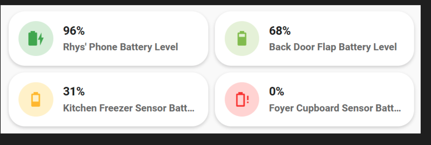
Can we do that with battery card you shared ?
rhysb
June 27, 2022, 1:37am
1495
What are you wanting to do?
rhysb
June 27, 2022, 1:43am
1496
Do you have Card Mod installed? While Mushroom cards do not require it, if you want to modify the CSS you will need Card Mod.
berkans
June 27, 2022, 1:48am
1497
This is the color icon card you just shared a few messages before. Can the icons in this card be like this :
1 Like
rhysb
June 27, 2022, 1:54am
1498
Yes, just replace the code for icon_color with ‘disabled’
1 Like
rhysb
June 27, 2022, 1:58am
1499
Mushroom doesn’t require any other cards but if you want to modify or combine cards you do. Combining cards you will need Stack-In-Card plus whatever card you are wanting to combine/stack with. Modifying CSS (Styles) you will need Card-Mod.
i thought card-mod was only applied if you prefix stlyes with card-mod
card-mod:
  styles: ...
where as the examples provided here do not have the card-mod prefix
rhysb
June 27, 2022, 2:13am
1501
Just styles: is legacy syntax and still works. Correct syntax is as below:
card_mod:
   styles:
Both require card_mod
rhysb
June 27, 2022, 2:21am
1502
To further explain this, ‘red’ is mush-rgb-red and ‘disabled’ is mush-rgb-disabled.
1 Like
rhysb
June 27, 2022, 3:48am
1503
It is because you are overlaying one card over another. You could change the layering order with z-index, but it starts getting awfully messy.
Hi there.
Is there a way to include something? I want the same list of chips in a row as kind of a navigation on every view without editing all the views when doing a change.
I tried it with an include like this - !include …/includes/navigation.yaml but an yaml exception occurs when saving the raw configuration. Can I temporarly use the yaml mode for mushroom? Or how do you solve this?
Thank you for any kind of help
Stuartie
June 27, 2022, 9:58am
1505
Yeah I can see how that can start to get quite messy. I did fiddle around with z-index and managed to get what I wanted, I don’t plan to add anymore to this card so hopefully it’ll stay tidy enough like this.
type: custom:stack-in-card
cards:
  - type: custom:mushroom-template-card
    primary: Living Room
    secondary: '{{ states(''sensor.thermostat_1_current_temperature'') }} °C'
    icon: mdi:sofa
    entity: light.living_room_lights
    icon_color: |-
      {% if is_state('light.living_room_lights', 'on') %}
        orange
      {% endif %}
    hold_action:
      action: toggle
    tap_action:
      action: navigate
      navigation_path: livingroom
    badge_icon: |-
      {% if is_state('sensor.count_living_room_lights_on', '0') %}
      {% elif is_state('sensor.count_living_room_lights_on', '1') %}
        mdi:numeric-1
      {% elif is_state('sensor.count_living_room_lights_on', '2') %}
        mdi:numeric-2
      {% elif is_state('sensor.count_living_room_lights_on', '3') %}
        mdi:numeric-3
      {% elif is_state('sensor.count_living_room_lights_on', '4') %}
        mdi:numeric-4
      {% elif is_state('sensor.count_living_room_lights_on', '5') %}
        mdi:numeric-5
      {% elif is_state('sensor.count_living_room_lights_on', '6') %}
        mdi:numeric-6
      {% elif is_state('sensor.count_living_room_lights_on', '7') %}
        mdi:numeric-7
      {% elif is_state('sensor.count_living_room_lights_on', '8') %}
        mdi:numeric-8
      {% elif is_state('sensor.count_living_room_lights_on', '9') %}
        mdi:numeric-9
      {% else %}
        mdi:numeric-9-plus
      {% endif %}
    badge_color: orange
    fill_container: true
    layout: horizontal
    multiline_secondary: false
    card_mod:
      style: |
        :host {
          z-index: 1;
        }
  - type: custom:mushroom-chips-card
    chips:
      - type: conditional
        conditions:
          - entity: binary_sensor.living_room_motion_sensor_occupancy
            state: 'on'
        chip:
          type: template
          icon_color: green
          icon: mdi:window-open-variant
      - type: conditional
        conditions:
          - entity: binary_sensor.living_room_window
            state: 'on'
        chip:
          type: template
          icon_color: red
          icon: mdi:motion-sensor
    alignment: end
    card_mod:
      style: |
        ha-card {
          --chip-box-shadow: none;
          --chip-background: none;
          --chip-spacing: 0;
          top: -36px;
          z-index: 0;
        }
card_mod:
  style: |
    ha-card {
      height: 66px;
    }
Thanks for your help!
4 Likes
piitaya
June 27, 2022, 10:10am
1506
You can change it using theme variables : https://github.com/piitaya/lovelace-mushroom-themes
mush-rgb-yellow: 255, 235, 59
mush-rgb-state-cover-open: var(--mush-rgb-yellow)
1 Like
rhysb
June 27, 2022, 11:09am
1507
Here is another combo card with an entities drop-down that may be useful. I wanted something that would still work as a half width card on my phone.
type: custom:stack-in-card
cards:
  - type: custom:layout-card
    layout_type: custom:grid-layout
    layout:
      grid-template-columns: auto 33px
      margin: '-4px -4px -8px -4px;'
    cards:
      - type: custom:mushroom-template-card
        primary: Amplifiers
        secondary: |-
          {% if is_state(entity, 'on') %}
            {{ states('sensor.lounge_amp_front_power') | round(0) +
            states('sensor.lounge_amp_center_power') | round(0) +
            states('sensor.lounge_amp_left_surround_power') | round(0) +
            states('sensor.lounge_amp_right_surround_power') | round(0) }} W
          {% else %}
            Off
          {% endif %}
        icon: mdi:audio-video
        entity: group.lounge_amps
        icon_color: '{{ ''blue'' if is_state(entity, ''on'') else ''disabled'' }}'
        fill_container: false
        multiline_secondary: false
        card_mod:
          style: |
            ha-card {
              background: none;
              --ha-card-box-shadow: 0px;
            }
      - type: custom:mushroom-template-card
        entity: input_boolean.amps_dropdown
        primary: ''
        secondary: ''
        icon: >-
          {{ 'mdi:chevron-up' if is_state(entity, 'on') else 'mdi:chevron-down'
          }}
        icon_color: disabled
        hold_action:
          action: none
        card_mod:
          style: |
            ha-card {
              align-items: flex-end;
              background: none;
              --ha-card-box-shadow: 0px;
            }
            mushroom-shape-icon {
              --shape-color: none !important;
            }
  - type: conditional
    conditions:
      - entity: input_boolean.amps_dropdown
        state: 'on'
    card:
      type: entities
      entities:
        - entity: switch.lounge_amp_front
          secondary_info: null
          name: LR
        - entity: switch.lounge_amp_center
          name: C
        - entity: switch.lounge_amp_left_surround
          name: LS
        - entity: switch.lounge_amp_right_surround
          name: RS
      state_color: true
      show_header_toggle: false
      card_mod:
        style: |
          ha-card {
            box-shadow: none !important;
            --paper-item-icon-active-color: #2196f3;
            --paper-item-icon-color: #6f6f6f;
          }
17 Likes