And actually, I can get to it by clicking the media icon on the left. I was just hoping to get one click select.
Using the card layout as I did, you should be able to place any card on top right. So reorganize entities /cards you already have to acheive your wish. Cards are yaml code and relies on existing entities, so noboby can do it from 1 screenshot
Is there a way to set templatable parameters in a conditional chip card (or add conditions to a template chip card??)
At the moment I’m using the state switch card together with the template chip card but it’s causing weird formatting problems (it is creating line breaks in some but not all of my template chip cards)
Thanks!
Is this a sensor you created and if so could you please share…
binary_sensor.updater
I like your media control page. Is this a special card I can use as well?
I was working on something similar and Have used this here:
type: custom:swipe-card
card_width: 100px
parameters:
  slidesPerView: auto
  spaceBetween: 10
cards:
Maybe you need do adjust the card width…
How do you get the squeezebox page in HA? Or is it just iframe?
I am searching for a long time for a good LMS lovelace card, but it seems it doesn’t exist.
hey mate, im like what you have done.
Question your first Tab seems to have alot of info, so you dont mind scrolling i guess??
Whats the best way to accomplish the task of seeing all lights that are on? I have this conditional chip card which then opens to my light group (just a few for testing).
But I’d like to ONLY see lights that are on. Is that possible?

Have the Conditional Chip open a Conditional card,
Use Auto entities to show lights that are on with Card-mod Popup
You’d probably need to do it how he’s doing it. Create a drop down helper with all the source names and then use conditional cards. When Input equals x then play on the correct source.
Thanks! I’ll try this.
The players are the “mini media player” cards. The music page is a webpage card (iframe) that shows the Squeezebox server layout.
I use the single card iframe page to show the LMS site. With the “Material skin” installed on your LMS this works very well, also when using HA on mobile. The Material skin also allows you to use an iframe card to use on your dashboard that scales nicely
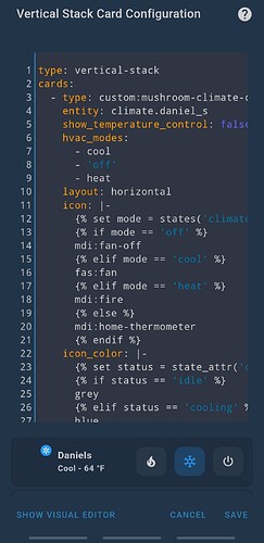
With the new climate card. I’m trying to use what I created with a vertical stack card on my tablet dashboard.
Does anyone know why the icon doesn’t show using this code?
type: vertical-stack
cards:
  - type: custom:mushroom-climate-card
    entity: climate.daniel_s
    show_temperature_control: false
    hvac_modes:
      - cool
      - 'off'
      - heat
    layout: horizontal
    icon: |-
      {% set mode = states('climate.daniel_s') %}
      {% if mode == 'off' %}
      mdi:fan-off
      {% elif mode == 'cool' %}
      fas:fan
      {% elif mode == 'heat' %}
      mdi:fire
      {% else %}
      mdi:home-thermometer
      {% endif %}
    icon_color: |-
      {% set status = state_attr('climate.daniel_s','hvac_action') %}
      {% if status == 'idle' %}
      grey
      {% elif status == 'cooling' %}
      blue
      {% elif status == 'heating' %}
      red
      {% else %}
      grey
      {% endif %}
    card_mod:
      style:
        mushroom-shape-icon:
          $: |
            .shape ha-icon {
                {% set status = state_attr('climate.daniel_s','hvac_action') %}
                {% if status == 'cooling' or status == 'heating' %}
                  --icon-animation: rotation 1s linear infinite;
                {% endif %}
              }
              @keyframes rotation {
                0% {
                  transform: rotate(0deg);
                }
                100% {
                  transform: rotate(360deg);
                }
              }
          .: |
            mushroom-shape-icon {
              --shape-color: none !important;
            }
            ha-card {
              padding-bottom: 14px !important;
            }
Because the icon doesn’t support template
Code for this would be amazing.
Are there animated icons that can be used or should the css option?
Here’s my icon situation…
icon: |
              {% if is_state('climate.john_s_device', 'cool') %}
              mdi:fan
              {% else %}
              mdi:fan
              {% endif %}
            use_light_color: false
            icon_animation: true
Had to try but it’s not working…
Thank you!
Yes, you can animate the border shadow like this:

type: custom:mushroom-template-card
primary: Warning
secondary: null
icon: mdi:radioactive
icon_color: red
card_mod:
  style: |
    ha-card {
      animation: borderPulse 2s ease-out infinite;
    }
    @keyframes borderPulse {
      50% {
        box-shadow: 0 0 20px red;
      }
    }

