Continuing the discussion from Mushroom Cards - Build a beautiful dashboard easily 🍄 (Part 1) - #10293 by SoulAssassin.
Previous discussions:
Continuing the discussion from Mushroom Cards - Build a beautiful dashboard easily 🍄 (Part 1) - #10293 by SoulAssassin.
Previous discussions:
Hi All, not sure if I should be posting here, or in the auto-entities post, or to the author of the unavailable-entities post…but I’ll give it a try here first.
What I’m trying to achieve is a combination of using the auto-enties card, with a sensor template listing unavailable entities along with a mushroom card and card-mod formatting.
Here is the (current) code I’ve tried along with a screenshot of the result:
type: custom:auto-entities
card:
  type: entities
filter:
  template: "{{ state_attr('sensor.unavailable_entities','entity_id') }}"
options:
  type: custom:mushroom-entity-card
  vertical: true
  tap_action: null
  action: more-info
  card_mod:
    style:
      mushroom-shape-icon$: |
        .shape {
            outline: var(--disabled-text-color) 1.5px solid;
           --icon-color: orange !important;
           --icon-color-disabled: var(--disabled-text-color) !important;
           --shape-color-disabled: var(--primary-background-color) !important;
           --shape-color: rgb(35,35,41) !important;
        }
      sort:
      method: state
Any variation of code either results in the layout in the SS or an error saying no card configured…I’ve spent several hours looking at other posts on the various pages, some which have seemed relevant, but none that I could get to work…
I’d really apprecaiate if someone could point me in the right direction…
thanks in advance
Probably fits best in the auto entities thread. but take a look at this example and see how yours deviates a lot.

type: custom:auto-entities
card:
  type: custom:stack-in-card
card_param: cards
filter:
  include:
    - state: unavailable
      options:
        type: custom:mushroom-entity-card
        tap_action:
          action: more-info
        card_mod:
          style:
            mushroom-shape-icon$: |
              .shape {
                outline: var(--disabled-text-color) 1.5px solid;
                --icon-color: orange !important;
                --icon-color-disabled: var(--disabled-text-color) !important;
                --shape-color-disabled: var(--primary-background-color) !important;
                --shape-color: rgb(35,35,41) !important;
              }
@LiQuid_cOOled I’m certain I’ve become a nuisance at this point (I’m so sorry), but did you happen to have a chance to look at suggestions regarding my code? Our back and forth was here: Mushroom Cards - Build a beautiful dashboard easily 🍄 (Part 1) - #10259 by crankycowboy
Thank you for any time you can offer.
Haven’t forgotten about you, home remodeling is slowing me down 
Typo to start --bg-colr: #1d1d1d !important;
should be --bg-color: #1d1d1d !important; That allows the secondary info to appear.
type: custom:mushroom-number-card
entity: input_number.test_level_1
layout: horizontal
display_mode: slider
card_mod:
  style:
    mushroom-number-value-control$:
      mushroom-slider$: |
        .slider {
          position: absolute !important;
          width: calc(100% - 76px) !important;
          right: 12px;
          height: 42px !important;
          --bg-color: #1d1d1d !important;
        }
    mushroom-state-info$: |
      .container {
        flex-direction: row !important;
        position: absolute;
        width: 79%;
        top: 17px;
        align-items: baseline;
      }
      .primary {
        color: transparent !important;
        position: relative;
           flex-shrink: 1;
        flex-grow: 1;
      }
      .primary:after {
        content: "{{states('input_number.test_level_1')}}";
        position: absolute;
        color: var(--primary-text-color);
        left: 5px;
        width: max-content !important;
      }
      .secondary {
        color: transparent !important;
        position: relative;
        flex-shrink: 1;
        flex-grow: 0;

      }
      .secondary:after {
        content: '{{states('timer.timer')}}';
        position: relative;
        color: var(--secondary-text-color);
        right: 0px;
        padding-right: 10px;
      }
    .: |
      mushroom-state-info {
        padding-left: 15px;
        pointer-events: none;
        z-index: 1;
        display: flex;
      }
      mushroom-shape-icon {
        --icon-size: 34px;
        position: relative;
        top: 4px;
      }
      ha-card {
        height: 58px !important;
      }
Other edits applied. please swap my entities for yours.
really like this. Can this be also work with the fold-entity-row?
type: entities
title: Unavailable Entities
show_header_toggle: false
entities:
  - type: custom:auto-entities
    show_empty: true
    unique: true
    filter:
      template: '{{ state_attr(''sensor.unavailable_entities'',''entity_id'') }}'
    sort:
      method: state
    card:
      type: custom:fold-entity-row
      padding: 0
      head:
        entity: sensor.unavailable_entities
        style: |
          :host {
          --paper-item-icon-color:
           {% if states(config.entity)|float > 0 %}
             rgb(244, 67, 54)
           {% else %}
             rgb(76, 175, 80)
           {% endif %};
           }
Hi all.
This one is bugging the sh** out of me, can somebody please point me to the easy mistake
            mushroom-shape-icon$: |
              {% if is_state(config.entity, 'on') %}
               .shape {
                --shape-color: none;
                filter: drop-shadow(0px 5px 5px orange);
                     }
              {% else %}
               --shape-color: none;
              {% endif %}
Basically what I’m trying to achieve here is to have the shape-colour: none both when the entity is on or of, current code means it only works when it’s on,
Thanks in advance.
What are u trying to do? Set ‘none’ for ‘off’ and ‘on’ state? Remove the condition.
mushroom-shape-icon$: |
     .shape {
      --shape-color: none;
      filter: drop-shadow(0px 5px 5px orange);
           }
Like this??
type: custom:mushroom-entity-card
icon: mdi:fan
entity: fan.bedroom_fan
card_mod:
  style:
    mushroom-shape-icon$: |
      .shape {
          background: none !important;

               }
    .: |
       ha-state-icon {
       {% if is_state(config.entity, 'on') %}
        color: orange !important;
        filter: drop-shadow(0px 5px 5px orange);
        {%else%}
         color: grey !important;
         {% endif %}
            }
off

on

This if you just want the standard colors
type: custom:mushroom-entity-card
icon: mdi:fan
entity: fan.bedroom_fan
card_mod:
  style:
    mushroom-shape-icon$: |
      .shape {

          background: none !important;
         filter: drop-shadow(0px 5px 5px orange);
               }
Perfect, just what I was after, thanks !
Again question is probably best for auto entities. but can be done with 2 auto entities in an entities card like this:

type: entities
entities:
  - type: custom:fold-entity-row
    head:
      type: custom:auto-entities
      sort:
        method: name
        numeric: true
        first: 0
        count: 1
      card_param: cards
      card:
        type: custom:stack-in-card
      filter:
        include:
          - state 1: unavailable
          - state 2: unknown
            options:
              type: custom:mushroom-entity-card
              tap_action:
                action: more-info
              card_mod:
                style:
                  mushroom-shape-icon$: |
                    .shape {
                      outline: var(--disabled-text-color) 1.5px solid;
                      --icon-color: orange !important;
                      --icon-color-disabled: var(--disabled-text-color) !important;
                      --shape-color-disabled: var(--primary-background-color) !important;
                      --shape-color: rgb(35,35,41) !important;
                    }
    entities:
      - type: custom:auto-entities
        sort:
          method: name
          numeric: true
          first: 1
          count: 100
        card_param: cards
        card:
          type: custom:stack-in-card
        filter:
          include:
            - state 1: unavailable
            - state 2: unknown
              options:
                type: custom:mushroom-entity-card
                tap_action:
                  action: more-info
                card_mod:
                  style:
                    mushroom-shape-icon$: |
                      .shape {
                        outline: var(--disabled-text-color) 1.5px solid;
                        --icon-color: orange !important;
                        --icon-color-disabled: var(--disabled-text-color) !important;
                        --shape-color-disabled: var(--primary-background-color) !important;
                        --shape-color: rgb(35,35,41) !important;
                      }
this one selects both unavailable and unknown, i didnt have enough unavailable entities to test with.
just keep in mind that either fold entity row or auto entities (probably fold entity row) is adding the padding (making the card look fatter/taller). so you would need to remove that with card mod as well somehow if it bothers you.
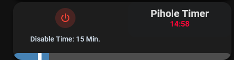
Thank you very much! That gets me closer. One thing I was hoping to recreate from my original card was that the secondary information would actually count down the time once you click the icon. I basically have a helper that will switch from off to on. When It turns on the timer will countdown from whatever number the slider is at, and then the secondary number will dynamically show the time remaining. Please see attached picture. Is this achieveable with mushroom? I’ve also attached the full card I was hoping to replicate.

Thanks again.
On a separate note, what kind of remodeling are you doing?
I’m close to that design. Give me a day.
Turned a closet into well :)…I’ll DM you a pic
I am trying to send the state of the sensor, instead, it is sending the whole thing. However, it just seems to send the whole command instead of evaluating the state
type: custom:mushroom-chips-card
chips:
  - type: template
    entity: button.tp_link_controller_command_execute
    icon: mdi:block-helper
    icon_color: red
    content: null
    tap_action:
      action: call-service
      service: script.omada_command_execute
      service_data:
        data: states("sensor.tp_link_router_clients")
      target: {}
I checked, the data is passed as states(“sensor.tp_link_router_clients”) instead of the count
Thanks
thanks for the response @dimitri.landerloos - I do have a working card which is constructed similiar to the code you posted - I was trying to achieve the same result with just using the sensor state attr. itself. It just seems to be a “tider” approach, than what you shared - might try my luck on auto-entities and see if I get any additional info.
thanks again for taking the time to respond!
there is an example posted over on the github page of the person who created the unavilable entity sensor using the fold entity row.
It just uses the sensor state attr.
This isnt a finished template. This is just a string (text) that says:
states("sensor.tp_link_router_clients")
Templates should start and end with {{ }} or {% %} for if statements, for statements, and the like.
So to finish your template it should be like this.
{{ states("sensor.tp_link_router_clients") }}
I dont guarantee that it will work, unsure if services in tap actions for cards support templates. But the template is correct. I would also normally ensure you convert to float (number) if its supposed to be a number:
{{ states("sensor.tp_link_router_clients") | float}}
Hello all. I have designed a media player card for my soundbar using a mushroom template card, showing different content (buttons, etc…) based on the media source. Now, if I play from Spotify, I would like a button to browse the Spotify library.
At the more-info dialog of the Spotify media_player, there is a nice Browse button that shows a Media Library popup, which is exactly what I want. However, I do not know if this can be called somehow; I did not find a specific service.
Another option I was thinking about is using browser_mod. Then, I can have something like
type: custom:button-card
entity: media_player.spotify_playername
tap_action:
  action: fire-dom-event
  browser_mod:
    service: browser_mod.popup
    data:
      title: Media Library
      content:
        type: iframe
        url: /media-browser/media_player.spotify_playername
      aspect_ratio: 200%
This works great on a PC browser. Unfortunately, the iframe does not load on Android companion app (there is an infinite “Loading data” screen  ).
).
Does anyone have an idea how to do it in a way that works?
Hi vmonkey
I’m don’t know why you have used mushroom template, as your “foundation” for your mediaplayer-card , and then custom:button-cards there, but we all have our choices
Then you want another “button-card” to call a “fire-dom-event”, open a browser_mod.popup, ( tha’t cool ), and this pop-up with an ifram-card.
And you say it works fine, but none of above is related to Mushroom.
Your issue seems to be, that it doesn’t work in Android Companion, so i think you get better response, if you Post/ Search in the Companion-Forum ( Search for i.e Iframe loading in Companion App )
PS: Maybe the “webview” in Android-APP don’t have proper support for iframe

