
Please post your code using the community standards. See #11
Sorry!!! 
type: custom:mushroom-template-card
primary: Terrasse 2
secondary: ''
icon: ''
entity: switch.terrasse_2_sockel_1
picture: |-
  {% if is_state(entity, 'on') %}
    /local/my_icons/IMG_4867.png
  {% else %}
    /local/my_icons/IMG_4866.png
  {% endif %}
fill_container: true
multiline_secondary: false
layout: vertical
card_mod:
  style: |
    ha-card {
      padding: 0px !important;
      --ha-card-border-width: 1px !important;
      --ha-card-border-color: white !important;
      zoom: 180% !important;
      background: transparent;
      height: 70px !important;
    }
still not right. Use the back tick vs quotes

Oh no, I Changed it😊
Try this
card_mod:
  style:
    mushroom-state-info$: |
      .container {
        --card-primary-color: blue;
       margin: -10px;
    .: |
      ha-card {
       padding: 0px !important;
       border: 1px solid white;
       background: transparent;
       height: 100px !important;
           }
I consolidated your border code. You’ll nee to make other tweaks, but it should point you in the right direction.
Thank you😊
I used your Code and it Seems to be that nothing changed…
Looks originally😔
I know it’s working because I can do this…

type: custom:mushroom-template-card
primary: Terrasse 2
entity: switch.kitchen_lights
picture: |
  /local/pics/space.png
fill_container: true
multiline_secondary: false
layout: vertical
secondary: ''
card_mod:
  style:
    mushroom-state-info$: |
      .container {
        --card-primary-color: blue;
       margin:50px;
    .: |

      ha-card {
       padding: 0px !important;
       border: 1px solid white;
       background: transparent;
       height: 100px !important;
           }
I can move it under too

type: custom:mushroom-template-card
primary: Terrasse 2
entity: switch.kitchen_lights
picture: |
  /local/pics/space.png
fill_container: true
multiline_secondary: false
layout: vertical
secondary: ''
card_mod:
  style:
    mushroom-state-info$: |
      .container {
        --card-primary-color: blue;
       margin:-80px;
    .: |

      ha-card {
       padding: 0px !important;
       border: 1px solid white;
       background: transparent;
       height: 120px !important;
           }
Hm,
Maybe it is Not Working with the „Zoom:“
I Need to make the picture higher, because it is too small…
So this is why I Need to use the „Zoom“ also…
Any idea how to implement it in your Perfect Code?
It can work with Zoom. Can you create a pic of what you’d like it to look like?
type: custom:mushroom-template-card
primary: Terrasse 2
entity: switch.kitchen_lights
picture: |
  /local/pics/space.png
fill_container: true
multiline_secondary: false
layout: vertical
secondary: ''
card_mod:
  style:
    mushroom-shape-avatar$: |
      .container {
      margin-top: 20px;
           }
    mushroom-state-info$: |
      .container {
        --card-primary-color: blue;
        margin-top: -10px;
    .: |
      ha-card {
       padding: 0px !important;
       border: 1px solid white;
       background: transparent;
       zoom: 180% !important;
       height: 100px !important;
           }

Perfect code???
Des, I think your code is Perfect😊
Ah ok with Avatar, I can change the Position in the picture.
With state_info, I can change the Position of the Text,
Very Nice!!!
I do have a Maximum „high“ of 83px, so O’Neill try this Code😊
Mans thanks!
May bee helpful to move the zoom off the entire card
type: custom:mushroom-template-card
primary: Terrasse 2
entity: switch.kitchen_lights
picture: |
  /local/pics/yt.png
fill_container: true
multiline_secondary: false
layout: vertical
secondary: ''
card_mod:
  style:
    mushroom-shape-avatar$: |
      .container {
      margin-top: 10px;
      zoom: 120% !important;
           }
    mushroom-state-info$: |
      .container {
        --card-primary-color: red;
        margin-top: -10px;
        zoom: 80% !important;
    .: |

      ha-card {
       padding: 0px !important;
       border: 1px solid white;
       background: transparent;
       height: 83px !important;
           }

Perfect man!
Think you very much.
With transponiert in the Avatar Code, it Looks Perfect for me
🫶🏽
Left you See befor and on the Right you can See it with your Code 🫶🏽

Please. Still no luck to fix that by myself
Maybe you can help ne Here again?
It makes me Crazy😂
Want to have the Same Style and so, Like the Other, nur Here with a rotating Icon.
This works, but the Fan is Not correct positioned and so on😵💫
type: custom:mushroom-template-card
primary: Heizung
icon: mdi:fan
icon_color: |
  {% if is_state('climate.heizung_dachflur','heat') %}
    red
  {% else %}
    black
  {% endif %}
entity: climate.heizung_dachflur
layout: vertical
picture: ''
card_mod:
  style:
    mushroom-shape-icon: |
      mushroom-shape-icon {
        --icon-size: 0px;
      }
      ha-state-icon {
        --icon-symbol-size: 60px;
        margin-top: 10px;
        {{ 'animation: spin 2s linear infinite;' if is_state('climate.heizung_dachflur','heat') }}
      }
      ha-card {
        --card-primary-font-size: 16px
        background: blue !important;
        border: 1px solid white;
        height: 83px !important;
        zoom: 150%;
      }
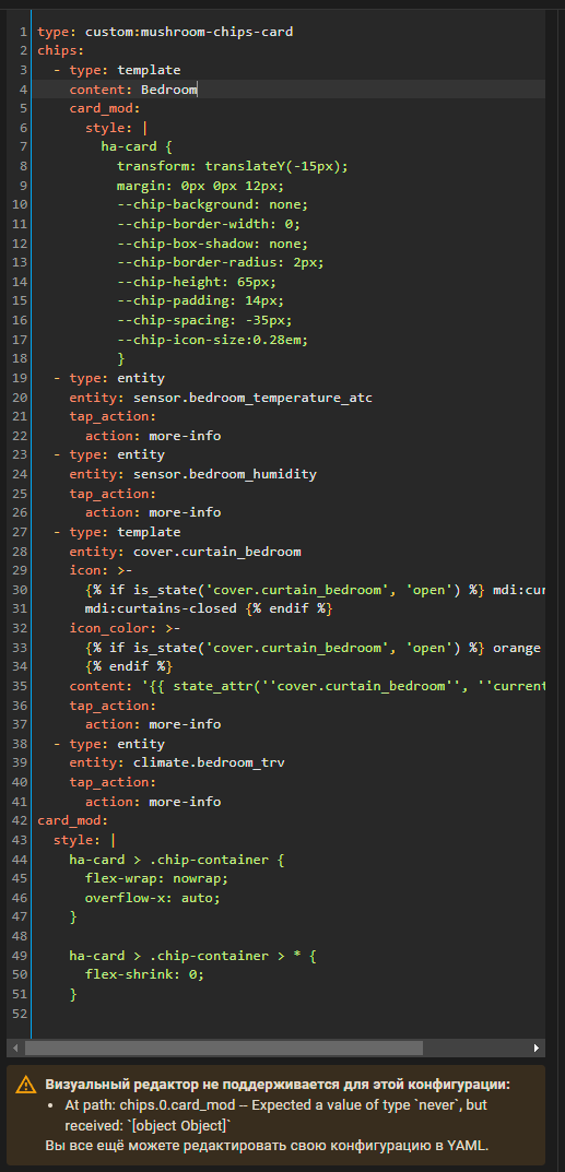
Struggling to get a scrollable title with chips. Well it works but the visual editor for chips is gone for some reason. Not a big deal but would love to get it back. Get the standard * At path: chips.0.card_mod – Expected a value of type never, but received: [object Object]
Searched through the topic but couldn’t find something related. Indention seems fine.
Hello, please tell me. My code has an animation that runs when the switch is active and turns off when the switch is disabled. I need to make sure that when the switch is turned on, the animation runs for 2 seconds and turns itself off, and the switch itself remains on. is it possible to do this? Now this animation is turned off by home assistant automation, but this imposes a number of restrictions. I wish the animation would turn itself off…

type: custom:mushroom-template-card
icon: mdi:radiator
icon_color: red
secondary: ''
entity: input_boolean.vkliuchenie_rozetok_kukhnia
tap_action:
  action: toggle
card_mod:
  style:
    mushroom-shape-icon$: |
      .shape {
       --shape-color: none;
       }
       {% if states('input_boolean.vkliuchenie_rozetok_kukhnia') == 'on' %}
      .shape:after {
       content: '';
       position: absolute;
       width: inherit;
       height: inherit;
       border: 4px solid transparent;
       border-top-color: rgb(var(--rgb-deep-orange));
       border-bottom-color: rgb(var(--rgb-deep-orange));
       border-radius:50%;
       animation: spin 2s ease infinite;
       }
      @keyframes circle {
       0% {transform: rotate(0deg);}
       100% {transform:rotate(360deg);}
      }
       {% endif %}
    .: |
      ha-card {
        background: none;
        box-shadow: none;
        margin-left: -0px !important;
        margin-right: 0px !important;
        margin-bottom: 0px !important;
        #width: 75%;
      }
I’ll have to think about that. I can make it run for 2 seconds, but making the lines go away is another challenge.
Please post your code using the community standards. #11
My mistake. It’s just the topics I’ve searched everyone demanded screenshots of the full code 
type: custom:mushroom-chips-card
chips:
  - type: template
    content: Bedroom
    card_mod:
      style: |
        ha-card {
          transform: translateY(-15px);
          margin: 0px 0px 12px;
          --chip-background: none;
          --chip-border-width: 0;
          --chip-box-shadow: none;
          --chip-border-radius: 2px;
          --chip-height: 65px;
          --chip-padding: 14px;
          --chip-spacing: -35px;
          --chip-icon-size:0.28em;
          }
  - type: entity
    entity: sensor.bedroom_temperature_atc
    tap_action:
      action: more-info
  - type: entity
    entity: sensor.bedroom_humidity
    tap_action:
      action: more-info
  - type: template
    entity: cover.curtain_bedroom
    icon: >-
      {% if is_state('cover.curtain_bedroom', 'open') %} mdi:curtains {% else %}
      mdi:curtains-closed {% endif %}
    icon_color: >-
      {% if is_state('cover.curtain_bedroom', 'open') %} orange {% else %} grey
      {% endif %}
    content: '{{ state_attr(''cover.curtain_bedroom'', ''current_position'') }}%'
    tap_action:
      action: more-info
  - type: entity
    entity: climate.bedroom_trv
    tap_action:
      action: more-info
card_mod:
  style: |
    ha-card > .chip-container {
      flex-wrap: nowrap;
      overflow-x: auto;
    }

    ha-card > .chip-container > * {
      flex-shrink: 0;
    }